容器组件
- Container
- 说明:
- 容器的大小可以通过width、height属性来指定,也可以通过constraints来指定;如果它们同时存在时,width、height优先。实际上Container内部会根据width、height来生成一个constraints。
- color和decoration是互斥的,如果同时设置它们则会报错!实际上,当指定color时,Container内会自动创建一个decoration
- key
- Key
- Container唯一标识符,用于查找更新
- alignment
- AlignmentGeometry
- 控制child的对齐方式,如果Container或者Container父节点尺寸大于child的尺寸,这个属性会起作用
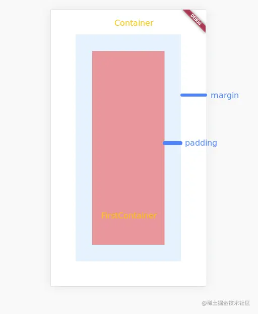
- padding
- EdgeInsetsGeometry
- Decoration内部的空白区域,如果有child话,child位于padding内部,
[在点击事件区域]
- color
- Color
- 用来设置Container背景色,如果设置foregroundDecoration,可能会遮盖color效果
- decoration
- Decoration
- 绘制在child后面的装饰,如果设置了decoraton,就不能设置color属性,否则会报错,此时应该在decoration中进行颜色的设置
- foregroundDecoration
- width
- height
- constraints
- BoxConstraints
- 添加到child上额外的约束条件
- margin
- EdgeInsetsGeometry
- 围绕在Decoration和child之外的空白区域,不属于内容区域,
[不在点击事件区域]
- transform
- Matrix4
- 设置Container的变换矩阵,类型为Matrix4
- transformAlignment
- child
- Widget
- Container中的内容Widget
- clipBehavior
import 'package:flutter/material.dart';

void main(List<String> args) {
  runApp(const App());
}

class App extends StatelessWidget {
  const App({Key? key}) : super(key: key);

  @override
  Widget build(BuildContext context) {
    return MaterialApp(
      title: 'first app',
      theme: ThemeData(primaryColor: Colors.blue),
      home: const Home(),
    );
  }
}

class Home extends StatelessWidget {
  const Home({Key? key}) : super(key: key);

  @override
  Widget build(BuildContext context) {
    return Container(
      color: Colors.blue[50],
      margin: const EdgeInsets.all(60),
      padding: const EdgeInsets.all(40),
      child: const FirstContainer(),
    );
  }
}

class FirstContainer extends StatelessWidget {
  const FirstContainer({Key? key}) : super(key: key);

  @override
  Widget build(BuildContext context) {
    return Container(
      color: Colors.red[200],
      width: 10, # 无效
      height: 10, # 无效
    );
  }
}
图片组件
    ```
  - Image从ImageProvider获取图像
  - Image.asset
    - 图片资源的加载
      - 在Flutter工程中,若要通过资源加载的方式加载图片,首先需要配置资源路径,在pubspec.yaml文件的Flutter标签下添加如下配置项
      ```
        flutter:
          assets:
            - src/xxx.jpeg
      ```
      ```
      children: <Widget>[
        Image.asset("src/xxx.jpeg"),
      ]
  - Image.file 加载本地图片
    - 需要注意,如果需要使用File类,就需要导入Dart的io模块,在main.dart文件头部添加如下代码
    ```
     import 'dart.io';

     ...
     Image.file(new File('/path/....xxx.jpeg'))
    ```
  - Image.network 加载网络图片
  - Image.memory  加载Uint8List资源图片
  - 组件描述
    - Image.network(url: '', fit: BoxFit.contain, ...)
    - image
      - ImageProvider [类型]
      - 抽象类,需要自己实现获取图片数据的操作
    - width/height
      - double
      - Image显示区域的宽高设置,这里需要把Image和图片区分开,图片本身有大小,Image Widget是图片的容器,本身也有大小。
    - fit
      - BoxFit
        - BoxFit.fill 全图显示,显示可能拉伸、充满
        - BoxFit.contain  全图显示,显示原比例,不需要充满
        - BoxFit.cover  显示可能拉伸,可能剪裁,充满
        - BoxFit.fitWidth 显示可能拉伸,可能剪裁,宽度充满
        - BoxFit.fitHeight  显示可能拉伸,可能剪裁,高度充满
        - BoxFit.none 原始大小
        - BoxFit.scaleDown  效果和BoxFit.contain相似,但是此属性不允许显示超过图片大小,可小不可大
    - color
      - Color
      - 图片颜色
    - colorBlendMode
      - BlendMode
      - 在对图片进行手动处理的时候,可能用到图层混合,如改变图片的颜色。此属性可以对颜色进行混合处理。有多种模式
    - filterQuality
      - FilterQuality
      - 设置图片过滤器的质量
    - alignment
      - Alignment
        - bottomCenter bottomLeft bottomRight center centerleft centerRight topCenter topLeft topRight
      - 控制图片的摆放位置,比如图片放置在右下角则为Alignment.bottomRight
    - repeat
      - ImageRepeat
        - noRepeat  不进行复制
        - repeat 水平和垂直放心都进行复制
        - repeatX 水平方向进行复制,竖直方向进行拉伸
        - repeatY 竖直方向囧知复制,水平方向进行拉伸
      - 此属性可以设置图片重复模式。noRepeat为不重复,Repeat为x和y方向重复,repeatX为x方向重复,repeatY为y方向重复
    - centerSlice
      - Rect
      - 当图片需要被拉伸显示时,centerSlice定义的矩形区域会被拉伸,可以理解成我们在图片内部定义9个点用于拉伸,这9个点分别为上、下、左、右、上中、下中、左中、右中、正中
    - matchTextDirection
      - bool
      - matchTextDirection与Directionality配合使用。TextDirection有两个值,分别为:TextDirection.ltr从左向右展示图片;TextDirection.rtl从右向左展示图片
    - gaplessPlayback
      - bool
      - 当ImageProvider发生变化后,重新加载图片的过程中,原图片的展示是否保留。值为true则保留;值为false则不保留,直接空白等待下一张图片加载
- 图标
  - 为展示图标的组件,该组件不可交互
  - Icons 框架自带Icon集合
  - IconTheme Icon主题
  - ImageIcon 通过AssetImages或者其他图片显示Icon
  - 属性
    - color
      - Color
      - null
      - 图标的颜色
    - icon
      - IconData
      - null
      - 展示等具体图标,使用Icons图标列表中的任意一个图标即可,如Icons.phone表示一个电话的图标
    - style
      - TextStyle
      - null
      - 文本样式,可定义文本的字体大小、颜色、粗细等
    - size
      - Double
      - 24.0
      - 图标的大小,需要注意带上小数位
    - textDirection
      - TextDirection
      - TextDirection.ltr
      - Icon组件里也可以添加文本内容。
    - 实例
      ```
      Icon(
        Icons.phone,
        color: Colors.green[500],
        size: 80.0,
      )
      ```
图标按钮
- 图标按钮组件(IconButton)是基于Material Design风格的组件,它可以响应按下事件,并且按下时会带一个水波纹效果。如果它的onPressed回调函数为null,那么这个按钮处于禁用状态,并且不可以按下
- 属性
- alignment
- icon
- color
- disabledColor
- iconSize
- onPressed
- tooltip
- 按钮组件的基类MaterialButton
- 我们一般不会直接使用MeterialButton组件,这个组件是更多定制化按钮组件的基类,其中定义了许多通用的属性
- animationDuration
- 时间间隔Duration对象
- 定义按钮形状或高亮变化的动画时间
- child
- color
- colorBrightness
- disabledColor
- enabled
- highlightColor
- height
- minWidth
- onPressed
- textColor
凸起按钮
- RaisedButton是Material Design中的button,是一个凸起的材质矩形按钮,它可以响应按下事件,并且按下时会带一个触摸的效果
- 属性
- color
- disabledColor
- Color
- ThemeData.disabledColor
- 组件禁用的颜色,默认主题禁用颜色
- onPressed
- VoidCallback
- null
- 当按下按钮时会触发此回调事件
- child
- Widget
- 空
- 按钮的child通常为一个Text文本组件,用来显示按钮的文本
- enable
- FlatButton是平面的按钮组件,不带阴影效果
- DropdownButton组件略微复杂,但功能也更加强大。当单击按钮时,其提供一组供用户进行选择的选项列表
- disabledHint
- hint
- Widget
- 提示组件,当按钮值为null时默认显示
- iconSize
- items
- 元素为DropdownMenuItem类型的列表对象
- 设置选项列表
- onChanged
- value
  var item = DropdownMenuItem(child: Text("按钮名称"), value: "按钮值");
  List<DropdownMenuItem<dynamic>> list = [item];
  DropdownButton(items: list, onChanged: onChange, value: this.value)
- FloatingActionButton
- 悬浮按钮
- backgroundColor
- child
- foregroundColor
- mini
- onPressed
- tooltip
文本组件 Text
- textAlign
- TextAlign[是一个枚举]
- left 左对齐
- right 右对齐
- center 居中对齐
- justify 充满宽度
- start 文本的首部对齐
- end 文本的尾部对齐
- data
- maxLines
- style
- TextStyle
- null
- 文本样式,可定义文本字体大小、颜色、粗细等
- textDirection
- TextDirection
- TextAlign.center
- 文本水平方向对齐方式,取值有center、end、justify、left、right、start、values
- textScaleFactor
- double
- 1.0
- 字体缩放系数,比如,如果此属性设置等值为1.5,那么字体会放大到150%,也就是比原来的大了50%
- textSpan
- TextSpan
- null
- 文本块,TextSpan里可以包含文本内容及样式
- decoration属性设置文本的修饰,TextDecoration类中定义了几个常量可以直接使用,
- none常量表示不使用修饰,
- underline常量表示使用下画线进行修饰,
- overline表示使用上画线进行修饰,
- lineThrough表示使用从文本中间穿过的线进行修饰。
- decorationColor属性设置修饰线的颜色。
- TextDecorationStyle设置修饰线的风格,
- TextDecorationStyle也是一个枚举类型,
- soild表示实线,
- double表示双实线,
- dotted表示点状虚线,
- dashed表示线状虚线,
- wavy表示波浪线。
- fontStyle属性用来设置字体的风格,其提供了两种枚举值,即normal和italic,normal表示正常风格,italic表示倾斜字体。fontWeight属性设置字体的粗细程度。
- letterSpacing属性设置字符间的间距
- overflow
- TextOverflow枚举中定义了3个值,
- clip直接进行截断,
- fade会将超出的文本透明度改变进行隐藏,
- ellipsis会将超出的文本处理为省略号
- 实例
Text('我是文本',
style: TextStyle(
color: Color(0xffff0000),
decoration: TextDecoration.lineThrough,
decorationColor: Color(0xff000000),
fontSize: 18.0,
fontStyle: FontStyle.italic,
fontWeight: FontWeight.bold,
letterSapcing: 2.0,
)
)
Scaffold
- 界面脚手架组件,导航栏、抽屉、悬浮按钮、内容视图等
- appBar
- AppBar对象
- actions
- backgroundColor
- centerTile
- leading
- title
- 配置应用导航栏
- backgroundColor
- body
- bottomNavigationBar
- Widget
- 底部导航栏
- items
- BottomNavigationBarItem列表
- icon
- title
- activeIcon
- backgroundColor
- 设置标签组,必选
- onTap
- BottomNavigationBarType
- 枚举:fixed-自适应宽度 shifting位置和吃训都有单击动画
- 设置类型
- fixedColor
- backgroundColor
- iconSize
- selectedItemColor
- unselectedItemColor
- selectedIconTheme
- unselectedIconTheme
- seletedFontSize
- unseletedFontSize
- seletedLabelStyle
- unseletedLabelStyle
- bottomSheet
- drawer
- endDrawer
- floatingActionButton
- presistentFooterButtons
- 元素为Widget的List对象
- 持久化显示的底部按钮组件
- primary
基础列表
- 水平列表
- 垂直列表
- 数据量非常大的列表
- 矩阵式的列表
- ListView
- 属性
- scrollDirection
- Axis
- Axis.vertical
- 列表的排列方向,Axis.vertical为垂直方向,是默认值,Axis.horizontal为水平方向
- padding
- EdgeInsetsGeometry
- 空
- 列表内部的空白区域,如果有child,child位于padding内部
- reverse
- children
- List
- 空
- 列表元素,注意List元素全部为Widget
- 实例
...
ListView(
scrollDirection: Axis.horizontal,
children: <Widget> [
Container(
width: 200.0,
color: Colors.lightBlue,
),
Container(
width: 200.0,
color: Colors.lightGreen,
),
]
)
...
Column(
children: <Widget>[
Text(
'水平',
style: TextStyle(
fontWeight: FontWeight.bold,
fontSize: 36.0,
),
),
Text(
'水平',
style: TextStyle(
fontWeight: FontWeight.bold,
fontSize: 36.0,
),
),
]
)
长列表
ListView.builder(
  itemCount: items.length,
  itemBuilder: (context, index) {
    return Text('test');
  }
)
网格列表
- GridView
- GridView.count 通过单行展示个数创建GridView
- GridView.extent 通过最大宽度创建GridView
- 属性d9
- scrollDirection
- reverse
- controller
- primary
- physics
- shrinkWrap
- padding
- gridDelegate
- cacheExtent
表单组件
- Form组件
- 用于提交整个表单
- key
- autovalidate
- child
- onChanged
- VoidCallback
- 当FormField值改变时的回调函数
- TextFormField组件
- 用于用户输入
- autovalidate
- initialValue
- T
- 表单字段初始值,比如输入收货地址时,默认回填本地地址信息
- onSaved
- FormFieldSetter
- 当Form表单调用保存方法Save时回调的函数
- validator
- FormFieldValidator
- Form表单验证器
MaterialDesign
- AppBar
- AlertDialog
- BottomNavigationBar


