

Motion One是一个新的库,它允许你快速而毫不费力地在你的网站上添加小而光滑、功能强大的动画。你可以把它们添加到任何元素中,并轻松地控制它们。
这篇文章将给你一个关于Motion One功能的快速概述。它之所以在体积小的情况下性能如此强大,是因为它建立在Web Animations API的基础上,这是一种为DOM元素制作动画的本地语言。Motion One只是通过其不言自明的代码提供了一种简单的实现方式。
Motion One的动画也是完全响应的,它支持SVG和CSS转换、过渡和动画,此外还有一些DSL,使简单的动画变得更加简单。最后,它也有缓和功能(包括预定义的和自定义的)。
在这篇文章中,我们将介绍开始使用Motion One的所有基础知识。以下是我们要讨论的内容。
为了跟上进度,我为本教程建立了一个GitHub仓库。如果你迷路了,可以去看一下。
对Motion One进行基准测试
这里有一些来自BundlePhobia的关于Motion One捆绑规模的详细信息。
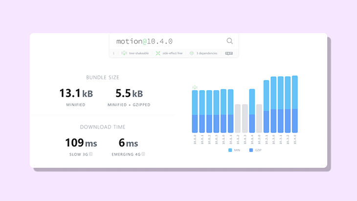
Motion One的核心功能是animate() API,它的大小只有3.8kB。开发者Matt Perry打算通过进一步的改进和版本升级将其减少到1.8kB!
与市场上的其他动画库相比,Motion One的大小仅仅是Anime.js的一半,是GSAP的七分之一。
Motion One的另一个很酷的特点是,它可以在没有主JavaScript线程的情况下运行。这意味着在繁重的应用渲染过程中,动画仍然可以执行。
使用animate() API
在开始之前,先去安装这个库,使用。
npm install motion
安装完毕后,让我们深入了解一下Motion One的核心功能之一。animate() API提供了一种简单的方法,使DOM上的某个元素从其当前的方向或位置开始产生动画。
Motion One的核心功能之一是animate() 函数,它接收三个参数。
- 一个CSS选择器
- 可动画的值
- 选项
让我们更详细地了解一下这些参数。
1.CSS选择器
第一个参数是DOM上将被动画化的元素的id 或class 。
import { animate } from "motion";

function Trigger ( ) {
  animate(".box", { x: 100} )
}
2.可动画的值
第二个参数指定该元素在动画过程中的表现,例如在DOM上移动100px或旋转45度。
import { animate } from "motion";

function Trigger ( ) {
  animate(".box", { x: 100, rotate: 45 } );
}
3.3.选项
最后一个参数是Options,它可以用来控制动画的各个方面,如延迟、持续时间、重复次数等等。
import { animate } from "motion";

function Trigger ( ) {
  animate('.click', { transform: 'rotate(45deg)' }, { duration: 0.5 })
}
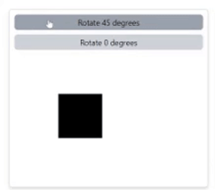
animate() 函数可以使用与按钮绑定的onClick 事件来触发。
<button
  className="rounded-md bg-gray-300 hover:bg-gray-400 p-1 text-sm"
  onClick={() =>
    animate('.click', { transform: 'rotate(45deg)' }, { duration: 0.5 })
  }
>
  Rotate 45 degrees
</button>

// element to be animated
<div className="click"></div>
用Motion One创建交互式动画
为什么不把我们到目前为止所学到的一切结合起来,创建一个互动动画呢?
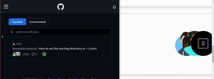
在本教程中,我们将以GitHub的贡献者列表中的这个动画为灵感。重现这个动画的主要目的是,当鼠标悬停在头像上时,将头像在横轴上向左移动。
在本教程中,我将使用Tailwind CSS来加快开发过程,但用vanilla CSS的概念也是一样的。
首先,我们为这个动画需要三个<image> 元素,每个元素都被一个<div> 标签包围。
<div
  onMouseOver={onHover}
  onMouseOut={onHoverOff}
>
  <div>
    <Image
      className="rounded-full"
      alt="one"
      src="/images/avataaars.png"
      width="60"
      height="60"
    />
  </div>
    <div>
      <Image
        className=" rounded-full"
        alt="two"
        src="/images/new.jpg"
        width="60"
        height="60"
       />
  </div>
    <div>
     <Image
      className="rounded-full"
      alt="three"
      src="/images/logo.png"
      width="60"
      height="60"
     />
  </div>
</div>
我们将使父<div> ,而子元素是绝对的,然后增加每个子元素的z-index,以使照片一个在另一个上面对齐。
<div className="relative">
  <div className="absolute z-0"><Image {...attributes} /></div>
  <div className="absolute z-10"><Image {...attributes} /></div>
  <div className="absolute z-20"><Image {...attributes} /></div>
</div>
接下来,定位每个子元素,使所有的图片都在一排上对齐。
<div className="relative">
  <div className="absolute z-0 right-10"><Image {...attributes} /></div>
  <div className="absolute z-10 right-5"><Image {...attributes} /></div>
  <div className="absolute z-20 right-0"><Image {...attributes} /></div>
</div>
给父级<div> 标签添加两个事件,分别是onMouseOver 和onMouseOut 。现在需要做的就是把图片移动到一个特定的位置,使它们的间距相等。
为每个事件创建一个处理函数:当鼠标在元素上,以及当鼠标离开该区域。
function onHover () {
  // code goes here
}

function onHoverExit () {
  // code goes here
}
我们希望当鼠标指针悬停在X轴上时,图像分散在三个不同的位置。
function onHover() {
  animate('.one', { x: -70 }, { duration: 0.2 });
  animate('.two', { x: -40 }, { duration: 0.2 });
  animate('.three', { x: -10 }, { duration: 0.2 });
}
这里的减号将图像向左移动。同样地,在下面的发生中,我们希望它能回到以前的位置。
function onHoverOff() {
  animate('.one', { x: 0 }, { duration: 0.2 });
  animate('.two', { x: 0 }, { duration: 0.2 });
  animate('.three', { x: 0 }, { duration: 0.2 });
}
这就是它的作用!这一次很容易就完成了,是不是很神奇呢?让我们再来介绍一些基本原理。
使用关键帧和stagger 函数
用关键帧在DOM中移动元素
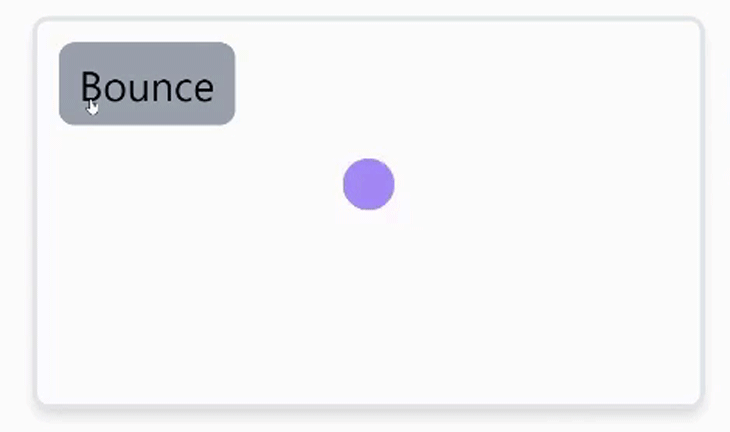
当动画元素需要在DOM上多次移动,覆盖不同的坐标时,比如加载指示器弹跳时,可以使用关键帧。这些值可以以数组的形式提供,如下图所示。
function bounceHandler() {
   animate(
     '.bounce',
     { y: [-30, 120, 50, 120] },
    { duration: 1, direction: 'alternate' }
   );
}
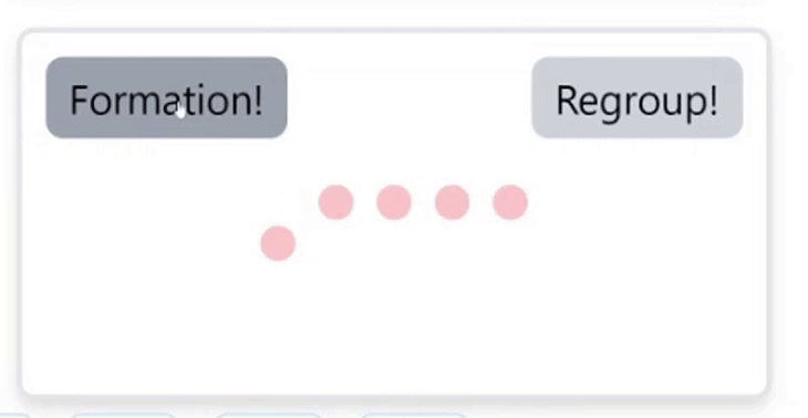
用stagger给多个元素做动画
错开是另一个很酷的功能。当给多个元素做动画时,可以用相同的class 或id ,给每个元素应用一个延迟。
<div className="flex justify-center">
  <div className="pawn"></div>
  <div className="pawn"></div>
  <div className="pawn"></div>
  <div className="pawn"></div>
  <div className="pawn"></div>
</div>
如果你用animate() 函数来绑定单个元素,像这样。
// onClick trigger
function moveUsingStagger() {
  animate('.pawn', { y: 50 }, { delay: stagger(0.1) });
}
这就是你可能期望看到的情况。
为了看到这些在一个更有挑战性的例子中的使用,让我们做一个音乐波形,就像下面这个。
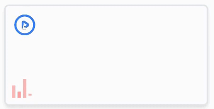
很有趣,不是吗?首先,我们需要一个按钮,和四个波形条。
<div>
  // button trigger to animate waveform
  <button onClick={play} >
    <PlayIcon />
  </button

  // waveform
  <div className="flex overflow-hidden">
    <span className="w-1 h-4" />
    <span className="w-1 h-2" />
    <span className="w-1 h-6" />
    <span className="w-1 h-2" />
  </div>
</div>
作为提醒,你可以随时在我为这篇文章创建的GitHub repo中查看完整的代码。
然后我们将进入动画部分。给按钮添加一个onClick 事件,并将其分配给一个函数。然后,指向每个<span /> 并调用animate() 函数。记住要给每个子元素一个独特的名字。与其他动画不同,我们将在这里以不同的方式为每个<span /> 制作动画。
function playWaveform ( ) {
  // some code here
  const animation1 = animate(
      '#bar1',
      {
        transform: [
          'scaleY(1.0) translateY(0rem)',
          'scaleY(1.5) translateY(-0.082rem)',
          'scaleY(1.0) translateY(0rem)',
        ],
      },
      {
        duration: 1.0,
        repeat: Infinity,
        easing: 'ease-in-out',
      }
    );
    const animation2 = animate(
      '#bar2',
      {
        transform: [
          'scaleY(1.0) translateY(0rem)',
          'scaleY(3) translateY(-0.083rem)',
          'scaleY(1.0) translateY(0rem)',
        ],
      },
      {
        delay: 0.2,
        duration: 1.5,
        repeat: Infinity,
        easing: 'ease-in-out',
      }
    );
    const animation3 = animate(
      '#bar3',
      {
        transform: [
          'scaleY(1.0)  translateY(0rem)',
          'scaleY(0.8) translateY(0.37rem)',
          'scaleY(1.0)  translateY(0rem)',
        ],
      },
      {
        delay: 0.3,
        duration: 1.5,
        repeat: Infinity,
        easing: 'ease-in-out',
      }
    );
    const animation4 = animate(
      '#bar4',
      {
        transform: [
          'scaleY(0.3)  translateY(0rem)',
          'scaleY(2.0) translateY(-0.05rem)',
          'scaleY(0.3)  translateY(0rem)',
        ],
      },
      {
        delay: 0.3,
        duration: 1.5,
        repeat: Infinity,
        easing: 'ease-in-out',
      }
    );

  // some more code here ( wait for it )
}
正如你可能已经注意到的,我已经给每个animate() 函数分配了一个引用常数。这是有特殊原因的,我们稍后会说到。
现在,让我们先了解一下animate() API的作用。首先,我们传入两个关键帧到transform 属性。
ScaleY:垂直调整元素的大小TranslateY:沿Y轴移动所选元素的位置。
结果,你可能已经注意到,我给父元素添加了一个overflow-hidden 属性,以掩盖这两个属性造成的溢出。在这之后,repeat 属性被设置为infinity ,这导致同一个动画被无限期地重复。
将delay 属性添加到最后三个子元素中,使它们彼此区分开来,并导致每个条的动画独立于其他条的感觉。
缓和属性控制动画播放的速度。在这个例子中,我们把它设置为ease-in-out ,这意味着动画开始时很慢,在中间加速,然后在结束时再次放慢。
了解控制
animate() 函数返回一个叫做controls 的东西。我们可以使用控件来控制动画的播放。每次调用animate() 函数时都会返回控件,这可以通过将animate() 函数实例化为一个变量来访问。
再看上一个例子,我们可能想只在音乐播放时对波形进行动画处理。这时,控件就会非常有用。
为了掌握controls ,引用animate 函数。
const animation1 = animate("#bar1", ...options )
之后,要控制动画,在给定的布尔条件下使用pause() 或play() 方法。
// if music is playing
animation1.play( );

// if the music stops playing
animation1.pause( );
现在让我们返回到我们之前的动画!为了控制播放,我们可以使用一个在布尔条件之间切换的状态。
import { useState } from "react";

// component
function MusicWaveform () {
  const [ isPlaying, setIsPlaying ] = useState(false);

  // toggles between state
  function switchModeHandler() {
    setIsPlaying((prevState) => !prevState);
  }

  // animation code goes here
  function playWaveform() {
    switchModeHandler();
    // animate functions for each bar ...
  }
  // JSX code
}

export default MusicWaveform;
>
现在当按钮被点击时,playWaveform 函数被触发,状态被切换。剩下的就是在按钮被触发的时候播放波形。
function playWaveform() {
  switchModeHandler();
  // useState
  // animate functions for each bar
  if (isPlaying) {
    animation1.pause();
    animation2.pause();
    animation3.pause();
    animation4.pause();
  } else {
    animation1.play();
    animation2.play();
    animation3.play();
    animation4.play();
  }
}
这就是它的全部内容了!你应该能看到小节在跳舞
总结
Motion One是一个功能齐全的网络动画库。它建立在Web Animations API的基础上,这是一个网络标准,允许Web Animations甚至可以在没有主JavaScript线程的情况下运行(因此保持流畅)。
Motion One真的很轻量级,并且拥有你所需要的一切来构建伟大的动画。你可以通过访问motion.dev,了解更多关于Motion One的信息。
