

1. 相关软件ps、蓝湖,pxcook、imgcook(自动生成前端代码)
2. css盒模型的组成:content、padding、border、margin
- background:content、padding、border
- width、height:content
- padding不能负,margin能为负
- margin-top传递现象:
- 用padding-top。 2. 给父亲加个border。 3. bfc格式上下文。4. 弹性布局和网格布局
- margin-top叠加现象:上下两个盒子一个margin-bottom(40px),一个margin-top(30px),只会取大的哪个px(40px)
- 解决:1、直接给一个盒子设置足够的margin-top:70px
2、bfc格式化
3、弹性布局和网格布局
3. 块级盒子(默认 block box)与内联盒子(inline box):
- 块级盒子(div):1、独占一行 2、所有样式都会生效 3、会继承父亲的宽度 4、形状为矩形
- 内联级盒子(span):1、不会换行 2、一般情况下不会支持(可以转为display:block就支持)3、由内容撑开 4盒子之间会有空隙 5、最好用来做文本标签
4. 自适应盒模型的特性(div):两个嵌套的盒子,默认情况下子盒子会继承父盒子的width。
- 如果子盒子规定了与父盒子一样的宽,给子盒子加padding,margin会溢出父盒子,不会改变内容的宽高。
- 如果子盒子继承父盒子一样的宽,给子盒子加padding,margin,会自动适应父盒子的宽度,不会溢出;,不会改变内容的宽高。
<style>
    .p{
        width: 200px;
        height: 200px;
        background-color: red;
    }
     .s{
        /* width: 200px;   */
        height: 50px;
        /* padding: 20px; */
        background-color: rgb(179, 174, 174);
    }
</style>
<body>
    <div class="p">
        <div class="s"></div>
    </div>
</body>
5. 怪异盒模型(ie盒子):box-sizeing:border-box(默认:content-box)
- width,height:content、padding、border:加入了padding、border会缩小内容的大小;没有padding、border全是content的大小
<style>
.p{
width: 200px;
height: 200px;
background-color: red;
}
.s{
box-sizing: border-box;
width: 200px;
height: 50px;
/* padding: 20px; */
background-color: #b3aeae;
}
</style>
<body>
<div class="p">
<div class="s">123</div>
</div>
</body>
- 应用: 1、量取尺寸时不用再去计算一些值,只需要注意margin。2、解决一些需要设置百分比的盒模型值:比如移动端底部的table bar(使用了固定定位,宽为内容的大小)
6. 浮动:左右布局
- 清除浮动:clear、BFC、空标签、伪类(.class::after{content:'',clear:both,display:block})
- 注意:1、只会影响后面的元素。2、文本不会被浮动元素覆盖。3、浮动的盒子,宽高由内容撑开。4、浮动的元素,父容器装不下,会自动换行(空隙不好处理)
7. 定位(更加灵活):叠加效果
- static、
- absolute:相对非static父级()偏移,没有就一直往上一级找,直到找到body。脱离标准流,内联特征(行、块)
- relative:相对自己偏移,不会脱离标准流。
- sticky:相对转为-》固定定位-》相对定位
- fixed:相对可视区偏移。脱离文档流,内联特征。
8. z-index:默认后写的层级高于前面的
- 生效条件:有position且不是static
- 注意:跟嵌套的元素相比较,如果嵌套元素的父级(满足生效条件)有z-index,就直接比较;如果没有就跟里面的子元素比较
9. flex弹性布局:适合做一维布局(一行或者一列)
- 注意:必须要有父级盒子,针对与子元素
- display: flex 将对象作为弹性伸缩盒显示
- display: inline-flex 将对象作为内联级弹性盒子伸缩盒显示
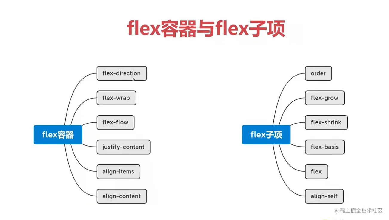
- 容器与子项:
- flex-drection:row、column、row-reverse、column-reverse
默认:主轴:left->right 交叉轴:top->bottom - flex-wrap:wrap、wrap-reverse 父元素的height没设置si,会挨着换行;有高,会产生相等的距离在换行(display:inline-flex可以避免这种情况)。
- flex-flow:[flex-drection] [flex-wrap]
- 主轴: just-content: flex-start、flex-end、space-around、between-around、space-evenly
- 交叉轴(全部):align-content:stretch、flex-start、flex-end、space-around、between-around、space-evenly 当不折行该样式不生效,必须要与flex-warp一起用
- 每一行的交叉轴 align-item:center、stretch、flex-start、flex-end、baseline
- 案例 三种上下居中
<!DOCTYPE html>
<html lang="en">
<head>
    <meta charset="UTF-8">
    <meta http-equiv="X-UA-Compatible" content="IE=edge">
    <meta name="viewport" content="width=device-width, initial-scale=1.0">
    <title>Document</title>
</head>
<style>
/* .box{
    width: 410px;
    height: 410px;
    border: 1px solid black;
    display: flex;
    align-items: center;
} */
/* .box{
    width: 410px;
    height: 410px;
    border: 1px solid black;
    display: flex;
    flex-wrap: wrap;
    align-content: center;
} */
.box{
    width: 410px;
    height: 410px;
    border: 1px solid black;
    display: table-cell;
    vertical-align: middle;
}
.son{
    width: 100px;
    height: 100px;
    margin: 1px;
    background-color: pink;
}
</style>
<body>
    <div class="box">
        阿三大苏打撒旦撒啊啊啊啊啊啊啊啊啊啊啊阿斯顿撒旦水水水水水水水水水水水水水水撒旦撒旦撒啊啊啊啊啊啊啊啊啊啊啊啊啊啊
    </div>
</body>
</html>
- 4种上下左右居中 :
<!DOCTYPE html>
<html lang="en">
<head>
    <meta charset="UTF-8">
    <meta http-equiv="X-UA-Compatible" content="IE=edge">
    <meta name="viewport" content="width=device-width, initial-scale=1.0">
    <title>Document</title>
</head>
<style>

/* .box{
    width: 410px;
    height: 410px;
    border: 1px solid black;
   display: flex;
   align-items: center;
   justify-content: center;
} */

/* .box{
    width: 410px;
    height: 410px;
    border: 1px solid black;
   display: flex;
   flex-wrap: wrap;
   align-content: center;
   justify-content: center;
} */

/* .son{
    width: 100px;
    height: 100px;
    margin: 1px;
    background-color: rgb(218, 155, 165);
} */


 .box{
    width: 410px;
    height: 410px;
    border: 1px solid black;
    position: relative;
}
/*
.son{
    position: absolute;
    left: 50%;
    top: 50%;
    transform: translate(-50%,-50%);
    width: 100px;
    height: 100px;
    margin: 1px;
    background-color: rgb(218, 155, 165);
} */

 .son{
     width: 100px;
    height: 100px;
    margin: 1px;
    background-color: rgb(218, 155, 165);
    position: absolute;
    top: 0;
    right: 0;
    left: 0;
    bottom: 0;
    margin: auto;
}

</style>
<body>
    <div class="box">
        <div class="son">123</div>
    </div>
</body>
</html>
- 子选项分布布局
<!DOCTYPE html>
<html lang="en">
<head>
    <meta charset="UTF-8">
    <meta http-equiv="X-UA-Compatible" content="IE=edge">
    <meta name="viewport" content="width=device-width, initial-scale=1.0">
    <title>Document</title>
</head>
<style>

.box{
    width: 410px;
    height: 410px;
    border: 1px solid black;
   display: flex;
   justify-content: space-between;
}
.box div:nth-of-type(2){
** margin-right: auto;**
}
.son{
    width: 40px;
    height: 100px;
    margin: 1px;
    background-color: rgb(218, 155, 165);
}


</style>
<body>
    <div class="box">
        <div class="son">123</div>
        <div class="son">123</div>
        <div class="son">123</div>
        <div class="son">123</div>
        <div class="son">123</div>
        <div class="son">123</div>
        <div class="son">123</div>
    </div>
</body>
</html>
- 子项
- flex-grow;1; 单个孩子-》占满全部;多个孩子-》除去自己的宽,占一份比例。flex-grow默认值为0,表示**不占用剩余的空白间隙(减去width)**来扩展自己的宽度。
- flex-shrink:默认值为1,表示flex容器不足的时候收缩的比例。
- flex - basis:默认值为auto,指定flex在主轴方向上的初始大小(px),默认会覆盖掉width,改变主轴会覆盖height。
- order:默认为0,越大越往后排。
- align-self:改变子项对其方式。与align-item作用一样
- 应用:
1、等高布局。2、两列、三列布局
10 grid布局:dispaly:grid/inline-grid
(1)、父项:
1.注意:repeat()、auto-fill、minmax(100px,1fr)
- grid-template-rows:100px repeat(2,15px)/ repeat(auto-fill,15px) ->单位可以是px,行
- grid-template-columns:1fr 1fr 1fr ->单位可以是px,列
<!DOCTYPE html>
<html lang="en">

<head>
    <meta charset="UTF-8">
    <meta http-equiv="X-UA-Compatible" content="IE=edge">
    <meta name="viewport" content="width=device-width, initial-scale=1.0">
    <title>Document</title>
</head>
<style>
    .box {
        height: 300px;
        background-color: pink;
        display: grid;
        /* grid-template-columns: 100px 1fr 100px; */

        grid-template-columns: 100px minmax(100px,1fr) 100px;
        grid-template-rows: 100px;
    }
    .box div {
        background-color: rgb(99, 99, 241);
        border: 1px rgb(0, 4, 10) solid;
    }
</style>

<body>
    <div class="box">
        <div>1</div>
        <div>3</div>
        <div>4</div>

    </div>

</body>

</html>
- grid-template-areas:合并网格与网格命名(子项要用-》grid-area) - grid-template:grid-template-areas、grid-template-rows、grid-template-columns合并的语法
<style>
.box{
    width: 204px;
    height: 204px;
    background-color: pink;
    display: grid;
     /* grid-template-rows: 1fr;
    grid-template-columns: 1fr 1fr 1fr  ;
    grid-template-areas:
    "a1 a1 a3"
    "a1 a1 a3"
    "a2 a2 a2"; */
    grid-template:
    "a1 a1 a3" 1fr
    "a1 a1 a3" 1fr
    "a2 a2 a2" 1fr/
    1fr 1fr 1fr;
}
.box div{
    border: 1px black solid;
}
.box div:nth-of-type(1){
    grid-area: a1;
}
.box div:nth-of-type(2){
    grid-area: a2;
}
.box div:nth-of-type(3){
    grid-area: a3;  得到名字显示
}
</style>
<body>
    <div class="box">
        <div>1</div>
        <div>2</div>
        <div>3</div>
    </div>
</body>
- 表格间隙
- row-gap: 行间隙
- column-gap: 列间隙 - gap: 行 列;
- 注意:子项要比表格小
- 作用与子项垂直居中: align-items: center;
- 作用与子项横向居中: justify-items: center; -** place-items: align-items justify-items;**
- 注意:表格要比容器小
- 作用与表格垂直居中: align-content: center;
- 作用与表格横向居中: justify-content: center;
- place-content: align-content justify-content;
- 隐式网格设置
- grid-auto-flow: column/row(默认);:
- grid-auto-columns: 100px;/ grid-auto-rows: 100px;
(2)、子项:
- 基于线的元素放置
- 横着: grid-column-start: 2;、 grid-column-end: 3;
- grid-column: grid-column-start/grid-column-end;
- 竖着 grid-row-start: 1;、 grid-row-end: 4;
- grid-row: grid-row-start/grid-row-end
- grid-column: grid-column-start/grid-column-end
- 起别名:
- grid-area:grid-row-start/ grid-column-start/grid-row-end/grid-column-end
2、规定每个子项的位置
-
justify-self: center;
-
align-self: center;
-
palace-self:align-self justify-selfzzz
(3)、应用:
-
(1):比网格更方便的叠加布局
-
(2) : 多种组合排列布局-》注意:span 2
-
-
(3):栅格布局
- (4) 行自适应和列自适应
10 移动端布局
1. rem布局
- em原理:em为相对单位,相对于自身的font-size的大小(自身的font-size:1em,就找父级的font-size)
- rem原理:看根(html)的font-size
- vscode测rem插件:px to rem
- 逻辑像素:CSS像素的单位也叫PX。他是图像显示的基本单元
- 物理像素:设备屏幕实际拥有的像素点。比如一个图片,细分最小单位就是像素,也就是说图片是由许多的像素构成。一个设备生产出来,他们的像素就已经确定了,iphone5的分辨率是640*1136px,代表屏幕的宽是640px,高是1136px
- 注意:(1)默认情况下,一个CSS像素等于一个物理像素的宽度。但是在高像素密度的设备上,CSS像素甚至在默认情况下相当于多个物理像素的尺寸。比如iPhone的屏幕对比一般的手机屏幕会看起来更精细清晰一些。(2)iPhone6,7,8都是两倍屏手机,即一个CSS像素等于两个物理像素。iPhone6Plus等于三倍屏手机,即一个CSS像素等于3个物理像素。(3)以iPhone6为例,设计稿给出一个图片的宽高为4040,在实际开发中要除以2,宽高要写成2020,因为iPhone6是两倍屏手机
2. vw布局
- vw: 把屏幕宽度分成100份。iphone5的分辨率是640*1136px--》100vw = 640px
- vscode测vw插件:px to vw
