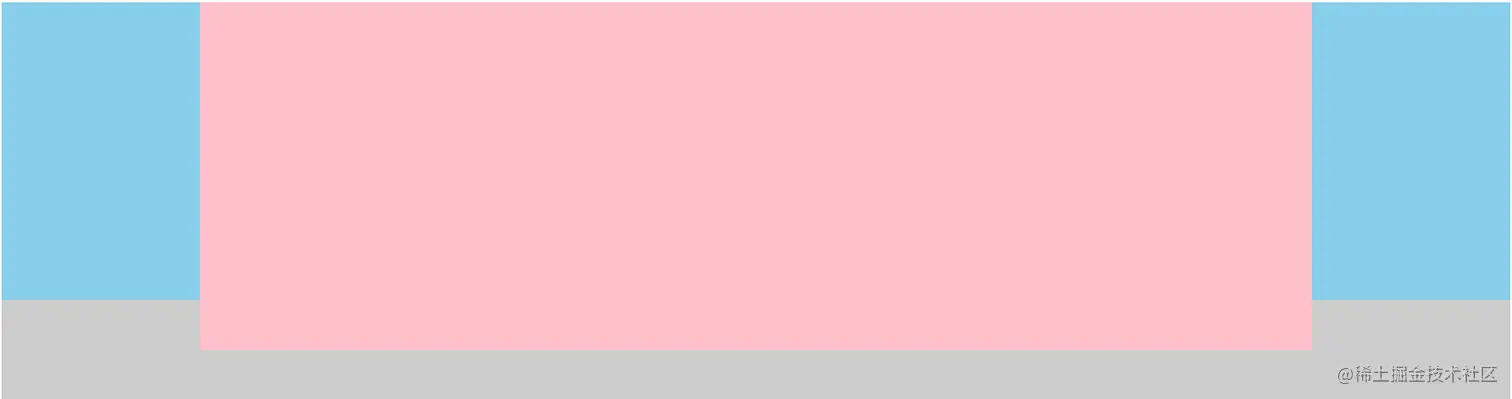
方法一、定位
- 按照
左、中、右 排列盒子
- 给父盒子设置左右
padding 值,padding-left 值 为左盒子的宽度,padding-right 值 为右盒子的宽度
- 子绝父相,左盒子
left 的值为0,top值为0;右盒子 right 值为0,top值为 0
- 中间盒子自适应
<!DOCTYPE html>
<html lang="en">

<head>
    <meta charset="UTF-8">
    <meta http-equiv="X-UA-Compatible" content="IE=edge">
    <meta name="viewport" content="width=device-width, initial-scale=1.0">
    <title>Document</title>
    <style>
        .father {
            position: relative;
            height: 400px;
            padding: 0 200px;
            background-color: #ccc;
        }

        .left,
        .right {
            position: absolute;
            width: 200px;
            height: 300px;
            background-color: skyblue;
            top: 0;
        }

        .left {
            left: 0;
        }

        .right {
            right: 0;
        }

        .center {
            height: 350px;
            background-color: pink;
        }
    </style>
</head>

<body>
    <div class="father">
        <div class="left"></div>
        <div class="center"></div>
        <div class="right"></div>
    </div>
</body>

</html>
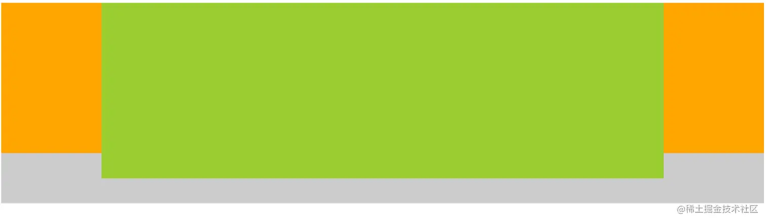
方法二、浮动
- 按照
左 、右、 中 排列
- 左盒子
float 值为 left,右盒子 float 值为 right
- 中间盒子
overflow 值为 hidden
<!DOCTYPE html>
<html lang="en">

<head>
    <meta charset="UTF-8">
    <meta http-equiv="X-UA-Compatible" content="IE=edge">
    <meta name="viewport" content="width=device-width, initial-scale=1.0">
    <title>Document</title>
    <style>
        .father {
            height: 400px;
            background-color: #ccc;
        }

        .left,
        .right {
            width: 200px;
            height: 300px;
            background-color: orange;
        }

        .left {
            float: left;
        }

        .right {
           float: right;
        }

        .center {
            height: 350px;
            background-color: yellowgreen;
            overflow: hidden;
        }
    </style>
</head>

<body>
    <div class="father">
        <div class="left"></div>
        <div class="right"></div>
        <div class="center"></div>
    </div>
</body>

</html>
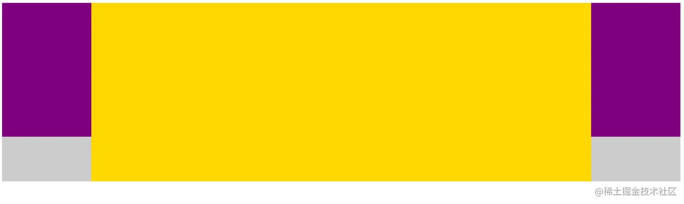
方法三、flex 弹性布局
- 按照
左、中、右 排列盒子
- 父盒子设置
display 值为 flex
- 左右盒子设置固定宽高
- 中间盒子
flex 值为1或 auto
<!DOCTYPE html>
<html lang="en">

<head>
    <meta charset="UTF-8">
    <meta http-equiv="X-UA-Compatible" content="IE=edge">
    <meta name="viewport" content="width=device-width, initial-scale=1.0">
    <title>Document</title>
    <style>
        .father {
            display: flex;
            height: 400px;
            background-color: #ccc;
        }

        .left,
        .right {
            width: 200px;
            height: 300px;
            background-color: purple;
        }

        .center {
            flex: 1;
            background-color: gold;
        }
    </style>
</head>

<body>
    <div class="father">
        <div class="left"></div>
        <div class="center"></div>
        <div class="right"></div>
    </div>
</body>

</html>


