字体图标
购物车案例
<style>
* {
margin: 0;
padding: 0;
}
.cart {
display: block;
width: 100px;
height: 50px;
text-decoration: none;
line-height: 50px;
color: #000;
}
.cart .icon-gouwuchekong {
color: orangered;
}
</style>
 <a href="#" class="cart">
        <i class="iconfont icon-gouwuchekong"></i> 购物车
        <i class="iconfont icon-downarrow"></i>
    </a>
平面转换
双开门案例(平移)
<style>
* {
margin: 0;
padding: 0;
}
.box {
width: 1366px;
height: 600px;
margin: 50px auto;
border: 10px solid #000;
background: url(./images/bg.jpg);
overflow: hidden;
}
.box::before,
.box::after {
content: "";
width: 50%;
height: 100%;
float: left;
background-image: url(./images/fm.jpg);
transition: 1s;
}
.box::after {
background-position: right;
}
.box:hover::before {
transform: translate(-100%);
}
.box:hover::after {
transform: translate(100%);
}
</style>
<div class="box"></div>
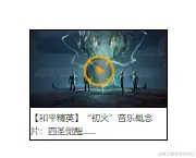
和平精英案例(缩放)
<style>
* {
margin: 0;
padding: 0;
}
.box {
width: 250px;
height: 200px;
border: 1px solid #000;
margin: 100px;
line-height: 1.5;
overflow: hidden;
}
.pic img {
width: 100%;
}
.box .pic {
position: relative;
}
.pic::after {
content: "";
position: absolute;
left: 50%;
top: 50%;
transform: translate(-50%, -50%) scale(5);
width: 58px;
height: 58px;
background-image: url(./images/play.png);
opacity: 0;
transition: 0.6s;
}
.pic:hover::after {
transform: translate(-50%, -50%) scale(1);
opacity: 1;
}
</style>
   <div class="box">
        <div class="pic">
            <img src="./images/party.png" alt="">
        </div>
        <p>【和平精英】“初火”音乐概念片:四圣觉醒......</p>
    </div>
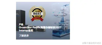
华为综合案例(缩放)
<style>
* {
margin: 0;
padding: 0;
box-sizing: border-box;
}
a {
display: block;
width: 350px;
height: 247px;
background-color: red;
margin: 50px auto;
position: relative;
overflow: hidden;
}
.title {
position: absolute;
left: 0;
bottom: -50px;
padding-left: 20px;
padding-right: 50px;
background-color: transparent;
color: #fff;
transition: 0.6s;
z-index: 1;
}
.title p {
margin-top: 15px;
margin-bottom: 15px;
}
a::after {
content: "";
position: absolute;
left: 0;
top: 0;
width: 100%;
height: 100%;
background-image: linear-gradient(rgba(0, 0, 0, 0), rgba(0, 0, 0, 0.5));
opacity: 0;
transition: 0.6s;
}
a img {
transition: 0.6s;
}
a:hover img {
transform: scale(1.2);
}
a:hover .title {
bottom: 0;
}
a:hover::after {
opacity: 1;
}
</style>
   <a href="#">
        <img src="./images/pic2.png" alt="">
        <div class="title">
            <h5>产品</h5>
            <h4>OceanStor Pacific海量存储斩获2021 Interop金奖</h4>
            <p>了解更多</p>
        </div>
    </a>
王者荣耀缩放案例
<style>
* {
margin: 0;
padding: 0;
box-sizing: border-box;
}
.box a {
display: block;
width: 291px;
height: 134px;
margin: 50px auto;
overflow: hidden;
}
.box img {
transition: 1s;
}
.box a:hover img {
transform: scale(1.1);
}
</style>
<div class="box">
        <a href="#">
            <img src="./images/wzj.jpg" alt="">
        </a>
    </div>
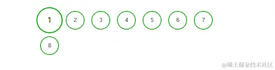
分页放大效果案例
<style>
* {
margin: 0;
padding: 0;
box-sizing: border-box;
}
li {
list-style: none;
}
.box ul {
width: 580px;
height: 100px;
margin: 100px auto;
}
.box li {
float: left;
text-align: center;
width: 53px;
height: 53px;
line-height: 53px;
border-radius: 50%;
margin: 10px;
border: 1px solid green;
transition: 1.5s;
}
.box li:hover {
transform: scale(1.3) rotate(360deg);
}
</style>
<div class="box">
        <ul>
            <li>1</li>
            <li>2</li>
            <li>3</li>
            <li>4</li>
            <li>5</li>
            <li>6</li>
            <li>7</li>
            <li>8</li>
        </ul>
    </div>


