<html lang="en">
<head>
<meta charset="UTF-8">
<title>Title</title>
</head>
<style>
body {
background-color: #111;
}
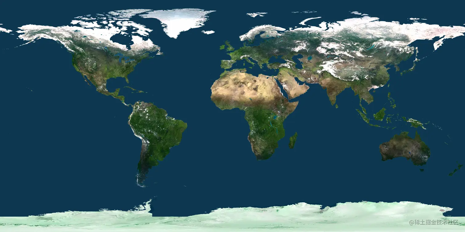
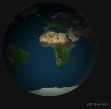
#earth {
width: 300px;
height: 300px;
background: url("./bg.jpg");
border-radius: 50%;
background-size: 610px;
box-shadow: inset 8px 36px 80px 36px rgb(0, 0, 0),
inset -6px 0 12px 4px rgba(255, 255, 255, 0.3);
animation-name: rotate;
animation-duration: 12s;
animation-iteration-count: infinite;
animation-timing-function: linear;
-webkit-animation-name: rotate;
-webkit-animation-duration: 12s;
-webkit-animation-iteration-count: infinite;
-webkit-animation-timing-function: linear;
}
@keyframes rotate {
from { background-position: 0px 0px; }
to { background-position: 500px 0px; }
}
@-webkit-keyframes rotate {
from { background-position: 0px 0px; }
to { background-position: 500px 0px; }
}
</style>
<body>
<div id="earth"></div>
</body>
</html>


