最近觉得有必要总结一下前端工作中可能会遇到的弹性布局内容,于是便有了这篇文章QAQ
以下主要会从例子出发分析其常用属性。
Flex
垂直水平居中
            article {
                display: flex;
                align-items: center;
                justify-content: center;
                color: rgb(105, 113, 226);
            }
| 属性 | 作用 |
|---|
display: flex | 声明布局 |
align-items: center | 垂直居中 |
justify-content: center | 水平居中 |
圣杯布局
            body {
                min-height: 100vh;
                display: flex;
                flex-direction: column;
            }
| 属性 | 作用 |
|---|
flex-direction: column | 元素垂直正排 |
            article {
                flex: auto;
                background: rgb(215, 253, 197);
            }
flex布局中flex:1和flex:auto的区别?
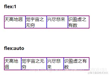
flex:1 的尺寸是较长的尺寸优先牺牲自己的尺寸,而flex:auto 中是较长的尺寸优先扩展自己的尺寸。
所以,flex:1 更适合在等比例列表时使用,flex:auto适用于元素充分利用剩余空间,比如头部导航文字多少不一致时使用。
九宫格
            .box {
                display: flex;
                height: 630px;
                width: 630px;
                background: rgb(138, 130, 238);
                flex-wrap: wrap;
            }
| 属性 | 作用 |
|---|
flex-wrap: wrap | 元素自动换行 |
Grid
垂直水平居中
            article {
                display: grid;
                align-items: center;
                justify-content: center;
                color: rgb(105, 113, 226);
            }
| 属性 | 作用 |
|---|
display: grid | 声明布局 |
align-items: center | 垂直居中 |
justify-content: center | 水平居中 |
圣杯布局
            body {
                width: 100%;
                height: 100vh;
                display: grid;
                grid-template-rows: 150px auto 150px;
            }
| 属性 | 作用 |
|---|
grid-template-rows: 150px auto 150px | 垂直正排(设置高度+自适应伸展) |
            body {
                width: 100%;
                height: 100vh;
                display: grid;
                grid-template-columns: 150px auto 150px;
                grid-template-rows: 150px auto 150px;
                grid-template-areas:
                    'a a a'
                    'b c d'
                    'e e e';
                color: rgb(110, 119, 202);
                font-size: 24px;
                text-align: center;
            }
            header {
                background-color: rgb(190, 229, 229);
                grid-area: a;
            }
| 属性 | 作用 |
|---|
grid-template-areas | 定义分块 |
grid-area: a | 分配块a |
九宫格
            * {
                margin: 0;
                padding: 0;
            }
            .main {
                width: 900px;
                height: 900px;
                display: grid;
                grid-template-columns: 33% 33% 33%;
            }
            .soild {
                width: 100%;
                height: 100%;
                background: rgb(230, 238, 203);
                border: 5px solid rgb(187, 183, 183);
                display: grid;
                justify-content: center;
                align-items: center;
                font-size: 48px;
                color: rgb(114, 214, 231);
            }
        <div class="main">
            <div class="soild">1</div>
            <div class="soild">2</div>
            <div class="soild">3</div>
            <div class="soild">4</div>
            <div class="soild">5</div>
            <div class="soild">6</div>
            <div class="soild">7</div>
            <div class="soild">8</div>
            <div class="soild">9</div>
        </div>
其他
垂直滚轮
            aside {
                height: 100vh;
                display: flex;
                width: 180px;
                flex-direction: column;
                display: block;
                background: rgb(143, 223, 225);
                overflow-y: auto;
            }
绑定上栏
            header {
                height: 100px;
                position: fixed;
                background-color: rgb(249, 219, 237);
                width: 100%;
            }


