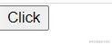
插槽 slot
- 内容占位标签
- slot 可以替换为普通文本,html,组件等
- 一般的slot之间的内容是默认值
<template>
  <div class="home">
    <my-button>Click</my-button>
  </div>
</template>

<script>
import MyButton from "./MyButton.vue"
export default {
  name: 'Home',
  components: {
    MyButton
  }
}
</script>
<template>
  <button>
    <slot></slot>
  </button>
</template>

<script>
export default {
  name: 'MyUiMybutton'
};
</script>
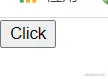
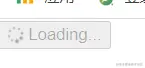
带loading的button
//=> 父组件
<template>
  <div class="home">
    <my-button
      @click="changeStatus"
      :disabled="isLoading"
      :loading-icon="true"
      :is-loading="isLoading"
    >
      {{ isLoading ? 'Loading...' : 'Click' }}
    </my-button>
  </div>
</template>

<script>
import MyButton from "./MyButton.vue"
export default {
  name: 'Home',
  components: {
    MyButton
  },
  data() {
    return {
      isLoading: false
    }
  },
  methods: {
    changeStatus() {
      this.isLoading = true;
      setTimeout(() => {
        this.isLoading = false;
      }, 3000);
    }
  }
}
</script>
<template>
  <button type="button" @click="changeStatus">
    <my-icon :loading-icon="loadingIcon" :is-loading="isLoading"/>
    <slot></slot>
  </button>
</template>

<script>
import MyIcon from "./MyIcon.vue";
export default {
  name: 'MyUiMybutton',
  components: {
    MyIcon
  },
  props: {
    loadingIcon: {
      type: Boolean
    },
    isLoading: {
      type: Boolean
    }
  },
  methods: {
    changeStatus() {
      this.$emit('click')
    }
  }
};
</script>
<template>
  <span v-if="loadingIcon && isLoading" class="fa fa-spinner fa-spin"></span>
</template>

<script>
export default {
  name: 'MyUiMyicon',
  props: {
    loadingIcon: {
      type: Boolean
    },
    isLoading: {
      type: Boolean
    }
  }
};
</script>


