

需求: ie下多行文本超出隐藏显示省略号
解决方案:float布局
代码:
html:
<div class="fix-height">
        <div class="text">这段文字很长这段文字很长这段文字很长这段文字很长这段文字很长这段文字很        长这段文字很长这段文字很长这段文字很长这段文字很长这段文字很长</div>
</div>
css:
    .height-fixed {
      height: 40px;
      overflow: hidden;
      line-height: 20px;
    }
    .height-fixed .text {
      float: right;
      width: 100%;
      margin-left: -5px;
      word-break: break-all;
    }
    .height-fixed::before {
      float: left;
      width: 5px;
      content: "";
      height: 100%;
    }
    .height-fixed::after {
      float: right;
      content: "...";
      height: 20px;
      line-height: 20px;
      width: 16px;
      /* 40 = 省略号长度 + padding-left长度 */
      margin-left: -40px;
      padding-left: 24px;
      /* 真实长度 小于等于5 */
      padding-right: 5px;
      position: relative;
      left: 100%;
      top: -20px;
      background: -webkit-linear-gradient(left, transparent, #fff 50%);
      background: -o-linear-gradient(right, transparent, #fff 50%);
      background: -moz-linear-gradient(right, transparent, #fff 50%);
      background: linear-gradient(to right, transparent, #fff 50%);
    }
效果: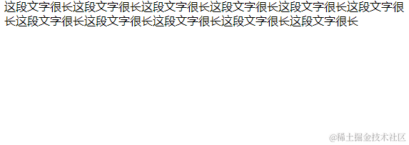
布局原理:
基本图 文本区域未超出固定高度时:
基本图 文本区域超出固定高度时:
代码:
<div style="width: 400px; height: 200px; background-color: azure">
      <div style="float: left; width: 100px; height: 200px; background-color: aqua">左侧悬浮框 高度等于外层高度</div>
      <div style="float: right; width: 100%; margin-left: -100px; border: 2px dashed blue; padding-left: 100px; box-sizing: border-box">
        float:right width: 100% margin-left: -100px;
        <br />
        蓝色虚线框 - 文本主体右侧悬浮,通过margin-left: -100px;使其和左侧悬浮框同起点
        <br />
        下方省略号宽度需低于左侧悬浮框以保证文本主题超出后能定位到左侧悬浮框下方
        下方省略号宽度需低于左侧悬浮框以保证文本主题超出后能定位到左侧悬浮框下方
        下方省略号宽度需低于左侧悬浮框以保证文本主题超出后能定位到左侧悬浮框下方
      </div>
      <div style="float: right; height: 50px; width: 100px; background-color: aquamarine" class="ellipsis-div">省略号</div>
    </div>
现在我们的目标是在文本溢出时将省略号放在文本块右下方,未溢出时不显示省略号。
添加ellipsis-div类:
    .ellipsis-div{
        position: relative;
        left: 100%;
        /* 20为line-height高度 */
        top: -20px;
        /* margin-left 的值与padding-right对应 防止布局出错 */
        margin-left: -100px;
        /* padding-right使当前块向左移到text块 */
        padding-right: 100px;
    }
文本区域未超出固定高度时:
文本区域超出固定高度时:
细节调整下即可达到效果。
上面是高度固定下多行溢出,下面添加一些属性来达到高度自适应。
本来以为直接用max-height即可,天真了,有最小最大高度的父盒子-其下子盒子无法继承父盒子的高度。解决方式在外层加flex层。
    <div style="display: flex">
      <div class="height-fixed">
        <div class="text">
          这段文字很长这段文字很长这段文字很长这段文字很长这段文字很长这段文字很长这段文字很长这段文字很长这段文字很长这段文字很长这段文字很长
          这段文字很长这段文字很长这段文字很长这段文字很长这段文字很长这段文字很长这段文字很长这段文字很长这段文字很长这段文字很长这段文字很长
        </div>
      </div>
    </div>
然后将内部height改为max-height即可。
