仿苹果官网滚动图片缩小
<!DOCTYPE html>
<html>
<head>
<meta charset="utf-8" />
<meta http-equiv="X-UA-Compatible" content="IE=edge" />
<meta name="viewport" content="user-scalable=0">
<title>图片缩放示例</title>
<script type="text/javascript" src="https://vncdn.mobi88.cn/public/jquery-2.1.3.min.js"></script>
</head>
<style>
body {
overflow-x: hidden;
}
.banner {
position: relative;
height: 1880px;
overflow: hidden;
min-width: 750px;
}
.box {
width: 100%;
height: auto;
position: absolute;
}
.undertitle {
width: 100%;
height: 650px;
font-size: 46px;
font-weight: bold;
text-align: center;
padding-top: 450px;
margin: 0 auto;
box-sizing: border-box;
}
.bgbox {
width: 736px;
height: 430px;
margin: 0 auto;
background: url(../images/loading.png) no-repeat;
background-size: contain;
-moz-transition: -moz-transform .1s linear;
-webkit-transition: -webkit-transform .2s linear;
box-sizing: border-box;
transform-origin: center center;
position: relative;
}
.bigImg {
width: 562px;
height: 352px;
margin: 0 auto;
background: url(../images/2.jpg) no-repeat;
background-size: cover;
position: relative;
top: 30px;
}
.smallimgBox {
width: 100%;
height: 100%;
}
.smallimg {
width: 100%;
height: 100%;
background: url(../images/3.jpg) no-repeat;
background-size: cover;
}
.bannertitle {
position: absolute;
top: 200px;
left: 0;
right: 0;
margin: 0 auto;
font-size: 86px;
font-weight: bold;
text-align: center;
color: red;
-moz-transition: .1s linear;
-webkit-transition: .2s linear;
}
.footer {
background: #333;
height: 200px;
}
</style>
<body>
<div class="banner">
<div class="box">
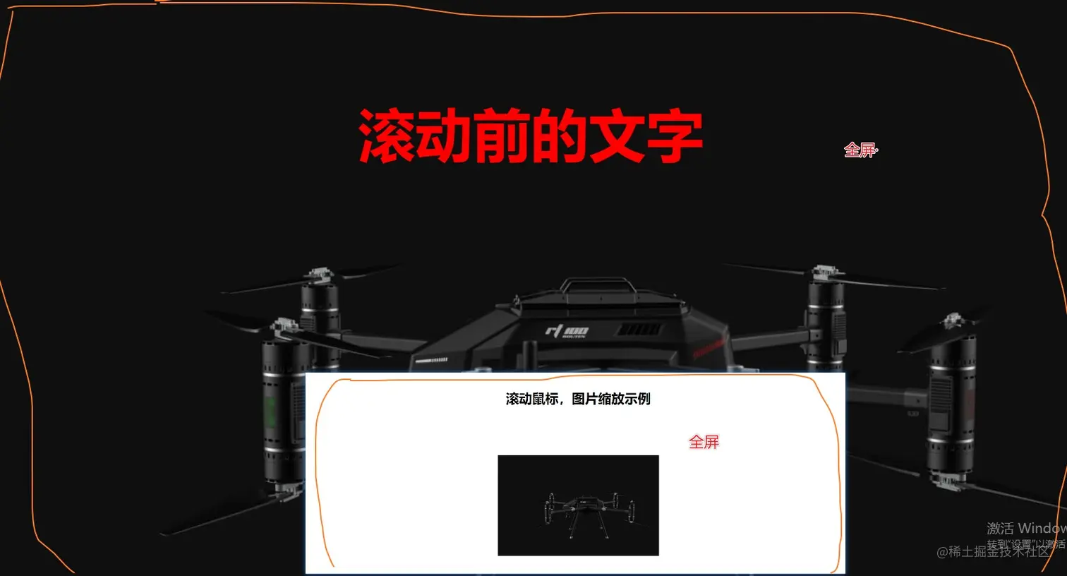
<div class="undertitle">滚动鼠标,图片缩放示例</div>
<div class="bgbox">
<div class="bigImg">
<div class="smallimgBox">
<div class="smallimg"></div>
</div>
</div>
</div>
</div>
<div class="bannertitle">滚动前的文字</div>
</div>
<div style="height: 300px;background: #333333;"></div>
<script>
$(document).ready(function () {
var brower = {
versions: function () {
var u = window.navigator.userAgent;
var num;
if (u.indexOf('Trident') > -1) {
return "IE";
} else if (u.indexOf('Presto') > -1) {
return "Opera";
} else if (u.indexOf('Gecko') > -1 && u.indexOf('KHTML') == -1) {
return "Firefox";
} else if (u.indexOf('AppleWebKit' && u.indexOf('Safari') > -1) > -1) {
if (u.indexOf('Chrome') > -1) {
return "Chrome";
} else if (u.indexOf('OPR')) {
return "Opera_webkit"
} else {
return "Safari";
}
} else if (u.indexOf('Mobile') > -1) {
if (!!u.match(/\(i[^;]+;( U;)? CPU.+Mac OS X/)) {
if (u.indexOf('iPhone') > -1) {
return "iPhone"
} else if (u.indexOf('iPod') > -1) {
return "iPod"
} else if (u.indexOf('iPad') > -1) {
return "iPad"
}
} else if (u.indexOf('Android') > -1 || u.indexOf('Linux') > -1) {
num = u.substr(u.indexOf('Android') + 8, 3);
return {
"type": "Android",
"version": num
};
} else if (u.indexOf('BB10') > -1) {
return "BB10";
} else if (u.indexOf('IEMobile')) {
return "Windows Phone"
}
}
}
}
var system = brower.versions();
if (system != "IE") {
var sc_t = 0;
bg(sc_t);
$(window).resize(function () {
sc_t = $(window).scrollTop();
bg(sc_t);
})
} else {
}
function bg(sc_t) {
var window_h = $(window).height();
var window_w = $(window).width();
var img_min_h = 352;
var img_min_w = 562;
var phone_min_h = 430;
var phone_min_w = 736;
var phone_set_h = window_h / img_min_h * phone_min_h;
var phone_set_w = window_w / img_min_w * phone_min_w;
var scale_big_x = phone_set_w / phone_min_w;
var scale_big_y = phone_set_h / phone_min_h;
var scale_big = scale_big_x >= scale_big_y ? scale_big_x : scale_big_y;
var t_h_s = $(".undertitle").innerHeight() + phone_min_h / 2;
var t_h_b = phone_min_h * scale_big / 2 - 30 * scale_big;
var t_h = t_h_s - t_h_b;
var scroll_length = 300;
$(window).scroll(function () {
var scroll_num = $(window).scrollTop();
setPhoneSize(scroll_num);
});
setPhoneSize(sc_t);
function setPhoneSize(num) {
var scroll_num = (1 - scale_big) * num / scroll_length + scale_big;
var translate_num = (0 - t_h) / scroll_length * num + t_h;
var op_num = 1 - (num / scroll_length);
if (num >= scroll_length) {
$(".bgbox").css({
"-moz-transform": "translate(0,0) scale(1)",
"-webkit-transform": "translate(0,0) scale(1)"
});
$(".bannertitle").css({
"opacity": "0",
"display": "none"
});
$(".smallimgBox").css({
"opacity": "1"
})
} else {
$(".bgbox").css({
"-moz-transform": "translate(0,-" + translate_num + "px) scale(" + scroll_num + ")",
"-webkit-transform": "translate(0,-" + translate_num + "px) scale(" + scroll_num + ")"
});
$(".bannertitle").css({
"opacity": op_num,
"display": "block"
});
$(".smallimgBox").css({
"opacity": 1 - op_num
})
}
}
}
});
</script>
</body>
</html>
加载组件
<!DOCTYPE html>
<html lang="en">
<head>
<meta charset="UTF-8">
<meta http-equiv="X-UA-Compatible" content="IE=edge">
<meta name="viewport" content="width=device-width, initial-scale=1.0">
<title>加载中</title>
</head>
<style>
@-webkit-keyframes gradient {
50% {
background-position: 100% 0
}
}
@keyframes gradient {
50% {
background-position: 100% 0
}
}
@-webkit-keyframes img {
0% {
-webkit-transform: rotate(0deg);
}
100% {
-webkit-transform: rotate(-360deg);
}
}
@keyframes img {
0% {
-webkit-transform: rotate(0deg);
transform: rotate(0deg);
}
100% {
-webkit-transform: rotate(-360deg);
transform: rotate(-360deg);
}
}
@-webkit-keyframes spin {
0% {
-webkit-transform: rotate(0deg);
}
100% {
-webkit-transform: rotate(360deg);
}
}
@keyframes spin {
0% {
-webkit-transform: rotate(0deg);
transform: rotate(0deg);
}
100% {
-webkit-transform: rotate(360deg);
transform: rotate(360deg);
}
}
@-webkit-keyframes spin-reverse {
0% {
-webkit-transform: rotate(0deg);
}
100% {
-webkit-transform: rotate(-360deg);
}
}
@keyframes spin-reverse {
0% {
-webkit-transform: rotate(0deg);
transform: rotate(0deg);
}
100% {
-webkit-transform: rotate(-360deg);
transform: rotate(-360deg);
}
}
#loader-wrapper {
background-color: rgba(0, 0, 0, .95);
background-size: 400%;
background-position: 0% 100%;
-webkit-animation: gradient 7.5s ease-in-out infinite;
animation: gradient 7.5s ease-in-out infinite;
}
#loader-wrapper {
position: fixed;
top: 0;
left: 0;
width: 100%;
height: 100%;
z-index: 10;
overflow: hidden;
}
#loader {
display: flex;
position: relative;
left: 50%;
top: 50%;
width: 150px;
height: 150px;
margin: -75px 0 0 -75px;
border-radius: 50%;
border: 3px solid transparent;
border-top-color: #fff;
animation: spin 1.7s linear infinite;
z-index: 11;
}
#loader:before {
content: "";
position: absolute;
top: 5px;
left: 5px;
right: 5px;
bottom: 5px;
border-radius: 50%;
border: 3px solid transparent;
border-top-color: #fff;
animation: spin-reverse .6s linear infinite;
}
#loader:after {
content: "";
position: absolute;
top: 15px;
left: 15px;
right: 15px;
bottom: 15px;
border-radius: 50%;
border: 3px solid transparent;
border-top-color: #fff;
animation: spin 1s linear infinite;
}
#loader img {
margin: auto;
align-items: center;
display: table-cell;
vertical-align: middle;
text-align: center;
animation: img 1.7s linear infinite;
}
.loader {
top: 76%;
left: 50%;
-webkit-transform: translate(-50%, -50%);
-mos-transform: translate(-50%, -50%);
transform: translate(-50%, -50%);
text-align: center;
-webkit-touch-callout: none;
-webkit-user-select: none;
-khtml-user-select: none;
-moz-user-select: none;
-ms-user-select: none;
user-select: none;
cursor: default;
width: 100%;
max-width: 990px;
overflow: visible;
z-index: 99;
}
.loader,
.loader div {
position: absolute;
height: 36px
}
.loader div {
width: 30px;
margin: 0 20px;
opacity: 0;
animation: move 2s linear infinite;
-o-animation: move 2s linear infinite;
-moz-animation: move 2s linear infinite;
-webkit-animation: move 2s linear infinite;
transform: rotate(180deg);
-o-transform: rotate(180deg);
-moz-transform: rotate(180deg);
-webkit-transform: rotate(180deg);
color: #fff;
font-size: 20px;
}
.loader div:nth-child(8):before {
background: #ffffff;
}
.loader div:nth-child(8):before,
.loader div:nth-child(9):before {
content: '';
position: absolute;
bottom: 0px;
left: 0;
width: 10px;
height: 10px;
border-radius: 100%;
}
.loader div:nth-child(9):before {
background: #f2f2f2
}
.loader div:nth-child(10):before {
bottom: -15px;
height: 10px;
background: #ffffff;
}
.loader div:after,
.loader div:nth-child(10):before {
content: '';
position: absolute;
left: 0;
width: 10px;
border-radius: 100%;
}
.loader div:after {
bottom: -40px;
height: 5px;
background: rgba(255, 255, 255, .1);
}
.loader div:nth-child(2) {
animation-delay: .2s;
-o-animation-delay: .2s;
-moz-animation-delay: .2s;
-webkit-animation-delay: .2s
}
.loader div:nth-child(3) {
animation-delay: .4s;
-o-animation-delay: .4s;
-webkit-animation-delay: .4s
}
.loader div:nth-child(4) {
animation-delay: .6s;
-o-animation-delay: .6s;
-moz-animation-delay: .6s;
-webkit-animation-delay: .6s
}
.loader div:nth-child(5) {
animation-delay: .8s;
-o-animation-delay: .8s;
-moz-animation-delay: .8s;
-webkit-animation-delay: .8s
}
.loader div:nth-child(6) {
animation-delay: 1s;
-o-animation-delay: 1s;
-moz-animation-delay: 1s;
-webkit-animation-delay: 1s
}
.loader div:nth-child(7) {
animation-delay: 1.2s;
-o-animation-delay: 1.2s;
-moz-animation-delay: 1.2s;
-webkit-animation-delay: 1.2s
}
.loader div:nth-child(8) {
animation-delay: 1.4s;
-o-animation-delay: 1.4s;
-moz-animation-delay: 1.4s;
-webkit-animation-delay: 1.4s
}
.loader div:nth-child(9) {
animation-delay: 1.6s;
-o-animation-delay: 1.6s;
-moz-animation-delay: 1.6s;
-webkit-animation-delay: 1.6s
}
.loader div:nth-child(10) {
animation-delay: 1.8s;
-o-animation-delay: 1.8s;
-moz-animation-delay: 1.8s;
-webkit-animation-delay: 1.8s
}
@keyframes move {
0% {
right: 0;
opacity: 0
}
35% {
right: 41%
}
35%,
65% {
-webkit-transform: rotate(0);
transform: rotate(0);
opacity: 1
}
65% {
right: 59%
}
to {
right: 100%;
-webkit-transform: rotate(-180deg);
transform: rotate(-180deg)
}
}
@-webkit-keyframes move {
0%,
to {
opacity: 0
}
0% {
right: 0
}
35% {
right: 41%
}
35%,
75% {
-webkit-transform: rotate(0);
transform: rotate(0);
opacity: 1
}
75% {
right: 59%
}
to {
right: 100%;
-webkit-transform: rotate(-180deg);
transform: rotate(-180deg);
opacity: 0
}
}
</style>
<body>
<div id="loader-wrapper">
<div id="loader"><img src="../images/loading.png"></div>
</div>
<div class="loader">
<div> L </div>
<div> O </div>
<div> A </div>
<div> D </div>
<div> I </div>
<div> N </div>
<div> G </div>
<div> </div>
<div> </div>
<div> </div>
</div>
</body>
</html>
网页视觉差换
     <style>
    body,
    html {
      margin: 0;
      width: 100%;
      height: 100%;
    }

    #bg1 {
      width: 100%;
      height: 100%;
      background-color: antiquewhite;
      background-image: url(https://hqtcsz-oss.oss-cn-shenzhen.aliyuncs.com/hqtcsz_pc/ScrollMagic/360.jpg);
      background-repeat: no-repeat;
      background-size: 100% 100%;
      background-attachment: fixed;
    }

    #bg2 {
      width: 100%;
      height: 100%;
      background-color: antiquewhite;
      background-image: url(https://hqtcsz-oss.oss-cn-shenzhen.aliyuncs.com/hqtcsz_pc/ScrollMagic/361.jpg);
      background-size: 100% 120%;
      background-repeat: no-repeat;
      background-attachment: fixed;
    }

    #bg3 {
      width: 100%;
      height: 100%;
      background-color: antiquewhite;
      background-image: url(https://hqtcsz-oss.oss-cn-shenzhen.aliyuncs.com/hqtcsz_pc/ScrollMagic/362.jpg);
      background-size: 100% 140%;
      background-repeat: no-repeat;
      background-attachment: fixed;
    }
  </style>
</head>

<body>
  <div id="bg1"></div>
  <div id="bg2"></div>
  <div id="bg3"></div>
  <script>
    const bg1 = document.querySelector('#bg1');
    const bg2 = document.querySelector('#bg2');
    const bg3 = document.querySelector('#bg3');
    window.addEventListener("scroll", function () {
      const t = document.documentElement.scrollTop / 10;
      bg1.style.backgroundPositionY = -t + 'px';
      bg1.style.transform = "translateY(" + (-t) + "px)";
      bg2.style.backgroundPositionY = -t + 'px';
      bg2.style.transform = "translateY(" + (-t) + "px)";
      bg3.style.backgroundPositionY = -t + 'px';
      bg3.style.transform = "translateY(" + (-t) + "px)";
    });

  </script>
</body>


