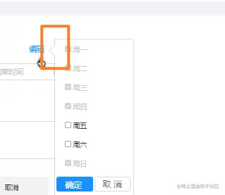
ui图:
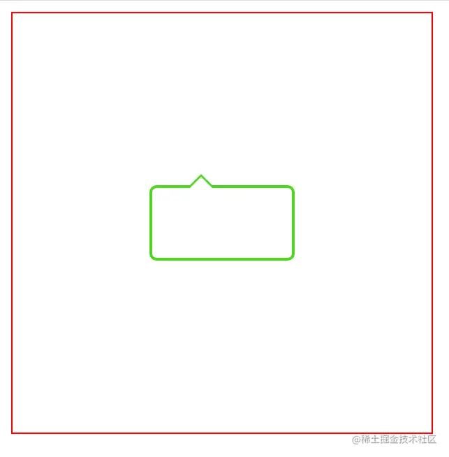
实现效果:
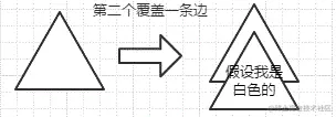
原理:先画一个三角形,再画白色三角形的,调整几像素位置,覆盖掉一边
附上代码:
<!DOCTYPE html>
<html lang="en">
<head>
<meta charset="UTF-8">
<meta http-equiv="X-UA-Compatible" content="IE=edge">
<meta name="viewport" content="width=device-width, initial-scale=1.0">
<title>Document</title>
<style>
.father-wrap{
width: 300px;
height: 300px;
border: 1px solid red;
display: flex;
justify-content: center;
align-items: center;
}
.triangle {
position: relative;
width: 100px;
height: 50px;
border: 2px solid #4ed621;
border-radius: 5px;
}
.triangle:before {
position: absolute;
content: "";
top: -10px;
left: 25px;
border-left: 10px solid transparent;
border-right: 10px solid transparent;
border-bottom: 10px solid #4ed621;
}
.triangle:after {
position: absolute;
content: "";
top: -8px;
left: 25px;
border-left: 10px solid transparent;
border-right: 10px solid transparent;
border-bottom: 10px solid #fff;
}
</style>
</head>
<body>
<div class="father-wrap">
<div class="triangle"></div>
</div>
</body>
</html>


