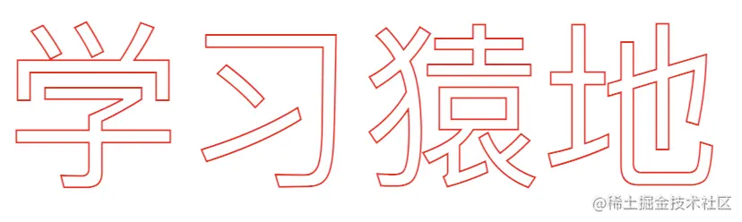
文字镂空效果
div {
   font-size: 100px;
   -webkit-text-stroke: 1px #f00;
   color: transparent;
}
hover时元素浮动
box2 {
   width: 150px;
   height: 300px;
   border: 1px solid #ccc;
   margin:  0 auto;
}
.box2:hover {
   transform: translate(0, -30px);
   box-shadow: 0 0 5px 5px #f5f5f5;
}
某个scroll位置,header以动画显示
header.sticky {
    position: fixed;
    background-color: white;
    box-shadow: 0 0 18px rgba(0,0,0,0.2);
    animation: dropDown 0.5s ease-in-out forwards;
}

@keyframes dropDown {
    from {
        transform: translateY(-100px);
    }
    to {
        transform: translateY(0);
    }
}
const headerEl = document.querySelector('header');
window.addEventListener('scroll', () => {
    let height = headerEl.getBoundingClientRect().height;
    if(window.pageYOffset - height > 800) {
        if(!heightEl.classList.contains('sticky')) {
            headerEl.classList.add('sticky')
        }
    } else {
        headerEl.classList.remove('sticky')
    }
})
scroll to top
const scrollToTop = document.querySelector('.scrollToTop');

window.addEventListener('scroll', () => {
    if(window.pageYOffset > 2000) {
        scrollToTop.style.display = 'block';
    } else {
        scrollToTop.style.display = 'none';
    }
})


