实现三列布局 (内联块布局、圣杯布局、双飞翼布局)
1. 使用内联块的方式实现
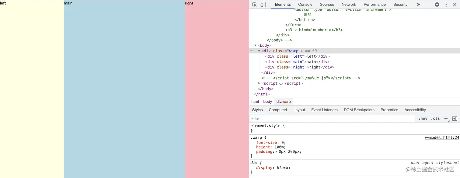
1.1 父元素设置内边距的同时两边元素设置负的外边距,中间元素宽度撑满
.warp{
     font-size: 0;
     height: 100%;
     padding: 0px 200px;
 }
 .left,.right,.main{
     display: inline-block;
     height: 100%;
     font-size: 12px;
 }
 .left{
     width: 200px;
     margin-left:-200px;
     background-color: lightyellow;
 }
 .right{
     width: 200px;
     margin-right: -200px;
     background-color: lightpink;
 }
 .main{
     width: 100%;
     background-color: lightblue;
 }
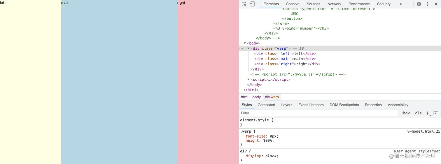
1.2 在不考虑兼容性的情况下,用css的calc()函数动态计算剩余宽度,这样代码量少很多
.warp{
    font-size: 0px;
    height: 100%;
}
.left,.main,.right{
    display:inline-block;
    height: 100%;
}
.left{
    width: 200px;
    background-color: lightyellow;
}
.right{
    width: 200px;
    background-color: lightyellow;
}
.main{
    width: calc(100% - 200px - 200px);
    background-color: lightblue;
}
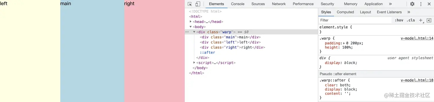
2.圣杯布局
.warp{
    padding: 0 200px;
    height: 100%;
}
.warp::after{
    clear: both;
    display: block;
    content: '';
}
.left,.main,.right{
    height: 100%;
    float: left;
    position: relative;
}
.left{
    width: 200px;
    margin-left: -100%;
    right: 200px;
    background-color: lightyellow;
}
.right{
    width: 200px;
    margin-right: -100%;
    background-color: lightpink;
}
.main{
    width: 100%;
    background-color: lightblue;
}
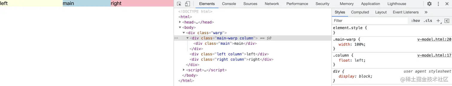
3.双飞翼布局
.warp{
    position: relative;
}
.column{
    float: left;
}
.main-warp{
    width: 100%;
}
.main{
    margin:0 200px;
    background-color: lightblue;
}
.left{
    width: 200px;
    margin-left: -100%;
    background-color: lightyellow;
}
.right{
    width: 200px;
    margin-left: -200px;
    background-color: lightpink;
}


