

商品详情
商品详情-基础布局
目的:完成商品详情基础布局,路由配置,搭好页面架子。
大致步骤:
- 准备组件结构容器
- 提取商品推荐组件且使用
- 配置路由和组件
落地代码:
- 页面组件:
src/views/goods/index.vue
<template>
  <div class='xtx-goods-page'>
    <div class="container">
      <!-- 面包屑 -->
      <XtxBread>
        <XtxBreadItem to="/">首页</XtxBreadItem>
        <XtxBreadItem to="/">手机</XtxBreadItem>
        <XtxBreadItem to="/">华为</XtxBreadItem>
        <XtxBreadItem to="/">p30</XtxBreadItem>
      </XtxBread>
      <!-- 商品信息 -->
      <div class="goods-info"></div>
      <!-- 商品推荐 -->
      <GoodsRelevant />
      <!-- 商品详情 -->
      <div class="goods-footer">
        <div class="goods-article">
          <!-- 商品+评价 -->
          <div class="goods-tabs"></div>
          <!-- 注意事项 -->
          <div class="goods-warn"></div>
        </div>
        <!-- 24热榜+专题推荐 -->
        <div class="goods-aside"></div>
      </div>
    </div>
  </div>
</template>

<script>
import GoodsRelevant from './components/goods-relevant'
export default {
  name: 'XtxGoodsPage',
  components: { , GoodsRelevant }
}
</script>

<style scoped lang='less'>
.goods-info {
  min-height: 600px;
  background: #fff;
}
.goods-footer {
  display: flex;
  margin-top: 20px;
  .goods-article {
    width: 940px;
    margin-right: 20px;
  }
  .goods-aside {
    width: 280px;
    min-height: 1000px;
  }
}
.goods-tabs {
  min-height: 600px;
  background: #fff;
}
.goods-warn {
  min-height: 600px;
  background: #fff;
  margin-top: 20px;
}
</style>
- 商品推荐组件:
src/views/goods/components/goods-relevant.vue
<template>
  <div class='goods-relevant'></div>
</template>

<script>
export default {
  name: 'GoodsRelevant'
}
</script>

<style scoped lang='less'>
.goods-relevant {
  background: #fff;
  min-height: 460px;
  margin-top: 20px;
}
</style>
- 路由配置:
src/router/index.js
const Goods = () => import('@/views/goods/index')
    children: [
      { path: '/', component: Home },
      { path: '/category/:id', component: TopCategory },
      { path: '/category/sub/:id', component: SubCategory },
+      { path: '/product/:id', component: Goods }
    ]
总结:
- 实现页面的基本结构
- 拆分推荐的商品的组件
- 配置路由
商品详情-渲染面包屑
目的:获取数据,渲染面包屑。
大致步骤:
- 定义获取商品详情API函数
- 在组件setup中获取商品详情数据
- 定义一个useXxx函数处理数据
注意:如果携带一个错误的token,那么是获取不到数据的(后端的验证策略有问题)
落地代码:
- API函数
src/api/product.js
import request from '@/utils/request'

// 获取商品的详细数据
export const findGoods = (id) => {
  return request({
    method: 'get',
    url: '/goods',
    data: { id }
  })
}
- useGoods函数
src/views/goods/index.vue在setup中使用
import GoodsRelevant from './components/goods-relevant'
import { nextTick, ref, watch } from 'vue'
import { findGoods } from '@/api/product'
import { useRoute } from 'vue-router'
export default {
  name: 'XtxGoodsPage',
  components: { GoodsRelevant },
  setup () {
    const goods = useGoods()
    return { goods }
  }
}
// 获取商品详情
const useGoods = () => {
  // 出现路由地址商品ID发生变化,但是不会重新初始化组件
  const goods = ref(null)
  const route = useRoute()
  watch(() => route.params.id, (newVal) => {
    if (newVal && `/product/${newVal}` === route.path) {
      findGoods(route.params.id).then(data => {
        // 让商品数据为null让后使用v-if的组件可以重新销毁和创建
        goods.value = null
        nextTick(() => {
          goods.value = data.result
        })
      })
    }
  }, { immediate: true })
  return goods
}
- 防止报错,加载完成goods再显示所有内容
<div class='xtx-goods-page' v-if="goods">
- 渲染面包屑
<!-- 面包屑 -->
<XtxBread>
    <XtxBreadItem to="/">首页</XtxBreadItem>
    <XtxBreadItem :to="'/category/'+goodsDetail.categories[1].id">{{goodsDetail.categories[1].name}}</XtxBreadItem>
    <XtxBreadItem :to="'/category/sub/'+goodsDetail.categories[0].id">{{goodsDetail.categories[0].name}}</XtxBreadItem>
    <XtxBreadItem>{{goodsDetail.name}}</XtxBreadItem>
</XtxBread>
总结:
- 处理详情数据,需要先置空,再通过nextTick更新数据
- 把逻辑处理代码拆分为Hook函数
- 面包屑进行动态填充
商品详情-图片预览组件
目的:完成商品图片预览功能和切换
大致步骤:
- 首先准备商品信息区块左右两侧的布局盒子
- 在定义一个商品图片组件,用来实现图片预览
- 首先组件布局,渲染
- 实现切换图片
落地代码:
- 商品信息区块,布局盒子
src/views/goods/index.vue
<!-- 商品信息 -->
<div class="goods-info">
    <div class="media"></div>
    <div class="spec"></div>
</div>
.goods-info {
  min-height: 600px;
  background: #fff;
  display: flex;
  .media {
    width: 580px;
    height: 600px;
    padding: 30px 50px;
  }
  .spec {
    flex: 1;
    padding: 30px 30px 30px 0;
  }
}
- 商品图片组件,渲染和切换
src/views/goods/components/goods-image.vue
<template>
  <div class="goods-image">
    <div class="middle">
      <img :src="images[currIndex]" alt="">
    </div>
    <ul class="small">
      <li v-for="(img,i) in images" :key="img" :class="{active:i===currIndex}">
        <img @mouseenter="currIndex=i" :src="img" alt="">
      </li>
    </ul>
  </div>
</template>
<script>
import { ref } from 'vue'
export default {
  name: 'GoodsImage',
  props: {
    images: {
      type: Array,
      default: () => []
    }
  },
  setup (props) {
    const currIndex = ref(0)
    return { currIndex }
  }
}
</script>
<style scoped lang="less">
.goods-image {
  width: 480px;
  height: 400px;
  position: relative;
  display: flex;
  .middle {
    width: 400px;
    height: 400px;
    background: #f5f5f5;
  }
  .small {
    width: 80px;
    li {
      width: 68px;
      height: 68px;
      margin-left: 12px;
      margin-bottom: 15px;
      cursor: pointer;
      &:hover,&.active {
        border: 2px solid @xtxColor;
      }
    }
  }
}
</style>
总结:
- 实现基本布局
- 封装图片预览组件,实现鼠标悬停切换效果(类似之前所作的Tab效果)
商品详情-图片放大镜
目的:实现图片放大镜功能
大致步骤:
- 首先准备大图容器和遮罩容器
- 然后使用
@vueuse/core的useMouseInElement方法获取基于元素的偏移量 - 计算出 遮罩容器定位与大容器背景定位 暴露出数据给模板使用
落地代码:src/views/goods/components/goods-image.vue
- 准备大图容器
  <div class='goods-image'>
+    <div class="large" :style="[{backgroundImage:`url(${images[currIndex]})`}]"></div>
    <div class="middle">
.goods-image {
  width: 480px;
  height: 400px;
  position: relative;
  display: flex;
+  z-index: 500;
+  .large {
+    position: absolute;
+    top: 0;
+    left: 412px;
+    width: 400px;
+    height: 400px;
+    box-shadow: 0 0 10px rgba(0,0,0,0.1);
+    background-repeat: no-repeat;
+    background-size: 800px 800px;
+    background-color: #f8f8f8;
+  }
总结:实现右侧大图布局效果(背景图放大4倍)
- 准备待移动的遮罩容器
    <div class="middle" ref="target">
      <img :src="images[currIndex]" alt="">
+      <div class="layer"></div>
    </div>
  .middle {
    width: 400px;
    height: 400px;
+    position: relative;
+    cursor: move;
+    .layer {
+      width: 200px;
+      height: 200px;
+      background: rgba(0,0,0,.2);
+      left: 0;
+      top: 0;
+      position: absolute;
+    }
  }
- 使用vueuse提供的API获取鼠标偏移量
import { reactive, ref, watch } from 'vue'
import { useMouseInElement } from '@vueuse/core'
const usePreviewImg = () => {
  const target = ref(null)
  const show = ref(false)
  // elementX 鼠标基于容器左上角X轴偏移
  // elementY 鼠标基于容器左上角Y轴偏移
  // isOutside 鼠标是否在模板容器外
  const { elementX, elementY, isOutside } = useMouseInElement(target)
  const position = reactive({ left: 0, top: 0 })
  const bgPosition = reactive({ backgroundPositionX: 0, backgroundPositionY: 0 })
  watch([elementX, elementY, isOutside], () => {
    // 控制X轴方向的定位 0-200 之间
    if (elementX.value < 100) position.left = 0
    else if (elementX.value > 300) position.left = 200
    else position.left = elementX.value - 100
    // 控制Y轴方向的定位 0-200 之间
    if (elementY.value < 100) position.top = 0
    else if (elementY.value > 300) position.top = 200
    else position.top = elementY.value - 100
    // 设置大背景的定位
    bgPosition.backgroundPositionX = -position.left * 2 + 'px'
    bgPosition.backgroundPositionY = -position.top * 2 + 'px'
    // 设置遮罩容器的定位
    position.left = position.left + 'px'
    position.top = position.top + 'px'
    // 设置是否显示预览大图
    show.value = !isOutside.value
  })
  return { position, bgPosition, show, target }
}
- 在setup中返回模板需要数据,并使用它
  setup () {
    const { currIndex, toggleImg } = useToggleImg()
+    const { position, bgPosition, show, target } = usePreviewImg()
+    return { currIndex, toggleImg, position, bgPosition, show, target }
  }
    <div class="large" v-show="show" :style="[{backgroundImage:`url(${images[currIndex]})`},bgPosition]"></div>
    <div class="middle" ref="target">
      <img :src="images[currIndex]" alt="">
      <div class="layer" v-show="show" :style="position"></div>
    </div>
总结:
- 基于Vueuse提供方法监控进入DOM内的坐标
- 基于坐标的变化控制遮罩层的移动
- 基于坐标的变化控制右侧预览图背景的变化
- 控制进入和离开时显示和隐藏效果
目的:展示商品基本信息
大致步骤:
- 商品销售属性组件
- 商品名称信息组件
落地代码:
- ⑴基础布局:
红色区域1 src/views/goods/components/goods-sales.vue
<template>
  <ul class="goods-sales">
    <li>
      <p>销量人气</p>
      <p>200+</p>
      <p><i class="iconfont icon-task-filling"></i>销量人气</p>
    </li>
    <li>
      <p>商品评价</p>
      <p>400+</p>
      <p><i class="iconfont icon-comment-filling"></i>查看评价</p>
    </li>
    <li>
      <p>收藏人气</p>
      <p>600+</p>
      <p><i class="iconfont icon-favorite-filling"></i>收藏商品</p>
    </li>
    <li>
      <p>品牌信息</p>
      <p>苏宁电器</p>
      <p><i class="iconfont icon-dynamic-filling"></i>品牌主页</p>
    </li>
  </ul>
</template>

<script>
export default {
  name: 'GoodsSales'
}
</script>

<style scoped lang='less'>
.goods-sales {
  display: flex;
  width: 400px;
  align-items: center;
  text-align: center;
  height: 140px;
  li {
    flex: 1;
    position: relative;
    ~ li::after {
      position: absolute;
      top: 10px;
      left: 0;
      height: 60px;
      border-left: 1px solid #e4e4e4;
      content: "";
    }
    p {
      &:first-child {
        color: #999;
      }
      &:nth-child(2) {
        color: @priceColor;
        margin-top: 10px;
      }
      &:last-child {
        color: #666;
        margin-top: 10px;
        i {
          color: @xtxColor;
          font-size: 14px;
          margin-right: 2px;
        }
        &:hover {
          color: @xtxColor;
          cursor: pointer;
        }
      }
    }
  }
}
</style>
红色区域2 src/views/goods/components/goods-name.vue
<template>
  <p class="g-name">2件装 粉釉花瓣心意点缀 点心盘*2 碟子盘子</p>
  <p class="g-desc">花瓣造型干净简约 多功能使用堆叠方便</p>
  <p class="g-price">
    <span>108.00</span>
    <span>199.00</span>
  </p>
  <div class="g-service">
    <dl>
      <dt>促销</dt>
      <dd>12月好物放送,App领券购买直降120元</dd>
    </dl>
    <dl>
      <dt>配送</dt>
      <dd>至 </dd>
    </dl>
    <dl>
      <dt>服务</dt>
      <dd>
        <span>无忧退货</span>
        <span>快速退款</span>
        <span>免费包邮</span>
        <a href="javascript:;">了解详情</a>
      </dd>
    </dl>
  </div>
</template>

<script>
export default {
  name: 'GoodName'
}
</script>

<style lang="less" scoped>
.g-name {
  font-size: 22px
}
.g-desc {
  color: #999;
  margin-top: 10px;
}
.g-price {
  margin-top: 10px;
  span {
    &::before {
      content: "¥";
      font-size: 14px;
    }
    &:first-child {
      color: @priceColor;
      margin-right: 10px;
      font-size: 22px;
    }
    &:last-child {
      color: #999;
      text-decoration: line-through;
      font-size: 16px;
    }
  }
}
.g-service {
  background: #f5f5f5;
  width: 500px;
  padding: 20px 10px 0 10px;
  margin-top: 10px;
  dl {
    padding-bottom: 20px;
    display: flex;
    align-items: center;
    dt {
      width: 50px;
      color: #999;
    }
    dd {
      color: #666;
      &:last-child {
        span {
          margin-right: 10px;
          &::before {
            content: "•";
            color: @xtxColor;
            margin-right: 2px;
          }
        }
        a {
          color: @xtxColor;
        }
      }
    }
  }
}
</style>
- ⑵使用组件
src/views/goods/index.vue
import GoodsSales from './components/goods-sales'
import GoodsName from './components/goods-name'
components: { GoodsRelevant, GoodsImage, GoodsSales, GoodsName },
      <!-- 商品信息 -->
      <div class="goods-info">
        <div class="media">
          <GoodsImage :images="goods.mainPictures" />
+          <GoodsSales />
        </div>
        <div class="spec">
+          <GoodsName :goods="goods"/>
        </div>
      </div>
- ⑶渲染数据
src/views/goods/components/goods-name.vue
  <p class="g-name">{{goods.name}}</p>
  <p class="g-desc">{{goods.desc}}</p>
  <p class="g-price">
    <span>{{goods.price}}</span>
    <span>{{goods.oldPrice}}</span>
  </p>
总结:
- 准备商品销售信息组件
- 商品名称信息组件
商品详情-城市组件-基础布局
目的:完成城市组件的基础布局和基本显示隐藏切换效果。
大致步骤:
- 准备基本组件结构
- 完成切换显示隐藏
- 完成点击外部隐藏
落地代码:
src/components/library/xtx-city.vue
- 结构
<template>
  <div class="xtx-city" ref="target">
    <div class="select" @click="toggle" :class="{active}">
      <span class="placeholder">请选择配送地址</span>
      <span class="value"></span>
      <i class="iconfont icon-angle-down"></i>
    </div>
    <div class="option" v-show='isShow'>
      <span class="ellipsis" v-for="i in 24" :key="i">北京市</span>
    </div>
  </div>
</template>
- 逻辑
<script>
import { ref } from 'vue'
import { onClickOutside } from '@vueuse/core'
export default {
  name: 'XtxCity',
  setup () {
    const isShow = ref(false)
    // 控制选择城市弹窗的显示和隐藏
    const toggle = () => {
      isShow.value = !isShow.value
    }
    return { isShow, toggle }
  }
}
</script>
- 样式
<style scoped lang="less">
.xtx-city {
  display: inline-block;
  position: relative;
  z-index: 400;
  .select {
    border: 1px solid #e4e4e4;
    height: 30px;
    padding: 0 5px;
    line-height: 28px;
    cursor: pointer;
    &.active {
      background: #fff;
    }
    .placeholder {
      color: #999;
    }
    .value {
      color: #666;
      font-size: 12px;
    }
    i {
      font-size: 12px;
      margin-left: 5px;
    }
  }
  .option {
    width: 542px;
    border: 1px solid #e4e4e4;
    position: absolute;
    left: 0;
    top: 29px;
    background: #fff;
    min-height: 30px;
    line-height: 30px;
    display: flex;
    flex-wrap: wrap;
    padding: 10px;
    > span {
      width: 130px;
      text-align: center;
      cursor: pointer;
      border-radius: 4px;
      padding: 0 3px;
      &:hover {
        background: #f5f5f5;
      }
    }
  }
}
</style>
总结:
- 实现城市选择组件的基本布局
- 控制弹窗的显示和隐藏
商品详情-城市组件-获取数据
2目的:组件初始化的时候获取城市数据,进行默认展示。
大致步骤:
- 获取数据函数封装且支持缓存。
- 获取数据渲染且加上加载中效果。
- 加上一个
vue-cli配置,处理图片为base64
落地代码:src/components/library/xtx-city.vue
- 获取数据的函数
// 获取城市数据
// 1. 数据在哪里?https://yjy-oss-files.oss-cn-zhangjiakou.aliyuncs.com/tuxian/area.json
// 2. 何时获取?打开城市列表的时候,做个内存中缓存
// 3. 怎么使用数据?定义计算属性,根据点击的省份城市展示
export const getCityList = async () => {
  // 添加缓存,防止频繁加载列表数据
  if (window.cityList) {
    // 缓存中已经存在数据了
    return window.cityList
  }
  const ret = await axios.get(cityUrl)
  // 给window对象添加了一个属性cityList
  window.cityList = ret.data
  // 把数据返回
  return ret.data
}
- toggle使用函数
<script>
import { ref } from 'vue'
import { getCityList } from '@/api/product.js'

export default {
  name: 'XtxCity',
  setup () {
    // 城市列表数据
    const list = ref([])
    // 显示隐藏状态位
    const isShow = ref(false)
    // 控制选择城市弹窗的显示和隐藏
    const toggle = () => {
      isShow.value = !isShow.value
      // 打开弹窗是调用接口获取城市列表数据
      if (isShow.value) {
        getCityList().then(data => {
          list.value = data
        })
      }
    }
    return { isShow, toggle, list }
  }
}
</script>
总结:
- 点击选择城市按钮,调用接口获取城市列表数据
- 添加城市列表数据的缓存(基于window的全局属性进行缓存)
- 加载中样式
.option {
    // 省略...
    .loading {
      height: 290px;
      width: 100%;
      background: url(../../assets/images/loading.gif) no-repeat center;
    }
}
- 模板中使用
    <div class="option" v-if="visible">
+      <div v-if="loading" class="loading"></div>
+      <template v-else>
+        <span class="ellipsis" v-for="item in currList" :key="item.code">{{item.name}}</span>
+      </template>
    </div>
注意事项: 需要配置10kb下的图片打包成base64的格式 vue.config.js
  chainWebpack: config => {
    config.module
      .rule('images')
      .use('url-loader')
      .loader('url-loader')
      .tap(options => Object.assign(options, { limit: 10000 }))
  }
总结:
- 添加一个加载的状态效果
- 需要把小图片转换为base64数据,提高加载效率(基于webpack的配置进行处理)
商品详情-城市组件-交互逻辑
3目的:显示省市区文字,让组件能够选择省市区并且反馈给父组件。
大致步骤:
- 明确和后台交互的时候需要产生哪些数据,省code,市code,地区code,它们组合再一起的文字。
- 商品详情的默认地址,如果登录了有地址列表,需要获取默认的地址,设置商品详情的地址。
- 然后默认的地址需要传递给
xtx-city组件做默认值显示 - 然后
xtx-city组件产生数据的时候,需要给出:省code,市code,地区code,它们组合在一起的文字。
落的代码:
- 第一步:父组件设置 省市区的code数据,对应的文字数据。
src/views/goods/components/goods-name.vue
  setup (props) {
    // 默认情况
    const provinceCode = ref('110000')
    const cityCode = ref('119900')
    const countyCode = ref('110101')
    const fullLocation = ref('北京市 市辖区 东城区')
    // 有默认地址
    if (props.goods.userAddresses) {
      const defaultAddr = props.goods.userAddresses.find(addr => addr.isDefault === 1)
      if (defaultAddr) {
        provinceCode.value = defaultAddr.provinceCode
        cityCode.value = defaultAddr.cityCode
        countyCode.value = defaultAddr.countyCode
        fullLocation.value = defaultAddr.fullLocation
      }
    }
    return {  fullLocation }
  }
<XtxCity :fullLocation="fullLocation" />
总结:获取后端的详情数据中默认的配送地址,进行显示
- 第二步:监听用户点击 省,市 展示 市列表和地区列表。
src/components/xtx-city.vue
    <div class="option" v-show="visible">
+      <span @click="changeCity(city)" class="ellipsis"
// 选中的省市区
const changeResult = reactive({
  provinceCode: '',
  provinceName: '',
  cityCode: '',
  cityName: '',
  countyCode: '',
  countyName: '',
  fullLocation: ''
})
// 控制城市的切换
const changeCity = (city) => {
  if (city.level === 0) {
    // 省级
    changeResult.provinceCode = city.code
    changeResult.provinceName = city.name
  } else if (city.level === 1) {
    // 市级
    changeResult.cityCode = city.code
    changeResult.cityName = city.name
  } else if (city.level === 2) {
    // 县级
    changeResult.countyCode = city.code
    changeResult.countyName = city.name
    // 关闭弹窗
    toggle()
    // 把选中的数据交给父组件
    changeResult.fullLocation = `${changeResult.provinceName} ${changeResult.cityName} ${changeResult.countyName}`
    emit('change-result', changeResult)
  }
}
- 计算出需要展示列表
// 动态计算当前显示的是省级还是市级还是县级
const cityList = computed(() => {
  // 省级列表
  let result = list.value
  // 计算市级列表
  if (changeResult.provinceCode && changeResult.provinceName) {
    // 点击了省,计算它的市级数据
    result = result.find(item => item.code === changeResult.provinceCode).areaList
  }
  // 计算县级列表
  if (changeResult.cityCode && changeResult.cityName) {
    // 点击了省,计算它的市级数据
    return result.find(item => item.code === changeResult.cityCode).areaList
  }
  return result
})
- 打开弹层清空之前的选择
// 控制选择城市弹窗的显示和隐藏
const toggle = () => {
  isShow.value = !isShow.value
  // 打开弹窗是调用接口获取城市列表数据
  if (isShow.value) {
    loading.value = true
    getCityList().then(data => {
      list.value = data
      loading.value = false
    })
    // 打开弹窗时,请求数据
+    for (const key in changeResult) {
+      changeResult[key] = ''
+    }
  }
}
- 第三步:点击地区的时候,将数据通知给父组件使用,关闭对话框
src/components/xtx-city.vue
// 控制城市的切换
const changeCity = (city) => {
  if (city.level === 0) {
    // 省级
    changeResult.provinceCode = city.code
    changeResult.provinceName = city.name
  } else if (city.level === 1) {
    // 市级
    changeResult.cityCode = city.code
    changeResult.cityName = city.name
  } else if (city.level === 2) {
    // 县级
    changeResult.countyCode = city.code
    changeResult.countyName = city.name
    // 关闭弹窗
    toggle()
    // 把选中的数据交给父组件
    changeResult.fullLocation = `${changeResult.provinceName} ${changeResult.cityName} ${changeResult.countyName}`
    emit('change-result', changeResult)
  }
}
src/views/goods/components/goods-name.vue
// 更新选中的省市区信息
const changeResult = (result) => {
  provinceCode.value = result.provinceCode
  cityCode.value = result.cityCode
  countyCode.value = result.countyCode
  fullLocation.value = result.fullLocation
}
<XtxCity @change-result='changeResult' :fullLocation='fullLocation' />
总结:
- 控制选中省市区的切换操作
- 通过计算属性获取当前的省市区数据
- 控制结果的选中
- 第四步,点击弹窗之外关闭弹窗
// 弹窗引用对象
const target = ref(null)
onClickOutside(target, () => {
  // 点击弹窗之外的区域自动触发
  toggle()
})
总结:基于vueuse提供onClickOutside方法控制弹窗的关闭
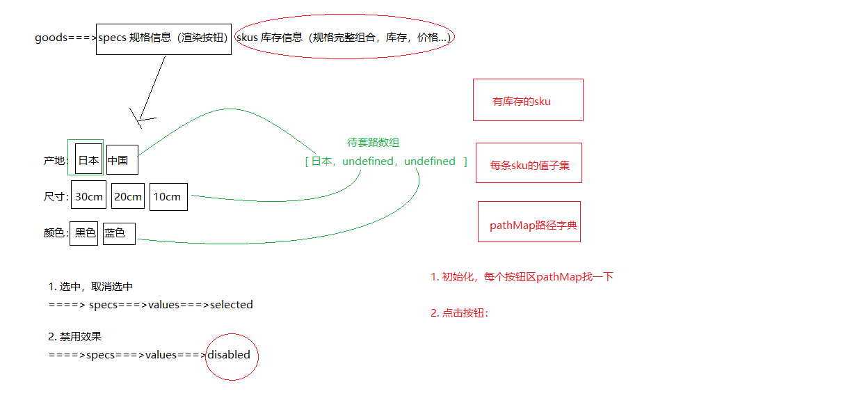
★规格组件-SKU&SPU概念
官方话术:
- SPU(Standard Product Unit):标准化产品单元。是商品信息聚合的最小单位,是一组可复用、易检索的标准化信息的集合,该集合描述了一个产品的特性。通俗点讲,属性值、特性相同的商品就可以称为一个SPU。
- SKU(Stock Keeping Unit)库存量单位,即库存进出计量的单位, 可以是以件、盒、托盘等为单位。SKU是物理上不可分割的最小存货单元。在使用时要根据不同业态,不同管理模式来处理。
画图理解:
总结一下:
- spu代表一种商品,拥有很多相同的属性。
- sku代表该商品可选规格的任意组合,他是库存单位的唯一标识。
- 如何判断组合选择的规格参数是否可以选中?
- 从后端可以得到所有的SKU数据
- 我们需要过滤出有库存的SKU数据
- 为了方便进行组合判断,需要计算每个SKU规格的集合数据的【笛卡尔集】
- 此时当点击规格标签时,把选中的规格进行组合,然后去笛卡尔集中判断,只要有一个存在,就证明这种组合是有效的(点击组合点击)
★规格组件-基础结构和样式
目标,完成规格组件的基础布局。
大致步骤:
- 准备组件
- 使用组件
落地代码:
- 组件结构
src/views/goods/components/goods-sku.vue
<template>
  <div class="goods-sku">
    <dl>
      <dt>颜色</dt>
      <dd>
        <img class="selected" src="https://yanxuan-item.nosdn.127.net/d77c1f9347d06565a05e606bd4f949e0.png" alt="">
        <img class="disabled" src="https://yanxuan-item.nosdn.127.net/d77c1f9347d06565a05e606bd4f949e0.png" alt="">
      </dd>
    </dl>
    <dl>
      <dt>尺寸</dt>
      <dd>
        <span class="disabled">10英寸</span>
        <span class="selected">20英寸</span>
        <span>30英寸</span>
      </dd>
    </dl>
    <dl>
      <dt>版本</dt>
      <dd>
        <span>美版</span>
        <span>港版</span>
      </dd>
    </dl>
  </div>
</template>
<script>
export default {
  name: 'GoodsSku'
}
</script>
<style scoped lang="less">
.sku-state-mixin () {
  border: 1px solid #e4e4e4;
  margin-right: 10px;
  cursor: pointer;
  &.selected {
    border-color: @xtxColor;
  }
  &.disabled {
    opacity: 0.6;
    border-style: dashed;
    cursor: not-allowed;
  }
}
.goods-sku {
  padding-left: 10px;
  padding-top: 20px;
  dl {
    display: flex;
    padding-bottom: 20px;
    align-items: center;
    dt {
      width: 50px;
      color: #999;
    }
    dd {
      flex: 1;
      color: #666;
      > img {
        width: 50px;
        height: 50px;
        .sku-state-mixin ();
      }
      > span {
        display: inline-block;
        height: 30px;
        line-height: 28px;
        padding: 0 20px;
        .sku-state-mixin ();
      }
    }
  }
}
</style>
- 使用组件
src/views/goods/index.vue
+import GoodsSku from './components/goods-sku'

  name: 'XtxGoodsPage',
+  components: { GoodsRelevant, GoodsImage, GoodsSales, GoodsName, GoodsSku },
  setup () {
        <div class="spec">
          <!-- 名字区组件 -->
          <GoodsName :goods="goods" />
          <!-- 规格组件 -->
+          <GoodsSku />
        </div>
总结: 每一个按钮拥有
selecteddisabled类名,做 选中 和 禁用 要用。
★规格组件-渲染与选中效果
目的:根据商品信息渲染规格,完成选中,取消选中效果。
大致步骤:
- 依赖
goods.specs渲染规格 - 绑定按钮点击事件,完成选中和取消选中
- 当前点的是选中,取消即可
- 当前点的未选中,先当前规格按钮全部取消,当前按钮选中。
落的代码:src/views/goods/components/goods-sku.vue
<template>
  <div class="goods-sku">
    <dl v-for='(item, i) in specs' :key='i'>
      <dt>{{item.name}}</dt>
      <dd>
        <template v-for='(tag, n) in item.values' :key='n'>
          <img :class='{selected: tag.selected}' v-if='tag.picture' :src="tag.picture" alt="" @click='toggle(tag, item.values)'>
          <span :class='{selected: tag.selected}' v-else @click='toggle(tag, item.values)'>{{tag.name}}</span>
        </template>
      </dd>
    </dl>
  </div>
</template>
<script>
export default {
  name: 'GoodsSku',
  props: {
    // 商品的规格参数
    specs: {
      type: Array,
      default: () => []
    }
  },
  setup () {
    // 控制当前标签的选中和反选
    const toggle = (tag, list) => {
      if (tag.selected) {
        // 如果有selected属性并且值为true,证明已经选中
        tag.selected = false
      } else {
        // 没有selected属性或者值为false,没有选中
        // 先把同类标签所有的selected状态设置Wiefalse(取消选中),当前的标签状态设置为选中
        list.forEach(item => {
          item.selected = false
        })
        tag.selected = true
      }
    }

    return { toggle }
  }
}
</script>
总结:
- 动态渲染所有的规格参数:两层遍历
- 控制标签的选中和反选
★规格组件-禁用效果-思路分析
目标:大致了解禁用效果的整体思路,注意只是了解。
大致步骤:
- 根据后台返回的skus数据得到有效sku组合
- 根据有效的sku组合得到所有的子集集合
- 根据子集集合组合成一个路径字典,也就是对象。
- 在组件初始化的时候去判断每个规格是否可以点击
- 在点击规格的时候去判断其他规格是否可点击
- 判断的依据是,拿着所有规格和现在已经选中的规则取搭配,得到可走路径。
-
如果可走路径在字典中,可点击
-
如果可走路径不在字典中,禁用
-
★规格组件-禁用效果-路径字典
目的:根据后台skus数据得到可走路径字典对象
src/vender/power-set.js
/**
 * Find power-set of a set using BITWISE approach.
 *
 * @param {*[]} originalSet
 * @return {*[][]}
 */
export default function bwPowerSet(originalSet) {
  const subSets = [];

  // We will have 2^n possible combinations (where n is a length of original set).
  // It is because for every element of original set we will decide whether to include
  // it or not (2 options for each set element).
  const numberOfCombinations = 2 ** originalSet.length;

  // Each number in binary representation in a range from 0 to 2^n does exactly what we need:
  // it shows by its bits (0 or 1) whether to include related element from the set or not.
  // For example, for the set {1, 2, 3} the binary number of 0b010 would mean that we need to
  // include only "2" to the current set.
  for (let combinationIndex = 0; combinationIndex < numberOfCombinations; combinationIndex += 1) {
    const subSet = [];

    for (let setElementIndex = 0; setElementIndex < originalSet.length; setElementIndex += 1) {
      // Decide whether we need to include current element into the subset or not.
      if (combinationIndex & (1 << setElementIndex)) {
        subSet.push(originalSet[setElementIndex]);
      }
    }

    // Add current subset to the list of all subsets.
    subSets.push(subSet);
  }

  return subSets;
}
src/views/goods/components/goods-sku.vue
import getPowerSet from '@/vender/power-set.js'
const spliter = '★'
const getPathMap = (originSet) => {
  // 最终形成的路径字典
  const result = {}
  // 遍历所有的sku信息
  originSet.forEach(sku => {
    if (sku.inventory === 0) return
    // 后续处理表示有效SKU
    // 获取有效的SKU值:[蓝色, 中国, 20cm]
    const validSku = sku.specs.map(item => item.valueName)
    // 计算SKU的子集(笛卡尔集)
    const subset = getPowerSet(validSku)
    // 遍历subset,生成路径字典
    subset.forEach(path => {
      // 排除空集
      if (path.length === 0) return
      // 基于子集项目拼接字符串
      const pathKey = path.join(spliter)
      if (result[pathKey]) {
        // 字典已经存在该属性
        result[pathKey].push(sku.id)
      } else {
        // 字典中尚不存在该属性
        result[pathKey] = [sku.id]
      }
    })
  })
  return result
}
+  setup (props) {
+    const pathMap = getPathMap(props.goods.skus)
+    console.log(pathMap)
- 参照示例
★规格组件-禁用效果-设置状态
 > 目的:在组件初始化的时候,点击规格的时候,去更新其他按钮的禁用状态。
大致的步骤:
- 再需要更新状态的时候获取当前选中的规格数组
- 遍历所有的规格按钮,拿出按钮的值设置给规格数组,然后得到key
- 拿着key去路径字典中查找,有就可点击,没有禁用即可。
src/views/goods/components/goods-sku.vue
// 获取当前选中的规格数据
const getSelectedValue = (specs) => {
  const result = []
  specs.forEach((item, i) => {
    const tagObj = item.values.find(tag => tag.selected)
    if (tagObj) {
      // 其中一个选项选中了,存取选中的标签的名称
      result[i] = tagObj.name
    } else {
      // 一个标签也没有选中
      result[i] = undefined
    }
  })
  return result
}
// 控制规格标签是否被禁用
const updateDisabledStatus = (specs, pathMap) => {
  // seletedValues = [undefined, undefined, undefined]
  specs.forEach((spec, i) => {
    // 每次规格的遍历,选中的值需要重新初始化
    const seletedValues = getSelectedValue(specs)
    spec.values.forEach(tag => {
      if (tag.selected) {
        // 标签本身就是选中状态,不需要处理
        return
      } else {
        // 没有选中(初始化时,需要判断当个规格的禁用状态)
        seletedValues[i] = tag.name
      }
      // 此时,需要判断当前的按钮是否应该被禁用
      // 基于当前选中的值,组合一个路径
      // 过滤掉undefined值,基于剩余的值组合一个路径
      let currentPath = seletedValues.filter(item => item)
      if (currentPath.length > 0) {
        // 拼接路径字符串 currentPath = 黑色★10cm
        currentPath = currentPath.join(spliter)
        // 判断当前的路径是否在路径字典中(如果在字典中没有找到该路径,证明当前的标签应该禁用)
        tag.disabled = !pathMap[currentPath]
      }
      // 单独判断单个按钮是否应该禁用
      // tag.disabled = !pathMap[tag.name]
    })
  })
}
  setup (props) {
    const pathMap = getPathMap(props.goods.skus)
    // 组件初始化的时候更新禁用状态
+    updateDisabledStatus(props.goods.specs, pathMap)
    const clickSpecs = (item, val) => {
      // 如果是禁用状态不作为
+      if (val.disabled) return
      // 1. 选中与取消选中逻辑
      if (val.selected) {
        val.selected = false
      } else {
        item.values.find(bv => { bv.selected = false })
        val.selected = true
      }
      // 点击的时候更新禁用状态
+      updateDisabledStatus(props.goods.specs, pathMap)
    }
    return { clickSpecs }
  }
目的:根据传入的skuId进行默认选中,选择规格后触发change事件传出选择的sku数据。
大致步骤:
- 根据传入的SKUID选中对应规格按钮
- 选择规格后传递sku信息给父组件
- 完整规格,传 skuId 价格 原价 库存 规格文字
- 不完整的,传 空对象
落的代码:
- 根据传人的sku设置默认选中的规格
src/views/goods/components/goods-sku.vue
skuId: {
  type: String,
  default: ''
}
// 初始化规格的选中状态(根据skuId)
const initSkuSeletedStatus = (skuId, specs, skus) => {
  // 1、根据SKUId获取对应的sku详细信息
  const currentSku = skus.find(item => item.id === skuId)
  // 2、控制currentSku.specs中的规格进行选中
  specs.forEach(item => {
    // 3、得到需要选中的规格的值
    const selectedValue = currentSku.specs.find(skuItem => skuItem.name === item.name).valueName
    // 4、根据selectedValue控制规格的选中
    item.values.find(tag => tag.name === selectedValue).selected = true
  })
}
  setup (props, { emit }) {
    const pathMap = getPathMap(props.goods.skus)
    // 根据传入的skuId默认选中规格按钮
+    // 根据SKUId初始化规格的选中状态
+    if (props.skuId) {
+      initSkuSeletedStatus(props.skuId, props.specs, props.skus)
+    }
    // 组件初始化的时候更新禁用状态
    updateDisabledStatus(props.goods.specs, pathMap)
总结:根据SKUId中的规格数据控制规格的选中
- 根据选择的完整sku规格传出sku信息
- 其中传出的specsText是提供给购物车存储使用的。
src/views/goods/components/goods-sku.vue
+ setup (props, { emit }) {
const clickSpecs = (item, val) => {
      // 如果是禁用状态不作为
      if (val.disabled) return false
      // 1. 选中与取消选中逻辑
      if (val.selected) {
        val.selected = false
      } else {
        item.values.find(bv => { bv.selected = false })
        val.selected = true
      }
      // 点击的时候更新禁用状态
      updateDisabledStatus(props.goods.specs, pathMap)
+ // 获取此时选中的规格的所有的值,传递给父组件
+ // 1、如果所有的规格都选择了才是合理的
+ // 2、如果有未选的的规格,就不应该得到数据
+ const result = getSelectedValue(props.specs)
+ if (result.filter(item => item).length === props.specs.length) {
+   // 所有的规格都进行了选择
+   // 有效数据:skuId,price,oldPrice,inventory,specsText (来源于SKU记录)
+   // 根据当前的选中的规格结果,拼接路径字典key
+   const pathKey = result.join(spliter)
+   // 根据路径获取路径字典中存储的skuId
+   const skuId = pathMap[pathKey][0]
+   // 根据SKUId获取详细数据
+   const sku = props.skus.find(item => item.id === skuId)
+   // 拼接specsText数据
+   let specsText = ''
+   sku.specs.forEach(item => {
+     specsText += item.name + ':' + item.valueName + ','
+   })
+   if (specsText.length > 0) {
+     specsText = specsText.substring(0, specsText.length - 1)
+   }
+   // 组合有效数据
+   const specInfo = {
+     skuId: skuId,
+     price: sku.price,
+     oldPrice: sku.oldPrice,
+     inventory: sku.inventory,
+     specsText: specsText
+   }
+   emit('sku-info', specInfo)
+ } else {
+   // 还有规格没有选
+   emit('sku-info', {})
+ }
src/views/goods/index.vue
<GoodsSku @sku-info='skuInfo' :specs='goodsDetail.specs' :skus='goodsDetail.skus' />
  setup () {
    const goods = useGoods()
    // sku改变时候触发
+    const skuInfo = (sku) => {
+      if (sku.skuId) {
+        goods.value.price = sku.price
+        goods.value.oldPrice = sku.oldPrice
+        goods.value.inventory = sku.inventory
+      }
+    }
+    return { goods, changeSku }
  }
- 基于数组的reduce方法重构拼接字符串的逻辑
let specsText = ['', ...sku.specs].reduce((result, item) => result + item.name + ':' + item.valueName + ',')
specsText = specsText.length > 0 && specsText.substring(0, specsText.length - 1)
// 组合有效数据
const specInfo = {
  skuId: skuId,
  price: sku.price,
  oldPrice: sku.oldPrice,
  inventory: sku.inventory,
  specsText: specsText
}
总结:数组的reduce方法的基本使用
- 参数一表示什么意思?上一次计算的结果,t的初始值值是数组的第一项数据,后续的值是上一次计算的结果
- 参数二表示arr数组的其中一项数据,从第二项开始
商品详情-数量选择组件
目的:封装一个通用的数量选中组件。
大致功能分析:
- 默认值为1
- 可限制最大最小值
- 点击-就是减1 点击+就是加1
- 需要完成v-model得实现
- 存在无label情况
基础布局代码:src/components/library/xtx-numbox.vue
<template>
  <div class="xtx-numbox">
    <div class="label">数量</div>
    <div class="numbox">
      <a href="javascript:;">-</a>
      <input type="text" readonly value="1">
      <a href="javascript:;">+</a>
    </div>
  </div>
</template>
<script>
export default {
  name: 'XtxNumbox'
}
</script>
<style scoped lang="less">
.xtx-numbox {
  display: flex;
  align-items: center;
  .label {
    width: 60px;
    color: #999;
    padding-left: 10px;
  }
  .numbox {
    width: 120px;
    height: 30px;
    border: 1px solid #e4e4e4;
    display: flex;
    > a {
      width: 29px;
      line-height: 28px;
      text-align: center;
      background: #f8f8f8;
      font-size: 16px;
      color: #666;
      &:first-of-type {
        border-right:1px solid #e4e4e4;
      }
      &:last-of-type {
        border-left:1px solid #e4e4e4;
      }
    }
    > input {
      width: 60px;
      padding: 0 5px;
      text-align: center;
      color: #666;
    }
  }
}
</style>
逻辑功能实现:
src/components/library/xtx-numbox.vue
<script>
import { useVModel } from '@vueuse/core'
export default {
  name: 'XtxNumbox',
  props: {
    label: {
      type: String,
      default: ''
    },
    modelValue: {
      type: Number,
      default: 1
    },
    min: {
      type: Number,
      default: 1
    },
    max: {
      type: Number,
      required: true
    }
  },
  setup (props, { emit }) {
    const n = useVModel(props, 'modelValue', emit)
    // 控制商品数量变更
    const toggle = (step) => {
      let num = props.modelValue + step
      if (num <= 1) {
        // 控制最小值
        num = 1
      } else if (num >= props.max) {
        // 控制最大值
        num = props.max
      }
      // emit('update:modelValue', num)
      n.value = num
    }
    return { toggle, n }
  }
}
</script>
src/views/goods/index.vue
<XtxNumbox v-model='num' label='数量' :max='goodsDetail.inventory' />
// 选择的数量
+    const num = ref(1)
+    return { toggle, n, num }
总结:
- 父向子传递数据
- 子向父传递数据
- 基于第三方vueuse提供的方法useVModel优化父子之间的数据传递
商品详情-按钮组件
目的:封装一个通用按钮组件,有大、中、小、超小四种尺寸,有默认、主要、次要、灰色四种类型。
大致步骤:
- 完成组件基本结构
- 介绍各个参数的使用
- 测试按钮组件
落地代码:
- 封装组件:
src/components/library/xtx-button.vue
<template>
  <button class="xtx-button ellipsis" :class="[size,type]">
    <slot />
  </button>
</template>
<script>
export default {
  name: 'XtxButton',
  props: {
    size: {
      type: String,
      default: 'middle'
    },
    type: {
      type: String,
      default: 'default'
    }
  }
}
</script>
<style scoped lang="less">
.xtx-button {
  appearance: none;
  border: none;
  outline: none;
  background: #fff;
  text-align: center;
  border: 1px solid transparent;
  border-radius: 4px;
  cursor: pointer;
}
.large {
  width: 240px;
  height: 50px;
  font-size: 16px;
}
.middle {
  width: 180px;
  height: 50px;
  font-size: 16px;
}
.small {
  width: 100px;
  height: 32px;
  font-size: 14px;
}
.mini {
  width: 60px;
  height: 32px;
  font-size: 14px;
}
.default {
  border-color: #e4e4e4;
  color: #666;
}
.primary {
  border-color: @xtxColor;
  background: @xtxColor;
  color: #fff;
}
.plain {
  border-color: @xtxColor;
  color: @xtxColor;
  background: lighten(@xtxColor,50%);
}
.gray {
  border-color: #ccc;
  background: #ccc;;
  color: #fff;
}
</style>
- 使用组件:
src/views/goods/index.vue
        <div class="spec">
          <GoodsName :goods="goods"/>
          <GoodsSku :goods="goods" @change="changeSku"/>
          <XtxNumbox label="数量" v-model="num" :max="goods.inventory"/>
+          <XtxButton type="primary" style="margin-top:20px;">加入购物车</XtxButton>
        </div>
总结:封装通用的按钮组件,抽取尺寸和样式属性;基于默认插槽定制按钮文字。
商品详情-同类推荐组件
目的:实现商品的同类推荐与猜你喜欢展示功能。
大致功能需求:
- 完成基础布局(头部),后期改造xtx-carousel.vue组件来展示商品效果。
- 然后可以通过是否传入商品ID来区别同类推荐和猜你喜欢。
落的代码开始:
- 基础布局
src/views/goods/components/goods-relevant.vue
<template>
  <div class="goods-relevant">
    <div class="header">
      <i class="icon" />
      <span class="title">同类商品推荐</span>
    </div>
    <!-- 此处使用改造后的xtx-carousel.vue -->
  </div>
</template>

<script>
export default {
  // 同类推荐,猜你喜欢
  name: 'GoodsRelevant'
}
</script>

<style scoped lang='less'>
.goods-relevant {
  background: #fff;
  min-height: 460px;
  margin-top: 20px;
  .header {
    height: 80px;
    line-height: 80px;
    padding: 0 20px;
    .title {
      font-size: 20px;
      padding-left: 10px;
    }
    .icon {
      width: 16px;
      height: 16px;
      display: inline-block;
      border-top: 4px solid @xtxColor;
      border-right: 4px solid @xtxColor;
      box-sizing: border-box;
      position: relative;
      transform: rotate(45deg);
      &::before {
        content: "";
        width: 10px;
        height: 10px;
        position: absolute;
        left: 0;
        top: 2px;
        background: lighten(@xtxColor, 40%);
      }
    }
  }
}
</style>
- 获取数据传入xtx-carousel.vue组件
src/views/goods/index.vue传ID
<!-- 商品推荐 -->
<GoodsRelevant :goodsId="goodsDetail.id"/>
- 定义获取数据的API
src/api/goods.js
/**
 * 获取商品同类推荐-未传入ID为猜喜欢
 * @param {String} id - 商品ID
 * @param {Number} limit - 获取条数
 */
export const findRelGoods = (id, limit = 16) => {
  return request({
      method: 'get',
      url: '/goods/relevant',
      data: { id, limit }
  })
}
- 获取数据
src/views/goods/components/goods-relevant.vue
  <div class="header">
      <i class="icon" />
+     <span class="title">{{goodsId?'同类商品推荐':'猜你喜欢'}}</span>
  </div>
<script>
import { findRelGoods } from '@/api/product.js'
import { ref } from 'vue'
const useGoodsList = (goodsId) => {
  const list = ref([])
  findRelGoods(goodsId).then(data => {
    // list.value = data.result
    // 原始的数据data.result一共16条数据
    // 现在需要每页显示4条
    const pageSize = 4
    // 计算出总页数
    const perPageNum = Math.ceil(data.result.length / pageSize)
    // 对原始数据数据进行分页处理
    for (let i = 0; i < perPageNum; i++) {
      // 每一页的数据
      const pageArr = data.result.slice(i * pageSize, (i + 1) * pageSize)
      list.value.push(pageArr)
    }
  })
  return list
}

export default {
  // 同类推荐,猜你喜欢
  name: 'GoodsRelevant',
  props: {
    goodsId: {
      type: String,
      required: true
    }
  },
  setup (props) {
    // list = [[], [], [], []]
    const list = useGoodsList(props.goodsId)
    return { list }
  }
}
</script>
<!-- 此处使用改造后的xtx-carousel.vue -->
<XtxCarousel :slides="list" style="height:380px" auto-play />
- 改造xtx-carousel.vue组件
src/components/library/xtx-carousel.vue
+ <RouterLink v-if="item.hrefUrl" :to="item.hrefUrl">
<img :src="item.imgUrl" alt="">
</RouterLink>
+ <div v-else class="slider">
+ <RouterLink v-for="goods in item" :key="goods.id" :to="`/product/${goods.id}`">
+ <img :src="goods.picture" alt="">
+ <p class="name ellipsis">{{goods.name}}</p>
+ <p class="price">¥{{goods.price}}</p>
+ </RouterLink>
// 轮播商品
.slider {
  display: flex;
  justify-content: space-around;
  padding: 0 40px;
  > a {
    width: 240px;
    text-align: center;
    img {
      padding: 20px;
      width: 230px!important;
      height: 230px!important;
    }
    .name {
      font-size: 16px;
      color: #666;
      padding: 0 40px;
    }
    .price {
      font-size: 16px;
      color: @priceColor;
      margin-top: 15px;
    }
  }
}
- 覆盖xtx-carousel.vue的样式在
src/views/goods/components/goods-relevant.vue
:deep(.xtx-carousel) {
  height: 380px;
  .carousel {
    &-indicator {
      bottom: 30px;
      span {
        &.active {
          background: @xtxColor;
        }
      }
    }
    &-btn {
      top: 110px;
      opacity: 1;
      background: rgba(0,0,0,0);
      color: #ddd;
      i {
        font-size: 30px;
      }
    }
  }
}
注意:vue3.0使用深度作用选择器写法
:deep(选择器)
商品详情-标签页组件
目的:实现商品详情组件和商品评价组件的切换
大致步骤:
- 完成基础的tab的导航布局
- 完成tab标签页的切换样式效果
- 使用动态组件完成可切换 详情 和 评论 组件
落的代码:
- 标签页基础布局
src/vies/goods/components/goods-tabs.vue
  <div class="goods-tabs">
    <nav>
      <a class="active" href="javascript:;">商品详情</a>
      <a href="javascript:;">商品评价<span>(500+)</span></a>
    </nav>
    <!-- 切换内容的地方 -->
  </div>
.goods-tabs {
  min-height: 600px;
  background: #fff;
  nav {
    height: 70px;
    line-height: 70px;
    display: flex;
    border-bottom: 1px solid #f5f5f5;
    a {
      padding: 0 40px;
      font-size: 18px;
      position: relative;
      > span {
        color: @priceColor;
        font-size: 16px;
        margin-left: 10px;
      }
      &:first-child {
        border-right: 1px solid #f5f5f5;
      }
      &.active {
        &::before {
          content: "";
          position: absolute;
          left: 40px;
          bottom: -1px;
          width: 72px;
          height: 2px;
          background: @xtxColor;
        }
      }
    }
  }
}
- tabs组件切换
src/vies/goods/components/goods-tabs.vue
<template>
  <div class="goods-tabs">
    <nav>
      <a @click='toggle("GoodsDetail")' :class="{active: componentName === 'GoodsDetail'}" href="javascript:;">商品详情</a>
      <a @click='toggle("GoodsComment")' :class="{active: componentName === 'GoodsComment'}" href="javascript:;">商品评价<span>(500+)</span></a>
    </nav>
    <!-- 切换内容的地方 -->
    <!-- <GoodsDetail v-if='currentIndex === 0'/> -->
    <!-- <GoodsComment v-if='currentIndex === 1'/> -->
    <!-- 基于动态组件控制组件的切换 -->
    <component :is='componentName'></component>
  </div>
</template>
<script>
import GoodsDetail from './goods-detail.vue'
import GoodsComment from './goods-comment.vue'
import { ref } from 'vue'
export default {
  name: 'GoodsTabs',
  components: { GoodsDetail, GoodsComment },
  setup () {
    // 当前组件的名称
    const componentName = ref('GoodsDetail')
    const toggle = (name) => {
      componentName.value = name
    }
    return { toggle, componentName }
  }
}
</script>
- 使用tabs组件
src/views/goods/index.vue
+import GoodsTabs from './components/goods-tabs'
// ... 省略
export default {
  name: 'XtxGoodsPage',
+  components: { GoodsRelevant, GoodsImage, GoodsSales, GoodsName, GoodsSku, GoodsTabs },
  setup () {
        <div class="goods-article">
          <!-- 商品+评价 -->
+          <GoodsTabs :goods="goods" />
          <!-- 注意事项 -->
          <div class="goods-warn"></div>
        </div>
-.goods-tabs {
-  min-height: 600px;
-  background: #fff;
-}
- 定义详情组件,
src/vies/goods/components/goods-detail.vue
<template>
  <div class="goods-detail">详情</div>
</template>
<script>
export default {
  name: 'GoodsDetail'
}
</script>
<style scoped lang="less"></style>
- 定义评价组件。
src/vies/goods/components/goods-comment.vue
<template>
  <div class="goods-comment">评价</div>
</template>
<script>
export default {
  name: 'GoodsComment'
}
</script>
<style scoped lang="less"></style>
总结:
- 封装Tab选项卡组件并实现切换功能
- 基于动态组件实现组件的切换
商品详情-热榜组件
目的:展示24小时热榜商品,和周热榜商品。
大致步骤:
-
定义一个组件,完成多个组件展现型态,根据传入组件的类型决定。
-
1代表24小时热销榜 2代表周热销榜 3代表总热销榜
-
-
获取数据,完成商品展示和标题样式的设置。
落的代码:
- 定义组件
src/views/goods/components/goods-hot.vue
<template>
  <div class="goods-hot">
    <h3>{{title}}</h3>
  </div>
</template>
<script>
import { computed } from 'vue'
export default {
  name: 'GoodsHot',
  props: {
    type: {
      type: Number,
      default: 1
    }
  },
  setup (props) {
    const titleObj = { 1: '24小时热销榜', 2: '周热销榜', 3: '总热销榜' }
    const title = computed(() => {
      return titleObj[props.type]
    })
    return { title }
  }
}
</script>
<style scoped lang="less"></style>
- 使用组件
src/views/goods/index.vue
+import GoodsHot from './components/goods-hot'
// ... 省略
  name: 'XtxGoodsPage',
+  components: { GoodsRelevant, GoodsImage, GoodsSales, GoodsName, GoodsSku, GoodsTabs, GoodsHot },
  setup () {
<!-- 24热榜+专题推荐 -->
<div class="goods-aside">
    <GoodsHot :goodsId="goods.id" :type="1" />
    <GoodsHot :goodsId="goods.id" :type="2" />
</div>
- 获取数据,设置组件样式
src/api/goods.js
/**
 * 获取热榜商品
 * @param {Number} type - 1代表24小时热销榜 2代表周热销榜 3代表总热销榜
 * @param {Number} limit - 获取个数
 */
export const findHotGoods = ({id,type, limit = 3}) => {
  return request({
      method: 'get',
      url: '/goods/hot',
      data: {id, type, limit }
  })
}
src/views/goods/components/goot-hot.vue
import { computed, ref } from 'vue'
import GoodsItem from '../../category/components/goods-item'
import { findHotGoods } from '@/api/goods'
export default {
  name: 'GoodsHot',
  props: {
    type: {
      type: Number,
      default: 1
    },
    goodsId: {
      type: String
    }
  },
  components: { GoodsItem },
  setup (props) {
    // 处理标题
    const titleObj = { 1: '24小时热销榜', 2: '周热销榜', 3: '总热销榜' }
    const title = computed(() => {
      return titleObj[props.type]
    })
    // 商品列表
    const goodsList = ref([])
    findHotGoods({ id: props.goodsId, type: props.type }).then(data => {
      goodsList.value = data.result.map(item => {
        item.tag = item.desc
        return item
      })
    })
    return { title, goodsList }
  }
}
<template>
  <div class="goods-hot">
    <h3>{{title}}</h3>
    <div v-if="list">
      <GoodsItem v-for="item in list" :key="item.id" :info="item"/>
    </div>
  </div>
</template>
.goods-hot {
  h3 {
    height: 70px;
    background: @helpColor;
    color: #fff;
    font-size: 18px;
    line-height: 70px;
    padding-left: 25px;
    margin-bottom: 10px;
    font-weight: normal;
  }
  ::v-deep .goods-item {
    background: #fff;
    width: 100%;
    margin-bottom: 10px;
    img {
      width: 200px;
      height: 200px;
    }
    p {
      margin: 0 10px;
    }
    &:hover {
      transform: none;
      box-shadow: none;
    }
  }
}
总结:抽取组件时,需要定制变化的数据作为属性,计算属性的使用。
商品详情-详情组件
目的:展示商品属性和商品详情。
大致步骤:
- 完成基础布局,主要是属性,详情是图片。
goods/index.vue提供goods数据,子孙组件注入goods数据,渲染展示即可。
落的代码:
- 传递goods数据
src/views/goods/index.vuesetup中提供数据
provide('goods', goodsDetail)
- 使用goods数据,展示评价数量
src/views/goods/components/goods-tabs.vue
  setup () {
      const goods = inject('goods')
      return { goods }
  },
+ >商品评价<span>({{goods.commentCount}})</span></a
- 使用goods数据,展示商品详情
src/views/goods/components/goods-detail.vue
<template>
  <div class="goods-detail">
    <!-- 属性 -->
    <ul class="attrs">
      <li v-for="item in goods.details.properties" :key="item.value">
        <span class="dt">{{item.name}}</span>
        <span class="dd">{{item.value}}</span>
      </li>
    </ul>
    <!-- 图片 -->
    <img v-for="item in goods.details.pictures" :key="item" :src="item" alt="">
  </div>
</template>
<script>
import { inject } from 'vue'
export default {
  name: 'GoodsDetail',
  setup () {
      const goods = inject('goods')
      return { goods }
  }
}
</script>
<style scoped lang="less">
.goods-detail {
  padding: 40px;
  .attrs {
    display: flex;
    flex-wrap: wrap;
    margin-bottom: 30px;
    li {
      display: flex;
      margin-bottom: 10px;
      width: 50%;
      .dt {
        width: 100px;
        color: #999;
      }
      .dd {
        flex: 1;
        color: #666;
      }
    }
  }
  > img {
    width: 100%;
  }
}
</style>
