<!DOCTYPE html>
<html lang="en">
<head>
<meta charset="UTF-8">
<meta http-equiv="X-UA-Compatible" content="IE=edge">
<meta name="viewport" content="width=device-width, initial-scale=1.0">
<title>太极图</title>
<style>
* {
margin: 0;
padding: 0;
}
body {
background-color: #ccc;
}
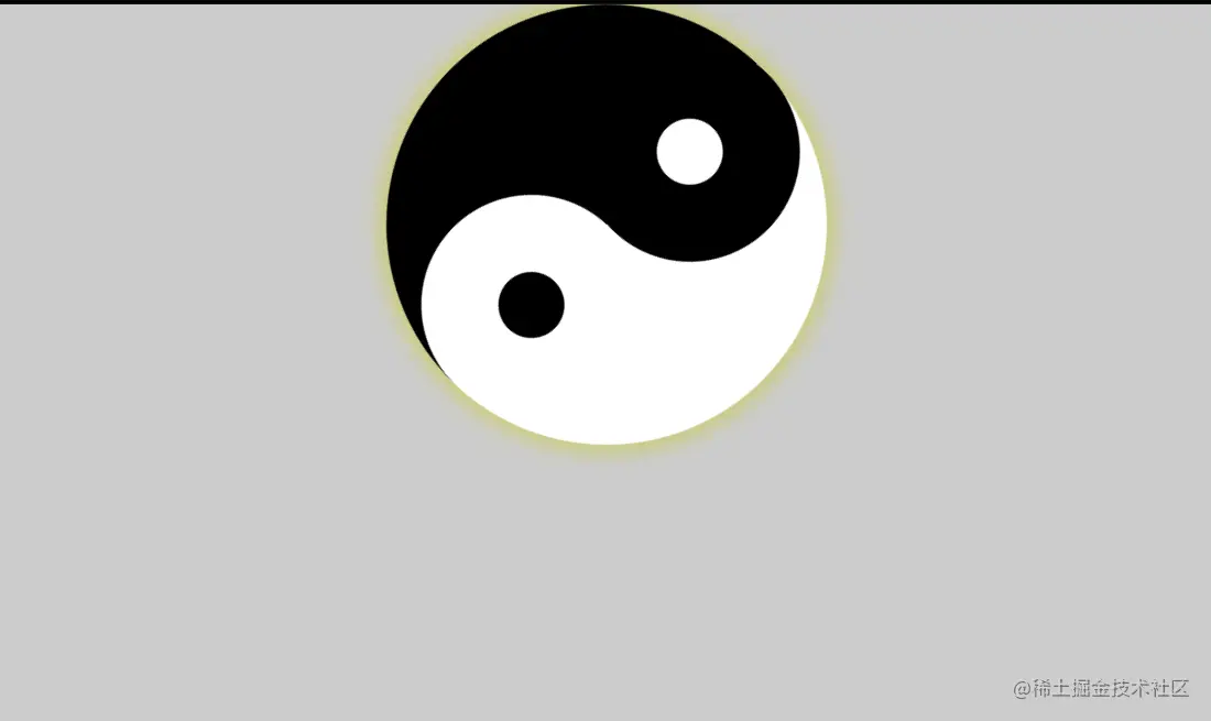
.box {
width: 0;
height: 400px;
border-left: 200px solid black;
border-right: 200px solid white;
border-radius: 50%;
box-shadow: 0px 0px 20px 5px #cccc66;
position: relative;
animation: x 10s linear infinite;
margin-left: auto;
margin-right: auto;
}
.box::before {
content: "";
width: 60px;
height: 60px;
border: 70px solid black;
border-radius: 50%;
position: absolute;
top: 0px;
left: -90px;
background-color: #fff;
}
.box::after {
content: "";
width: 60px;
height: 60px;
border: 70px solid white;
border-radius: 50%;
position: absolute;
margin-top: 200px;
margin-left: -100px;
background-color: #000;
}
/*先定义一个@keyframes 命名为x*/
@keyframes x {
from {
transform: rotate(0deg);
}
to {
transform: rotate(360deg);
}
}
</style>
</head>
<body>
<div class="box"></div>
</body>
</html>


