基于React的大屏监控
技术栈
- React
- ReactRouter
- Echarts
项目介绍
- 此项目是为了熟悉前端可视化同时学习Echarts而写
- 页面布局结合了Flex与Grid
- 使用rem匹配不同屏幕大小
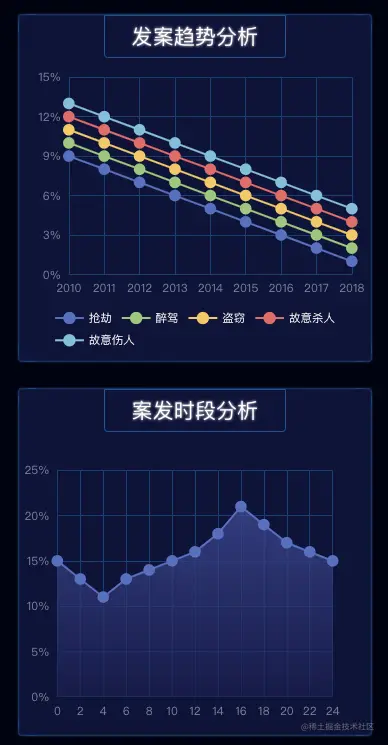
- 项目中的统计图、环形图、柱状图、地图等来自于Echarts,可以实现实时更新数据
- 此项目中数据不是真是数据,只是为了展示而编写的
- 写完项目才发现dataV,貌似直接用来做可视化更新快一下,下次会尝试使用
预览
- 预览地址
- github地址
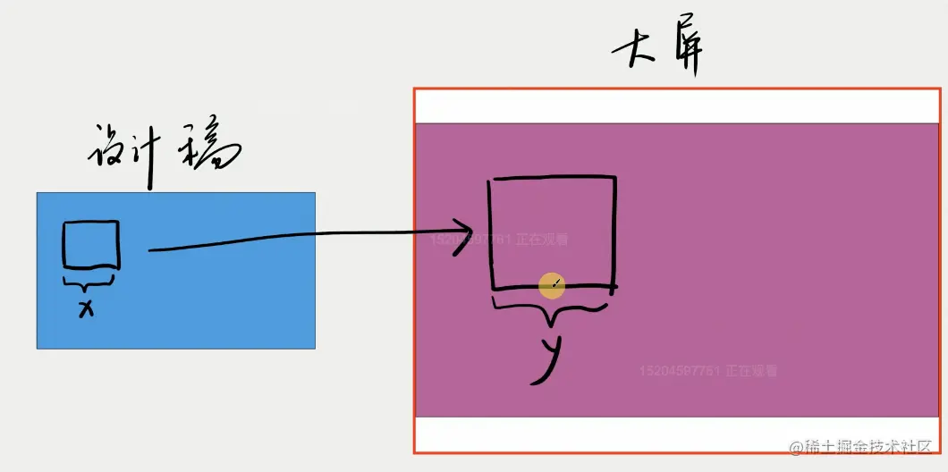
大屏适配
屏幕适配
- 设计稿是16:9,理想中大屏也是16:9
- 如果屏幕很宽,就左右剧中
- 如果屏幕很高,就上下剧中
- 公式

- Wp 为页面有效宽度,Hp 为页面有效高度
- 页面左右居中,上下居中,四周留白即可
- 第一种情况:设备很宽,就左右剧中,页面高度为屏幕高度,页面宽度按比例计算
- 第二种情况:设备很高,就上下剧中。页面的宽度为屏幕的宽度,页面高度按16:9计算
- 然后在 head 里用 JS 设置 1rem = Wp / 100(下文中会用到)
- 也可以设置
header:{
    width: px(2420);
    margin: 0 auto;
    }
 main {
    width: px(2420);
    margin: 0 auto;
}
rem计算公式
1. rem公式
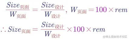
- 一个div在页面的尺寸/页面的宽度 = div在设计稿中的尺寸 / 设计稿的宽度
- 1rem = Wp / 100 推出: 页面宽度 = 100*rem
- 结合以上2点,推出: div在页面中的尺寸 = (div在设计稿中的尺寸 / 设计稿的宽度) * 100 * rem
- 假设某 div 在设计稿中长 100px,设计稿宽度 1920px,
- 那么该 div 在页面中长为 100/1920 X 100rem
- 最后可以写一个 px() 函数来计算 100px 对应的 rem
2. rem实际上是html里的font-size
<script>
const clientWidth= document.documentElement.clientWidth
const clientHeight = document.documentElement.clientHeight
window.pageWidth = clientWidth / clientHeight > 16 / 9 ? clientHeight * (16 / 9) : clientWidth;
const pageHeight = pageWidth/(16/9)
const string = `<style>html{
font-size:${pageWidth/100}px // 1rem
}</style>
`
document.write(string)
</script>
</head>
<body>
<div id="root"></div>
<script>
root.style.height= pageHeight+ 'px'
root.style.marginTop = (clientHeight - pageHeight) / 2 + 'px'
</script>
<script type="module" src="/src/main.tsx"></script>
</body>
代码:展示一个div
- 不能用px,要用rem
- 怎么将px转为rem呢?
- div在页面中的尺寸 = (div在设计稿中的尺寸 / 设计稿的宽度) * 100 * rem
- 在scss文件中
@function px($n){
  @return $n/2420*100rem
}
height: px(40);
Flex和Grid布局
- 为了让main占满页面
- 层级: root> App> home >header + main
- 每一层都设置flex布局
  flex:1; // 尽可能多占
  display: flex; //采用flex布局
  flex-direction:column; // 排列方式
- home包括header和main
 <div className="home">
      <header style={{backgroundImage:`url(${headerBg})`}}></header>
        <main>
            <section className="section1"></section>
            <section className="section2"></section>
            <section className="section3"></section>
            <section className="section4"></section>
            <section className="section5"></section>
        </main>
    </div>
@import "../shared/helper";
.home{
  flex:1;
  display: flex;
  flex-direction:column;
  > header{
    height:px(99);
    background-size:cover;
  }
  > main {
    flex: 1;
    display: grid;
    grid-template:
            "box1 box2 box4 box5" 755fr
            "box3 box3 box4 box5" 363fr / 366fr 361fr 811fr 747fr;
    > .section1 {
      grid-area: box1;
      background: pink;
    }
    > .section2 {
      grid-area: box2;
      background: lightgray;
    }
    > .section3 {
      grid-area: box3;
      background: lightblue;
    }
    > .section4 {
      grid-area: box4;
      background: lightcyan;
    }
    > .section5 {
      grid-area: box5;
      background: lightyellow;
    }
  }

}
背景和边框
- 边框:
section{
    &::before{
        content: '';
        position: absolute;
        left: 0;
        right: 0;
        bottom: 0;
        top: 0;
        border-radius: 4px;
        box-shadow:
            17px 0 0 -16px #0e325f,
            -17px 0 0 -16px #0e325f,
            0 17px 0 -16px #0e325f,
            0 -17px 0 -16px #0e325f,
            9px 0 0 -8px #0d4483,
            -9px 0 0 -8px #0d4483,
            0 9px 0 -8px #0d4483,
            0 -9px 0 -8px #0d4483,;

          }
}
图表
- 使用echart
- import * as echarts from "echarts";
  const divRef = useRef(null)
  useEffect(()=>{
        var myChart = echarts.init(divRef.current);
        myChart.setOption(createEchartsOptions({
            xAxis: {
            options
        }));
    },[])
    return (
        <div className="title bordered">
            <h2>title</h2>
            <div ref={divRef} className="chart"></div>
        </div>
    )
- section布局
- 每个section可能包含多个个chart
- section1包含chart1和chart2
            <section className="section1">
                <Chart1></Chart1>
                <Chart2></Chart2>
            </section>
- css
- flex布局
- chart1 和chart2 竖向排列
- space-between
> .section1 {
      grid-area: box1;
      display: flex;
      flex-direction: column;
      justify-content: space-between;
    }
- 每个chart
- 分为title区和chart区
- chart1
        <div className="流量统计 bordered">
            <h2>流量统计</h2>
            <div ref={divRef} className="chart"></div>
        </div>
.流量统计{
      height:px(315); // 给定高度
      display:flex; // flex布局
      flex-direction:column;
      align-items:center;
      h2{                   // title区
        flex-shrink:0;
        border:1px solid #0a5299;
        border-bottom-left-radius:4px;
        border-bottom-right-radius:4px;
        font-size:px(22);
        line-height:px(24); // 行高
        padding:px(10) px(28);
        text-shadow: 0 0 px(3) white;
      }
      .chart{               //   chart区
        flex:1; //flex中能占多少占多少
        width:100%;  // 满宽
      }
}
对echarts options的优化
- 使用echart要设定options,发现很多option都是重复的,本着封装的思想,消除重复
- 创建两个文件:
- baseEchartOptions: 一些基本的echartOptions
- createEchartsOptions: 处理基本的echartOptions和每个图表特定的options,做一个整合
- 代码
import {px} from "./px";

export const baseEchartOptions ={
    title: {show: false},
    legend: {show: false},
    grid:{
        x:px(40),
        y:px(40),
        x2:px(40),
        y2:px(40)
    },
    textStyle:{
        fontSize:px(12),
        color:'#79839e'
    },
}
- createEchartsOptions
- options参数包括baseEchartOptions和每个图表特定的options
import {baseEchartOptions} from './base-echart-options'
import {px} from './px'
export const createEchartsOptions = (options) => {
const result = { //解构options
...baseEchartOptions,
...options,
}
if (!(options?.xAxis?.axisLabel?.fontSize)) {
result.xAxis = result.xAxis || {}
result.xAxis.axisLabel = result.xAxis.axisLabel || {}
result.xAxis.axisLabel.fontSize = px(12)
}
if (!(options?.yAxis?.axisLabel?.fontSize)) {
result.yAxis = result.yAxis || {}
result.yAxis.axisLabel = result.yAxis.axisLabel || {}
result.yAxis.axisLabel.fontSize = px(12)
}
return result
}
- 使用
import {createEchartsOptions} from "../shared/create-echarts-options";
- 使用: 传入自己需要的options,交给createEchartsOptions做整合
useEffect(()=>{
var myChart = echarts.init(divRef.current)
myChart.setOption(createEchartsOptions({
xAxis: {
...
},
yAxis: {
...
},
series: [...]
}))
},[])


