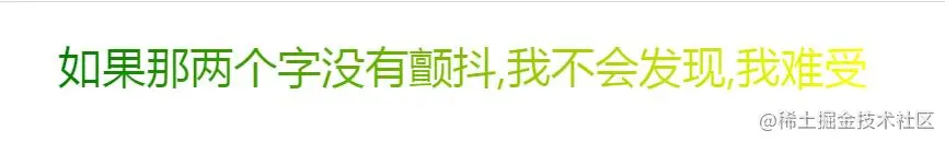
效果图

代码
<!DOCTYPE html>
<html lang="en">

<head>
    <meta charset="UTF-8">
    <meta name="viewport" content="width=device-width, initial-scale=1.0">
    <title>歌词效果</title>
</head>
<style>
    .box {
        display: flex;
        height: 100px;
        width: 100%;
        justify-content: center;
        align-items: center;
        font-size: 40px;
        color: red;
    }

    @keyframes scan {
        0% {
            background-size: 0 100%;
        }

        100% {
            background-size: 100% 100%;
        }
    }

    .text {
        background: #7e7e7e -webkit-linear-gradient(left, green, yellow) no-repeat 0 0;
        -webkit-text-fill-color: transparent;
        -webkit-background-clip: text;
        background-size: 0 100%;
    }

    .load {
        background-size: 100% 100%;
        animation: scan 5s linear;
    }
</style>

<body>
    <div class="box">
        <span class="text load">
            如果那两个字没有颤抖,我不会发现,我难受
        </span>
    </div>
</body>

</html>
关键点
background: #7e7e7e -webkit-linear-gradient(left, green, yellow) no-repeat 0 0;
linear-gradient() 函数用于创建一个表示两种或多种颜色线性渐变的图片。

创建一个线性渐变,需要指定两种颜色,还可以实现不同方向(指定为一个角度)的渐变效果,如果不指定方向,默认从上到下渐变。
linear-gradient(blue, red);
linear-gradient(45deg, blue, red);
linear-gradient(to left top, blue, red);
linear-gradient(0deg, blue, green 40%, red);


