五种方式:
float 布局:
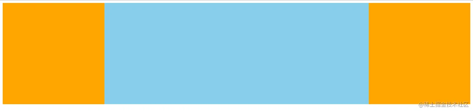
<!DOCTYPE html>
<html lang="en">
<head>
<meta charset="UTF-8">
<meta name="viewport" content="width=device-width, initial-scale=1.0">
<title>Document</title>
<style>
.output {
width: 100%;
height: 300px;
min-width: 600px;
}
.side {
height: 300px;
width: 300px;
background-color: orange;
}
.side-left {
float: left;
}
.side-right {
float: right;
}
.mid {
float: left;
width: calc(100% - 600px);
height: 300px;
background-color: skyblue;
}
</style>
</head>
<body>
<div class="output">
<div class="side side-left"></div>
<div class="side side-right"></div>
<div class="mid"></div>
</div>
<script>
</script>
</body>
</html>
position 布局:
<!DOCTYPE html>
<html lang="en">
<head>
<meta charset="UTF-8">
<meta name="viewport" content="width=device-width, initial-scale=1.0">
<title>Document</title>
<style>
.output {
width: 100%;
height: 300px;
position: relative;
}
.inner {
width: 300px;
height: 300px;
background-color: orange;
position: absolute;
}
.left {
left: 0;
}
.right {
right: 0;
}
.mid {
left: 300px;
right: 300px;
height: 300px;
position: absolute;
background-color: lightblue;
}
</style>
</head>
<body>
<div class="output">
<div class="inner left"></div>
<div class="mid"></div>
<div class="inner right"></div>
</div>
<script>
</script>
</body>
</html>
table布局:
<!DOCTYPE html>
<html lang="en">
<head>
<meta charset="UTF-8">
<meta name="viewport" content="width=device-width, initial-scale=1.0">
<title>Document</title>
<style>
.outer{
display: table;
}
.inner{
width: 300px;
height: 300px;
background-color:orange;
}
.mid{
display: table-cell;
background-color:lightblue;
width: 100%;
}
</style>
</head>
<body>
<div class="outer">
<div class="inner left"></div>
<div class="inner mid"></div>
<div class="inner right"></div>
</div>
<script>
</script>
</body>
</html>
flex布局:
<!DOCTYPE html>
<html lang="en">
<head>
<meta charset="UTF-8">
<meta name="viewport" content="width=device-width, initial-scale=1.0">
<title>Document</title>
<style>
.outer{
display: flex;
}
.inner{
width: 300px;
height: 300px;
background-color: orchid;
}
.mid{
flex: auto;
background-color: lightblue;
}
</style>
</head>
<body>
<div class="outer">
<div class="inner left"></div>
<div class="inner mid"></div>
<div class="inner right"></div>
</div>
<script>
</script>
</body>
</html>
grid布局:
<!DOCTYPE html>
<html lang="en">
<head>
<meta charset="UTF-8">
<meta name="viewport" content="width=device-width, initial-scale=1.0">
<title>Document</title>
<style>
.outer{
display: grid;
grid-template-rows: 300px;
grid-template-columns:300px auto 300px;
}
.inner{
background-color: orange;
}
.mid{
background-color: lightgoldenrodyellow;
}
</style>
</head>
<body>
<div class="outer">
<div class="inner left"></div>
<div class="inner mid"></div>
<div class="inner right"></div>
</div>
<script>
</script>
</body>
</html>


