linear-gradient线性渐变生成气泡带三角
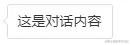
.talk {
    border: 1px solid #ddd;
    border-radius: 3px;
    padding: 6px 10px;
    font-size: 14px;
    background-color: #fff;
    position: relative;
}
.talk::before {
    content: '';
    position: absolute;
    width: 6px; height: 6px;
    background: linear-gradient(to top, #ddd, #ddd) no-repeat, linear-gradient(to right, #ddd, #ddd) no-repeat, linear-gradient(135deg, #fff, #fff 6px, hsla(0,0%,100%,0) 6px) no-repeat;
    background-size: 6px 1px, 1px 6px, 6px 6px;
    transform: rotate(-45deg);
    left: -4px; top: 13px;
}
border-color实现三角
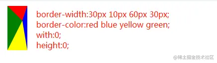
@mixin triangle($width, $height, $color, $direction) {
$width: $width/2;
$color-border-style: $height solid $color;
$transparent-border-style: $width solid transparent;
height: 0;
width: 0;
@if $direction==up {
border-bottom: $color-border-style;
border-left: $transparent-border-style;
border-right: $transparent-border-style;
}
@else if $direction==right {
border-left: $color-border-style;
border-top: $transparent-border-style;
border-bottom: $transparent-border-style;
}
@else if $direction==down {
border-top: $color-border-style;
border-left: $transparent-border-style;
border-right: $transparent-border-style;
}
@else if $direction==left {
border-right: $color-border-style;
border-top: $transparent-border-style;
border-bottom: $transparent-border-style;
}
}
CSS3的clip-path属性实现三角
.triangle{
width: 10px;
height: 10px;
background: red;
clip-path: polygon(0px 0px, 5px 10px, 10px 0px);
transform: rotate(180deg);
}


