

老铁记得 转发 ,猫哥会呈现更多 Flutter 好文~~~~
微信 flutter 研修群 ducafecat
猫哥说
这是一套用来做 Windows UWP APP 的界面解决方案库
界面的搭建,菜单 导航 Tab 表单 常用控件 样式抽取 转场动画 图标 主题 自适应切换 都有了
如果你用的话可以 clone 一套,自己维护或者研究
原文
代码
参考
正文
流畅的设计是微软为设计漂亮的 Windows 程序提供的解决方案。Flutter 最终在 Google i/o 2021 中扩展了对 Windows UWP 的支持,这需要精心设计的 Windows 应用程序。在本文中,我将向您展示如何使用 Flutter 创建一个基本的 Fluent 设计应用程序。
本指南最适用于 Win32 和 UWP Flutter 应用程序。如果你还没有设置你的 UWP 扑动应用程序尚未,按照我的其他指南这样做。
添加所需的包
第一步是由 bdlukaa 安装 fluent_ui 包。
flutter pub add fluent_ui
现在,是时候开始创建我们的 Fluent Design 应用程序了!
FluentApp
在 main.dart 中,导入 fluent_ui 包:
import 'package:fluent_ui/fluent_ui.dart';
然后,在 build 函数中创建 FluentApp 小部件,这是 Fluent 应用的基础。
return FluentApp();
你的代码现在应该是这样的:
import 'package:fluent_ui/fluent_ui.dart';void main() {
  runApp(MyApp());
}

class MyApp extends StatefulWidget {
  @override
  State<StatefulWidget> createState() {
    // TODO: implement createState
    return MyAppState();
  }
}

class MyAppState extends State<MyApp> {
  @override
  Widget build(BuildContext context) {
    // TODO: implement build
    return FluentApp();
  }
}
与 MaterialApp 类似,FluentApp 也有一个主题属性,该属性接受 ThemeData() ,并允许您自定义应用程序的外观。还可以使用 darkTheme 属性设置单独的暗主题。
ThemeData ()的一些关键属性是 ecastcolor (高亮元素的颜色)和 scaffoldBackgroundColor (应用程序的背景颜色)。当然,还有很多其他属性,比如 iconTheme,buttonTheme 和 contentDialogTheme,它们可以让你分别自定义图标、按钮和对话框的外观。
下面是 FluentApp 中使用主题的一个例子:
return FluentApp(
      theme: ThemeData(
          scaffoldBackgroundColor: Colors.white,
          accentColor: Colors.blue,
          iconTheme: const IconThemeData(size: 24)),
      darkTheme: ThemeData(
          scaffoldBackgroundColor: Colors.black,
          accentColor: Colors.blue,
          iconTheme: const IconThemeData(size: 24)),
);
导航视图
NavigationView 控制 Fluent Design 页面之间的移动。在 Fluent App 的 home 属性中添加一个 NavigationView,如下所示:
return FluentApp(
        theme: ThemeData(
            scaffoldBackgroundColor: Colors.white,
            accentColor: Colors.blue,
            iconTheme: const IconThemeData(size: 24)),
        darkTheme: ThemeData(
            scaffoldBackgroundColor: Colors.black,
            accentColor: Colors.blue,
            iconTheme: const IconThemeData(size: 24)),
        home: NavigationView()
);
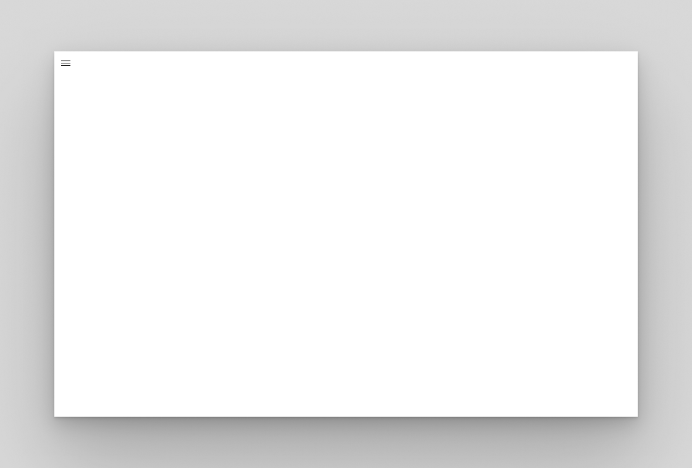
应用程序栏在很多 Windows 应用程序中都很常见,可以通过 appBar 属性中的 NavigationAppBar 实现到 NavigationView 中。
home: NavigationView(
          appBar: NavigationAppBar(
                 title: Text("Fluent Design App Bar")
          ),
      )
导航窗格
打开: 窗格被展开并放置在内容的左侧。每个类别或页面必须有一个图标
压缩: 窗格放置在内容的左侧,只显示图标,直到它被展开。
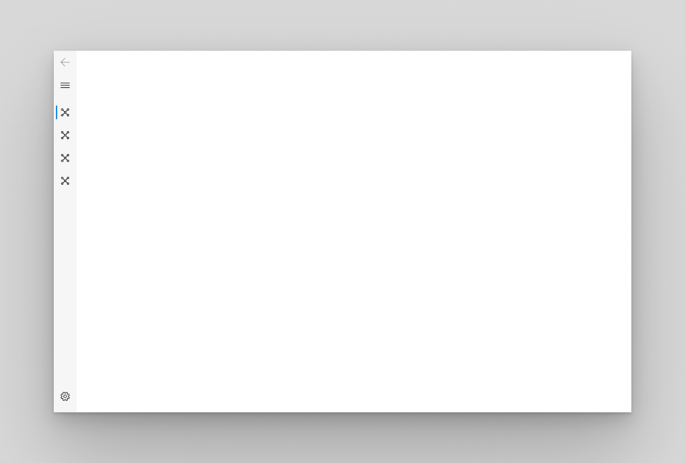
最小化: 在窗格展开之前,只显示菜单按钮。当展开时,它被放置在内容的左侧。
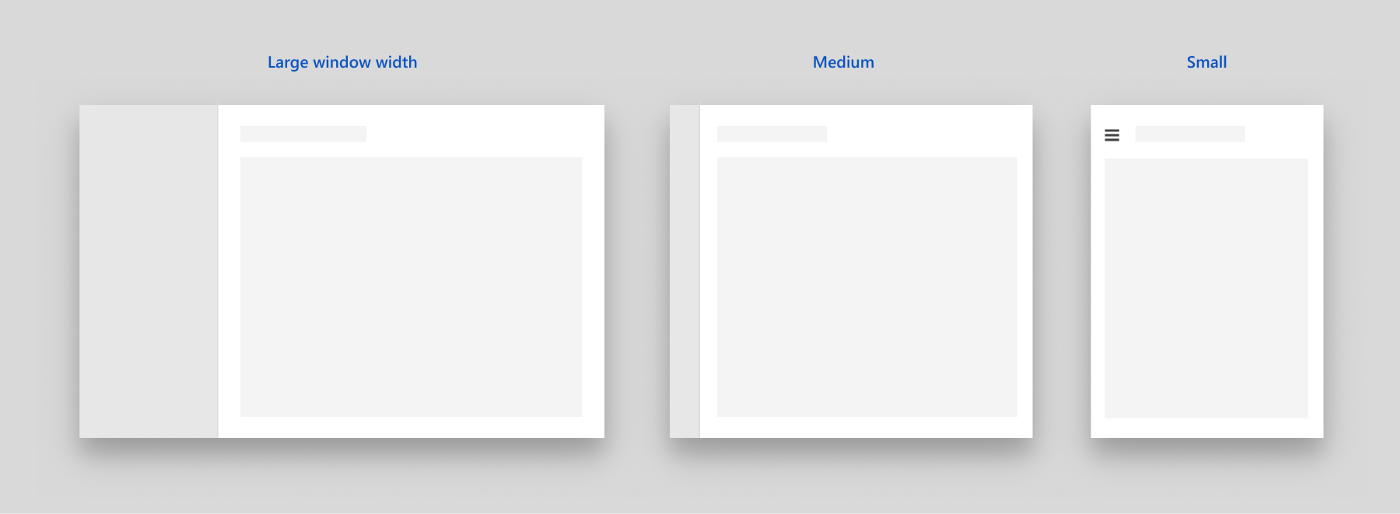
这个模式根据窗口的宽度动态地在 Minimal,Compact 和 Open 之间进行选择。
顶部: 窗格位于内容的上方。它对于不能用图标表示的类别或页面很有用。
要创建 NavigationPane,可以使用 NavigationView 的 pane 属性。然后,我们可以将 displayMode 设置为 PaneDisplayMode.auto,PaneDisplayMode.open,panedisplaymode.com pact,PaneDisplayMode.minimal 或 PaneDisplayMode.top。
home: NavigationView(
          appBar: NavigationAppBar(
            title: Text("Fluent Design App Bar")),
          pane: NavigationPane(
            displayMode: PaneDisplayMode.auto,
          ),
      )
接下来,我们需要在 NavigationPane 中指定项目。我们可以将 items 属性设置为 PaneItems 列表。每个 PaneItem 接受一个图标和一个标题。以下是我的例子:
pane: NavigationPane(
            displayMode: PaneDisplayMode.auto,
            items: [
              PaneItem(
                icon: Icon(Icons.code),
                title: Text("Sample Page 1")
              ),
              PaneItem(
                icon: Icon(Icons.desktop_windows_outlined),
                title: Text("Sample Page 2")
              )
            ]
          ),

现在,在 MyAppState 类中创建一个 int 类型的变量 index。这将负责管理 NavigationPane 中选定的页面。
class MyAppState extends State<MyApp> {
  int index = 0;
现在,我们将索引链接为 NavigationPane 的选定索引。将 NavigationPane 的选定属性设置为索引。
pane: NavigationPane(
            selected: index,
...
要在选定的 PaneItem 更改时更新索引变量,我们需要指定 onChanged 属性。
pane: NavigationPane(
            selected: index,
            onChanged: (newIndex){
              setState(() {
                index = newIndex;
              });
            },
...
可选: 要在 NavigationPane 中添加 Acrylic 透明效果,可以在 NavigationView 中将 usecrylic 属性设置为 true。
home: NavigationView(
          appBar: NavigationAppBar(
            title: Text("Fluent Design App Bar")),
          useAcrylic: true,
...
NavigationBody
NavigationBody 用于将页面转换实现为导航视图,并在页面之间切换时执行相关转换。
我们可以将 NavigationBody 设置为 NavigationView 的内容属性。
home: NavigationView(
          content: NavigationBody(),
...
接下来,我们需要指定 index 属性作为 NavigationPane 的选定索引。我们可以将它设置为我们的索引变量。
home: NavigationView(
          content: NavigationBody(
            index: index
          ),
...
然后,我们需要将 children 属性指定为一个 List,其中包含要为每个 PaneItem 显示的小部件。注意: children 属性中小部件的顺序必须与 PaneItem 小部件的顺序相同。
通常,这些窗口小部件是脚手架页面小部件:
content: NavigationBody(
            index: index,
            children: [
              ScaffoldPage(),
              ScaffoldPage(),
            ],
          ),
脚手架页面
脚手架 page 是 Fluent Design 中的 Material Scaffold。
Header 属性指定顶部栏。
ScaffoldPage(
      header: Text(
        "Sample Page 1",
        style: TextStyle(fontSize: 60),
      ),
    ),
Content 属性指定 ScaffoldPage 中的其他小部件,类似于 Material Scaffold 中的 body 属性。
ScaffoldPage(
      header: Text(
        "Sample Page 1",
        style: TextStyle(fontSize: 60),
      ),
      content: Center(
        child: Text("Welcome to Page 1!"),
      ),
    );
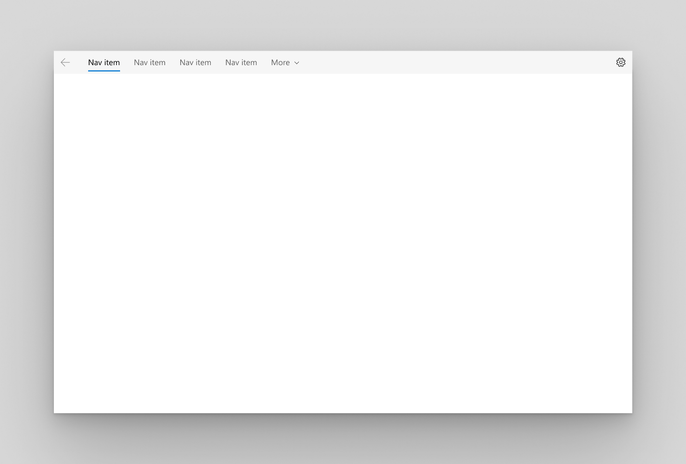
下面是我的应用程序到目前为止的样子:
Navigator.push & Navigator.pop
FluentApp 支持和 MaterialApp 相同的导航功能,因为我们都喜欢它。然而,当在 FluentApp 中浏览页面时,我们使用 FluentPageRoute 来代替 MaterialPageRoute。
Navigator.push(context, FluentPageRoute(builder: (context) => Page2()));
© 猫哥
往期
开源
GetX Quick Start
新闻客户端
strapi 手册译文
微信讨论群 ducafecat
系列集合
译文
开源项目
Dart 编程语言基础
space.bilibili.com/404904528/c…
Flutter 零基础入门
space.bilibili.com/404904528/c…
Flutter 实战从零开始 新闻客户端
space.bilibili.com/404904528/c…
Flutter 组件开发
space.bilibili.com/404904528/c…
Flutter Bloc
space.bilibili.com/404904528/c…
Flutter Getx4
space.bilibili.com/404904528/c…
