

浏览器的私有前缀
浏览器私有前缀,是浏览器对于新CSS属性的一个提前支持;加前缀是兼容老版本的写法,比较新版本的浏览器都支持直接写
 Gecko内核    CSS前缀为"-moz-"    如火狐浏览器

 WebKit内核  CSS前缀为"-webkit-"    如Chrome、Safari

 Presto内核      CSS前缀为"-o-"      如 Opera(欧朋)

 Trident内核     CSS前缀为"-ms-"    如IE
新增属性选择器
旧:E[attr="val"]
-
E[attr^="val"]选择拥有attr属性且属性值为val开头的E元素 -
E[attr$="val"]选择拥有attr属性且属性值以val结束的E元素 -
E[attr*="val"]选择拥有attr属性且属性值中包含val的E元素
新增结构性伪类选择器
-
E:first-child{}选择父元素中的第一个子元素E -
E:last-child{}选择父元素中的最后一个子元素E -
E:nth-child(n){}选择父元素中的第n个子元素En的取值: 数字
表达式 2n 2n+1 3n
关键词 even(偶数) odd(奇数)
-
E:nth-last-child(n){}选择父元素中倒数第n个子元素E -
E:nth-of-type(n){}选择父元素中类型为E的【正数第n个】子元素 数字
表达式 2n 2n+1 3n
关键词 even(偶数) odd(奇数)
-
E:nth-last-of-type(n){}选择父元素中【倒数第n个】子元素E
新增状态伪类选择器
input[type=text]:enabled/disabled/checked
边框属性
-
border-radius: 【空格隔开】一个值: 四个角的水平和垂直半径
两个值: 对角(左上右下 右上左下 水平和垂直)
三个值: 左上 右上左下 右下
四个值: 左上 右上 右下 左下
-
box-shadow:x轴偏移 y轴偏移 模糊值 颜色;
正值:向右 向下
x轴偏移 y轴偏移 模糊值 增强值 颜色;
x轴偏移 y轴偏移 模糊值 增强值 颜色 inset(内阴影);
背景属性
-
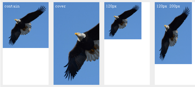
background-size:cover/contain/百分比/px
设置背景图片大小。图片可以保有其原有的尺寸,或者拉伸到新的尺寸,或者在保持其原有比例的同时缩放到元素的可用空间的尺寸。
.box2{
	background-size: 100px 100px;  /* 设置两个图片的大小*/
}
.box3{
	background-size: 100% 50%;
}
.box4{
	background-size: cover; /*覆盖拉伸*/
    background-repeat: no-repeat; /*不重复*/
}
.box5{
	background-size: contain;  /*保持原有尺寸*/
    background: url(images/pic2.jpeg) no-repeat left top; /*复合属性 left top 左上角位置*/
}
- background-origin:content-box/border-box/padding-box
background-origin规定了指定背景图片background-image属性的原点位置的背景相对区域.
.box2{
	background-origin: content-box;
}
.box3{
	background-origin: padding-box;
}
.box4{
	background-origin: border-box;
}
- background-clip
background-clip 设置元素的背景(背景图片或颜色)是否延伸到边框、内边距盒子、内容盒子下面。
background-clip:border-box 背景延伸至边框外沿(但是在边框下层)。
background-clip:padding-box 背景延伸至内边距(padding)外沿。不会绘制到边框处。
background-clip:content-box 背景被裁剪至内容区(content box)外沿。
background-clip:text  背景被裁剪成文字的前景色。
-webkit-background-clip: text;
color: transparent;  颜色透明
渐变
linear-gradient()
/* 渐变轴为45度,从蓝色渐变到红色 */
linear-gradient(45deg, blue, red);

/* 从右下到左上、从蓝色渐变到红色 */
linear-gradient(to left top, blue, red);

/* 从下到上,从蓝色开始渐变、到高度40%位置是绿色渐变开始、最后以红色结束 */
linear-gradient(0deg, blue, green 40%, red);
.box1{
    /*默认从上到下渐变*/
    background: -webkit-linear-gradient(red, yellow);
    background: -o-linear-gradient(red, yellow);
    background: -ms-linear-gradient(red, yellow);
    background: linear-gradient(red, yellow);/* 标准的语法(必须放在最后) */
}
.box2{
    background: -webkit-linear-gradient(left,red,yellow);
    background: -o-linear-gradient(left,red,yellow);
    background: -ms-linear-gradient(left,red,yellow);
    background: linear-gradient(left,red,yellow);
}
.box3{
    background: -webkit-linear-gradient(180deg,red,yellow);
    background: -o-linear-gradient(180deg,red,yellow);
    background: -ms-linear-gradient(180deg,red,yellow);
    background: linear-gradient(180deg,red,yellow);
}
radial-gradient()
.box5{
    width: 260px;
    background: -webkit-radial-gradient(red 20%,yellow 50%);
    background: -o-radial-gradient(red 20%,yellow 50%);
    background: -ms-radial-gradient(red 20%,yellow 50%);
    background: radial-gradient(red 20%,yellow 50%);
}
用户界面
box-sizing
CSS 中的 box-sizing 属性定义了 user agent 应该如何计算一个元素的总宽度和总高度。
content-box
默认值,标准盒子模型。 width 与 height 只包括内容的宽和高, 不包括边框(border),内边距(padding),外边距(margin)。注意: 内边距、边框和外边距都在这个盒子的外部。 比如说,.box {width: 350px; border: 10px solid black;} 在浏览器中的渲染的实际宽度将是 370px。
尺寸计算公式:
width = 内容的宽度
height = 内容的高度
宽度和高度的计算值都不包含内容的边框(border)和内边距(padding)。
border-box
width 和 height 属性包括内容,内边距和边框,但不包括外边距。这是当文档处于 Quirks模式 时Internet Explorer使用的盒模型。注意,填充和边框将在盒子内 , 例如, .box {width: 350px; border: 10px solid black;} 导致在浏览器中呈现的宽度为350px的盒子。内容框不能为负,并且被分配到0,使得不可能使用border-box使元素消失。
尺寸计算公式:
width = border + padding + 内容的宽度
height = border + padding + 内容的高度
.box2 {
    box-sizing: content-box;/*默认值*/
}

.box3 {
    box-sizing: border-box;/* 此时盒子的width值包括左右padding+左右border+内容*/
}
resize
resizeCSS 属性允许你控制一个元素的可调整大小性。
none
元素不能被用户缩放。
both
允许用户在水平和垂直方向上调整元素的大小。
horizontal
允许用户在水平方向上调整元素的大小。
vertical
允许用户在垂直方向上调整元素的大小。
resize: both;
resize: horizontal;
resize: vertical;
