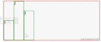
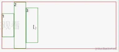
flex-direction 流动方向
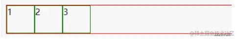
flex-direction: row; 将flex内容顺序排列
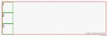
flex-direction: column; 将flex里的内容方向改为列
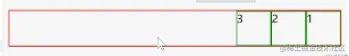
flex-direction: row-reverse; 将flex内容从右往左排
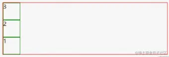
flex-direction: column-reverse; 将flex内容方向改为列且反方向排
flex-wrap改变折行
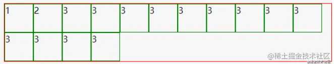
flex-wrap: wrap; 将flex内容折行,反之不折行: flex-wrap: nowrap;
flex-wrap: wrap-reverse;反方向折行
justify-content主轴对齐方式
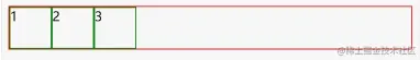
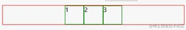
justify-content: flex-start; 顺序排
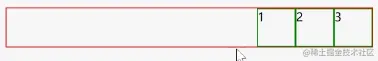
justify-content: flex-end; 都往后靠
justify-content: center;居中
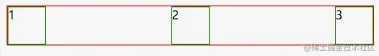
justify-content: space-between;把空间放中间
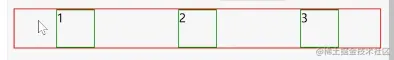
justify-content: space-around;把空间放在周围
align-items次轴的对齐方式
align-items: flex-start; 次轴 顺序
align-items: flex-end;次轴 倒序
align-items: center; 次轴居中
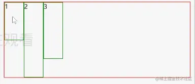
align-items: stretch; 跟着最高高度填充(一样高)
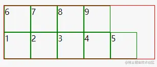
align-content多行内容
align-content: flex-start;   多行都集中在顶部
align-content: flex-end;    多行都集中在底部
align-content: center;    多行居中
align-content: space-between;  行与行之间保持相等距离
align-content: around;  每行周围保持相等距离
align-content: stretch;  每一行都被拉伸以充满容器


