

翻译自:Exploring @property and its Animating Powers | CSS-Tricks
作者: Jhey Tompkins 译者:大白
在了解 @property 之前,一些背景知识可能会有所帮助。
CSS 自定义属性 (Custom Property)已经受到了广泛的支持,并已经被使用在了许多前端组件库中,如 Material-UI。
带有前缀--的属性名,比如 --example—name,表示的是带有值的自定义属性,其可以通过 var() 函数在全文档范围内复用 — MDN
/* Modifed from MDN example*/
:root {
    /* 定义在伪根节点所以全局可用 */
  --main-bg-color: #488cff;
}

#firstParagraph {
    /* var(自定义属性值, 回退值)*/
  background-color: var(--main-bg-color, blue);
}
它能够帮助我们更好的管理复杂样式中的值,并且提升代码的可读性(毕竟 --main-bg-color 总是比 #488cff 更能清楚的描述值的意思)。但是在当前的使用中,我们没办法利用自定义属性稳定地实现动画效果。
Notably, they can even be transitioned or animated,since the UA has no way to interpret their contents, they always use the “flips at 50%” behavior that is used for any other pair of values that can’t be intelligently interpolated.
尤其是,它们(自定义属性)甚至可以被过渡或动画化,但因为用户代理无法解释这些内容,它们永远采用为所有它们不能智能补值的值所采用的“抛硬币”行为。 — CSS Custom Properties for Cascading Variables Module Level 1
而 @property 则帮助我们达成了这一目标,它允许我们明确的定义这些 CSS 自定义属性,例如为其提供类型,默认值,以及定义这些值是否应该继承 @property。这篇文章详细介绍了具体的实现方法。
@property --property-name {
  syntax: '<color>';
  initial-value: #c0ffee;
  inherits: false;
}
需要注意的是,@property 仍然处于 Working Draft 阶段,生产上的使用也许需要等待更多浏览器的支持 CSS Properties and Values API Level 1
正文
额,什么是 @property? 它是一个新的 CSS 特性!它让你具有了超能力。我不是在开玩笑,有一些 @property 可以做到的事解锁了我们以前从未能在 CSS 中做到的事。
虽然所有有关于 @property 的事都令人兴奋,但最有意思的莫过于它提供了一种为自定义 CSS 属性明确类型的方式。类型为浏览器提供了更多的上下文信息,而这成就了一些很酷的事:我们可以为浏览器提供它所需要来过渡以及动画化这些属性所需要的信息。
但在我们对其过于飘飘然之前,值得提到的是浏览器对它的支持还不完善。在这篇文章写作的时候,@property 只在 Chrome 以及 Edge(通过扩展)中支持。我们需要持续观察 浏览器支持 来了解我们什么时候才能在其他地方,比如 Firefox 以及 Safari ,中使用它。
首先,我们有了类型检查
@property --spinAngle {
  /* 自定义属性的初始值 */
  initial-value: 0deg;
  /* 是否应该从父级元素继承 */
  inherits: false;
  /* 类型。对,类型。觉得 TypeScript 酷吗 */
  syntax: '<angle>';
}

@keyframes spin {
  to {
    --spinAngle: 360deg;
  }
}
没有错!CSS 中的类型检查。它有点像在创建我们自己的迷你 CSS 规范。这仅仅是一个很简单的例子。看看我们可以使用的所有类型
-
length
-
number
-
percentage
-
length-percentage
-
color
-
image
-
url
-
integer
-
angle
-
time
-
resolution
-
transform-list
-
transform-function
-
custom-ident (一个自定义辨识字符串)
在有上述这些类型之前,我们需要依赖一些 “技巧” 来支持使用自定义属性的动画。
.jump
--size 50
--height 1
--squished calc(1 + (2 * (var(--height) / 10)))
--extended calc(1 - (2 * (var(--height) / 10)))
height calc(var(--size) * 1px)
width calc(var(--size) * 1px)
background radial-gradient(circle at 10% 10%, hsl(25, 100%, 70%), hsl(25, 100%, 40%))
transform-origin bottom center
animation jump 1s infinite ease
@keyframes jump
  0%, 100%
    transform translate(0, 0) scale(var(--squished), var(--extended))
  25%, 75%
    transform translate(0, 0) scale(1, 1)
  50%
    /* 注意这里 */
    transform translate(0, calc(var(--height) * -100%)) scale(var(--extended), var(--squished))

#jump:checked ~ .ground .jump
  --height 1

#higher:checked ~ .ground .jump
  --height 2

#highest:checked ~ .ground .jump
  --height 3

#jump:checked ~ [for='jump'],
#higher:checked ~ [for='higher'],
#highest:checked ~ [for='highest']
  background hsl(24,100%, 75)

label[for]:hover
  background hsl(24, 100%, 85)
那我们可以用它来做哪些有趣的事?让我们看看 (例子)来激发我们的想象力吧。
让我们动画化颜色
你会如何动画化一个元素来展示一系列颜色活在它们间变换?我是一个 HSL 色彩空间(Color Space)的忠实支持者,因为它将颜色拆分为了一些容易理解的数字:分别为色相(Hue),饱和度 (Saturation)以及亮度 (Lightness)。
动画化色相感觉像是一些我们能做的有趣的的事。什么是色彩丰富的?一道彩虹!有很多方法能画出一道彩虹,以下就是一例。
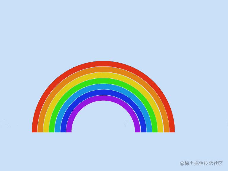
.rainbow
- let b = 0
while b < 7
.rainbow__band(style=`--index: ${b};`)
-- b++
*
box-sizing border-box
body
min-height 100vh
display grid
place-items center
background hsl(210, 80%, 90%)
.rainbow
height 25vmin
width 50vmin
position relative
overflow hidden
&__band
--size calc((50 - (var(--index, 0) * 4)) * 1vmin)
height 50vmin
width 50vmin
border-radius 50%
position absolute
top 100%
left 50%
border-width 2vmin
border-style solid
// 注意这里
border-color 'hsl(%s, 80%, 50%)' % var(--hue, 10)
transform translate(-50%, -50%)
height var(--size)
width var(--size)
&:nth-of-type(2)
--hue 35
&:nth-of-type(3)
--hue 55
&:nth-of-type(4)
--hue 110
&:nth-of-type(5)
--hue 200
&:nth-of-type(6)
--hue 230
&:nth-of-type(7)
在这个例子中,CSS 自定义属性被设置到了彩虹的每一个带(band)上,并通过使用 :nth-child() 来将他们的作用域设置在每一个单独的带上。每一个带同时有一个 --index 来帮助它们调整尺寸。
为了动画化这些带,我们可以使用 --index 来为他们设一些负的动画延迟,然后使用同样的 keyframe 动画来循环变换它们的颜色。
.rainbow__band {
  border-color: hsl(var(--hue, 10), 80%, 50%);
  animation: rainbow 2s calc(var(--index, 0) * -0.2s) infinite linear;
}

@keyframes rainbow {
  0%, 100% {
    --hue: 10;
  }
  14% {
    --hue: 35;
  }
  28% {
    --hue: 55;
  }
  42% {
    --hue: 110;
  }
  56% {
    --hue: 200;
  }
  70% {
    --hue: 230;
  }
  84% {
    --hue: 280;
  }
}
如果你想要 ”分步“ 的效果,这可能看起来还好。但这些 keyframe 的每一步并不是特别的准确。我每一步使用了 14% 作为一个大致的区间。
我们可以动画化 border-color,而这可以实现我们的效果。但我们仍然有计算 keyframe 步长的问题。并且我们需要写很多 CSS 来完成这个效果。
@keyframes rainbow {
  0%, 100% {
    border-color: hsl(10, 80%, 50%);
  }
  14% {
    border-color: hsl(35, 80%, 50%);
  }
  28% {
    border-color: hsl(55, 80%, 50%);
  }
  42% {
    border-color: hsl(110, 80%, 50%);
  }
  56% {
    border-color: hsl(200, 80%, 50%);
  }
  70% {
    border-color: hsl(230, 80%, 50%);
  }
  84% {
    border-color: hsl(280, 80%, 50%);
  }
}
@property 入场了。首先,为色相定义一个自定义属性。这告诉浏览器,--hue,将会是一个数字 (而不是一个看起来像数字的字符串):
@property --hue {
  initial-value: 0;
  inherits: false;
  /* 这里我们明确了类型 */
  syntax: '<number>';
}`


HSL 中的色相值可以从 0 增加到 360。我们从 0 作为初始值开始。这个值将不会继承。并且在这个案例中,我们的值是一个数字。那么动画就会被简化成:
`@keyframes rainbow {
  to {
    --hue: 360;
  }
}
对的,正是这样:
为了让起点准确,我们可以调整每个带的延迟。这给了我们一些很酷的灵活性。比如说,我们可以提高 animation-duration 来获得一个慢的循环。用下面这个例子来尝试一下不同的速度
&__band
  --size calc((50 - (var(--index, 0) * 4)) * 1vmin)
  height 50vmin
  width 50vmin
  border-radius 50%
  position absolute
  top 100%
  left 50%
  border-width 2vmin
  border-color 'hsl(%s, 80%, 50%)' % var(--hue)
  border-style solid
  transform translate(-50%, -50%)
  height var(--size)
  width var(--size)
  // 这里
  animation rainbow calc(var(--duration, 8) * 1s) calc(var(--index, 0) * -0.2s) infinite linear
这也许不是 “最天马行空” 的例子,但我觉得当我们使用数字有逻辑性的颜色空间的时候,动画化颜色有一些很有趣的使用场景。在以前动画化色轮需要一些技巧。比如说通过预处理器,例如 Stylus,来生成 keyframe。
@keyframes party
for $frame in (0..100)
    {$frame _ 1%}
background 'hsl(%s, 65%, 40%)' % (\$frame _ 3.6)
我们会这样做仅仅是因为浏览器不能理解我们想做什么。浏览器会把从色轮上从 0 变换到 360 的过程理解为一个瞬间的过渡,因为起点和终点的 HSL 值都表示一样的颜色。
@keyframes party {
  from {
    background: hsl(0, 80%, 50%);
  }
  to {
    background: hsl(360, 80%, 50%);
  }
}
这些 keyframe 都一样,所以浏览器假定这个动画将会停留在同样的 backgound 值上,虽然我们想让浏览器渲染整个光谱的颜色,从一个值开始做一些动作后结束在同样的值。
想一下我们所有其它的使用场景。我们可以:
- 动画化饱和度
- 使用不同的缓动函数
- 动画化亮度
- 尝试 rgb()
- 尝试 hsl()中的角度,并声明我们的自定义属性类型为 最棒的是我们可以在不同的元素中有作用域地共用这个动画化的值。考虑一下这个按钮。它的 border 和 shadow 会在鼠标悬浮的时候流转一整个色轮的颜色。
button Start Party!
@import url('https://fonts.googleapis.com/css2?family=Inter:wght@500&display=swap')

@property --hue
  syntax '<integer>'
  inherits true
  initial-value 0

:root
  --bg hsl(0, 0%, 10%)
  --button-bg hsl(0, 0%, 0%)

*
  box-sizing border-box

body
  background hsl(0, 0%, 10%)
  display flex
  align-items center
  justify-content center
  min-height 100vh
  transform-style preserve-3d
  perspective 800px

button
  --border 'hsl(%s, 0%, 50%)' % var(--hue, 0)
  --shadow 'hsl(%s, 0%, 80%)' % var(--hue, 0)
  user-select none
  font-family 'Inter', sans-serif
  font-size 2rem
  padding 1.25rem 2.5rem
  border-radius 0.5rem
  border 0.25rem solid
  background var(--button-bg)
  color hsl(0, 0%, 100%)
  border-color var(--border)
  box-shadow 0 1rem 2rem -1.5rem var(--shadow)
  transition transform 0.2s, box-shadow 0.2s
  cursor pointer
  outline transparent

  &:hover
    --border 'hsl(%s, 80%, 50%)' % var(--hue, 0)
    --shadow 'hsl(%s, 80%, 50%)' % var(--hue, 0)
    animation hueJump 0.75s infinite linear
    transform rotateY(10deg) rotateX(10deg)

  &:active
    transform rotateY(10deg) rotateX(10deg) translate3d(0, 0, -15px)
    box-shadow 0 0rem 0rem 0rem var(--shadow)
    animation-play-state paused

@keyframes hueJump
  to
    --hue 360
动画化颜色让我想到…… wow!
- const COUNT = 20
- let t = 0
while t < COUNT
  h1(style=`--index: ${COUNT - t};`) Wow!
  - t++
@import url('https://fonts.googleapis.com/css2?family=Montserrat:ital,wght@1,900&display=swap')

@property --hue
  inherits false
  initial-value 0
  syntax '<number>'

:root
  --bg hsl(45, 80%, 50%)
  --stroke hsl(0, 0%, 10%)

*
  box-sizing border-box

body
  min-height 100vh
  background var(--bg)
  font-family 'Montserrat', sans-serif
  min-height 100vh
  overflow hidden

h1
  --color 'hsl(%s, 80%, 60%)' % var(--hue)
  text-transform uppercase
  font-size 150px
  letter-spacing 0.25vmin
  position absolute
  margin 0
  top 50%
  left 50%
  line-height 0.8
  color var(--color)
  transform translate(-30%, -70%) translate(calc(var(--index) * (var(--x, -4) * 1%)), calc(var(--index) * (var(--y, 20) * 1%)))
  -webkit-text-stroke 1.25vmin var(--stroke)
  animation party 1s calc(var(--index) * -0.1s) infinite linear

@keyframes party
  0%
    --hue 0
  100%
    --hue 360
import gsap from 'https://cdn.skypack.dev/gsap'

document.addEventListener('pointermove', ({ x, y }) => {
  gsap.set('h1', {
    '--x': gsap.utils.mapRange(0, window.innerWidth, -10, 10, x),
    '--y': gsap.utils.mapRange(0, window.innerHeight, -10, 10, y)
  })
})
纯粹的计数
因为我们可以为数字定义类型—例如 integer 以及 number—这意味着我们也可以动画化这些数字,而不是将这些数字作为其它东西的一部分。 Carter Li 就在 CSS-Tricks 上写过一篇文章。秘诀就是使用 integer 以及 CSS counter 。 这类似于我们如何在 “纯 CSS” 游戏中使用 counters。
使用 counter 以及伪元素提供了一种将数字转成字符串的方法。然后我们可以使用这些字符作为伪元素的 content。以下是一些重点的部分:
@property --milliseconds {
  inherits: false;
  initial-value: 0;
  syntax: '<integer>';
}

.counter {
  counter-reset: ms var(--milliseconds);
  animation: count 1s steps(100) infinite;
}

.counter:after {
  content: counter(ms);
}

@keyframes count {
  to {
    --milliseconds: 100;
  }
}
这让我们获得这样的效果,非常酷
.counter
@property --milliseconds {
  inherits: false;
  initial-value: 0;
  syntax: '<integer>';
}

body {
  min-height: 100vh;
  display: grid;
  place-items: center;
  background: hsl(10, 10%, 10%);
}

.counter {
  position: relative;
  counter-reset: ms var(--milliseconds);
  animation: count 1s steps(100) infinite;
}

.counter:after {
  content: counter(ms);
  position: absolute;
  top: 0;
  left: 0;
  font-size: 5rem;
  transform: translate(-50%, 0);
  color: hsl(0, 0%, 100%);
  font-weight: bold;
  font-family: sans-serif;
}

@keyframes count {
  to {
    --milliseconds: 100;
  }
}
增强这个亿点点,然后你就有了了一个能运行的秒表,仅仅使用 CSS 和 HTML。 点击这些按钮试试!这里最好的就是这实际上能和计时器一样工作。 它不会受到 Time Drift 的影响 。在某种程度上甚至会比一般通过 setInterval 实现的 JavaScript 方案更精确。看看这个来自 Google Chrome Developer 关于 JavaScript 计数器的视频 。
Pure CSS Working Stopwatch 😎 (@property) 还有什么其他你可以动画化数字的地方?也许一个倒计时器?
动画化的渐变
你知道这些的, linear, radial, and conic . 有想过要过渡或者动画化颜色断点(Color Stop)的时候吗?好的,@property 可以实现这些效果。
考虑一下一个模仿沙滩上的浪的渐变。当我们将一些图片叠在一起的时候我们可以做出类似下面的东西:
body {
  background-image:
    linear-gradient(transparent 0 calc(35% + (var(--wave) * 0.5)), var(--wave-four) calc(75% + var(--wave)) 100%),
    linear-gradient(transparent 0 calc(35% + (var(--wave) * 0.5)), var(--wave-three) calc(50% + var(--wave)) calc(75% + var(--wave))),
    linear-gradient(transparent 0 calc(20% + (var(--wave) * 0.5)), var(--wave-two) calc(35% + var(--wave)) calc(50% + var(--wave))),
    linear-gradient(transparent 0 calc(15% + (var(--wave) * 0.5)), var(--wave-one) calc(25% + var(--wave)) calc(35% + var(--wave))), var(--sand);
}
这里代码比较多。但拆开来看,我们使用 calc() 来创建每个颜色断点。并且在计算中,我们添加了 --wave 的值。这里巧妙的技巧就是当我们动画化 --wave 的时候,所有的浪层都会移动。
*
  box-sizing border-box

:root
  --sand hsl(45, 40%, 50%)
  --wave-one hsl(200, 50%, 100%)
  --wave-two hsl(200, 50%, 90%)
  --wave-three hsl(210, 50%, 60%)
  --wave-four hsl(210, 80%, 25%)

@property --wave
  inherits false
  initial-value 0%
  syntax '<percentage>'

body
  background linear-gradient(transparent 0 calc(35% + (var(--wave) * 0.5)), var(--wave-four) calc(75% + var(--wave)) 100%),
             linear-gradient(transparent 0 calc(35% + (var(--wave) * 0.5)), var(--wave-three) calc(50% + var(--wave)) calc(75% + var(--wave))),
             linear-gradient(transparent 0 calc(20% + (var(--wave) * 0.5)), var(--wave-two) calc(35% + var(--wave)) calc(50% + var(--wave))),
             linear-gradient(transparent 0 calc(15% + (var(--wave) * 0.5)), var(--wave-one) calc(25% + var(--wave)) calc(35% + var(--wave))),
             var(--sand)
  min-height 100vh
以下是所有我们需要来实现海浪动画的代码:
body {
  animation: waves 5s infinite ease-in-out;
}
@keyframes waves {
  50% {
    --wave: 25%;
  }
}
如果不使用 @property 的话,我们的海浪就会在高和低间一步一步的循环。但有了 @property,我们就可以获得一个非常好的效果。
想到其它我们操作图像所能实现的场景就令人兴奋。比如说旋转。或者说动画化 conic-gradient….但,在一个 border-image 内。 Bramus Van Damme 非常好的解释了这一概念。
让我们通过实现一个充电指示器的方式一步步解释。我们会同时动画化角度以及色相。我们首先从定义这两个自定义属性开始:
@property --angle {
  initial-value: 0deg;
  inherits: false;
  syntax: '<number>';
}

@property --hue {
  initial-value: 0;
  inherits: false;
  syntax: '<angle>';
}
动画会在每次迭代的时候会先暂停一下,然后更新角度以及色相。
@keyframes load {
  0%, 10% {
    --angle: 0deg;
    --hue: 0;
  }
  100% {
    --angle: 360deg;
    --hue: 100;
  }
}
现在让我们将它作为 border-image 应用在元素上
.loader {
  --charge: hsl(var(--hue), 80%, 50%);
  border-image: conic-gradient(var(--charge) var(--angle), transparent calc(var(--angle) * 0.5deg)) 30;
  animation: load 2s infinite ease-in-out;
}
非常酷
.loader Charging...
*
  box-sizing border-box

:root
  --bg hsl(0, 10%, 10%)

body
  min-height 100vh
  background var(--bg)
  display grid
  place-items center

@property --a
  initial-value 0deg
  inherits false
  syntax '<angle>'
@property --h
  initial-value 0
  inherits false
  syntax '<number>'

.loader
  padding 2rem 4rem
  font-family monospace
  font-weight bold
  color hsl(0, 0%, 100%)
  border-style solid
  border-width 1vmin
  font-size 2rem
  --charge 'hsl(%s, 80%, 50%)' % var(--h, 0)
  border-image conic-gradient(var(--charge) var(--a), transparent calc(var(--a) + 0.5deg)) 30
  animation load 2s infinite ease-in-out

@keyframes load
  0%, 10%
    --a 0deg
    --h 0
  100%
    --a 360deg
    --h 100
不幸的是,**border-image** 和 **border-radius** 并不能很好的一起使用。但是,我们可以在元素后加一个伪元素。结合之前提到的动画化数字技巧,我们得到了一个完成的充电/加载动画。(是的,它会在 100% 电量的时候充电)
变换(Transform)也很酷
动画化变换的一个问题就是在不同的部分间过渡。它常常最后直接不成功或者看起来不像它该有的样子。个经典的例子就是一个被扔出去的球。我们想让它从 A 点移动到 B 点并同时模仿重力的效果。
一个早期的尝试可能看起来像这样:
@keyframes throw {
  0% {
    transform: translate(-500%, 0);
  }
  50% {
    transform: translate(0, -250%);
  }
  100% {
    transform: translate(500%, 0);
  }
}
但,我们马上就会发现它看起来并不是我们想要的。
<svg class="ball" viewBox="0 0 496 512" title="basketball-ball">
  <path d="M212.3 10.3c-43.8 6.3-86.2 24.1-122.2 53.8l77.4 77.4c27.8-35.8 43.3-81.2 44.8-131.2zM248 222L405.9 64.1c-42.4-35-93.6-53.5-145.5-56.1-1.2 63.9-21.5 122.3-58.7 167.7L248 222zM56.1 98.1c-29.7 36-47.5 78.4-53.8 122.2 50-1.5 95.5-17 131.2-44.8L56.1 98.1zm272.2 204.2c45.3-37.1 103.7-57.4 167.7-58.7-2.6-51.9-21.1-103.1-56.1-145.5L282 256l46.3 46.3zM248 290L90.1 447.9c42.4 34.9 93.6 53.5 145.5 56.1 1.3-64 21.6-122.4 58.7-167.7L248 290zm191.9 123.9c29.7-36 47.5-78.4 53.8-122.2-50.1 1.6-95.5 17.1-131.2 44.8l77.4 77.4zM167.7 209.7C122.3 246.9 63.9 267.3 0 268.4c2.6 51.9 21.1 103.1 56.1 145.5L214 256l-46.3-46.3zm116 292c43.8-6.3 86.2-24.1 122.2-53.8l-77.4-77.4c-27.7 35.7-43.2 81.2-44.8 131.2z" />
</svg>
*
  box-sizing border-box

body
  min-height 100vh
  display grid
  place-items center
  background hsl(190, 80%, 90%)


.ball
  height 10vmin
  width 10vmin
  border-radius 50%
  fill hsl(35, 80%, 50%)
  background hsl(35, 80%, 35%)
  animation throw 1s infinite alternate

@keyframes throw
  0%
    transform translate(-500%, 0)
  50%
    transform translate(0, -250%)
  100%
    transform translate(500%, 0)
以前,我们可能会使用包裹元素以及分别动画化这些元素来实现这一效果。但是,在有了 @property 之后, 我们可以同时动画化变换中每个独立的值。让我们快速看看这是如何通过定义自定义属性然后在球上设置变换实现的。
@property --x {
  inherits: false;
  initial-value: 0%;
  syntax: '<percentage>';
}

@property --y {
  inherits: false;
  initial-value: 0%;
  syntax: '<percentage>';
}

@property --rotate {
  inherits: false;
  initial-value: 0deg;
  syntax: '<angle>';
}

.ball {
  animation: throw 1s infinite alternate ease-in-out;
  transform: translateX(var(--x)) translateY(var(--y)) rotate(var(--rotate));
}
现在对于我们的动画来说,我们可以在 keyframe 组合我们想要的变换。
@keyframes throw {
  0% {
    --x: -500%;
    --rotate: 0deg;
  }
  50% {
    --y: -250%;
  }
  100% {
    --x: 500%;
    --rotate: 360deg;
  }
}
那么结果是?结果是我们获得了想要的曲线路径。并且我们可以根据使用的不同时序函数让它看起来不同。我们可以将这个动画拆成三个方向并且使用不同的时序函数。而这将会让球移动的方式有不同的结果。
让我们考虑另外一个例子,我们想驾驶一辆车环绕圆角四边形一周。
.road
img.car(src="https://assets.codepen.io/605876/little-red-car.png" alt="Little red car")
*
  box-sizing border-box

:root
  --road hsl(220, 8%, 50%)
  --grass hsl(90, 40%, 50%)
  --island hsl(45, 40%, 50%)
  --lines hsl(45, 80%, 90%)

@property --x
  inherits false
  initial-value -22.5
  syntax '<number>'

@property --y
  inherits false
  initial-value 0
  syntax '<number>'

@property --r
  inherits false
  initial-value 0deg
  syntax '<angle>'

body
  min-height 100vh
  display grid
  place-items center
  background var(--grass)

.car
  animation journey 5s infinite linear
  transform translate(calc(var(--x) * 1vmin), calc(var(--y) * 1vmin)) rotate(var(--r))
  width 3vmin
  object-fit cover

.road
  height 50vmin
  width 50vmin
  border-radius 12.5%
  border 5vmin solid var(--road)
  background var(--road)
  position absolute
  top 50%
  left 50%
  transform translate(-50%, -50%)

  &:before
    content ''
    position absolute
    height 44vmin
    width 44vmin
    border-radius 11%
    border 0.5vmin dashed var(--lines)
    top 50%
    left 50%
    transform translate(-50%, -50%)

  &:after
    content ''
    position absolute
    height 40vmin
    width 40vmin
    background var(--island)
    top 50%
    left 50%
    transform translate(-50%, -50%)
    border-radius 10%
我们可以使用类似之前在球上使用的方法
@property --x {
  inherits: false;
  initial-value: -22.5;
  syntax: '<number>';
}

@property --y {
  inherits: false;
  initial-value: 0;
  syntax: '<number>';
}

@property --r {
  inherits: false;
  initial-value: 0deg;
  syntax: '<angle>';
}
小车的变换使用了 vmin 来计算以保持响应性。
.car {
  transform: translate(calc(var(--x) * 1vmin), calc(var(--y) * 1vmin)) rotate(var(--r));
}`

现在我们可以写出这辆车精准的帧到帧行程了。我们可以从 --x 的值开始
`@keyframes journey {
  0%, 100% {
    --x: -22.5;
  }
  25% {
    --x: 0;
  }
  50% {
    --x: 22.5;
  }
  75% {
    --x: 0;
  }
}
我们可以看到车在 X 轴上的行程正确了。
然后我们在此之上添加 Y 轴的行程
@keyframes journey {
  0%, 100% {    --x: -22.5;
    --y: 0;
  }
  25% {
    --x: 0;
    --y: -22.5;
  }
  50% {
    --x: 22.5;
    --y: 0;
  }
  75% {
    --x: 0;
    --y: 22.5;
  }
}
但结果却不太对。
让我们添加一些额外的步骤到我们的 @keyframes 中来修复这一问题。
@keyframes journey {
  0%, 100% {
    --x: -22.5;
    --y: 0;
  }
  12.5% {
    --x: -22.5;
    --y: -22.5;
  }
  25% {
    --x: 0;
    --y: -22.5;
  }
  37.5% {
    --y: -22.5;
    --x: 22.5;
  }
  50% {
    --x: 22.5;
    --y: 0;
  }
  62.5% {
    --x: 22.5;
    --y: 22.5;
  }
  75% {
    --x: 0;
    --y: 22.5;
  }
  87.5% {
    --x: -22.5;
    --y: 22.5;
  }
}
嗯,现在看起来好多了
剩下的就是让这辆车旋转了。我们选了 5% 在角落的时间去旋转。这并不准确,但它展示了这种方法可以做到的潜力。
@keyframes journey {
  0% {
    --x: -22.5;
    --y: 0;
    --r: 0deg;
  }
  10% {
    --r: 0deg;
  }
  12.5% {
    --x: -22.5;
    --y: -22.5;
  }
  15% {
    --r: 90deg;
  }
  25% {
    --x: 0;
    --y: -22.5;
  }
  35% {
    --r: 90deg;
  }
  37.5% {
    --y: -22.5;
    --x: 22.5;
  }
  40% {
    --r: 180deg;
  }
  50% {
    --x: 22.5;
    --y: 0;
  }
  60% {
    --r: 180deg;
  }
  62.5% {
    --x: 22.5;
    --y: 22.5;
  }
  65% {
    --r: 270deg;
  }
  75% {
    --x: 0;
    --y: 22.5;
  }
  85% {
    --r: 270deg;
  }
  87.5% {
    --x: -22.5;
    --y: 22.5;
  }
  90% {
    --r: 360deg;
  }
  100% {
    --x: -22.5;
    --y: 0;
    --r: 360deg;
  }
}
然后我们有了想要的结果,一辆环绕圆角四边形的车。不用额外的包裹元素,也不需要复杂的数学。并且我们通过自定义属性实现了这一切。
通过变量驱动整个场景
我们到现在已经看了一些非常好的 @property 的使用场景,但将我们看到过的所有技巧组合在一起则可以将效果提升到另一个级别。比如来说,我们可以通过仅使用几个自定义属性驱动一整个场景。
考虑一下以下这个 404 页面的概念。两个注册的自定义属性驱动不同的移动部分。我们有一个通过 webkit-backgroun-clip 裁切的移动的渐变(模仿文字上的高光)。阴影通过读取属性的值移动(模仿文字形成的影子)。然后我们为了光的效果摆动另外一个元素(模仿摆动的光源)。
到此结束!
想到我们能用 @property 定义类型的能力所能做到的事真令人激动。通过提供浏览器一些关于自定义属性的额外上下文,我们可以达成一些以前使用基本字符串所不能实现的奇思妙想。
你对其它的类型有什么想法吗?时间和分辨率感觉能实现很有意思的过渡,虽然我承认我没能让他们像我想的那样工作。url 感觉也不错,比如说像走马灯(carousel) 一样在一系列来源 source 中变换。仅仅是在这头脑风暴(就给了我这些点子)。
我希望这篇对 @property 的快速展望能够激发你学习然后制作你自己的超赞例子的兴趣!我非常期待看到你的创意。事实上,请在评论中将它们分享给我。
原文链接:css-tricks.com/exploring-p…
欢迎关注「 字节前端 ByteFE 」简历投递联系邮箱「 tech@bytedance.com 」
