2022-css3动效
成果展示
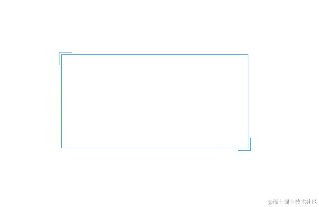
- 正常打开
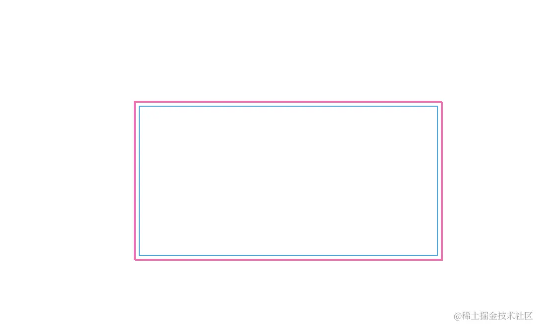
- 鼠标移入
html 代码
 <body>
    <div></div>
  </body>
css3 代码
<style>
html,
body {
width: 100%;
height: 100%;
display: flex;
margin: 0;
padding: 0;
}
:root {
--borderColor: #03a9f3;
--divWidth: 300px;
--divHeight: 150px;
--w20: 20px;
}
div {
width: var(--divWidth);
height: var(--divHeight);
border: 1px solid var(--borderColor);
margin: 200px auto;
position: relative;
}
div::before,
div::after {
content: " ";
position: absolute;
width: var(--w20);
height: var(--w20);
transition: 0.3s ease-in-out;
}
div::before {
top: -5px;
left: -5px;
border-top: 1px solid var(--borderColor);
border-left: 1px solid var(--borderColor);
}
div::after {
right: -5px;
bottom: -5px;
border-bottom: 1px solid var(--borderColor);
border-right: 1px solid var(--borderColor);
}
div:hover::before,
div:hover::after {
width: calc(100% + 9px);
height: calc(100% + 9px);
border: 1px solid hotpink;
}
</style>
完整的成功展示代码
<!DOCTYPE html>
<html lang="en">
<head>
<meta charset="UTF-8" />
<meta name="viewport" content="width=device-width, initial-scale=1.0" />
<title>Document</title>
<style>
html,
body {
width: 100%;
height: 100%;
display: flex;
margin: 0;
padding: 0;
}
:root {
--borderColor: #03a9f3;
--divWidth: 300px;
--divHeight: 150px;
--w20: 20px;
}
div {
width: var(--divWidth);
height: var(--divHeight);
border: 1px solid var(--borderColor);
margin: 200px auto;
position: relative;
}
div::before,
div::after {
content: " ";
position: absolute;
width: var(--w20);
height: var(--w20);
transition: 0.3s ease-in-out;
}
div::before {
top: -5px;
left: -5px;
border-top: 1px solid var(--borderColor);
border-left: 1px solid var(--borderColor);
}
div::after {
right: -5px;
bottom: -5px;
border-bottom: 1px solid var(--borderColor);
border-right: 1px solid var(--borderColor);
}
div:hover::before,
div:hover::after {
width: calc(100% + 9px);
height: calc(100% + 9px);
border: 1px solid hotpink;
}
</style>
</head>
<body>
<div></div>
</body>
</html>


