2022-css3动效
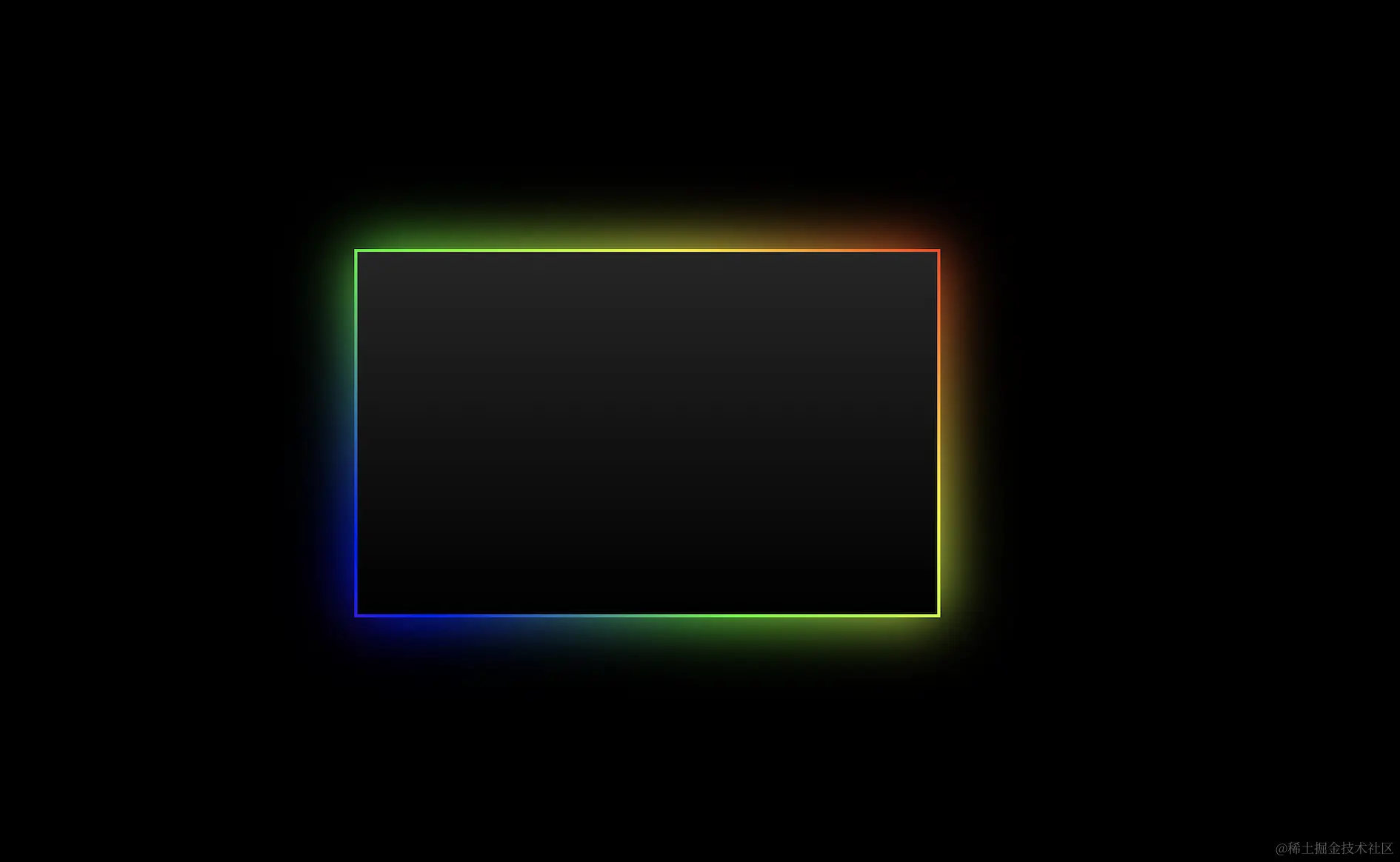
成果展示
html布局
<body>
    <div class="shadow"></div>
</body>
css样式
      body {
        margin: 0;
        padding: 0;
        background-color: #000;
      }
      .shadow {
        width: 400px;
        height: 250px;
        background: linear-gradient(to top, #000, #262626);
        margin: 200px auto;
        position: relative;
      }
      .shadow::before,
      .shadow::after {
        content: "";
        position: absolute;
        top: -2px;
        left: -2px;
        width: calc(100% + 4px);
        height: calc(100% + 4px);
        background: linear-gradient(45deg, #fb0094, #000fff, #00ff00, #ff0000, #fb0094, #000f00, #ffff00);
        background-size: 400%;
        z-index: -1;
        animation: animate 20s linear infinite;
        background-position: 0% 0;
      }

      @keyframes animate {
        0%{
          background-position: 0 0;
        }
        50%{
          background-position: 300% 0;
        }
        100%{
          background-position: 0 0;
        }
      }

      .shadow::after{
        filter: blur(20px);
      }
代码成果展示
<!DOCTYPE html>
<html lang="en">
  <head>
    <meta charset="UTF-8" />
    <meta name="viewport" content="width=device-width, initial-scale=1.0" />
    <title>Document</title>
    <style>
      body {
        margin: 0;
        padding: 0;
        background-color: #000;
      }
      .shadow {
        width: 400px;
        height: 250px;
        background: linear-gradient(to top, #000, #262626);
        margin: 200px auto;
        position: relative;
      }
      .shadow::before,
      .shadow::after {
        content: "";
        position: absolute;
        top: -2px;
        left: -2px;
        width: calc(100% + 4px);
        height: calc(100% + 4px);
        background: linear-gradient(45deg, #fb0094, #000fff, #00ff00, #ff0000, #fb0094, #000f00, #ffff00);
        background-size: 400%;
        z-index: -1;
        animation: animate 20s linear infinite;
        background-position: 0% 0;
      }

      @keyframes animate {
        0%{
          background-position: 0 0;
        }
        50%{
          background-position: 300% 0;
        }
        100%{
          background-position: 0 0;
        }
      }

      .shadow::after{
        filter: blur(20px);
      }


    </style>
  </head>
  <body>
    <div class="shadow"></div>
  </body>
</html>


