问题场景:有三个盒子,左右两个盒子固定宽度,中间盒子自适应,如何布局?
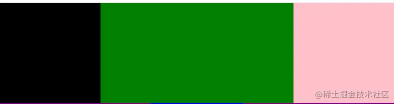
一、 自身浮动法
1. 原理:左右浮动,脱离标准流,中间不浮动,处在标准流之中,通过margin留出左右两个盒子的宽度。
2. 实现:左右分别采用浮动的方法,中间margin:0 width;
.left-1 {
float: left;
width: 200px;
height: 200px;
background-color: black;
}
.right-1 {
float: right;
width: 200px;
height: 200px;
background-color: pink;
}
.center-1 {
margin: 0 200px;
height: 200px;
background-color: green;
}
<div>
<div class="left-1"></div>
<div class="right-1"></div>
<div class="center-1"></div>
</div>
4. 效果图
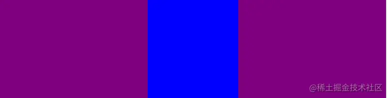
二、绝对定位法
1. 原理:两边绝对定位,脱离标准流,中间不脱离标准流,通过margin空出左右两个盒子的宽度。
2. 实现:左右position:absolute;左:left:0;右:right:0;中间:margin:0 width;
.left-2,
.right-2 {
position: absolute;
width: 300px;
height: 200px;
background-color: purple;
}
.left-2 {
left: 0;
}
.right-2 {
right: 0;
}
.center-2 {
margin: 0 300px;
height: 200px;
background-color: blue;
}
<div>
<div class="left-2"></div>
<div class="right-2"></div>
<div class="center-2"></div>
</div>
4. 效果图
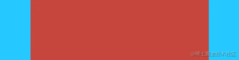
三、flex布局(CSS3新增)
1. 原理:外部flex布局,两边有固定宽度,中间占剩下的宽度。
2. 实现:给最外面一层div flex布局,中间:flex:1;再通过order属性确定项目排序,即第一个盒子为默认顺序0,第二个盒子为1,第三个盒子为2
.box-3 {
display: flex;
height: 200px;
}
.left-3,
.right-3 {
width: 100px;
height: 200px;
background-color: #26c9ff;
}
.right-3 {
order: 2;
}
.center-3 {
flex: 1;
order: 1;
height: 200px;
background-color: #c6463d;
}
<div class="box-3">
<div class="left-3"></div>
<div class="right-3"></div>
<div class="center-3"></div>
</div>
4. 效果图
四、圣杯布局


