

Flex布局介绍
一旦给父元素设置了display:flex; 这个父元素称为flex容器。它的所有子元素自动成为该容器成员,成为Flex项目,简称为项目。
容器默认存在两根轴:水平主轴和水平交叉轴。水平主轴的开始位置如图所示为main start,结束位置叫做main end;交叉轴的开始位置为cross start,结束位置为cross end。项目默认沿主轴排列。
Flex布局容器常用属性
先简单写一些元素
  <div class="father">
    <div class="item">1</div>
    <div class="item">2</div>
    <div class="item">3</div>
  </div>
给一下样式
.father {
  width: 800px;
  height: 800px;
  border: 1px solid #000;
}
.father div {
  width: 300px;
  height: 200px;
  font-size: 100px;
  line-height: 200px;
  text-align: center;
}
.father .item:nth-child(1) {
  background-color: red;
}
.father .item:nth-child(2) {
  background-color: green;
}
.father .item:nth-child(3) {
  background-color: blue;
}
获得图示
dispaly: flex
.father {
  width: 800px;
  height: 800px;
  border: 1px solid #000;
  display: flex;
}
flex-direction:决定主轴的方向(默认为row)
属性有:row column row-reverse column-reverse
更改一下主轴方向flex-direction: column
.father {
  width: 800px;
  height: 800px;
  border: 1px solid #000;
  display: flex;
  flex-direction: column;
}
更改一下主轴方向为flex-direction:row-resever;
flex-wrap:是否换行(默认不换行)
仔细看初始化设置 .father的width(800px)是小于三个.item的width(900px) 此时flex布局会默认缩小.item的width来完全填充.father
flex-wrap的属性有 wrap(换行) nowrap(不换行)
设置了 后
flex-wrap: wrap;
flex-flow (flex-direction和flex-wrap的综合缩写)
flex-flow有两个参数 第一个是flex-direction 第二个是flex-wrap
例如
flex-flow: column wrap-reverse;
justify-content:定义项目在主轴上的排列方式
justify-content的属性有
- flex-start 左对齐
- flex-end 右对齐
- center 中间
- space-between 两端对齐
- space-around 中间间隙是两端间隙的两倍
这里更改一下三个项目的width以更直观的看出justify-content的属性变化
.father .item:nth-child(1) {
  width: 100px;
  background-color: red;
}
.father .item:nth-child(2) {
  width: 200px;
  background-color: green;
}
.father .item:nth-child(3) {
  width: 100px;
  background-color: blue;
}
再更改.father里的justify-content属性为space-between
justify-content:space-between;
align-items:定义项目在交叉轴上的对齐方式。
属性有
- flex-start:交叉轴的起点对齐。
- flex-end:交叉轴的终点对齐。
- center:交叉轴的中点对齐。
- baseline: 项目的第一行文字的基线对齐。
- stretch(默认值):如果项目未设置高度或设为auto,将占满整个容器的高度。
例如:设置align-items:center
当项目没有设置高度时 且align-items没有被设置时(因为默认是stretch)
align-content定义了多根轴线的对齐方式。如果项目只有一根轴线,该属性不起作用。
要配合flex-wrap:wrap结合使用 可设置的属性值跟justify-content一样
例如:设置align-content:flex-end;(这里将item的width值设置为300px)
flex-wrap: wrap;
align-content: flex-end;
项目水平居中的方法
这里假设只保留一个项目
- 最简单
  justify-content:center;
  align-items:center;
  justify-content:center;
  flex-wrap: wrap;
  align-content:center;
项目常用属性
简单编写一下页面
  <div class="box">
    <div class="item">1</div>
    <div class="item">2</div>
    <div class="item">3</div>
    <div class="item">4</div>
    <div class="item">5</div>
    <div class="item">6</div>
    <div class="item">7</div>
    <div class="item">8</div>
    <div class="item">9</div>
  </div>
初始样式
.box {
  height: 800px;
  width: 1000px;
  border: 1px solid #000;
  display: flex;
}
.box .item {
  width: 200px;
  height: 100px;
  border: 2px solid darkgoldenrod;
  background-color: darkcyan;
  margin-right: 10px;
  margin-bottom: 10px;
  font-size: 30px;
  color:black
}
效果图
order 定义项目的排列方式 数值越小 排列越往前
order的值是常数
这里让第二个项目的order值为1
  .item:nth-child(2){
     order: 1;
  }
.item里的order为2
order: 2;
flex-grow 定义子元素的放大比例 默认值为0 会存在剩余空间
这里将项目只保留3个来操作
flex-grow的值为常数 意思是放大几倍
这里将值设为2
flex-grow: 2
ps:flex-grow: 1;时将等分剩余的空间
flex-shrink 缩小比例 默认值为1
这里恢复九个项目
值为常数 0表示不缩小
例如
.item:nth-child(2){
    flex-shrink: 0;
  }
flex-basis:定义项目在主轴上占据空间的大小
值为多少px
这里将项目减少为三个 设置第二个项目的flex-basis
.item:nth-child(2){
lex-basis: 500px;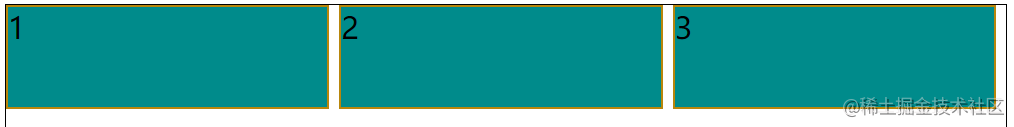
}
属性flex
flex:flex: auto;相当于
flex-grow: 1 flex-shrink: 1 flex-basis: auto
flex: none;相当于
flex-grow: 0 flex-shrink: 0 flex-basis: auto
flex:1;相当于
flex-grow: 1 flex-shrink: 1 flex-basis: 0%
