CSS
css怎么做样式隔离
flex属性
flex 属性是 flex-grow-一个数字,规定项目将相对于其他灵活的项目进行扩展的量、flex-shrink-一个数字,规定项目将相对于其他灵活的项目进行收缩的量、和 flex-basis-项目的长度,属性的简写属性。
默认值 0 1 auto
flex-direction:row
justify-concent:center//水平居中
align-items:center//垂直居中

flex-direction:column
justify-concent:center//垂直居中
align-items:center//水平居中
flex 实现左边自适应,右边定宽高
.box{
    display:flex;
    Width:100%;
    Height:1000px;
}
.left{
    Flex:1
}
.right{
    Width:200px
}
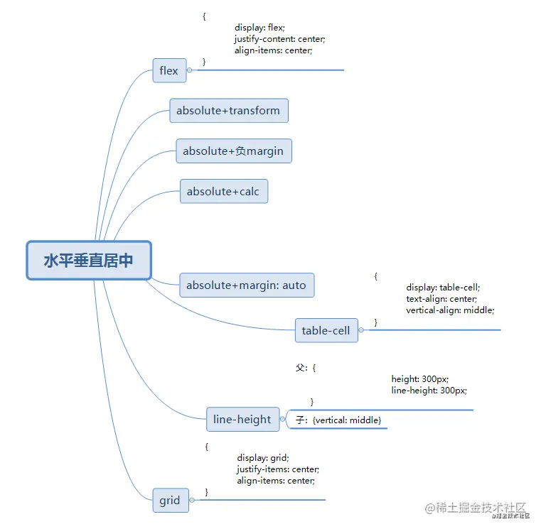
写出元素水平垂直居中的 n 种方法
写出元素垂直居中的 n 种方法
1. 子元素绝对定位
.box {
   width: 100px;
   height: 100px;
   position: absolute;
   left: 0px;
   right: 0px;
   bottom: 0px;
   top: 0px;
   margin: auto;
   background-color: red;
}
2.flex
body{
  display:flex;
  justify-content:center;
  align-items:center;
  height: 100vh;
  width:100%
}
.box{
  width: 100px;
  height: 100px;
  background:red;
}
3.绝对定位
.box {
   position: absolute;
   width: 100px;
   height: 100px;
   background: red;
   top: 50%;
   left: 50%;
   margin-left: -50px;
   margin-top: -50px;
}
4.绝对定位+transform
.box{
   position:absolute;
   width:100px;
   height:100px;
   background:red;
   top:50%;
   left:50%;
   transform:translate(-50%,-50%)
}
垂直居中
1.table属性
#wrapper {
display: table;
}
#cell {
display: table-cell;
vertical-align: middle;
}
2.绝对定位
#content {
position: absolute;
top: 50%;
height: 240px;
margin-top: -120px;
}
3.浮动
#floater {
float: left;
height: 50%;
margin-bottom: -120px;
}
#content {
clear: both;
height: 240px;
position: relative;
}
4.定位
#content {
position: absolute;
top: 0;
bottom: 0;
left: 0;
right: 0;
margin: auto;
height: 240px;
width: 70%;
}
css3哪些属性
- transition
- animation
- transform
- 选择器
- flex
position有哪几种?分别说一下对应的效果和用法
static
- 静态:默认值,元素不收top,bottom,left,right属性影响,正常出现在文档流中
relative
- 相对定位:不脱离文档流的布局,受top,bottom,left,right影响,只改变自身的位置,在文档流原来的位置遗留空白区域,定位的起始位置为此元素原型在文档流的位置
absolute
- 绝对定位:脱离文档流,遗留下来的空间由右面的元素填充,定为的起始位置为最近的父元素(position不为static),否则为html文档本身
fixed
- 固定:类似于absolute,但不随着滚动条的移动而改变位置,元素的位置相对于浏览器窗口是固定的
sticky
- 可以说是相对定位relative和固定定位fixed的结合;它主要用在对scroll事件的监听上;简单来说,在滑动过程中,某个元素距离其父元素的距离达到sticky粘性定位的要求时(比如top:100px);position:sticky这时的效果相当于fixed定位,固定到适当位置。
- 父元素不能overflow:hidden或者overflow:auto属性。
- 必须指定top、bottom、left、right4个值之一,否则只会处于相对定位
- 父元素的高度不能低于sticky元素的高度
- sticky元素仅在其父元素内生效
{
margin: 0;
padding: 0
}
html body {
height: 100vh;
width: 100%
}
h1 {
height: 200px;
position: relative;
background-color: lightblue;
}
h1:after {
content: '';
position: absolute;
top: 100px;
left: 0;
width: 100%;
height: 2px;
background-color: red;
}
#sticky-nav {
position: sticky;
top: 100px;
width: 100%;
height: 80px;
background-color: yellowgreen;
}
.scroll-container {
height: 600px;
width: 100%;
background-color: lightgrey;
}
————————————————
<h1>高200px;距顶部100px</h1>
<div id="sticky-nav">这是一个tab切换栏,给sticky定位top=100px</div>
<p class="scroll-container">发生滚动</p>
<p class="scroll-container" style="background:lightgoldenrodyellow;">发生滚动</p>
动画怎么去优化
- 用transition去做动画效果的时候优先使用transform,尽量不要使用height,width,margin,padding
- 尽量不要使用太复杂的选择器。事先给需要被操作的元素加上类名
BFC
‘块级格式化上下文’,它是一个独立的渲染区域,只有block-level box参与,它规定了内部的block-level box如何布局,并且与这个区域外部毫不相干
清除浮动
- 父级添加overflow:hidden
- 最后一个浮动元素后添加标签,给其设置clear:both
- 使用after伪元素
.clearfix:after{
content: "";
display: block;
height: 0;
clear:both;
visibility: hidden;
}
.clearfix{
*zoom: 1;
}
<body>
<div class="fahter clearfix">
<div class="big">big</div>
<div class="small">small</div>
<!--<div class="clear">额外标签法</div>-->
</div>
<div class="footer"></div>
</body>
- 使用before和after双伪元素清除浮动
.clearfix:after,.clearfix:before{
   content: "";
   display: table;
}
.clearfix:after{
   clear: both;
}
.clearfix{
   *zoom: 1;
}

<div class="fahter clearfix">
   <div class="big">big</div>
   <div class="small">small</div>
</div>
元素隐藏
- display:none
- visibility:hidden
- opacity:0
气泡框
.box {
    width: 100px;
    height: 50px;
    background-color: orange;
    position: relative;
    text-align: center;
    line-height: 50px;
    color: white;
    border-radius: 5px;
}
.box::after {
    content: "";
    width: 0;
    height: 0;
    border: 10px solid;
    position: absolute;
    border-color: transparent transparent transparent orange;
    position: absolute;
    left: 100%;
    top: 50%;
    transform: translateY(-50%);
}
像素
- 设备像素:pt
- css像素:px,也可称为设备独立像素,单位pt
rem和dpr
- flexible.js
- 会将视觉稿分为100份,每一份被称为一个单位a,1rem=10a
- dpr=设备像素/css像素
- 1px=dpr^2*pt
- rem是相对于根元素,这样就意味着,我们只需要在根元素确定一个px字号,则可以来算出元素的宽高
移动端css1px问题
- 出现原因:设计师要求的1px是物理像素,但是开发时写的是逻辑像素,两者之间存在一个换算比例,可通过window.devicePixelRatio获取,在iphone上出阿西的原因就是dpr=2,但是border-width=1,边框会被放大两倍,导致出现的边框变宽
- 解决方式
- viewport+rem:在meta标签的viewport设置缩放,通过js去动态修改viewport的值
- transform:sacle(0.5)
- 设置height: 1px,根据媒体查询结合transform缩放为相应尺寸。
- 用::after和::befor,设置border-bottom:1px solid #000,然后在缩放-webkit-transform: scaleY(0.5);可以实现两根边线的需求


