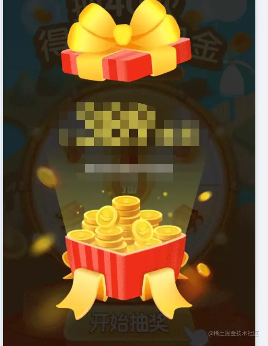
.gifts{    min-width: 100vw;    min-height: 100vh;    background: rgba(0, 0, 0, 0.6);    position: fixed;    z-index: 999;    top:0;    left: 0;    .content{        position: absolute;        top:50%;        left:50%;        transform:translate(-50%,-50%);        text-align: center;        .box{          display:inline-block;          width:Rem(604);          height:Rem(550);          background-image:url('礼物盒子部分');          background-size: cover;          text-align: center;          animation:giftsBoxAnimate 0.5s ease-in-out 1.2s 1;          animation-fill-mode: forwards;        }        .cover{         display:inline-block;         width:Rem(408);         height:Rem(278);         position: absolute;         left:Rem(110);         background-image:url('礼物盖子部分');         background-size: cover;         animation:giftsAnimate 1.6s ease-in-out 0s 1; //左晃右晃最后拉开         animation-fill-mode: forwards;         z-index:1;        }

     //炸出来的奖励内容
   .reward{             animation:giftsTipsAnimate 0.4s ease-in-out 1.4s 1;               animation-fill-mode: forwards;              position:relative;              opacity: 0;            .Otayonii{                position: absolute;                top:Rem(-500);                width:100%;                text-align: center;                span{                             font-weight: bold;                  color: #FEED5D;                }                span:nth-child(1){                    font-size:Rem(60);                }                span:nth-child(2){                    font-size:Rem(160);                }                span:nth-child(3){                    font-size: Rem(60);                }                            }            .tips{              position: absolute;              top:Rem(-300);              width:100%;              text-align: center;                 font-size: Rem(32);              font-family: PingFangSC-Regular, PingFang SC;              font-weight: 400;              color: #FFFFFF;              line-height: Rem(45);                                }        }            }   }
//奖励内容动画@keyframes giftsTipsAnimate{    0%{        transform:scale(0);        opacity: 0;    }    50%{        transform:scale(0);        opacity: 0;    }    100%{        transform:scale(1);        opacity: 1;    }}
//礼物盒子动画@keyframes giftsBoxAnimate{    0%{        transform:translateY(Rem(0));    }    100%{                transform:translateY(Rem(250)) scale(1.1);        background-image: url('https://img.zbzhi.cn/jibu/lottery/guangbox.png');    }}
//礼物盖子动画@keyframes giftsAnimate {    0%{              transform: rotateZ(-25deg);    }    10%{        transform: rotateZ(25deg);    }    20%{        transform: rotateZ(-25deg);    }    30%{        transform: rotateZ(25deg);    }    40%{        transform: rotateZ(-25deg);    }    50%{        transform: rotateZ(25deg);    }    60%{        transform: rotateZ(-25deg);    }    70%{        transform: rotateZ(25deg);    }    80%{        transform: rotateZ(0deg) translateY(Rem(0));    }    100%{        transform: rotateZ(0deg) translateY(Rem(-250));    }}

    gifts () {
    return(
     <div className='gifts'>
      <div className="content">
           <div className="cover"></div>
     <div className="box"></div>
     <div className="reward">
       <div className='Otayonii'>
          <span>+</span><span>100个</span><span>可爱</span>
          </div>
          <div className='tips'>啦啦啦啦啦~自己的奖励文案</div>
          </div>
         </div>
    </div>
     )    }


