<!DOCTYPE html>
<html lang="en">
<head>
<meta charset="UTF-8">
<meta name="viewport" content="width=device-width, initial-scale=1.0">
<title>Document</title>
<style>
div {
width: 1000px;
height: 100px;
margin: 30px auto;
text-align: center;
line-height: 100px;
color: #ccc;
font-size: 50px;
border: 1px solid #000;
}
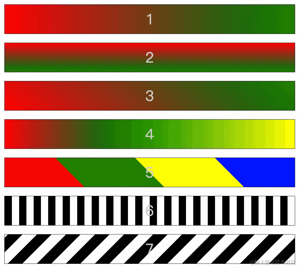
div:nth-child(1) {
background-image: linear-gradient(to right, red, green);
}
div:nth-child(2) {
background-image: linear-gradient(red, green);
}
div:nth-child(3) {
background-image: linear-gradient(45deg, red, green);
}
div:nth-child(4) {
background-image: linear-gradient(to right, red 0%, green 40%, yellow 100%);
}
div:nth-child(5) {
background-image: linear-gradient(45deg,
red 0%,
red 25%,
green 25%,
green 50%,
yellow 50%,
yellow 75%,
blue 75%,
blue 100%
);
}
div:nth-child(6) {
background-image: linear-gradient(to right,
#000 0%,
#000 25%,
#fff 25%,
#fff 50%,
#000 50%,
#000 75%,
#fff 75%,
#fff 100%
);
background-size: 100px 100%;
}
div:nth-child(7) {
background-image: linear-gradient(135deg,
#000 0%,
#000 25%,
#fff 25%,
#fff 50%,
#000 50%,
#000 75%,
#fff 75%,
#fff 100%
);
background-size: 100px 100%;
animation: gun 1s infinite linear;
}
@keyframes gun {
0%{
}
100%{
background-position: 100px 0px;
}
}
</style>
</head>
<body>
<div class="box">1</div>
<div class="box">2</div>
<div class="box">3</div>
<div class="box">4</div>
<div class="box">5</div>
<div class="box">6</div>
<div class="box">7</div>
</body>
</html>


