<!DOCTYPE html>
<html lang="en">
<head>
<meta charset="UTF-8">
<meta name="viewport" content="width=device-width, initial-scale=1.0">
<title>Document</title>
<style>
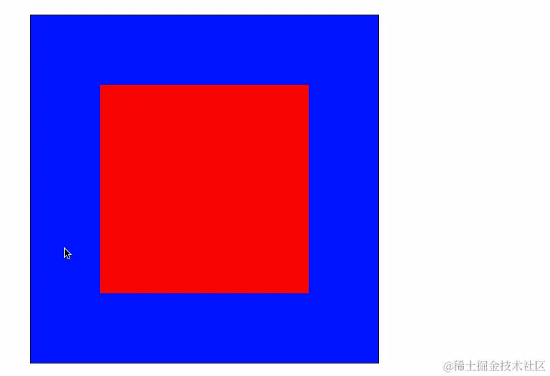
.out {
width: 500px;
height: 500px;
border: 1px solid #000;
background-color: blue;
margin: 100px auto;
perspective: 400px;
}
.in {
width: 300px;
height: 300px;
background-color: red;
margin: 100px auto;
transition: all 1s;
}
.out:hover .in {
transform: translateX(200px) rotateY(123deg);
}
</style>
</head>
<body>
<div class="out">
<div class="in"></div>
</div>
</body>
</html>


