<!DOCTYPE html>
<html lang="en">
<head>
<meta charset="UTF-8">
<meta name="viewport" content="width=device-width, initial-scale=1.0">
<title>Document</title>
<style>
.box {
width: 250px;
height: 250px;
margin: 100px;
background-color: green;
animation-name: move;
animation-duration: 2s;
animation-iteration-count: 3;
animation-direction: alternate;
animation-delay: 1s;
animation-fill-mode: forwards;
animation-timing-function: ease-in;
animation-play-state: running;
}
@keyframes move {
0% {
}
100% {
transform: translateX(500px) rotate(345deg);
}
}
</style>
</head>
<body>
<div class="box"></div>
</body>
</html>
<!DOCTYPE html>
<html lang="en">
<head>
<meta charset="UTF-8">
<meta name="viewport" content="width=device-width, initial-scale=1.0">
<title>Document</title>
<style>
.box {
width: 200px;
height: 200px;
margin: 100px auto;
background-color: green;
animation: move 2s infinite alternate linear;
}
@keyframes move {
from {
transform: translateX(0px) rotate(0deg);
}
to {
transform: translateX(500px) rotate(-555deg);
}
}
</style>
</head>
<body>
<div class="box"></div>
</body>
</html>

<!DOCTYPE html>
<html lang="en">
<head>
<meta charset="UTF-8">
<meta name="viewport" content="width=device-width, initial-scale=1.0">
<title>Document</title>
<style>
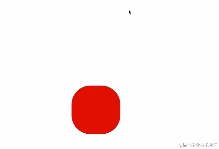
.box {
width: 200px;
height: 200px;
margin: 100px auto;
background-color: green;
animation: gun 2s;
}
@keyframes gun {
0% {
transform: translateX(0px) translateY(0px);
background-color: green;
border-radius: 0;
}
25% {
transform: translateX(500px) translateY(0px);
}
50% {
transform: translateX(500px) translateY(300px);
border-radius: 50%;
}
75% {
transform: translateX(0px) translateY(300px);
}
100% {
transform: translateX(0px) translateY(0px);
background-color: red;
border-radius: 0;
}
}
</style>
</head>
<body>
<div class="box"></div>
</body>
</html>
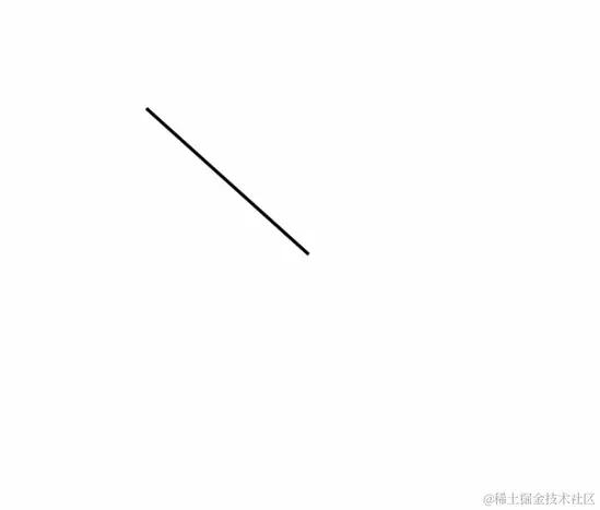
- animation-timing-function: steps(number)
<!DOCTYPE html>
<html lang="en">
<head>
  <meta charset="UTF-8">
  <meta name="viewport" content="width=device-width, initial-scale=1.0">
  <title>Document</title>
  <style>
    .box {
      width: 3px;
      height: 200px;
      background-color: #000;
      margin: 100px auto;
      transform-origin: bottom;
      animation: run 60s infinite steps(60);
    }
    @keyframes run {
      0% {
        transform: rotate(0deg);
      }
      100% {
        transform: rotate(360deg);
      }
    }
  </style>
</head>
<body>
  <div class="box"></div>
</body>
</html>


