<!DOCTYPE html>
<html lang="en">
<head>
<meta charset="UTF-8">
<meta name="viewport" content="width=device-width, initial-scale=1.0">
<title>Document</title>
<style>
* {
margin: 0;
padding: 0;
list-style: none;
}
body {
background-color: #eee;
font-size: 22px;
}
h3 {
margin: 10px;
font-weight: normal;
}
section {
width: 1000px;
margin: 0 auto;
}
ul {
background-color: #fff;
border: 1px solid #ccc;
}
ul li {
width: 200px;
height: 200px;
background-color: pink;
margin: 10px;
}
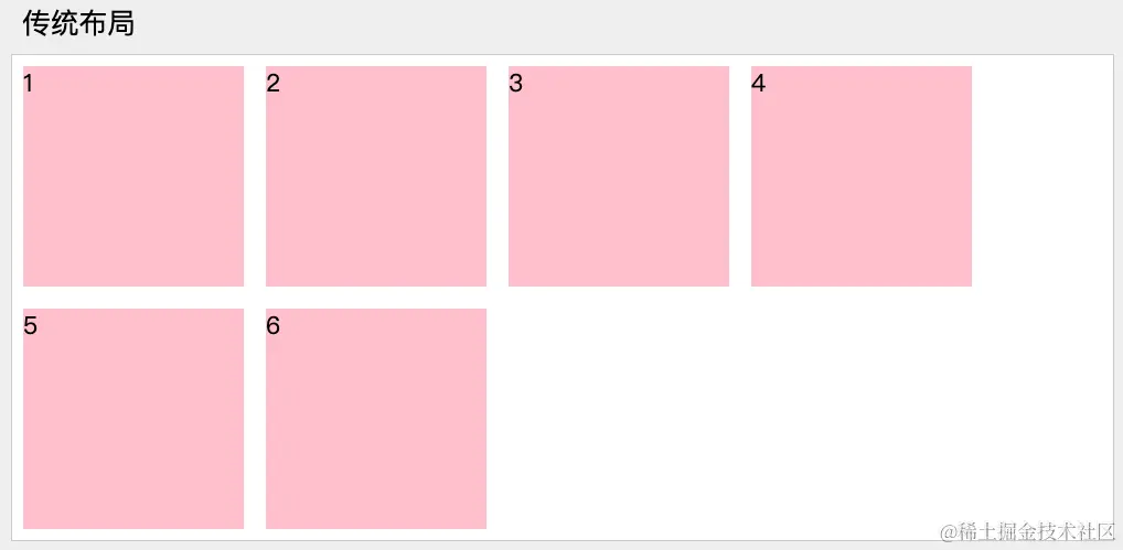
section:nth-child(1) ul {
overflow: hidden;
}
section:nth-child(1) ul li {
float: left;
}
section:nth-child(2) ul {
display: flex;
}
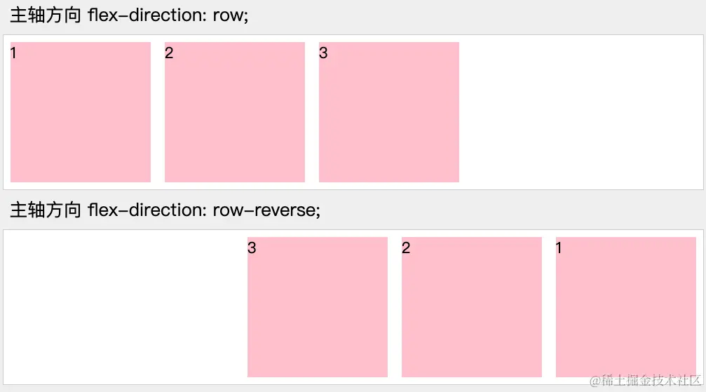
section:nth-child(3) ul {
display: flex;
flex-direction: row;
}
section:nth-child(4) ul {
display: flex;
flex-direction: row-reverse;
}
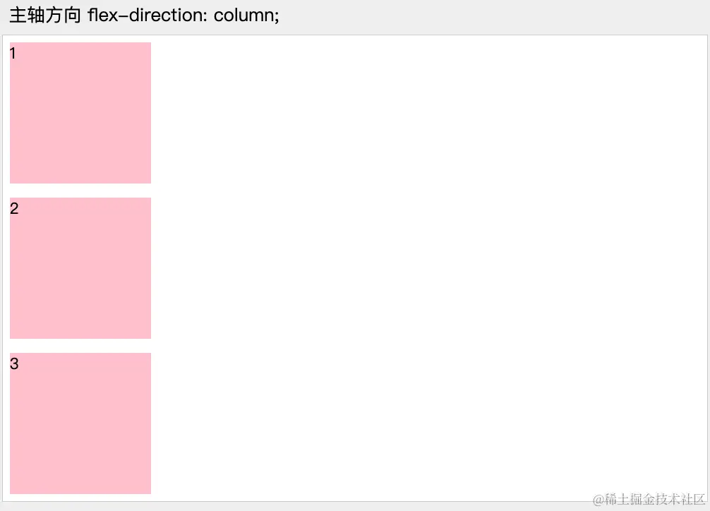
section:nth-child(5) ul {
display: flex;
flex-direction: column;
}
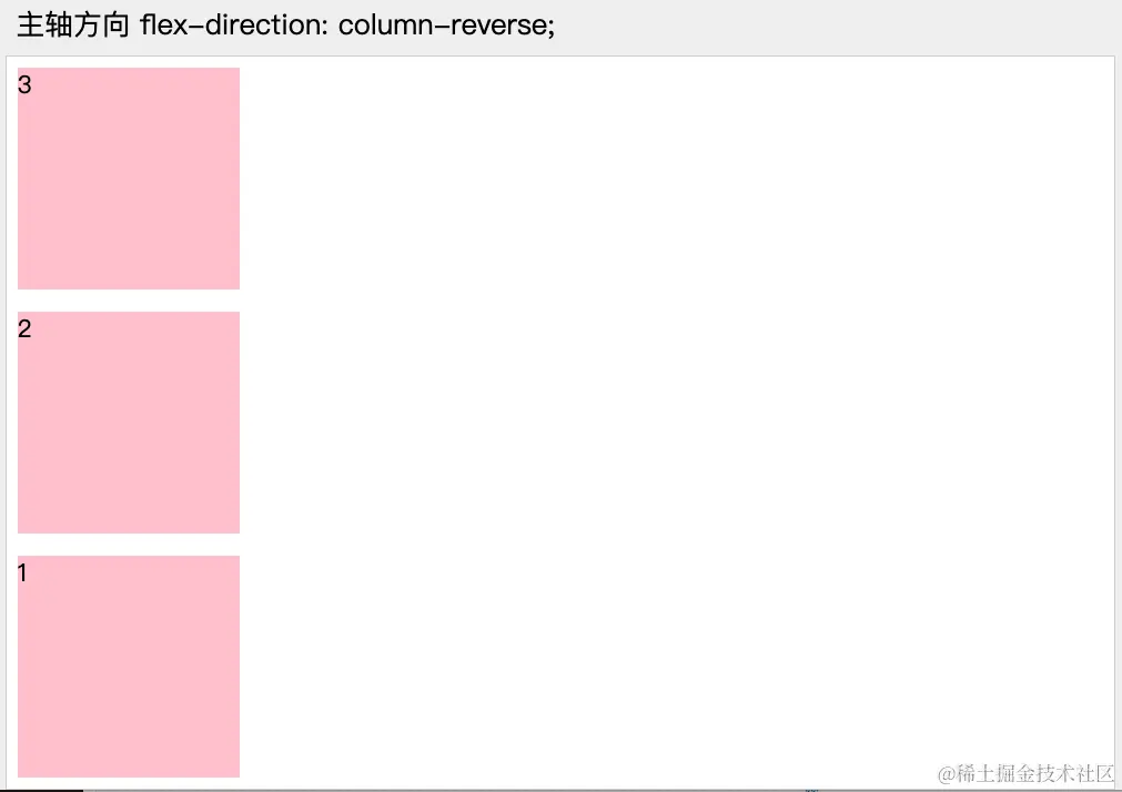
section:nth-child(6) ul {
display: flex;
flex-direction: column-reverse;
}
</style>
</head>
<body>
<section>
<h3>传统布局</h3>
<ul>
<li>1</li>
<li>2</li>
<li>3</li>
</ul>
</section>
<section>
<h3>伸缩布局 display: flex;</h3>
<ul>
<li>1</li>
<li>2</li>
<li>3</li>
</ul>
</section>
<section>
<h3>主轴方向 flex-direction: row;</h3>
<ul>
<li>1</li>
<li>2</li>
<li>3</li>
</ul>
</section>
<section>
<h3>主轴方向 flex-direction: row-reverse;</h3>
<ul>
<li>1</li>
<li>2</li>
<li>3</li>
</ul>
</section>
<section>
<h3>主轴方向 flex-direction: column;</h3>
<ul>
<li>1</li>
<li>2</li>
<li>3</li>
</ul>
</section>
<section>
<h3>主轴方向 flex-direction: column-reverse;</h3>
<ul>
<li>1</li>
<li>2</li>
<li>3</li>
</ul>
</section>
</body>
</html>


