

1. 介绍
CoordinatorLayout是一个超级功能FrameLayout。官方说明的功能是:
- 作为顶层的装饰布局。
- 作为多个子视图进行特定交互的容器。
借助其的帮助,可以比较方便的实现:
- 吸顶效果。
- 伸缩标题栏效果。
看一下效果:左边是标题栏吸顶效果,右边是可伸缩的标题栏的效果。


2. 使用
CoordinatorLayout作为一个协调器,协调子view之间的交互。通过给子view设置layout_behavior,来决定当其他的view发生交互的时候,视图上如何进行响应。
一般来说,除了一个可滚动的view之外,还需要有AppBarLayout和CollapsingToolbarLayout两个容器,来配合实现各种炫酷的效果:
AppBarLayout:默认设置了behavior,必须作为Coordinatorlayout的直接子view,并将图片和标题设置在其中,其的子view可设置layout_scrollFlags属性,会依据这个属性的取值,在AppBar.Behavior执行不同的响应效果。CollapsingToolbarLayout:实现可以折叠的标题,必须作为AppbarLayout的子view才能实现大多数效果,子view要配合Toolbar。
先看一个简单的实现,图中有一个图片,一个标题栏,一个列表。跟上面第一张图比较类似:
<androidx.coordinatorlayout.widget.CoordinatorLayout xmlns:android="http://schemas.android.com/apk/res/android"
    xmlns:app="http://schemas.android.com/apk/res-auto"
    xmlns:tools="http://schemas.android.com/tools"
    android:layout_width="match_parent"
    android:layout_height="match_parent"
    tools:context=".coordinator.CoordinatorActivity">

    <com.google.android.material.appbar.AppBarLayout
        android:layout_width="match_parent"
        android:layout_height="wrap_content">

        <ImageView
            android:id="@+id/image"
            android:layout_width="match_parent"
            android:layout_height="wrap_content"
            android:fitsSystemWindows="true"
            android:scaleType="fitXY"
            app:layout_scrollFlags="scroll" />

        <androidx.appcompat.widget.Toolbar
            android:layout_width="match_parent"
            android:layout_height="?attr/actionBarSize"
            app:title="我是标题" />
    </com.google.android.material.appbar.AppBarLayout>

    <androidx.recyclerview.widget.RecyclerView
        android:id="@+id/recycleView"
        android:layout_width="match_parent"
        android:layout_height="match_parent"
        app:layoutManager="androidx.recyclerview.widget.LinearLayoutManager"
        app:layout_behavior="@string/appbar_scrolling_view_behavior" />
</androidx.coordinatorlayout.widget.CoordinatorLayout>
2.1. layout_behavior属性
Coordinatorlayout的直接子view具有层级的结构,布局之间会互相覆盖,通过指定直接子view的app:layout_behavior,来处理不同子view之间的关系。
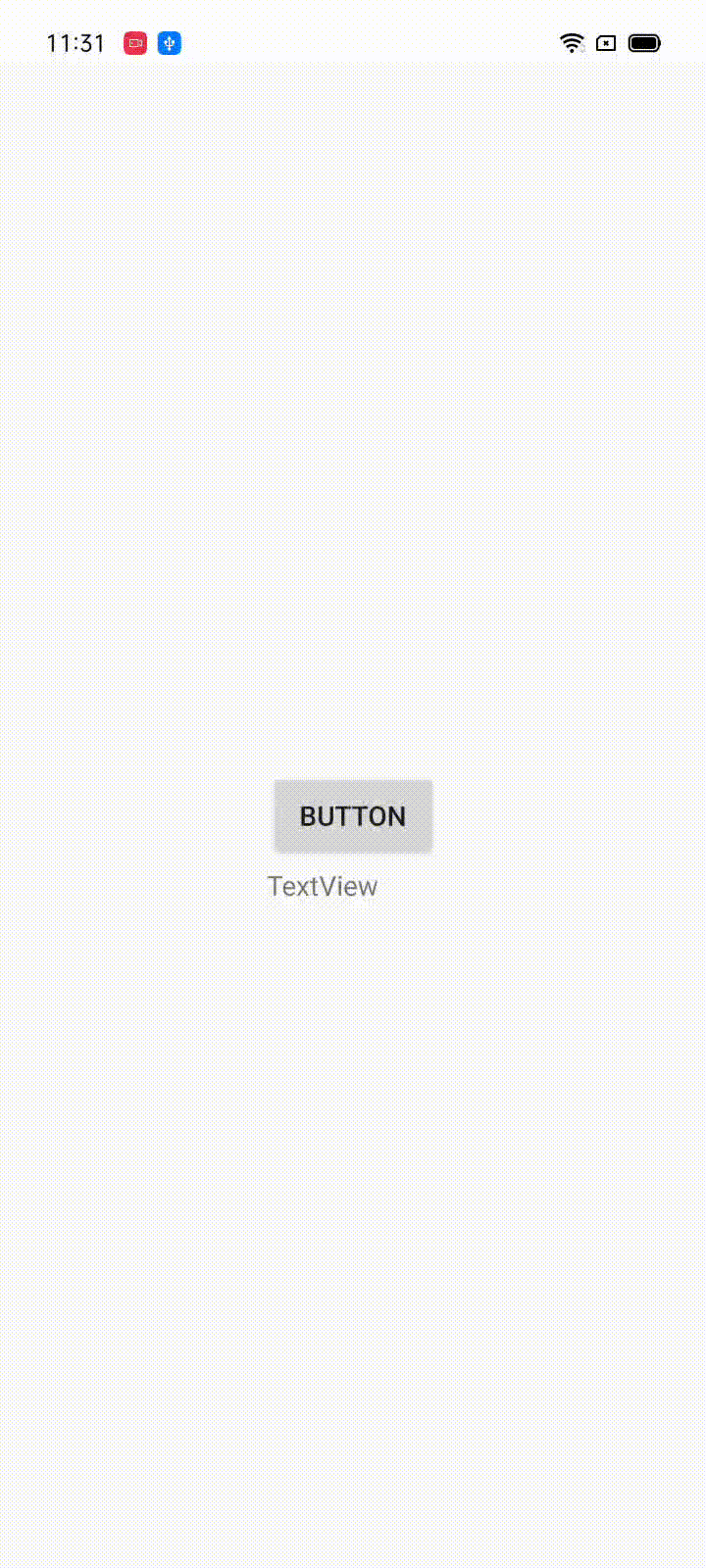
比如下面这个效果,让文本框跟随按钮的移动而移动。
2.1.1. 自定义behavior
针对上面的显示方法,先继承实现Coordinatorlayout.Behavior,实现其中两个方法:
layoutDependsOn:判断给定的view和同级view是否是依赖关系。onDependentViewChanged:根据依赖的视图变化作出变化。
package com.example.mytest.coordinator.behavior

import android.content.Context
import android.util.AttributeSet
import android.view.View
import android.widget.Button
import android.widget.TextView
import androidx.coordinatorlayout.widget.CoordinatorLayout
import com.example.mytest.Utils.px

class MyBehavior(context: Context, attrs: AttributeSet) :
    CoordinatorLayout.Behavior<TextView>(context, attrs) {
    override fun layoutDependsOn(
        parent: CoordinatorLayout,
        child: TextView,
        dependency: View
    ): Boolean {
        return dependency is Button
    }

    override fun onDependentViewChanged(
        parent: CoordinatorLayout,
        child: TextView,
        dependency: View
    ): Boolean {
        child.x = dependency.x
        child.y = dependency.y + 50.px
        return true
    }
}
xml布局:
<?xml version="1.0" encoding="utf-8"?>
<androidx.coordinatorlayout.widget.CoordinatorLayout xmlns:android="http://schemas.android.com/apk/res/android"
    xmlns:app="http://schemas.android.com/apk/res-auto"
    xmlns:tools="http://schemas.android.com/tools"
    android:layout_width="match_parent"
    android:layout_height="match_parent"
    tools:context=".coordinator.CoordinatorActivity">

    <TextView
        android:layout_width="wrap_content"
        android:layout_height="wrap_content"
        android:text="TextView"
        app:layout_behavior=".coordinator.behavior.MyBehavior" />

    <Button
        android:id="@+id/btn"
        android:layout_width="wrap_content"
        android:layout_height="wrap_content"
        android:layout_gravity="center"
        android:text="Button" />

</androidx.coordinatorlayout.widget.CoordinatorLayout>
最后,设置一下button的移动:
btn.setOnTouchListener { v, event ->
    if(event.action==MotionEvent.ACTION_MOVE){
        v.x=event.rawX-v.width/2
        v.y=event.rawY-v.height/2
    }
    true
}
2.1.2. 自带的behavior
CoordinatorLayout一般都会搭配AppBarlayout一起使用,AppBarLayout通过注解@DefaultBehavior(AppBarLayout.Behavior.class)设置了默认的behavior,他会根据AppBarLayout子view的app:layout_scrollFalgs属性,作出不同的响应行为。
与AppBarLayout配合,需要再有一个可滚动的视图,并设置其behavior为AppBarLayout.ScrollingViewBehavior,如下代码实现的就是第一个gif的效果:
<?xml version="1.0" encoding="utf-8"?>
<androidx.coordinatorlayout.widget.CoordinatorLayout xmlns:android="http://schemas.android.com/apk/res/android"
    xmlns:app="http://schemas.android.com/apk/res-auto"
    xmlns:tools="http://schemas.android.com/tools"
    android:layout_width="match_parent"
    android:layout_height="match_parent"
    tools:context=".coordinator.CoordinatorActivity">

    <com.google.android.material.appbar.AppBarLayout
        android:layout_width="match_parent"
        android:layout_height="wrap_content">
        <ImageView
            android:layout_width="match_parent"
            android:layout_height="wrap_content"
            android:id="@+id/image"
            android:scaleType="fitXY"
            app:layout_scrollFlags="scroll"/>
        <androidx.appcompat.widget.Toolbar
            android:layout_width="match_parent"
            android:layout_height="wrap_content"
            app:title="我是标题"/>
    </com.google.android.material.appbar.AppBarLayout>

    <androidx.recyclerview.widget.RecyclerView
        android:id="@+id/recycleView"
        android:layout_width="match_parent"
        android:layout_height="match_parent"
        app:layoutManager="androidx.recyclerview.widget.LinearLayoutManager"
        app:layout_behavior="com.google.android.material.appbar.AppBarLayout$ScrollingViewBehavior"/>

</androidx.coordinatorlayout.widget.CoordinatorLayout>
2.2. AppBarLayout - layout_scrollFlags属性
AppBarlayout的子view可以设置的属性,会根据取值的不同,在behavior中执行不同的操作。
定义在AppBarLayout.LayoutPrams中,具有六个状态,并且各个状态可通过取或操作叠加。
设置的方法有两种:
- xml中设置:
        <ImageView
            android:id="@+id/image"
            android:layout_width="match_parent"
            android:layout_height="wrap_content"
            android:scaleType="fitCenter"
            app:layout_scrollFlags="scroll|enterAlwaysCollapsed" />
- 代码中设置:
image.updateLayoutParams <AppBarLayout.LayoutParams>{
            scrollFlags=AppBarLayout.LayoutParams.SCROLL_FLAG_SCROLL
        }
属性对应的效果:
scroll:该视图会响应滚动事件,其他属性都是以这个为基础。enterAlways:当隐藏之后,只有滑到顶部才会呼出。enterAlwaysCollapsed:当已经隐藏的时候,从任意位置下滑都可呼出。如下,左边是enterAlways效果,右边是enterAlwaysCollapsed。


snap:当滚动结束后,该视图有一部分显示,会回弹到最近的边缘。snapMargins:与snap配合使用,如果这个隐藏的视图有margin,回回弹到这个margin的边缘。如下,左边的是只有snap属性,右边是snap|snapMargins,很明显看出一个回弹到view边界,一个回弹到margin边界。


exitUntilCollapsed:该视图回随着滚动而折叠,需要配合CollapsingToolbarLayout使用。
2.3. CollapsingToolbarLayout
CollapsingToolbarLayout一般用于实现如图所示的可折叠标题栏。

CollapsingToolbarLayout必须作为AppBarlayout的子view使用才能实现相关的效果,在onAttachedToWindow()的时候,会判断直接父容器是不是AppBarLayout,如果是的话会传入AppBarLayout.OnOffsetChangedListener监听,绑定父布局的滚动,进行自己的处理。如果父容器不是AppBarLayout,大部分的功能都是不起作用的。
protected void onAttachedToWindow() {
    super.onAttachedToWindow();
    ViewParent parent = this.getParent();
    if (parent instanceof AppBarLayout) {
        ViewCompat.setFitsSystemWindows(this, ViewCompat.getFitsSystemWindows((View)parent));
        if (this.onOffsetChangedListener == null) {
            this.onOffsetChangedListener = new CollapsingToolbarLayout.OffsetUpdateListener();
        }

        ((AppBarLayout)parent).addOnOffsetChangedListener(this.onOffsetChangedListener);
        ViewCompat.requestApplyInsets(this);
    }

}
CollapsingToolbarLayout的子view要有一个Toobar,并且必须设置成固定高度,折叠后的高度就是Toolbar的高度,并且标题的文字是设置给CollapsingToolbarLayout而不是Toolbar。
2.3.1. 常见属性
titleEnabled:是否显示标题,默认true。true的时候在Toolbar中设置的属性会不起作用。title:标题文字。expandedTitleGravity:未折叠的时候标题的位置,默认left|bottom。collapsedTitleGravity:折叠后标题位置,默认left|center_vertical。contentScrim:收缩后背景的颜色,即会在ToolBar和被折叠的view之间再设置一层挡板。
layout_collapseMode是需要设置给子view的属性常用的有两个:
pin:在滚动过程中一直停留在顶部,一般设置给Toolbar。parallax:该视图与页面同时滚动,滚动的速率受到layout_collapseParallaxMultiplier的影响,与其他滚动反映出不一样的视觉效果,逐渐隐藏。
