

首先搭建起始HTML结构及设置基本css样式
<body>    <div class="header">header</div>    <div class="main">        <div class="content">content</div>        <div class="left">left</div>        <div class="right">right</div>    </div>    <div class="footer">footer</div></body>

<style>        * {            margin: 0;            padding: 0;        }        .header,.footer {            height: 100px;            background: #000;            color:seashell;        }        .main {            height: 400px;            background: #ccc;        }        .content {            height: 400px;            background: #f90;        }        .left {            width: 300px;            height: 400px;            background: purple;        }        .right {            width: 300px;            height: 400px;            background: seagreen;        }    </style>
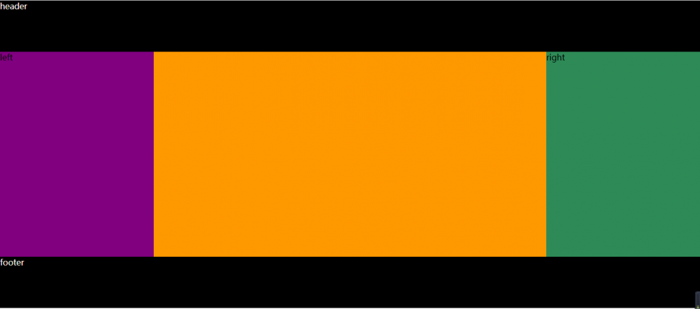
要实现的效果图如下:
1.经典方法 (浮动)
<style> * { margin: 0; padding: 0; } .header,.footer { height: 100px; background: #000; color:seashell; } .main { height: 400px; background: #ccc; } .content { height: 400px; background: #f90; float: left; width: 100%; } .left { width: 300px; height: 400px; background: purple; float: left; margin-left: -100%; } .right { width: 300px; height: 400px; background: seagreen; float: left; margin-left: -300px; } </style>
这个方法中首先在main这个父盒子中不按常规的思维,将content放在最上面(常规思维应该是left在最上面),这也是这个方法的妙处之一。首先main里面的三个盒子都设置为左浮动,然后设置content的width为100%,最后用margin-left将left和right两个盒子分列content左右,也就实现了圣杯布局。
2.flex布局
<style> * { margin: 0; padding: 0; } .header,.footer { height: 100px; background: #000; color:seashell; } .main { height: 400px; background: #ccc; display: flex; } .content { height: 400px; background: #f90; flex: auto; } .left { width: 300px; height: 400px; background: purple; flex: none; } .right { width: 300px; height: 400px; background: seagreen; flex: none; } </style>
相比于第一种方法,用flex符合属性来做就轻松很多,就加了四行代码,main变为伸缩盒子,content,left,right依次设为flex:auto; flex:none; flex:none;
说明:flex 是复合属性,是 flex-grow , flex-shrink 和 flex-basis 的简写,默认值为 0 1 auto。
-
如果缩写为
flex: 1, 则其计算值为1 1 0% -
如果缩写
flex: auto, 则其计算值为1 1 auto -
如果
flex: none, 则其计算值为0 0 auto
