

首先基本结构样式
<body> <div class="box"> <span></span> </div></body>
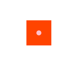
使里面的span元素(粉色圆点)水平垂直居中于其div父元素(淘宝色正方形)
实现的效果图如下:
下面是常用的三种方法:
1.定位
<style> * { margin: 0; padding: 0; } .box { width: 100px; height: 100px; background: #f40; position: relative; margin: 200px auto; } .box span{ width: 20px; height: 20px; background: pink; border-radius: 50%; position: absolute; left: 50%; margin-left: -10px; 还可以写成 transition:translateX(-50%); top:50%; margin-top: -10px; transition:translateY(-50%); } </style>
定位还有一种
.box span{ position:absolute; top:0; bottom:0; left:0; right:0; margin:auto;}
2.flex 设置主轴及侧轴方向居中
<style> * { margin: 0; padding: 0; } .box { width: 100px; height: 100px; background: #f40; margin: 200px auto; display: flex; justify-content: center; align-items: center; } .box span{ width: 20px; height: 20px; background: pink; border-radius: 50%; } </style>
3.最简单,最直接,最牛逼
直接在子元素span下设置 margin : auto;即可
<style> * { margin: 0; padding: 0; } .box { width: 100px; height: 100px; background: #f40; margin: 200px auto; display: flex; } .box span{ width: 20px; height: 20px; background: pink; border-radius: 50%; margin: auto; } </style>
