

首尾固定中间高度自适应实现的4种方式
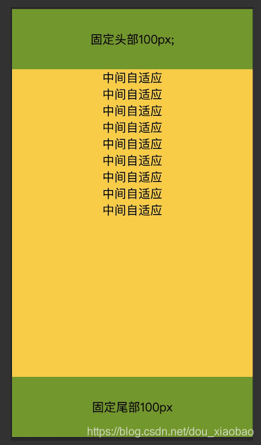
1、定位postion
<!DOCTYPE HTML>
<html>
<head>
  <meta charset="utf-8">
  <meta name="viewport" content="width=device-width,initial-scale=1.0, maximum-scale=1.0, minimum-scale=1.0, user-scalable=no">
  <title>首尾固定中间高度自适应</title>
  <style>
    html, body {
      height: 100%;
      margin: 0;
      padding: 0
    }
    .head {
      height:80px;
      line-height:80px;
      background: #690;
      width: 100%;
      position: absolute;
      top: 0;
      text-align: center;
    }
    .body {
      background: #FC0;
      width: 100%;
      overflow: auto;
      top: 80px;
      position: absolute;
      text-align: center;
      bottom: 80px;
    }
    .foot {
      height: 80px;
      line-height: 80px;
      background: #690;
      width: 100%;
      position: absolute;
      bottom: 0;
      text-align: center;
    }
  </style>
</head>
<body>
  <div class="head">固定头部80px;</div>
  <div class="body">
      中间自适应<br>
      中间自适应<br>
      中间自适应<br>
      中间自适应<br>
      中间自适应<br>
      中间自适应<br>
      中间自适应<br>
      中间自适应<br>
      中间自适应<br>
  </div>
  <div class="foot">固定尾部80px</div>
</body>
</html>
浏览器效果图如下,手机端与浏览器端效果一样,在这里只展示手机端,该方法除了ie6以及以下不支持外,其他浏览器均支持。
2、弹性布局—flex
<!DOCTYPE HTML>
<html>
<head>
  <meta charset="utf-8">
  <title>首尾固定中间高度自适应</title>
  <style>
    html, body {
      height: 100%;
      margin: 0;
      padding: 0
    }
    .wrap {
      display: flex;
      flex-direction: column;
      height: 100%;
    }
    .head1 {
      height:80px;
      line-height:80px;
      background: #690;
      width: 100%;
      text-align: center;
    }
    .body1 {
      background: #FC0;
      width: 100%;
      overflow: auto;
      text-align: center;
      flex: 1;
    }
    .foot1 {
      height: 80px;
      line-height: 80px;
      background: #690;
      width: 100%;
      text-align: center;
    }
  </style>
</head>
<body>
 <div class="wrap">
	<div class="head1">固定头部80px;</div>
	<div class="body1">
	     中间自适应<br>
	     中间自适应<br>
	     中间自适应<br>
	     中间自适应<br>
	     中间自适应<br>
	     中间自适应<br>
	     中间自适应<br>
	     中间自适应<br>
	     中间自适应<br>
	 </div>
	 <div class="foot1">固定尾部80px</div>
</div>
</body>
</html>
浏览器效果图如下,手机端与浏览器端效果一样,在这里只展示浏览器端,中间内容超出块级范围会出现滚动条,可根据需求设置,flex为css3属性兼容ie8及以上。

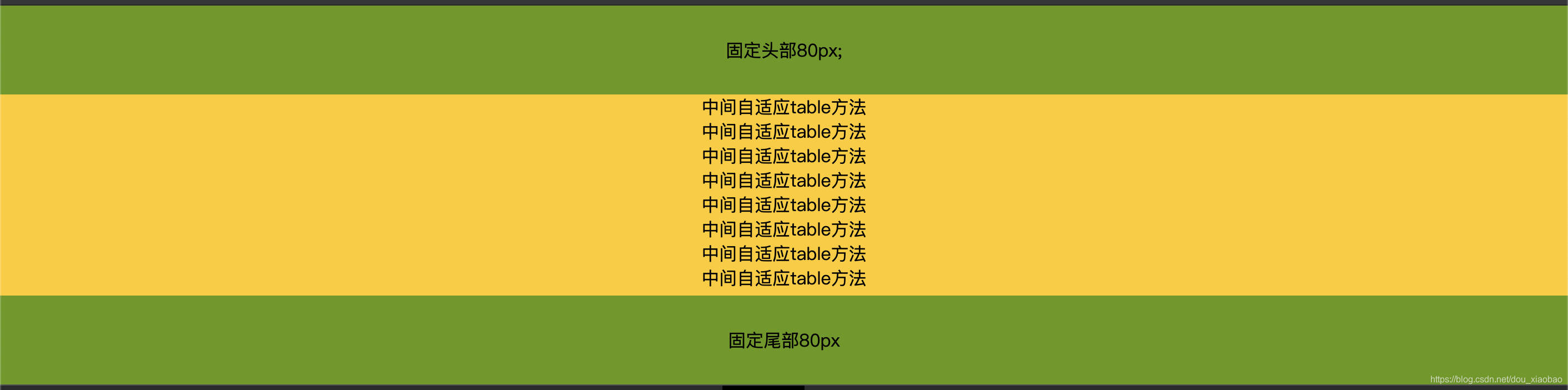
3、表格布局—table
<!DOCTYPE HTML>
<html>
<head>
  <meta charset="utf-8">
  <title>首尾固定中间高度自适应</title>
  <style>
    html, body {
      height: 100%;
      margin: 0;
      padding: 0
    }
    .wrap {
      display: table;
      flex-direction: column;
      height: 100%;
      width: 100%;
    }
    .wrap > div {display: table-row;}
    .head {
      height:80px;
      line-height:80px;
      background: #690;
      width: 100%;
      text-align: center;
    }
    .body {
      background: #FC0;
      width: 100%;
      text-align: center;
    }
    .foot {
      height: 80px;
      line-height: 80px;
      background: #690;
      text-align: center;
    }
  </style>
</head>
<body>
<div class="wrap">
  <div class="head">固定头部80px;</div>
  <div class="body">
    中间自适应table方法<br>
    中间自适应table方法<br>
    中间自适应table方法<br>
    中间自适应table方法<br>
    中间自适应table方法<br>
    中间自适应table方法<br>
    中间自适应table方法<br>
    中间自适应table方法<br>
  </div>
  <div class="foot">固定尾部80px</div>
</div>
</body>
</html>
浏览器效果图如下,手机端与浏览器端效果一样,在这里只展示浏览器端,中间内容超出块级范围会出现滚动条。
4、网格布局—grid
<!DOCTYPE HTML>
<html>
<head>
  <meta charset="utf-8">
  <title>首尾固定中间高度自适应</title>
  <style>
    html, body {
      height: 100%;
      margin: 0;
      padding: 0
    }
  	.wrap {
	   width: 100%;
	   height: 100%;
	   display: grid;
	   grid-template-rows: 80px auto 80px;
	   text-align: center;
  	}
 	.wrap .head, .wrap .foot {
	   background-color: #690;
	   line-height: 80px;
 	}
 	 .wrap .body { background-color:#FC0; }
  </style>
</head>
<body>
<div class="wrap">
  <div class="head">固定头部80px;</div>
  <div class="body">
    中间自适应grid方法<br>
    中间自适应grid方法<br>
    中间自适应grid方法<br>
    中间自适应grid方法<br>
    中间自适应grid方法<br>
    中间自适应grid方法<br>
    中间自适应grid方法<br>
    中间自适应grid方法<br>
  </div>
  <div class="foot">固定尾部80px</div>
</div>
</body>
</html>
浏览器效果图如下,手机端与浏览器端效果一样,在这里只展示浏览器端,中间内容超出块级范围会出现滚动条。css3属性。兼容ie8及以上~

