css画三角
一、
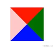
<style>
div {
width: 0;
height: 0;
border-top: 10px solid red;
border-right: 10px solid green;
border-bottom: 10px solid blue;
border-left: 10px solid pink;
}
</style>
<body>
<div></div>
</body>
二、
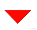
<style>
p {
width: 0;
height: 0;
border-style: solid;
border-width: 10px;
border-color: red transparent transparent transparent;
font-size: 0;
line-height: 0;
}
</style>
<body>
<p></p>
</body>
- 我们用css边框可以模拟三角效果
- 宽度高度为0
- 4个边框都要写,只保留需要的边框颜色,其余的不能省略,都改为transparent透明就好了
- 兼容低版本浏览器,可以加上font-size: 0; line-height: 0;


