

前言
开个大坑,从零搭建一个组件库。这次做一个基础组件Icon。
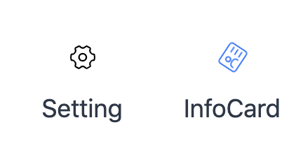
组件最后的效果是这样的
参考ant-design等知名组件库和相关文章的总结
基础组件库主要按以下分类来划分:
-
通用型组件: 比如Button, Icon等.
-
布局型组件: 比如Grid, Layout布局等.
-
导航型组件: 比如面包屑Breadcrumb, 下拉菜单Dropdown, 菜单Menu等.
-
数据录入型组件: 比如form表单, Switch开关, Upload文件上传等.
-
数据展示型组件: 比如Avator头像, Table表格, List列表等.
-
反馈型组件: 比如Progress进度条, Drawer抽屉, Modal对话框等.
成分
外部一个span元素包裹一个svg元素
设计思路
整理出一个如下的期望API表格
| 参数 | 说明 | 类型 | 默认值 | 版本 |
|---|---|---|---|---|
| type | 设置图标的名称 | string | - | |
| className | 设置图标的样式名 | string | - | |
| style | 设置图标的样式 例如:color,width,height |
CSSProperties | - | |
| color | 设置图标的主题颜色 同 css样式中的color |
string | - | |
| height | 设置图标的高度 | string/number | - | |
| width | 设置图标的宽度 | string/number | - | |
| size | 设置已规定图标的大小 | string | md | |
| spin | 是否有旋转动画 | boolean | false | |
| rotate | 图标旋转角度 | number | 0 | |
| component | 自定义svg | ReactComponent | - |
- 根据不同的名称(type字段)选择对应icon
- 能自定义className和style
- 能够设置主题色
- 自由改变宽高
- 自由选择旋转角度
- 选择是否触发旋转动画
- 自定义svg功能
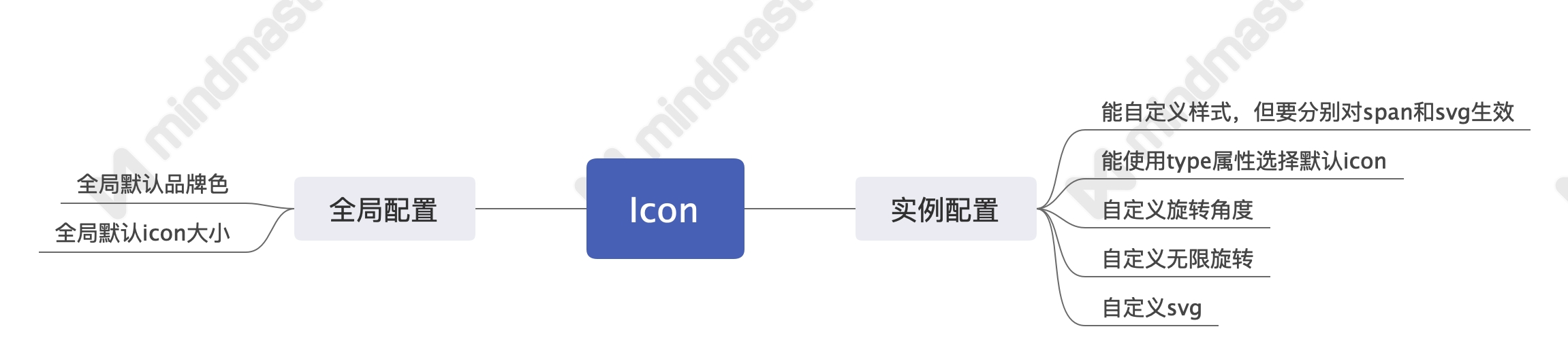
对应的设计思维导图 Icon.jpeg
基于React实现一个icon组件
svg的处理
思路:在页面顶部加载一个默认icon组成的类雪碧图,通过<symbol>标签的id属性和<use>标签的xlinkHref来进行一个选择。
优点:避免多次重绘,优化用户体验。
实现:
// 默认icon对象
const icons = (key?: string) => {
  return (
    {
      SimpleDocument:
        '<svg viewBox="0 0 1024 1024"><path d="M838.050909 93.090909A92.858182 92.858182 0 0 1 930.909091 185.949091v652.101818A92.858182 92.858182 0 0 1 838.050909 930.909091H185.949091A92.858182 92.858182 0 0 1 93.090909 838.050909V185.949091A92.858182 92.858182 0 0 1 185.949091 93.090909h652.101818z m0 46.545455H185.949091C160.349091 139.636364 139.636364 160.349091 139.636364 185.949091v652.101818c0 25.6 20.712727 46.312727 46.312727 46.312727h652.101818c25.6 0 46.312727-20.712727 46.312727-46.312727V185.949091C884.363636 160.349091 863.650909 139.636364 838.050909 139.636364zM581.771636 698.181818c11.962182 0 21.806545 8.913455 23.156364 20.549818L605.090909 721.454545c0 12.846545-10.612364 23.272727-23.319273 23.272728h-232.634181a23.249455 23.249455 0 1 1 0-46.545455h232.634181z m0-186.181818c11.962182 0 21.806545 8.913455 23.156364 20.549818L605.090909 535.272727c0 12.846545-10.612364 23.272727-23.319273 23.272728h-232.634181a23.249455 23.249455 0 1 1 0-46.545455h232.634181z m93.114182-186.181818c11.938909 0 21.783273 8.913455 23.133091 20.549818L698.181818 349.090909c0 12.846545-10.356364 23.272727-23.272727 23.272727H349.090909c-12.846545 0-23.272727-10.333091-23.272727-23.272727 0-12.846545 10.356364-23.272727 23.272727-23.272727h325.818182z"  /></svg>'
    }
    )
};
const svgSprite = (contents: string) => `
  <svg
    xmlns="http://www.w3.org/2000/svg"
    xmlns:xlink="http://www.w3.org/1999/xlink"
    id="__SHOW_UI_SVG_SPRITE_NODE__"
    style="display:none;overflow:hidden;width:0;height:0"
  >
    <defs>
      ${contents}
    </defs>
  </svg>
`;

const renderSvgSprite = () => {
  const Icons = icons()
  const symbols = Object.keys(Icons)
    .map(iconName => {
      const svgContent = Icons[iconName].length > 0 && Icons[iconName].split('svg')[1];
      return `<symbol id=${iconName}${svgContent}symbol>`;
    })
    .join('');
  return svgSprite(symbols);
};

const loadSprite = () => {
  if (!document) {
    return;
  }
  const existing = document.getElementById('__SHOW_UI_SVG_SPRITE_NODE__');
  const mountNode = document.body;

  if (!existing) {
    mountNode.insertAdjacentHTML('afterbegin', renderSvgSprite());
  }
};

export default loadSprite;
svg相关props
export interface svgProps {
  size?: string,
  width?: string | number,
  height?: string | number
}
Icon组件props
export type IconBaseProps = Omit<React.HTMLProps<HTMLSpanElement>,'size'>

export interface IconProps extends IconBaseProps, svgProps {
  type?: string,
  spin?: boolean,
  rotate?: number,
  color?: string,
  component?: Element
}
外部ref功能传入的实现
const Icon = React.forwardRef<HTMLSpanElement, IconProps>((props, ref) => {
  //...
})
默认样式,自定义svg的实现
  const classString = classnames(
    'show-icon',
    className
  )
  const renderInnerNode = () => {
    return (
        Component
    )
  }

  return (
    <span
      role="img"
      {...restProps}
      ref={ref}
      onClick={onClick}
      className={classString}
    >
      {
        Component ?
          renderInnerNode() :
          <svg className={svgClassString} style={svgStyle}>
            <use xlinkHref={`#${type}`} />
          </svg>
      }
    </span>
  );
})
svg旋转角度,宽高,和主题色功能的实现
  const svgStyle = {
    msTransform: `rotate(${rotate}deg)`,
    transform: `rotate(${rotate}deg)`,
    width,
    height,
    color
 }
默认属性值的实现
Icon.defaultProps = {
  rotate: 0,
  size: 'md',
  width: '',
  height: ''
}
相关css样式
.show-icon {
    display: inline-block;
    color: inherit;
    font-style: normal;
    line-height: 0;
    text-align: center;
    text-transform: none;
    vertical-align: -.125em;
    text-rendering: optimizeLegibility;
    -webkit-font-smoothing: antialiased;

    &-svg{
        fill: currentColor;
        background-size: cover;
        width: 100%;
        height: 100%;
    }

    &-md{
        width: @md-icon-size;
        height: @md-icon-size;
    }

    &-spin {
        animation: cirle-anim 1s linear infinite;
    }

    @keyframes cirle-anim {
        100% {
          transform: rotate(360deg);
        }
      }
}
