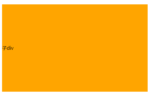
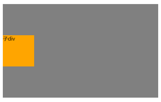
首先定义父元素和子元素的嵌套div,然后标记一下各自的背景:
<div class="father" style="background-color:grey">
	<div class="child" style="background-color:orange">子div</div>
</div>
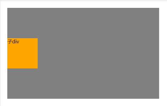
1.使用绝对定位和负外边距对块级元素进行垂直居中
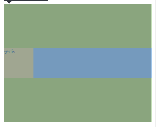
父元素,子元素固定宽高,父相子绝,子元素top属性50%,上外边距为子元素本身高度的一半(这种方式需要知道子元素的高度)
.father{
  width: 500px;
  height: 300px;
  position:relative;
}
.child{
  width: 100px;
  height: 100px;
  position: absolute;
  top:50%;
  margin-top:-50px;
}
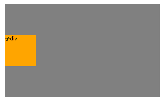
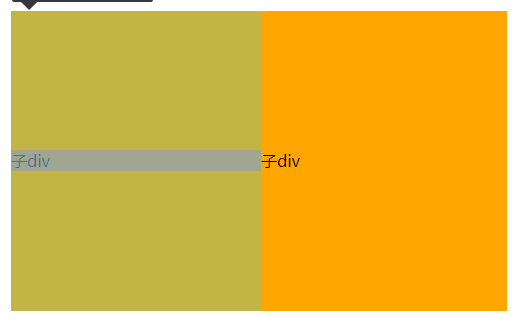
父元素固定宽高,父相子绝,子元素top属性50%,transform属性为Y轴方向偏移-50%
.father{
  width: 500px;
  height: 300px;
  position:relative;
}
.child{
  position: absolute;
  top:50%;
  transform: translateY(-50%);
}
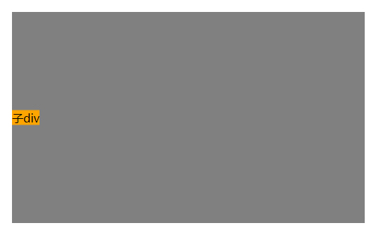
3.绝对定位结合margin:auto
父元素,子元素固定宽高,父相子绝,子元素top,bottom属性为0,margin在垂直方向auto
.father{
  width: 500px;
  height: 300px;
  position:relative;
}
.child{
  width: 100px;
  height: 100px;
  position: absolute;
  top:0;
  bottom: 0;
  margin: auto 0;
}
父元素不设置高度,子元素固定宽高,父相子绝,父元素设置垂直方向上的padding;父元素高度会被自动撑起
.father{
  width: 500px;
  position:relative;
  padding: 150px 0;
}
.child{
  width: 100px;
  height: 100px;
}
5.使用flex布局1
父元素,子元素固定宽高,父元素使用flex布局,设置align-items属性(该属性定义项目在交叉轴(这里是纵向轴,主轴默认为X轴)上的对齐方式)为center
.father{
  width: 500px;
  height: 300px;
  display: flex;
  align-items: center;
}
.child{
  width: 100px;
  height: 100px;
}
父元素,子元素固定宽高,父元素使用flex布局,设置flex-direction属性(设置主轴方向)为column(纵轴),justify-content属性设置主轴上的对齐方式为center
.father{
  width: 500px;
  height: 300px;
  display: flex;
  flex-direction: column;
  justify-content: center;
}
.child{
  width: 100px;
  height: 100px;
}
7.使用 display:table-cell 和 vertical-align 对容器里的文字进行垂直居中
父元素固定宽高,父元素设置display:table,子元素设置display:table-cell,并且vertical-align:middle
.father{
  width: 500px;
  height: 300px;
  display: table;
}
.child{
  display: table-cell;
  vertical-align:middle;
}
vertical-align属性只对拥有valign特性的html元素起作用,例如表格元素中的<td><th>等等,而像<div><span>这样的元素是不行的。
8.使用line-height对单行文本进行垂直居中
父元素固定宽高,子元素设置line-height属性和父元素的height属性一致。
(其中line-height属性不能设置为%,因为line-height属性的%是基于当前字体尺寸的百分比行间距)
.father{
  width: 500px;
  height: 300px;
}
.child{
  line-height:300px;
}