

plotly-express-13-plotly操作表格
文本中介绍的是如何利用plotly来操作表格,使用的go.Table方法
“
go.Tableprovides a Table object for detailed data viewing. The data are arranged in a grid of rows and columns. Most styling can be specified for header, columns, rows or individual cells. Table is using a column-major order, ie. the grid is represented as a vector of column vectors.
主要的内容包含:
参考链接
https://plotly.com/python/figure-factory-table/
https://plotly.com/python/table/
plotly生成表格
通过自己给定的数据来生成表格:go.Table()
number = np.random.randint(80,100,4)
# print(number)
fig = go.Figure(data=[go.Table(
    header=dict(values=['A Scores', 'B Scores']),   # 设置表头
    cells=dict(values=[number,   # 通过numpy给定数据
                        [95, 85, 75, 95]]))
                     ]
               )
fig.show()
自定义表格样式
fig = go.Figure(data=[go.Table(
    header=dict(values=['A Scores', 'B Scores'],
                line_color='darkslategray',
                fill_color='lightskyblue',
                align='left'),
    cells=dict(values=[[100, 90, 80, 90], # 1st column
                       [95, 85, 75, 95]], # 2nd column
               line_color='darkslategray',
               fill_color='lightcyan',
               align='center'))
])

fig.update_layout(width=600, height=300)
fig.show()
使用pandas 生成表格
图形工厂figure factory
给定数据创建
import plotly.figure_factory as ff

data_matrix = [['Country', 'Year', 'Population'],  # 每行数据记录
               ['United States', 2000, 282200000],
               ['Canada', 2000, 27790000],
               ['United States', 2005, 295500000],
               ['Canada', 2005, 32310000],
               ['United States', 2010, 309000000],
               ['Canada', 2010, 34000000]]

fig = ff.create_table(data_matrix)
fig.show()
添加链接 和使用Latex公式
data_matrix = [['User', 'Language', 'Chart Type', '# of Views', 'Equation'], # 第一行数据
['<a href="https://plotly.com/~empet/folder/home">empet</a>',
'<a href="https://plotly.com/python/">Python</a>',
'<a href="https://plotly.com/~empet/8614/">Network Graph</a>',
298,'$a^{2}+b^{2}=c^{2}

image-20200706150902998 使用pandas生成多个表格
data = px.data.gapminder()
df = data[20:25]
colorscale = [[0, '#1d004c'],[0.5, '#7d104c'], [1, '#ffffff']]
font=['#FCFCFC', '#00EE00', '#008B00', '#004F00', '#FF3030']
fig = ff.create_table(df, # 直接通过pandas创建
height_constant=50, # 每行记录的宽度
colorscale=colorscale, # 颜色范围
font_colors=font # 底部颜色
)
fig.show()
缩小间隔
fig = ff.create_table(df,height_constant=20) # 直接通过pandas创建
fig.show()
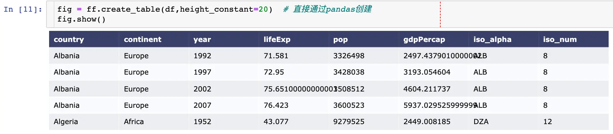
Table and Graph
demo(水平方向)
水平方向是根据相同的x轴来绘制的
# 给定表格数据
table_data = [['Team', 'Wins', 'Losses', 'Ties'], # 直接给定每行的数据
['Montréal<br>Canadiens', 18, 4, 0], # 数据的换行显示
['Dallas Stars', 18, 5, 0],
['NY Rangers', 16, 5, 0],
['Boston<br>Bruins', 13, 8, 0],
['Chicago<br>Blackhawks', 13, 8, 0],
['LA Kings', 13, 8, 0],
['Ottawa<br>Senators', 12, 5, 0]]
# Initialize a figure with ff.create_table(table_data)
fig = ff.create_table(table_data, # 表格数据
height_constant=60) # 间隔
# 给定画图的数据
x = ['Montréal Canadiens', 'Dallas Stars', 'NY Rangers', # 队名
'Boston Bruins', 'Chicago Blackhawks', 'LA Kings', 'Ottawa Senators']
GFPG = [3.54, 3.48, 3.0, 3.27, 2.83, 2.45, 3.18] # 2种得分
GAPG = [2.17, 2.57, 2.0, 2.91, 2.57, 2.14, 2.77]
# Make traces for graph
fig.add_trace(go.Scatter(x=x, y=GFPG,
marker=dict(color='#0099ff'), # 指定颜色
name='Goals For<br>Per Game', # 名称
xaxis='x2', yaxis='y2'))
fig.add_trace(go.Scatter(x=x, y=GAPG,
marker=dict(color='#404040'),
name='Goals Against<br>Per Game',
xaxis='x2', yaxis='y2'))
fig.update_layout(
title_text = 'Title of Figure', # 整个figure的名称
margin = {'t':50, 'b':100}, # 与顶部和底部的距离
xaxis = {'domain': [0, .5]}, # 表格的x轴范围
xaxis2 = {'domain': [0.6, 1]}, # 图形占据的x轴范围
yaxis2 = {'anchor': 'x2', # 表示yaxis的绘图是以x2为基准,title显示在yaxis上
'title': 'Goals'}
)
fig.show()
demo(竖直方向)
竖直方向是根据y轴来确定的
# Add table data
table_data = [['Team', 'Wins', 'Losses', 'Ties'],
['Montréal<br>Canadiens', 18, 4, 0],
['Dallas Stars', 18, 5, 0],
['NY Rangers', 16, 5, 0],
['Boston<br>Bruins', 13, 8, 0],
['Chicago<br>Blackhawks', 13, 8, 0],
['Ottawa<br>Senators', 12, 5, 0]]
fig = ff.create_table(table_data, height_constant=60)
# Add graph data
teams = ['Montréal Canadiens', 'Dallas Stars', 'NY Rangers',
'Boston Bruins', 'Chicago Blackhawks', 'Ottawa Senators']
GFPG = [3.54, 3.48, 3.0, 3.27, 2.83, 3.18]
GAPG = [2.17, 2.57, 2.0, 2.91, 2.57, 2.77]
fig.add_trace(go.Bar(x=teams, y=GFPG, xaxis='x2', yaxis='y2', # 上面的表格属于x1,y1
marker=dict(color='#0099ff'),
name='Goals For<br>Per Game'))
fig.add_trace(go.Bar(x=teams, y=GAPG, xaxis='x2', yaxis='y2',
marker=dict(color='#404040'),
name='Goals Against<br>Per Game'))
fig.update_layout(
title_text = '2016 Hockey Stats',
height = 1000,
margin = {'t':75, # 与顶部的距离
'l':50}, # 与左边的距离
yaxis = {'domain': [0, 0.5]}, # 从最下面开始,向上为正,y轴的区间范围
xaxis2 = {'anchor': 'y2'}, # anchor
yaxis2 = {'domain': [.6, 1], 'anchor': 'x2', 'title': 'Goals'}
)
fig.show()
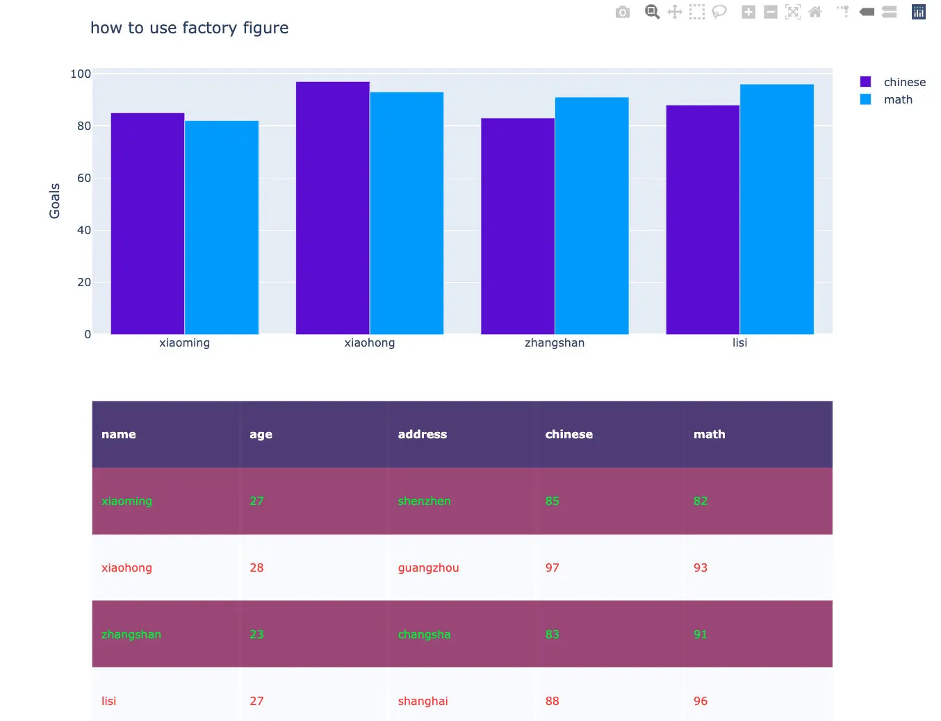
自身数据
df = pd.DataFrame({"name":["xiaoming","xiaohong","zhangshan","lisi"],
"age":np.random.randint(22,30,4),
"address":["shenzhen","guangzhou","changsha","shanghai"],
"chinese":np.random.randint(80,100,4),
"math":np.random.randint(80,100,4)})
colorscale = [[0, '#1d004c'],[0.5, '#7d104c'], [1, '#ffffff']]
font=['#FCFCFC', '#00EE00', '#FF3030']
fig = ff.create_table(df, # 直接通过pandas创建
height_constant=50, # 每行记录的宽度
colorscale=colorscale, # 颜色范围
font_colors=font # 底部颜色
)
# fig.show()
fig.add_trace(go.Bar(x=df["name"].tolist(),
y=df["chinese"].tolist(),
xaxis='x2', yaxis='y2',
marker=dict(color='#580bd3'),
name='chinese')
)
fig.add_trace(go.Bar(x=df["name"].tolist(),
y=df["math"].tolist(),
xaxis='x2', yaxis='y2',
marker=dict(color='#0099ff'),
name='math')
)
fig.update_layout(
title_text = 'how to use factory figure',
height = 800,
margin = {'t':75, # 与顶部的距离
'l':50}, # 与左边的距离
yaxis = {'domain': [0, 0.5]}, # 从最下面开始,向上为正,y轴的区间范围
xaxis2 = {'anchor': 'y2'}, # anchor
yaxis2 = {'domain': [.6, 1], 'anchor': 'x2', 'title': 'Goals'}
)
本文使用 mdnice 排版
], # 第2行数据
['<a href="https://plotly.com/~Grondo/folder/home">Grondo</a>',
'<a href="https://plotly.com/matlab/">Matlab</a>',
'<a href="https://plotly.com/~Grondo/42/">Subplots</a>',
356,'$F-E+V=2
image-20200706150902998 使用pandas生成多个表格
data = px.data.gapminder()
df = data[20:25]

colorscale = [[0, '#1d004c'],[0.5, '#7d104c'], [1, '#ffffff']]
font=['#FCFCFC', '#00EE00', '#008B00', '#004F00', '#FF3030']

fig = ff.create_table(df,  # 直接通过pandas创建
                      height_constant=50,  # 每行记录的宽度
                      colorscale=colorscale,   # 颜色范围
                      font_colors=font   # 底部颜色
                     )
fig.show()
缩小间隔
fig = ff.create_table(df,height_constant=20)  # 直接通过pandas创建
fig.show()
Table and Graph
demo(水平方向)
水平方向是根据相同的x轴来绘制的
# 给定表格数据
table_data = [['Team', 'Wins', 'Losses', 'Ties'],  # 直接给定每行的数据
              ['Montréal<br>Canadiens', 18, 4, 0],  # 数据的换行显示
              ['Dallas Stars', 18, 5, 0],
              ['NY Rangers', 16, 5, 0],
              ['Boston<br>Bruins', 13, 8, 0],
              ['Chicago<br>Blackhawks', 13, 8, 0],
              ['LA Kings', 13, 8, 0],
              ['Ottawa<br>Senators', 12, 5, 0]]
# Initialize a figure with ff.create_table(table_data)
fig = ff.create_table(table_data, # 表格数据
                      height_constant=60)  # 间隔

# 给定画图的数据
x = ['Montréal Canadiens', 'Dallas Stars', 'NY Rangers',   # 队名
         'Boston Bruins', 'Chicago Blackhawks', 'LA Kings', 'Ottawa Senators']

GFPG = [3.54, 3.48, 3.0, 3.27, 2.83, 2.45, 3.18]  # 2种得分
GAPG = [2.17, 2.57, 2.0, 2.91, 2.57, 2.14, 2.77]
# Make traces for graph
fig.add_trace(go.Scatter(x=x, y=GFPG,
                    marker=dict(color='#0099ff'),  # 指定颜色
                    name='Goals For<br>Per Game',  # 名称
                    xaxis='x2', yaxis='y2'))
fig.add_trace(go.Scatter(x=x, y=GAPG,
                    marker=dict(color='#404040'),
                    name='Goals Against<br>Per Game',
                    xaxis='x2', yaxis='y2'))

fig.update_layout(
    title_text = 'Title of Figure',   # 整个figure的名称
    margin = {'t':50, 'b':100},   # 与顶部和底部的距离
    xaxis = {'domain': [0, .5]},   # 表格的x轴范围
    xaxis2 = {'domain': [0.6, 1]},  # 图形占据的x轴范围
    yaxis2 = {'anchor': 'x2',   # 表示yaxis的绘图是以x2为基准,title显示在yaxis上
              'title': 'Goals'}
)

fig.show()
demo(竖直方向)
竖直方向是根据y轴来确定的
# Add table data
table_data = [['Team', 'Wins', 'Losses', 'Ties'],
              ['Montréal<br>Canadiens', 18, 4, 0],
              ['Dallas Stars', 18, 5, 0],
              ['NY Rangers', 16, 5, 0],
              ['Boston<br>Bruins', 13, 8, 0],
              ['Chicago<br>Blackhawks', 13, 8, 0],
              ['Ottawa<br>Senators', 12, 5, 0]]

fig = ff.create_table(table_data, height_constant=60)

# Add graph data
teams = ['Montréal Canadiens', 'Dallas Stars', 'NY Rangers',
         'Boston Bruins', 'Chicago Blackhawks', 'Ottawa Senators']

GFPG = [3.54, 3.48, 3.0, 3.27, 2.83, 3.18]
GAPG = [2.17, 2.57, 2.0, 2.91, 2.57, 2.77]

fig.add_trace(go.Bar(x=teams, y=GFPG, xaxis='x2', yaxis='y2',   # 上面的表格属于x1,y1
                     marker=dict(color='#0099ff'),
                     name='Goals For<br>Per Game'))

fig.add_trace(go.Bar(x=teams, y=GAPG, xaxis='x2', yaxis='y2',
                     marker=dict(color='#404040'),
                     name='Goals Against<br>Per Game'))

fig.update_layout(
    title_text = '2016 Hockey Stats',
    height = 1000,
    margin = {'t':75,   # 与顶部的距离
              'l':50},  # 与左边的距离
    yaxis = {'domain': [0, 0.5]},   # 从最下面开始,向上为正,y轴的区间范围
    xaxis2 = {'anchor': 'y2'},   # anchor
    yaxis2 = {'domain': [.6, 1], 'anchor': 'x2', 'title': 'Goals'}
)

fig.show()
自身数据
df = pd.DataFrame({"name":["xiaoming","xiaohong","zhangshan","lisi"],
                  "age":np.random.randint(22,30,4),
                  "address":["shenzhen","guangzhou","changsha","shanghai"],
                  "chinese":np.random.randint(80,100,4),
                  "math":np.random.randint(80,100,4)})

colorscale = [[0, '#1d004c'],[0.5, '#7d104c'], [1, '#ffffff']]
font=['#FCFCFC', '#00EE00', '#FF3030']

fig = ff.create_table(df,  # 直接通过pandas创建
                      height_constant=50,  # 每行记录的宽度
                      colorscale=colorscale,   # 颜色范围
                      font_colors=font   # 底部颜色
                     )
# fig.show()
fig.add_trace(go.Bar(x=df["name"].tolist(),
                     y=df["chinese"].tolist(),
                     xaxis='x2', yaxis='y2',
                     marker=dict(color='#580bd3'),
                     name='chinese')
                    )

fig.add_trace(go.Bar(x=df["name"].tolist(),
                     y=df["math"].tolist(),
                     xaxis='x2', yaxis='y2',
                     marker=dict(color='#0099ff'),
                     name='math')
                    )

fig.update_layout(
    title_text = 'how to use factory figure',
    height = 800,
    margin = {'t':75,   # 与顶部的距离
              'l':50},  # 与左边的距离
    yaxis = {'domain': [0, 0.5]},   # 从最下面开始,向上为正,y轴的区间范围
    xaxis2 = {'anchor': 'y2'},   # anchor
    yaxis2 = {'domain': [.6, 1], 'anchor': 'x2', 'title': 'Goals'}
)
本文使用 mdnice 排版
] # 第3行数据
]
fig = ff.create_table(data_matrix)
fig.show()
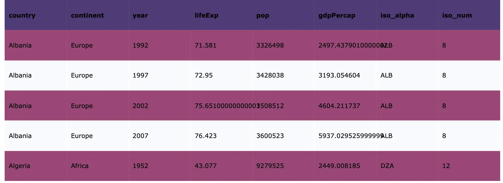
使用pandas生成多个表格
data = px.data.gapminder()
df = data[20:25]
colorscale = [[0, '#1d004c'],[0.5, '#7d104c'], [1, '#ffffff']]
font=['#FCFCFC', '#00EE00', '#008B00', '#004F00', '#FF3030']
fig = ff.create_table(df, # 直接通过pandas创建
height_constant=50, # 每行记录的宽度
colorscale=colorscale, # 颜色范围
font_colors=font # 底部颜色
)
fig.show()
缩小间隔
fig = ff.create_table(df,height_constant=20) # 直接通过pandas创建
fig.show()
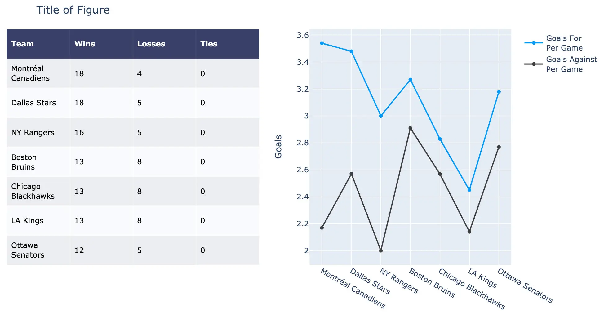
Table and Graph
demo(水平方向)
水平方向是根据相同的x轴来绘制的
# 给定表格数据
table_data = [['Team', 'Wins', 'Losses', 'Ties'], # 直接给定每行的数据
['Montréal<br>Canadiens', 18, 4, 0], # 数据的换行显示
['Dallas Stars', 18, 5, 0],
['NY Rangers', 16, 5, 0],
['Boston<br>Bruins', 13, 8, 0],
['Chicago<br>Blackhawks', 13, 8, 0],
['LA Kings', 13, 8, 0],
['Ottawa<br>Senators', 12, 5, 0]]
# Initialize a figure with ff.create_table(table_data)
fig = ff.create_table(table_data, # 表格数据
height_constant=60) # 间隔
# 给定画图的数据
x = ['Montréal Canadiens', 'Dallas Stars', 'NY Rangers', # 队名
'Boston Bruins', 'Chicago Blackhawks', 'LA Kings', 'Ottawa Senators']
GFPG = [3.54, 3.48, 3.0, 3.27, 2.83, 2.45, 3.18] # 2种得分
GAPG = [2.17, 2.57, 2.0, 2.91, 2.57, 2.14, 2.77]
# Make traces for graph
fig.add_trace(go.Scatter(x=x, y=GFPG,
marker=dict(color='#0099ff'), # 指定颜色
name='Goals For<br>Per Game', # 名称
xaxis='x2', yaxis='y2'))
fig.add_trace(go.Scatter(x=x, y=GAPG,
marker=dict(color='#404040'),
name='Goals Against<br>Per Game',
xaxis='x2', yaxis='y2'))
fig.update_layout(
title_text = 'Title of Figure', # 整个figure的名称
margin = {'t':50, 'b':100}, # 与顶部和底部的距离
xaxis = {'domain': [0, .5]}, # 表格的x轴范围
xaxis2 = {'domain': [0.6, 1]}, # 图形占据的x轴范围
yaxis2 = {'anchor': 'x2', # 表示yaxis的绘图是以x2为基准,title显示在yaxis上
'title': 'Goals'}
)
fig.show()
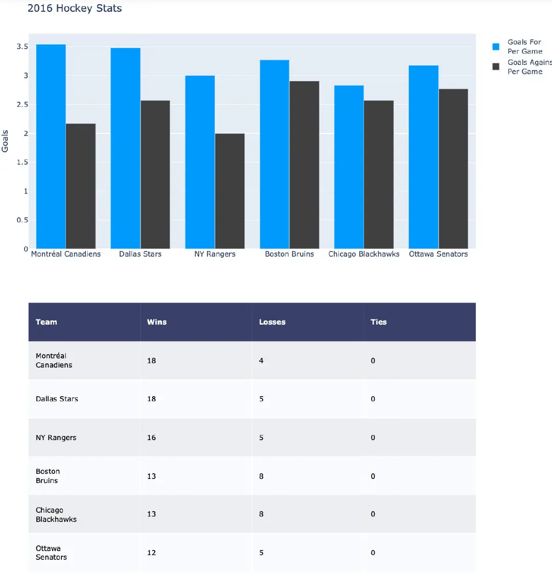
demo(竖直方向)
竖直方向是根据y轴来确定的
# Add table data
table_data = [['Team', 'Wins', 'Losses', 'Ties'],
['Montréal<br>Canadiens', 18, 4, 0],
['Dallas Stars', 18, 5, 0],
['NY Rangers', 16, 5, 0],
['Boston<br>Bruins', 13, 8, 0],
['Chicago<br>Blackhawks', 13, 8, 0],
['Ottawa<br>Senators', 12, 5, 0]]
fig = ff.create_table(table_data, height_constant=60)
# Add graph data
teams = ['Montréal Canadiens', 'Dallas Stars', 'NY Rangers',
'Boston Bruins', 'Chicago Blackhawks', 'Ottawa Senators']
GFPG = [3.54, 3.48, 3.0, 3.27, 2.83, 3.18]
GAPG = [2.17, 2.57, 2.0, 2.91, 2.57, 2.77]
fig.add_trace(go.Bar(x=teams, y=GFPG, xaxis='x2', yaxis='y2', # 上面的表格属于x1,y1
marker=dict(color='#0099ff'),
name='Goals For<br>Per Game'))
fig.add_trace(go.Bar(x=teams, y=GAPG, xaxis='x2', yaxis='y2',
marker=dict(color='#404040'),
name='Goals Against<br>Per Game'))
fig.update_layout(
title_text = '2016 Hockey Stats',
height = 1000,
margin = {'t':75, # 与顶部的距离
'l':50}, # 与左边的距离
yaxis = {'domain': [0, 0.5]}, # 从最下面开始,向上为正,y轴的区间范围
xaxis2 = {'anchor': 'y2'}, # anchor
yaxis2 = {'domain': [.6, 1], 'anchor': 'x2', 'title': 'Goals'}
)
fig.show()
自身数据
df = pd.DataFrame({"name":["xiaoming","xiaohong","zhangshan","lisi"],
"age":np.random.randint(22,30,4),
"address":["shenzhen","guangzhou","changsha","shanghai"],
"chinese":np.random.randint(80,100,4),
"math":np.random.randint(80,100,4)})
colorscale = [[0, '#1d004c'],[0.5, '#7d104c'], [1, '#ffffff']]
font=['#FCFCFC', '#00EE00', '#FF3030']
fig = ff.create_table(df, # 直接通过pandas创建
height_constant=50, # 每行记录的宽度
colorscale=colorscale, # 颜色范围
font_colors=font # 底部颜色
)
# fig.show()
fig.add_trace(go.Bar(x=df["name"].tolist(),
y=df["chinese"].tolist(),
xaxis='x2', yaxis='y2',
marker=dict(color='#580bd3'),
name='chinese')
)
fig.add_trace(go.Bar(x=df["name"].tolist(),
y=df["math"].tolist(),
xaxis='x2', yaxis='y2',
marker=dict(color='#0099ff'),
name='math')
)
fig.update_layout(
title_text = 'how to use factory figure',
height = 800,
margin = {'t':75, # 与顶部的距离
'l':50}, # 与左边的距离
yaxis = {'domain': [0, 0.5]}, # 从最下面开始,向上为正,y轴的区间范围
xaxis2 = {'anchor': 'y2'}, # anchor
yaxis2 = {'domain': [.6, 1], 'anchor': 'x2', 'title': 'Goals'}
)
