

在开始之前,补充下上一篇文章没有一提到的注意点。
伪元素:before 和 :after 直接用content引入的图片无法设置大小,需要设置图片大小的话,可以以背景图的方式引入。同时他们也无法直接绑定事件,因为他们不是真是的dom元素,js无法获取。
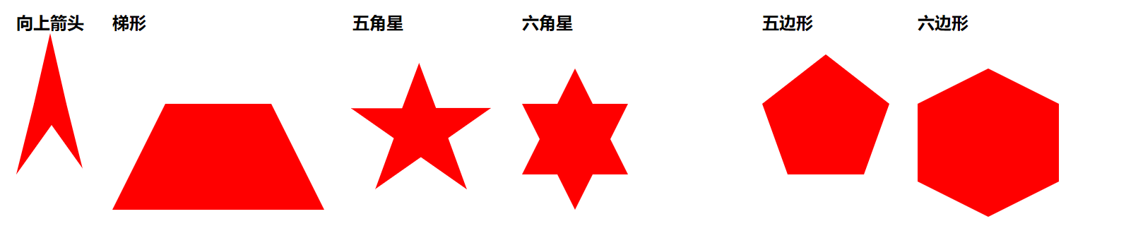
css 制作梯形, 五角星, 六角星, 五边形,六边形
做多边形时主要计算好宽高。
代码如下
<style>
        .body{
            display: flex;
            flex-wrap: wrap;
        }
        .body > div{
            margin: 20px ;

        }
        h2{
            margin-bottom: 100px;
        }
        .top_J{
            border-bottom: 100px solid red;
            border-left: 25px  solid transparent;
            border-right: 25px  solid transparent;
           position: relative;
        }
        .top_J::before{
            content: '';
            border-bottom: 70px solid #fff;
            border-left: 50px solid transparent;
            border-right: 50px solid transparent;
            position: absolute;
            display: block;
            bottom: -100px;
            left: -25px;
        }
        .top_J::after{
            content: '';
            border-bottom: 70px solid red;
            border-left: 50px solid transparent;
            border-right: 50px solid transparent;
            position: absolute;
            display: block;
            bottom: 0;
            left: -25px;
        }
        .ti{
            width: 300px;
            height: 150px;
            overflow: hidden;
            position: relative;
        }
        .ti::before{
           content: '';
           display: block;
           border-bottom: 300px solid red;
           border-left: 150px solid transparent;
           border-right: 150px solid transparent;
           position: absolute;
            bottom: 0;
        }
        .wu{
            width: 300px;
            height: 300px;
            position: relative;
        }
        .wu {
            margin: 50px 0;
            position: relative;
            display: block;
            color: red;
            width: 0px;
            height: 0px;
            border-right: 100px solid transparent;
            border-bottom: 70px solid red;
            border-left: 100px solid transparent;
            -moz-transform: rotate(35deg);
            -webkit-transform: rotate(35deg);
            -ms-transform: rotate(35deg);
            -o-transform: rotate(35deg);
        }
        .wu:before {
            border-bottom: 80px solid red;
            border-left: 30px solid transparent;
            border-right: 30px solid transparent;
            position: absolute;
            height: 0;
            width: 0;
            top: -45px;
            left: -65px;
            display: block;
            content: '';
            -webkit-transform: rotate(-35deg);
            -moz-transform: rotate(-35deg);
            -ms-transform: rotate(-35deg);
            -o-transform: rotate(-35deg);
        }
        .wu:after {
            position: absolute;
            display: block;
            color: red;
            top: 3px;
            left: -105px;
            width: 0px;
            height: 0px;
            border-right: 100px solid transparent;
            border-bottom: 70px solid red;
            border-left: 100px solid transparent;
            -webkit-transform: rotate(-70deg);
            -moz-transform: rotate(-70deg);
            -ms-transform: rotate(-70deg);
            -o-transform: rotate(-70deg);
            content: '';
        }


        .liu{
            width: 300px;
            height: 300px;
            position: relative;

        }
        .liu::before{
            content: '';
            display: block;
            position: absolute;
            top: -50px;
            border-bottom: 150px solid red;
            border-left: 75px solid transparent;
            border-right: 75px solid transparent;
        }
        .liu::after{
            content: '';
            position: absolute;
            top: 0px;
            display: block;
            border-top: 150px solid red;
            border-left: 75px solid transparent;
            border-right: 75px solid transparent;
        }

        .five_sides{
            position: relative;
            width: 108px;
            border-width: 100px 36px 0;
            border-style: solid;
            border-color: red transparent;
        }
        .five_sides::before{
            content: "";
            position: absolute;
            height: 0;
            width: 0;
            top: -170px;
            left: -36px;
            border-width: 0 90px 70px;
            border-style: solid;
            border-color: transparent transparent red;
        }
        .hexagon{
            width: 200px;
            height: 110px;
            background: red;
            position: relative;
        }
        .hexagon:before {
            content: "";
            position: absolute;
            top: -50px;
            left: 0;
            width: 0;
            height: 0;
            border-left: 100px solid transparent;
            border-right: 100px solid transparent;
            border-bottom: 50px solid red;
        }
       .hexagon:after {
            content: "";
            position: absolute;
            bottom: -50px;
            left: 0;
            width: 0;
            height: 0;
            border-left: 100px solid transparent;
            border-right: 100px solid transparent;
            border-top: 50px solid red;
        }
    </style>

    <div class="body">
        <div>
            <h2>向上箭头</h2>
            <P class="top_J"></P>
        </div>
        <div>
            <h2>梯形</h2>
            <P class="ti"></P>
        </div>
        <div>
            <h2>五角星</h2>
            <P class="wu"></P>
        </div>
        <div>
            <h2>六角星</h2>
            <P class="liu"></P>
        </div>

        <div>
            <h2>五边形</h2>
            <P class="five_sides"></P>
        </div>

        <div>
            <h2>六边形</h2>
            <P class="hexagon"></P>
        </div>
    </div>
