

一、需求
一般在开发公司内部或者自己的组件库的时候,往往需要编写一些demo用来调试组件,
然后在编写文档的时候,我们又需要给对应的组件编写示例代码和demo,就显得很麻烦。
所以我想把两件事一起做了!
二、思路
1、把文档中的示例代码run起来,作为我们的调试代码
2、markdown-it可以把md标记转换为html代码
3、在webpack loader中可以使用markdown-it来转换代码,将整个md文件转换为vue单文本组件
4、在loader中提取vue代码标记为子组件,然后再次请求当前loader返回vue代码用作当前md文件的子组件实际代码
三、编写loader
不得不在这里吐槽一下,webpack编写loader不能热更新,只能修改一下run一下,就跟写html页面一样,改一下刷新一下(如果有好的调试办法,请安利一下)。
1、我们跳过配置阶段,重点就是新增loader和resolveLoader:
// webpack.conf.js

{
    test: /\.md$/,
    use: [{
        loader: 'vue-loader'
    },{
        loader: 'markdone-vue-loader'
    }]
}
.
.
.
resolveLoader: {
    alias: {
        'markdone-vue-loader': resolvePath('../lib/index.js')
    }
},
2、在loader中调用markdown-it、markdown-it-container来转换md标记,然后将将vue代码标记为子组件
md.use(container, 'demo', {
    validate: (params: string): boolean => {
        return containerReg.test(params.trim());
    },
    render: (tokens: any, idx: number): string => {
        // 开标签
        if (tokens[idx].nesting === 1) {
            // 当前md文件中唯一组件名
            const componentName: string = getName();
            // 替换:::demo中vue代码为组件
            return `<div class="${demoWrapperClass}">
                <${componentName}></${componentName}>
            `;
        }else{
            // 闭标签
            return `</div>\n`;
        }
    }
});

/**
 * 原始代码:
 *
 * ### 一些markdown标记...
 *
 * :::demo 一些代码简介
 *  ``` vue
 *      <template>
 *          <div>
 *              vue content
 *          </div>
 *      </template>
 *      <scrip>
 *          export default {
 *              name: 'demo'
 *          };
 *      </scrip>
 *  ```
 * :::
 *
 * ###一些markdown标记...
 *
 *
 * ===> 转换结果
 *
 * <h3>一些markdown标记...<h3>
 *  <component0></component0>
 *  <component1></component1>
 * <h3>一些markdown标记...<h3>
 */
3、然后我们把md转换成的html放在<template></template>内,并返回代script的字符串,把步骤二标记的<component0></component0><component1></component1>等组件局部注册,从而让我们的md变成一个类似vue单文本组件。
// 每转换一次`vue`代码,生成对应的唯一组件名、引入路径等
function getName(){
    // 生成唯一组件名,防止与全局冲突
    const componentName: string = `${uniqComponentName}${componentIndex}`;
    // 生成新的请求参数请求当前md文件对应的vue代码
    const request: string = `${resourcePath}?fence&componentIndex=${componentIndex++}`;
    // 引入组件
    srciptImport += `import ${componentName} from ${loaderUtils.stringifyRequest(loaderContext, request)};`;
    // 局部注册组件
    components.push(`'${componentName}': ${componentName}`);
    return componentName;
}

// markdown将md文件转换为html代码
const code: string = md.render(source);

const ret = `
    <template>
        <div class="demo">
            ${code}
        </div>
    </template>

    <script>
        ${srciptImport}
        export default {
            name: 'ComponentDoc',
            components: {
                ${components.join(',')}
            }
        };
    </script>
`;

/**
 * 最终我们的md文件生成结果:
 *
 * <template>
 *  <div class="demo">
 *      ${code}
 *  </div>
 * </template>
 *
 * <script>
 *  import component0 from './当前md文件.md?fence&componentIndex=0'
 *  import component1 from './当前md文件.md?fence&componentIndex=1'
 *
 *  export default {
 *      name: 'ComponentDoc',
 *      components: {
 *          component0,
 *          component1
 *      }
 *  };
 * </script>
 */
4、步骤三已经生成了我们的期望单文本vue组件了,然后底部js运行的时候import component0 from './当前md文件.md?fence&componentIndex=0',会再次请求这个md文件(我在请求参数中添加了fence参数用于loader区分,componentIndex用于分辨我们到底要返回哪一个vue),这一次我们仅需提取我们实际的vue代码并返回,这个返回就是我们步骤三中注册的子组件代码。
// 请求md文件中vue代码块
if (queryParams.fence) {
    // 请求md文件中的第n个vue代码块,从0开始
    const index: number = typeof queryParams.componentIndex === 'string'
        ? Number(queryParams.componentIndex)
        : 0;
    // 从md文件中匹配特殊标记的vue代码
    const matches: null | RegExpMatchArray = source.match(/:::demo[\s\S]*?:::/ig);
    if (!matches || !matches[index]) {
        console.log(`${colors.warn('[md-vue-loader]')}: 请求${resourcePath}中的第${index}个${colors.error(':::demo')}标记块失败。`);
        return '';
    }

    const vueBlocks: null | RegExpMatchArray = matches[index].match(/```([\s\S]*?)(<[\s\S]*)```/i);
    if (vueBlocks && vueBlocks[2]) {
        return vueBlocks[2];
    }

    console.log(`${colors.warn('[md-vue-loader]')}: 请求${resourcePath}中的第${index}个${colors.error(':::demo')}标记块中的vue代码块失败。`);
    return '';
}
5、由于步骤三和步骤四实际都是返回的vue代码,所以我们在webpack配置loader的时候,需要先md-vue-loader,再vue-loader,这样就省去了我们再去处理md文件中的scoped,babel的事情。最终,我们的md文件中的vue代码其实和正常写单文本组件毫无差别(就是在markdown文件中写vue代码没有代码提示,有点别扭)。
6、至此我们的md-vue-loader主要功能基本已实现。我们添加一些参数用作自定义配置,一个比较完善的loader就诞生了。
四、实现并上传至npm
按照上面的逻辑,我已实现一个初级版本,完善了一些参数配置,并上传至npm,由于md-vue-loader名称被占用,所以我取名为markdone-vue-loader。仓库代码为github。
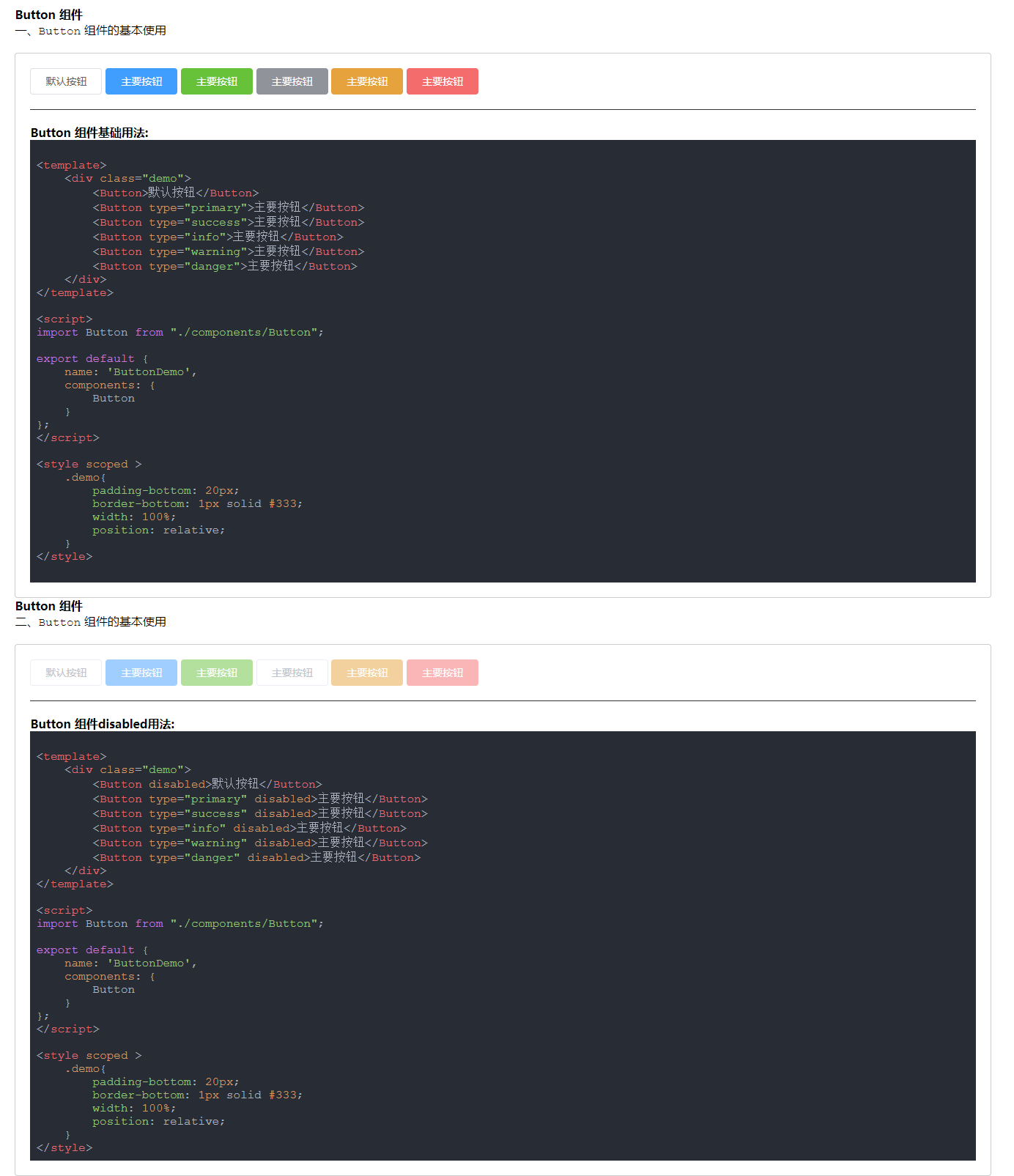
五、转换效果
## Button 组件

一、`Button` 组件的基本使用

:::demo #### Button 组件基础用法:

``` vue

<template>
    <div class="demo">
        <Button>默认按钮</Button>
        <Button type="primary">主要按钮</Button>
        <Button type="success">主要按钮</Button>
        <Button type="info">主要按钮</Button>
        <Button type="warning">主要按钮</Button>
        <Button type="danger">主要按钮</Button>
    </div>
</template>

<script>
import Button from "./components/Button";

export default {
    name: 'ButtonDemo',
    components: {
        Button
    }
};
</script>

<style scoped >
    .demo{
        padding-bottom: 20px;
        border-bottom: 1px solid #333;
        width: 100%;
        position: relative;
    }
</style>

```
:::

## Button 组件

二、`Button` 组件的基本使用

:::demo #### Button 组件disabled用法:
```vue

<template>
    <div class="demo">
        <Button disabled>默认按钮</Button>
        <Button type="primary" disabled>主要按钮</Button>
        <Button type="success" disabled>主要按钮</Button>
        <Button type="info" disabled>主要按钮</Button>
        <Button type="warning" disabled>主要按钮</Button>
        <Button type="danger" disabled>主要按钮</Button>
    </div>
</template>

<script>
import Button from "./components/Button";

export default {
    name: 'ButtonDemo',
    components: {
        Button
    }
};
</script>

<style scoped >
    .demo{
        padding-bottom: 20px;
        border-bottom: 1px solid #333;
        width: 100%;
        position: relative;
    }
</style>
```
:::
六、写在最后
参考:
1、vue-loader
2、element
