

实现思路
❝在vue项目中,会用到很多对话框,通常会借助第三方ui组件库,这里将使用vue自定义组件方式手动实现一个确认对话框组件,在父组件中通v-model指令调用对话框组件,通过props属性动态设置对话框的提示内容、确认取消按钮文字,通过子组件$emit派发事件。
❞
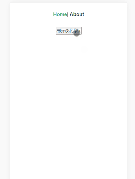
实现效果如下
代码
组件部分
<template>
  <!-- 使用vue的transition添加过渡动画 -->
  <transition name="fade">
    <!-- 透明遮罩层 -->
    <div class="confirm-mask" v-if="showConfirm">
      <div class="wrapper">
        <!-- 提示信息 -->
        <p class="content">{{ content }}</p>
        <!-- 操作按钮 -->
        <div class="btns">
          <span @click="cancel">{{ cancelText }}</span>
          <span @click="confirm">{{ confirmText }}</span>
        </div>
      </div>
    </div>
  </transition>
</template>

<script>
export default {
  props: {
    // 父组件调用通过v-model属性传入
    value: {
      type: Boolean,
      default: false
    },

    content: {
      type: String,
      default: '这里是提示文本'
    },
    cancelText: {
      type: String,
      default: '取消'
    },
    confirmText: {
      type: String,
      default: '确认'
    }
  },
  data() {
    return {
      showConfirm: false // 控制弹框显示和隐藏
    }
  },
  watch: {
    // 因为无法在子组件直接修改props的value属性,所以借助value属性来修改data里面的showfirm属性
    value(val) {
      this.showConfirm = val
    }
  },
  methods: {
    cancel() {
      this.showConfirm = false
      this.$emit('input', false) // 重要, 在设修改子组件的showConfirm为false, 同时也要同步修改父组件中绑定了v-model的属性为false
    },
    confirm() {
      this.showConfirm = false
      this.$emit('input', false)
      this.$emit('confirm') // 派发confirm事件,供父组件调用
    }
  }
}
</script>

<style lang="less" scoped>
.confirm-mask {
  position: fixed;
  left: 0;
  right: 0;
  top: 0;
  bottom: 0;
  background: rgba(0, 0, 0, 0.5);
  color: #555;
  z-index: 998;

  // 过渡动画
  transition: all 0.3s;
  &.fade-enter-active,
  &.fade-leave-to {
    opacity: 0;
    .wrapper {
      transform: scale(0.8);
    }
  }

  .wrapper {
    transition: all 0.3s;

    position: absolute;
    top: 50%;
    left: 50%;
    margin-left: -150px;
    margin-top: -55px;
    z-index: 999;
    width: 300px;
    background: #fff;
    border-radius: 10px;
    overflow: hidden;

    .content {
      height: 60px;
      line-height: 60px;
      margin: 0;
      border-bottom: 1px solid #ddd;
    }
    .btns {
      display: flex;
      span {
        flex: 1;
        height: 50px;
        line-height: 50px;
        &:active {
          background: #eee;
        }
        &:first-child {
          border-right: 1px solid #ddd;
          color: #666;
        }
        &:last-child {
          color: #1989fa;
        }
      }
    }
  }
}
</style>
在父组件中调用
<template>
  <div class="home">
    <button @click="btnClick">显示对话框</button>
    <confirm v-model="show" @confirm="confirm"></confirm>
  </div>
</template>

<script>
import Confirm from '@/components/Confirm'

export default {
  name: 'Home',
  components: {
    Confirm
  },
  data() {
    return {
      show: false
    }
  },
  methods: {
    btnClick() {
      this.show = true
    },
    confirm() {
      alert('弹框显示了')
    }
  }
}
</script>
本文使用 mdnice 排版
