

plotly-express-11-plotly实现柱状图
本文中介绍的是如何在plotly中绘制柱状图Bar,主要是通过两种方法来实现:
- 基于
px.bar - 基于
go.Bar
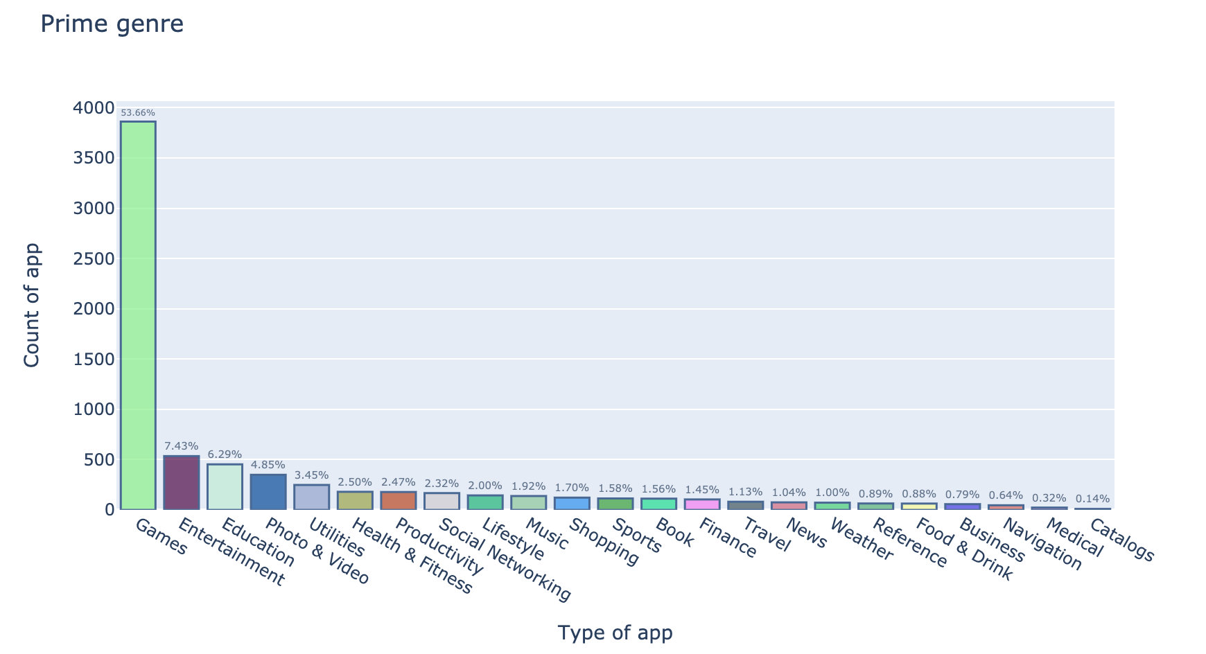
good method
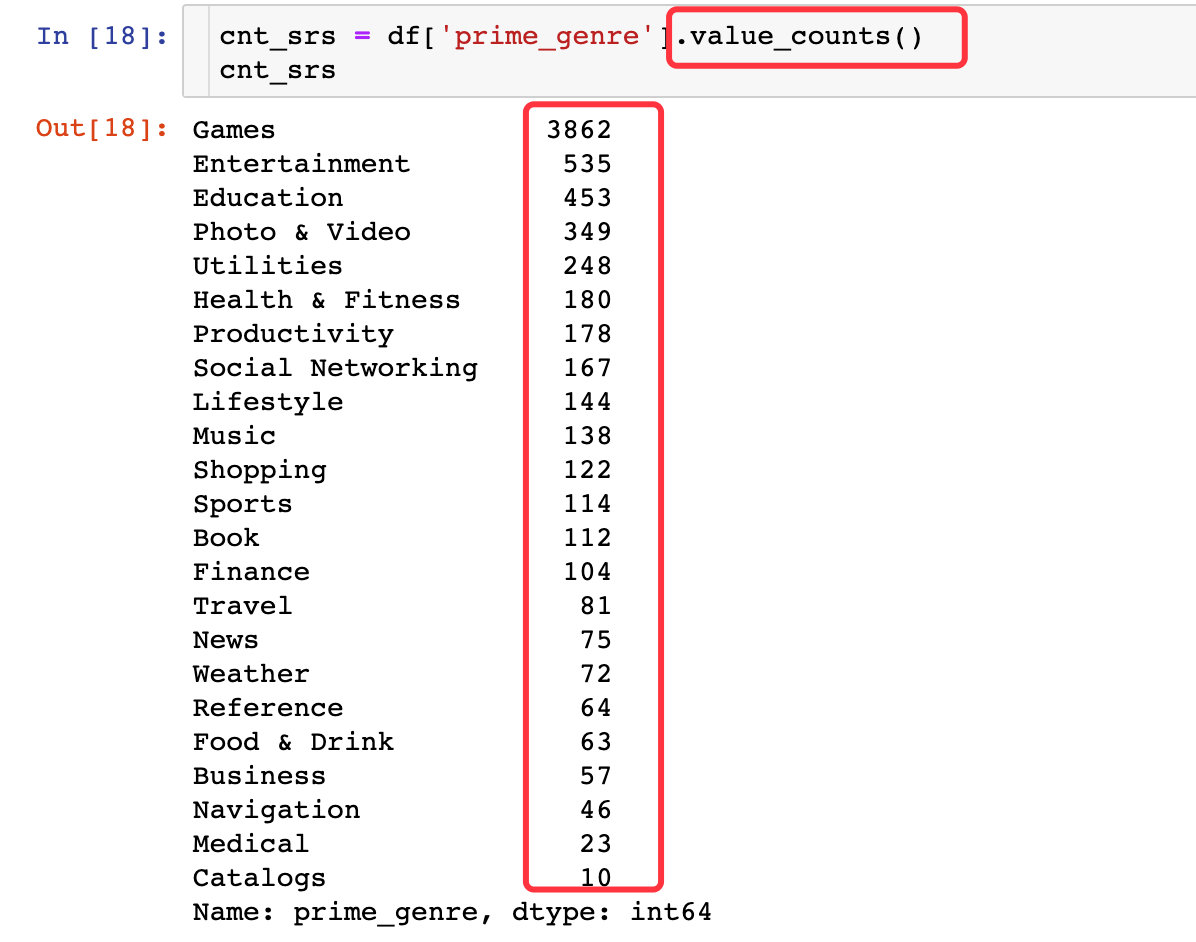
一个很好的方法,如何将Series型数据的index和value通过不同的颜色柱展示出来
数据
文本显示部分
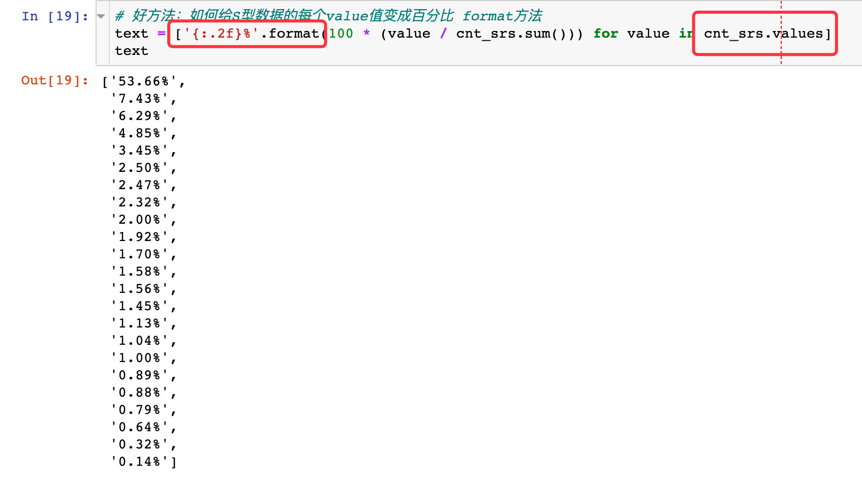
# 颜色的随机生成:#123456  # 加上6位数字构成
def random_color_generator(number_of_colors):
    color = ["#"+''.join([random.choice('0123456789ABCDEF') for j in range(6)])
                 for i in range(number_of_colors)]
    return color

trace = go.Bar(
    x = cnt_srs.index,
    y = cnt_srs.values,
    text = text,
    marker = dict(
        color = random_color_generator(100),
        line = dict(color='rgb(8, 48, 107)',   # 柱子的外围线条颜色和宽度
                    width = 1.5)
    ),
    opacity = 0.7   # 透明度设置
)

# 数据部分:一定是列表的形式
data = [trace]

# 布局设置
layout = go.Layout(
    title = 'Prime genre',   # 整个图的标题
    margin = dict(
        l = 100   # 左边距离
    ),
    xaxis = dict(
        title = 'Type of app'   # 2个轴的标题
    ),
    yaxis = dict(
        title = 'Count of app'
    ),
    width = 900,  # figure的宽高
    height = 500
)

fig = go.Figure(data=data, layout=layout)

fig.update_traces(textposition="outside")

fig.show()
结果
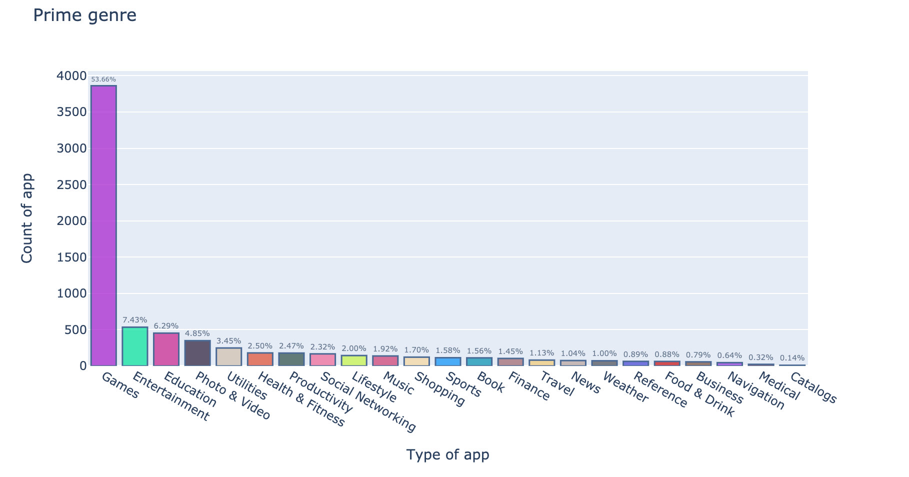
每次运行的结果不同,因为引入了随机模块
导入库
import pandas as pd
import numpy as np

import plotly_express as px
import plotly.graph_objects as go

import dash
import dash_core_components as dcc
import dash_html_components as html
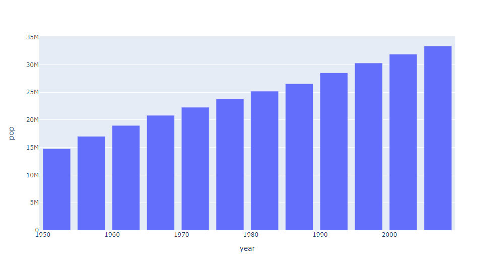
基于px.bar实现
With px.bar, each row of the DataFrame is represented as a rectangular mark.
basic
data_canada = px.data.gapminder().query("country == 'Canada'")
fig = px.bar(data_canada, x="year", y="pop")
fig.show()
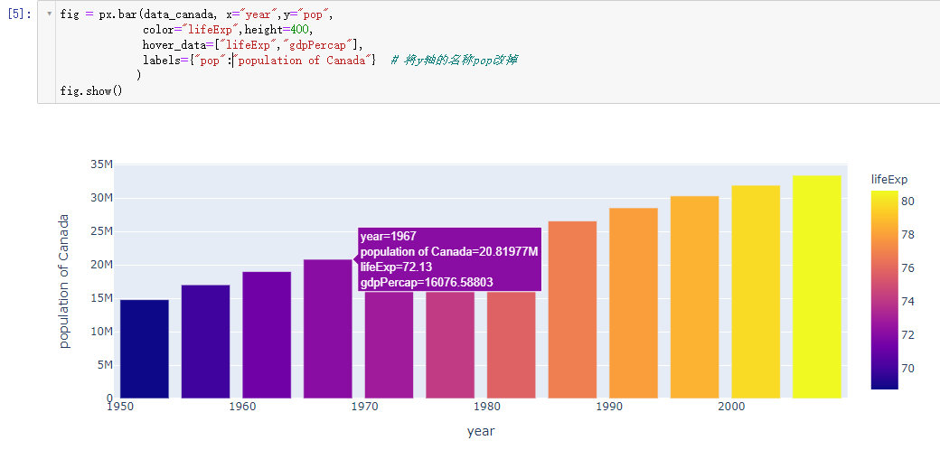
自定义customize
fig = px.bar(data_canada, x="year",y="pop",
             color="lifeExp",height=400,
             hover_data=["lifeExp","gdpPercap"],
             labels={"pop":"population of Canada"}  # 将y轴的名称pop改掉
            )
fig.show()
堆叠柱状图
When several rows share the same value of x (here Female or Male), the rectangles are stacked on top of one another by default.
通过堆叠的方式展示
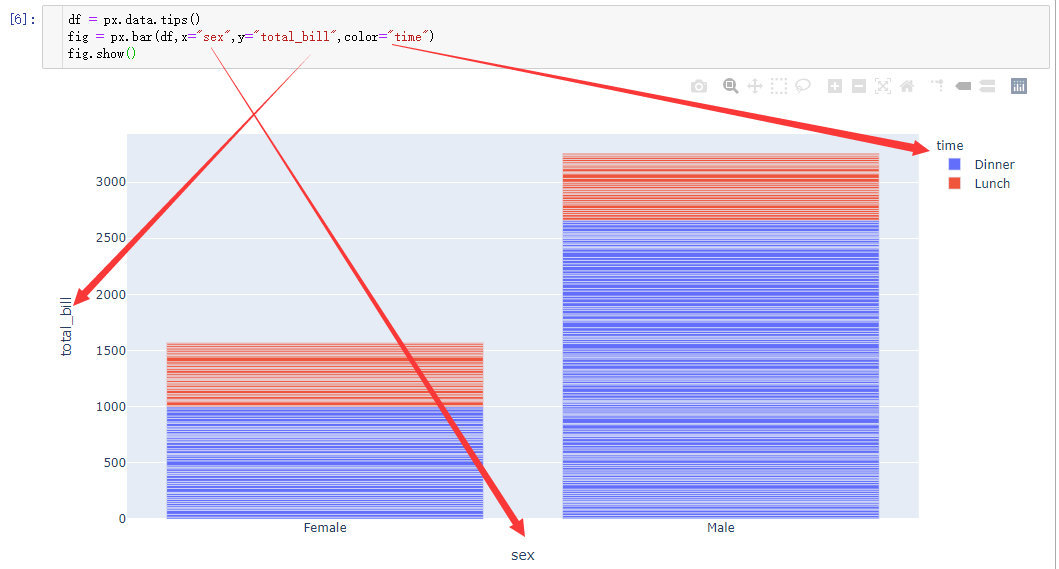
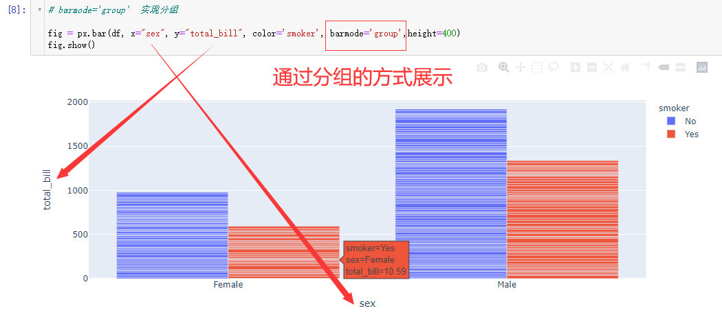
通过分组的方式展示
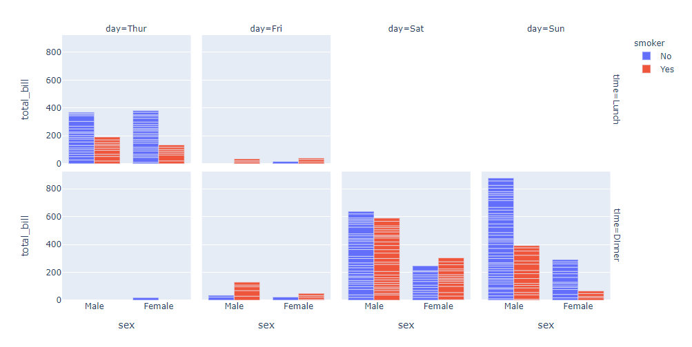
facetted subplots
fig = px.bar(df, x="sex",y="total_bill",
             color="smoker",barmode="group",
             facet_col="day",   #  in the horizontal direction 水平方向
             facet_row="time",  #  in the vertical direction  竖直方向
             category_orders={"day":["Thur","Fri","Sat","Sun"],  # 2个方向的具体分类情况
                             "time":["Lunch","Dinner"]})
fig.show()
基于go.Bar实现
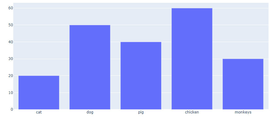
basic
animals = ["cat","dog","pig","chicken","monkeys"]
values = [20,50,40,60,30]

fig = go.Figure(data=(go.Bar(x=animals,y=values)))
fig.show()
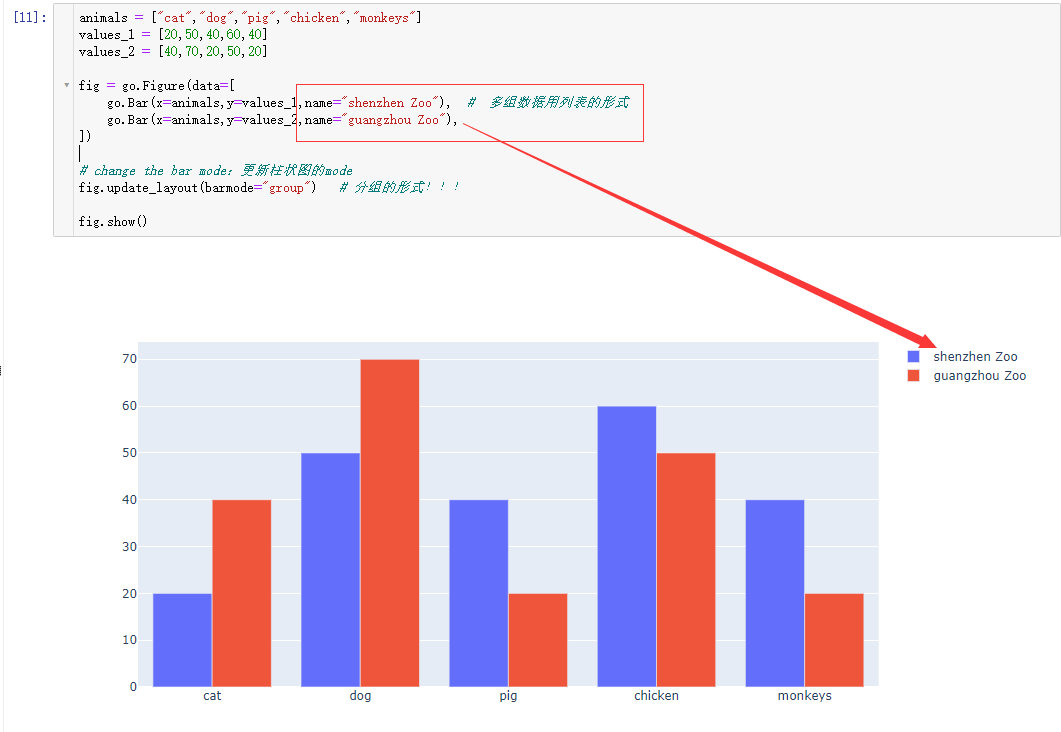
grouped bar chart
animals = ["cat","dog","pig","chicken","monkeys"]
values_1 = [20,50,40,60,40]
values_2 = [40,70,20,50,20]

fig = go.Figure(data=[
    go.Bar(x=animals,y=values_1,name="shenzhen Zoo"),  #  多组数据用列表的形式
    go.Bar(x=animals,y=values_2,name="guangzhou Zoo"),
])

# change the bar mode:更新柱状图的mode
fig.update_layout(barmode="group")   # 分组的形式!!!

fig.show()
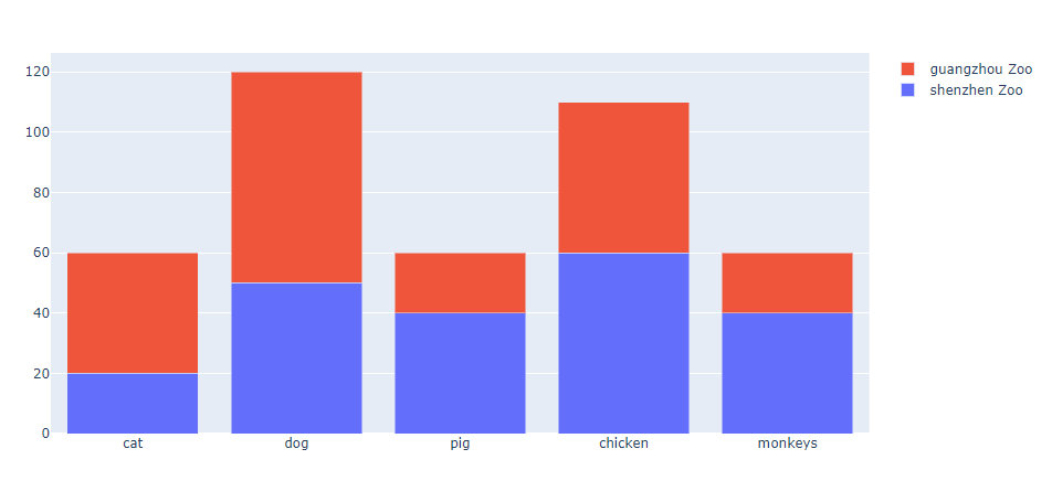
stack bar chart
animals = ["cat","dog","pig","chicken","monkeys"]
values_1 = [20,50,40,60,40]
values_2 = [40,70,20,50,20]

fig = go.Figure(data=[
    go.Bar(x=animals,y=values_1,name="shenzhen Zoo"),  #  多组数据用列表的形式
    go.Bar(x=animals,y=values_2,name="guangzhou Zoo"),
])

# change the bar mode:更新柱状图的mode
fig.update_layout(barmode="stack")   # 堆叠图的形式

fig.show()
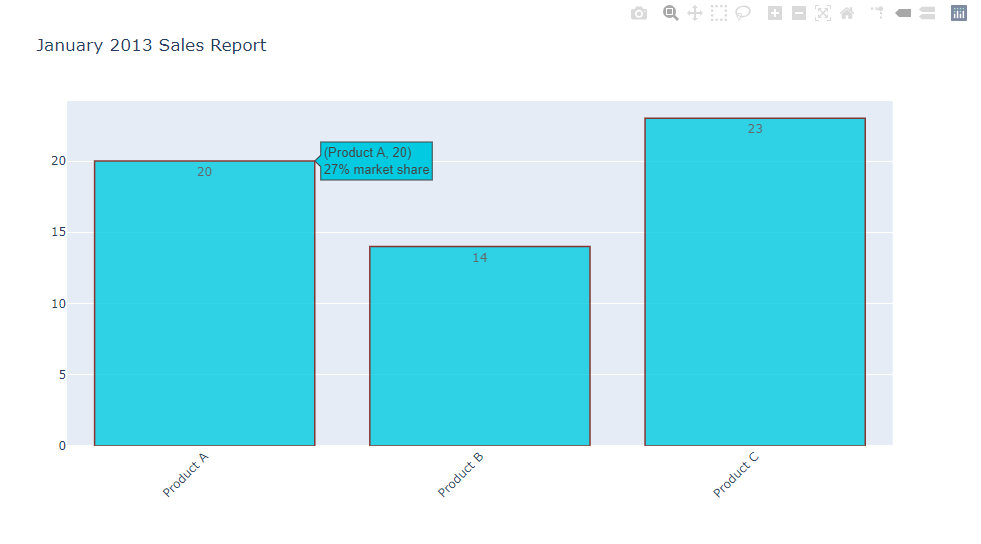
Bar Chart with Hover Text
- 悬停文字信息的显示
- x轴标签的旋转
- y轴上文本信息的显示和位置显示(auto/outside/inside)
x = ['Product A', 'Product B', 'Product C']
y = [20, 14, 23]

# Use the hovertext kw argument for hover text
fig = go.Figure(data=[go.Bar(x=x, y=y,
                             text=y,textposition="auto",  # 矩形框中显示的文本text和文本的位置textposition
                             hovertext=['27% market share', '24% market share', '19% market share']) # 悬停显示文本
                     ])

# update_traces
fig.update_traces(marker_color='rgb(1,202,225)',
                  marker_line_color='rgb(108,10,0)',  # 边框线条颜色
                  marker_line_width=1.5,   # 矩形边框的线条粗细
                  opacity=0.8
                 )

# 图表标题
fig.update_layout(title_text='January 2013 Sales Report',xaxis_tickangle=-45) # 标题 + x轴标签旋转45度
fig.show()
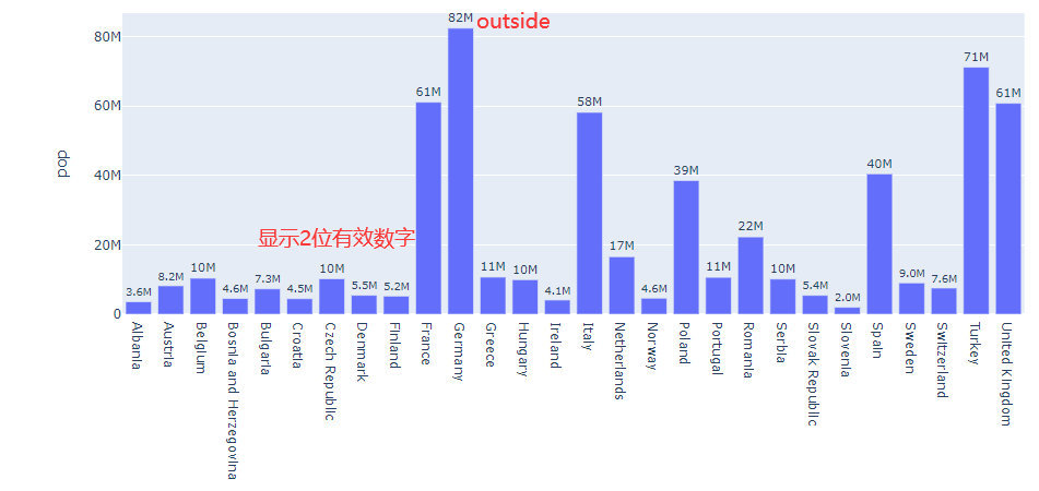
Controlling text fontsize with uniformtext
df = px.data.gapminder().query("continent == 'Europe' and year == 2007 and pop > 2.e6")
fig = px.bar(df, x="country", y="pop", text="pop")

fig.update_traces(texttemplate="%{text:.2s}",  # 数字保留2位有效数字
                  textposition="outside")  # 数字显示在外面
fig.update_layout(uniformtext_minsize=10, uniformtext_mode="hide")

fig.show()
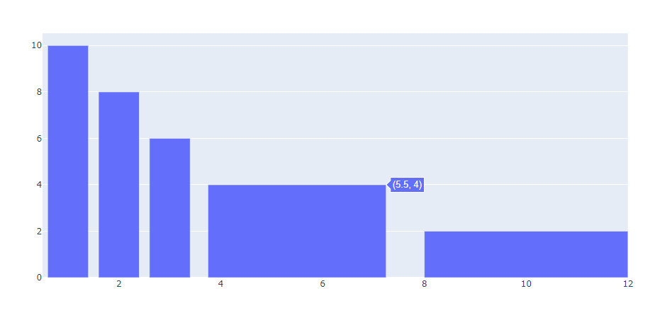
Customizing Individual Bar Widths
如何自定义矩形框的宽度
fig = go.Figure(data=[go.Bar(
    x=[1, 2, 3, 5.5, 10],
    y=[10, 8, 6, 4, 2],
    width=[0.8, 0.8, 0.8, 3.5, 4] # 指定每个矩形框的宽度
)])

fig.show()
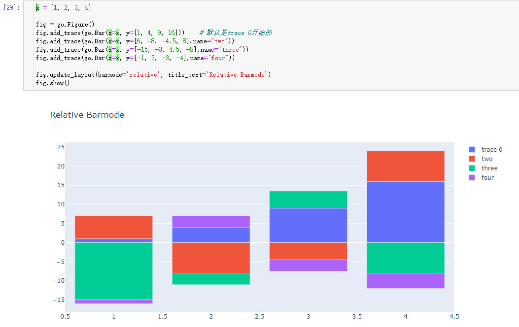
Bar Chart with Relative Barmode
With “relative” barmode, the bars are stacked on top of one another, with negative values below the axis, positive values above.
通过barmode参数的relative来设置
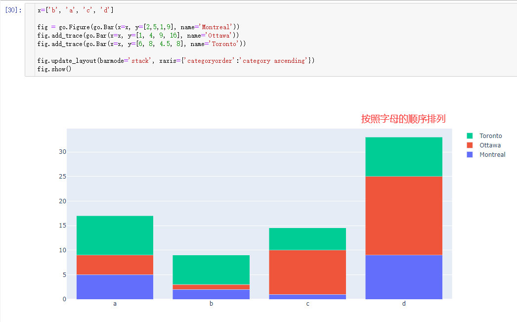
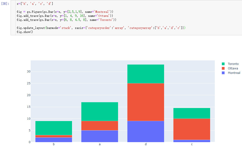
Bar Chart with Sorted or Ordered Categories
Set categoryorder to "category ascending" or "category descending" for the alphanumerical order of the category names or "total ascending" or "total descending" for numerical order of values. categoryorder for more information.
Note that sorting the bars by a particular trace isn’t possible right now - it’s only possible to sort by the total values. Of course, you can always sort your data before plotting it if you need more customization.
参数
- data_frame (DataFrame or array-like or dict) – This argument needs to be passed for column names (and not keyword names) to be used. Array-like and dict are tranformed internally to a pandas DataFrame. Optional: if missing, a DataFrame gets constructed under the hood using the other arguments.
- x (str or int or Series or array-like) – Either a name of a column in
data_frame, or a pandas Series or array_like object. Values from this column or array_like are used to position marks along the x axis in cartesian coordinates. Eitherxorycan optionally be a list of column references or array_likes, in which case the data will be treated as if it were ‘wide’ rather than ‘long’. - y (str or int or Series or array-like) – Either a name of a column in
data_frame, or a pandas Series or array_like object. Values from this column or array_like are used to position marks along the y axis in cartesian coordinates. Eitherxorycan optionally be a list of column references or array_likes, in which case the data will be treated as if it were ‘wide’ rather than ‘long’. - color (str or int or Series or array-like) – Either a name of a column in
data_frame, or a pandas Series or array_like object. Values from this column or array_like are used to assign color to marks. - facet_row (str or int or Series or array-like) – Either a name of a column in
data_frame, or a pandas Series or array_like object. Values from this column or array_like are used to assign marks to facetted subplots in the vertical direction. - facet_col (str or int or Series or array-like) – Either a name of a column in
data_frame, or a pandas Series or array_like object. Values from this column or array_like are used to assign marks to facetted subplots in the horizontal direction. - facet_col_wrap (int) – Maximum number of facet columns. Wraps the column variable at this width, so that the column facets span multiple rows. Ignored if 0, and forced to 0 if
facet_rowor amarginalis set. - hover_name (str or int or Series or array-like) – Either a name of a column in
data_frame, or a pandas Series or array_like object. Values from this column or array_like appear in bold in the hover tooltip. - hover_data (list of str or int, or Series or array-like*, or* dict) – Either a list of names of columns in
data_frame, or pandas Series, or array_like objects or a dict with column names as keys, with values True (for default formatting) False (in order to remove this column from hover information), or a formatting string, for example ‘:.3f’ or ‘|%a’ or list-like data to appear in the hover tooltip or tuples with a bool or formatting string as first element, and list-like data to appear in hover as second element Values from these columns appear as extra data in the hover tooltip. - custom_data (list of str or int, or Series or array-like) – Either names of columns in
data_frame, or pandas Series, or array_like objects Values from these columns are extra data, to be used in widgets or Dash callbacks for example. This data is not user-visible but is included in events emitted by the figure (lasso selection etc.) - text (str or int or Series or array-like) – Either a name of a column in
data_frame, or a pandas Series or array_like object. Values from this column or array_like appear in the figure as text labels. - error_x (str or int or Series or array-like) – Either a name of a column in
data_frame, or a pandas Series or array_like object. Values from this column or array_like are used to size x-axis error bars. Iferror_x_minusisNone, error bars will be symmetrical, otherwiseerror_xis used for the positive direction only. - error_x_minus (str or int or Series or array-like) – Either a name of a column in
data_frame, or a pandas Series or array_like object. Values from this column or array_like are used to size x-axis error bars in the negative direction. Ignored iferror_xisNone. - error_y (str or int or Series or array-like) – Either a name of a column in
data_frame, or a pandas Series or array_like object. Values from this column or array_like are used to size y-axis error bars. Iferror_y_minusisNone, error bars will be symmetrical, otherwiseerror_yis used for the positive direction only. - error_y_minus (str or int or Series or array-like) – Either a name of a column in
data_frame, or a pandas Series or array_like object. Values from this column or array_like are used to size y-axis error bars in the negative direction. Ignored iferror_yisNone. - animation_frame (str or int or Series or array-like) – Either a name of a column in
data_frame, or a pandas Series or array_like object. Values from this column or array_like are used to assign marks to animation frames. - animation_group (str or int or Series or array-like) – Either a name of a column in
data_frame, or a pandas Series or array_like object. Values from this column or array_like are used to provide object-constancy across animation frames: rows with matching [](https://plotly.com/python-api-reference/generated/plotly.express.bar.html#id3)animation_groups will be treated as if they describe the same object in each frame. - category_orders (dict with str keys and list of str values (default
{})) – By default, in Python 3.6+, the order of categorical values in axes, legends and facets depends on the order in which these values are first encountered indata_frame(and no order is guaranteed by default in Python below 3.6). This parameter is used to force a specific ordering of values per column. The keys of this dict should correspond to column names, and the values should be lists of strings corresponding to the specific display order desired. - labels (dict with str keys and str values (default
{})) – By default, column names are used in the figure for axis titles, legend entries and hovers. This parameter allows this to be overridden. The keys of this dict should correspond to column names, and the values should correspond to the desired label to be displayed. - color_discrete_sequence (list of str) – Strings should define valid CSS-colors. When
coloris set and the values in the corresponding column are not numeric, values in that column are assigned colors by cycling throughcolor_discrete_sequencein the order described incategory_orders, unless the value ofcoloris a key incolor_discrete_map. Various useful color sequences are available in theplotly.express.colorssubmodules, specificallyplotly.express.colors.qualitative. - color_discrete_map (dict with str keys and str values (default
{})) – String values should define valid CSS-colors Used to overridecolor_discrete_sequenceto assign a specific colors to marks corresponding with specific values. Keys incolor_discrete_mapshould be values in the column denoted bycolor. Alternatively, if the values ofcolorare valid colors, the string'identity'may be passed to cause them to be used directly. - color_continuous_scale (list of str) – Strings should define valid CSS-colors This list is used to build a continuous color scale when the column denoted by
colorcontains numeric data. Various useful color scales are available in theplotly.express.colorssubmodules, specificallyplotly.express.colors.sequential,plotly.express.colors.divergingandplotly.express.colors.cyclical. - range_color (list of two numbers) – If provided, overrides auto-scaling on the continuous color scale.
- color_continuous_midpoint (number (default
None)) – If set, computes the bounds of the continuous color scale to have the desired midpoint. Setting this value is recommended when usingplotly.express.colors.divergingcolor scales as the inputs tocolor_continuous_scale. - opacity (float) – Value between 0 and 1. Sets the opacity for markers.
- orientation (str, one of
'h'for horizontal or'v'for vertical.) – (default'v'ifxandyare provided and both continous or both categorical, otherwise'v'(‘h’) ifx(y) is categorical andy(x) is continuous, otherwise'v'(‘h’) if onlyx(y) is provided) - barmode (str (default
'relative')) – One of'group','overlay'or'relative'In'relative'mode, bars are stacked above zero for positive values and below zero for negative values. In'overlay'mode, bars are drawn on top of one another. In'group'mode, bars are placed beside each other. - log_x (boolean (default
False)) – IfTrue, the x-axis is log-scaled in cartesian coordinates. - log_y (boolean (default
False)) – IfTrue, the y-axis is log-scaled in cartesian coordinates. - range_x (list of two numbers) – If provided, overrides auto-scaling on the x-axis in cartesian coordinates.
- range_y (list of two numbers) – If provided, overrides auto-scaling on the y-axis in cartesian coordinates.
- title (str) – The figure title.
- template (str or dict or plotly.graph_objects.layout.Template instance) – The figure template name (must be a key in plotly.io.templates) or definition.
- width (int (default
None)) – The figure width in pixels. - height (int (default
None)) – The figure height in pixels.
本文使用 mdnice 排版
