

原文链接:CSS实现元素水平居右
如何实现下图所示的元素居右效果?
网上有很多关于元素水平居中、垂直居中的文章,却少有水平居右或者垂直居底的方法。
但是在实际工作中,元素右对齐以及居底的需求也并不少。
这篇文章就讲讲如何实现元素的水平居右。
内联元素
内联元素的右对齐很简单,只需要在其父元素上添加 text-align: right; 即可。
不过值得注意的是, text-align: right; 对于内联块级元素,比如 img 等同样适用。
代码:
<div class="out">
    <img src="./img/header1.jpg" alt="" class="in">
</div>
.out {
    background-color: cornsilk;
    text-align: right;
}
.in {
    width: 100px;
    height: 100px;
}
效果:
块级元素
块级元素的水平居右方式就有好几种了。
方式一:右浮动
大家之所以没太关注块级元素水平居右,应该很大程度上也是因为浮动,以为一行 float: right; 便能搞定。
但浮动会造成父元素高度的坍塌,所以在使用 float 属性时,往往我们还需要清楚浮动带来的副作用。
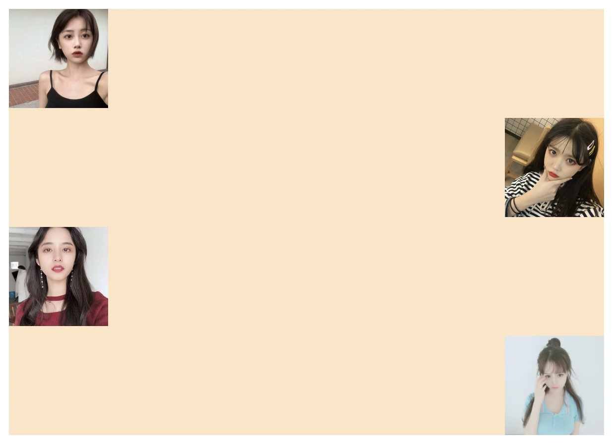
方式二:绝对定位
给元素设置 postion: absolute; right: 0; 也可以实现水平居右,但由于绝对定位,元素脱离了标准文档流。
为了避免给后面元素的位置造成影响,往往还添加一个相对定位的父元素,并且父元素需要知道子元素的高度。
代码:
<div class="demo">
    <h3>通过 postion 属性实现:</h3>
    <div class="box2">
        <img src="./img/header1.jpg" alt="girl" class="item">
        <div class="out">
            <img src="./img/header2.jpg" alt="girl" class="item p-right">
        </div>
        <img src="./img/header3.jpg" alt="girl" class="item">
        <div class="out">
            <img src="./img/header4.jpg" alt="girl" class="item p-right">
        </div>
    </div>
</div>
.demo {
    width: 600px;
    margin: 0 auto;
}
.box2 {
    background-color: bisque;
}
.item {
    width: 100px;
    height: 100px;
    margin-bottom: 10px;
}
.item:last-child {
    margin-bottom: 0;
}
.out {
    position: relative;
    height: 100px;
}
.p-right {
    position: absolute;
    right: 0;
}
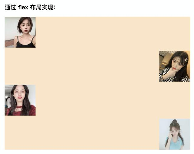
方式三:flex 布局
以前需要掌握各种技巧才能实现的复杂布局,通过 flex 都可以轻松实现,所以元素水平居右这种需求,对于 flex 来说也是小菜一碟。
代码:
<div class="demo">
    <h3>通过 flex 布局实现:</h3>
    <div class="box1">
        <img src="./img/header1.jpg" alt="girl" class="item">
        <img src="./img/header2.jpg" alt="girl" class="item flex-end">
        <img src="./img/header3.jpg" alt="girl" class="item">
        <img src="./img/header4.jpg" alt="girl" class="item flex-end">
    </div>
</div>
.demo {
    width: 600px;
    margin: 0 auto;
}
.box1 {
    display: flex;
    flex-direction: column;
    background-color: bisque;
}
.item {
    width: 100px;
    height: 100px;
    margin-bottom: 10px;
}
.item:last-child {
    margin-bottom: 0;
}
.flex-end {
    align-self: flex-end;
}
效果:
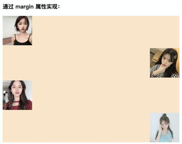
方式四:margin 与 auto
很多人天天都在使用 margin: 0 auto; 来实现块级元素居中,但却不知道 auto 这个值在 margin 属性中的具体表现。
我们将块级元素的某一个水平方向的 margin 值设置为 auto,那么它就会自动填充剩余空间。
如果两个水平方向的 margin 值都为 auto,那么元素就会居中。
代码:
<h3>通过 margin 属性实现:</h3>
<div class="box2">
    <img src="./img/header1.jpg" alt="girl" class="item">
    <img src="./img/header2.jpg" alt="girl" class="item ml-auto">
    <img src="./img/header3.jpg" alt="girl" class="item">
    <img src="./img/header4.jpg" alt="girl" class="item ml-auto">
</div>
.demo {
    width: 600px;
    margin: 0 auto;
}
.box2 {
    background-color: bisque;
}
.item {
    display: block;
    width: 100px;
    height: 100px;
    margin-bottom: 10px;
}
.item:last-child {
    margin-bottom: 0;
}
.ml-auto {
    margin-left: auto;
}
效果:
总结
方式一和方式二虽然都能实现元素水平居右,但都需要更多的代码去处理其副作用。而 flex 布局和 margin + auto 的方式则更显完美。
在需求比较简单时,推荐使用 margin-left: auto; 的方式,一行代码搞定。
布局要求复杂时,那么更强大的 flex 布局则是最佳选择。
至于更强大的 grid 布局,由于一些老版本的360浏览器、qq浏览器等,支持并不是很完善,用户数又较大,所以暂时不做介绍。
