

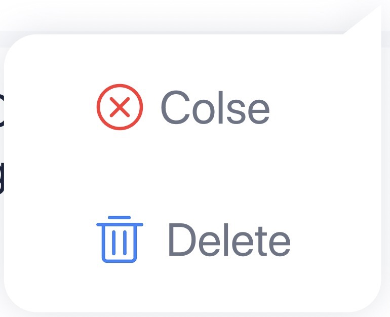
如图
.box{
            position: absolute;
            top: 315px;
            right: 30px;
            box-shadow: 0px 0px 140px rgba(102, 109, 128, 0.2);
            width: 228px;
            height: 168px;
            z-index: 12;
            background: #fff;
            border-radius: 20px;
            display: flex;
            flex-direction: column;
            justify-content: center;
            border-top-right-radius: 0;
        }
        .box:before{
            box-shadow: inset 0 12px 12px -12px rgba(102, 109, 128, 0.2);
            content: '';
            position: absolute;
            right: -24.6px;
            top: -26px;
            width: 50px;
            height: 50px;
            background: #ffffff;
            background: linear-gradient(to bottom right, #fff 50%, rgba(102, 109, 128, 0.2) 52%, rgba(0, 0, 0, 0) 52%);
            transform: rotate(-45deg);
        }
如何大家谁还有更好的实现思路 可以留言讨论~~
