

面对js中需要获取的各种各样的宽度,高度,我们需要分清楚
一、window视图属性
1.1 outerWidth / outerHeight
- outerWidth 浏览器窗口 外部 的宽度
- outerHeight 浏览器窗口 外部 的高度
这2个属性,都是只读属性,如果,你将窗体方法,缩小,值会相应的变化
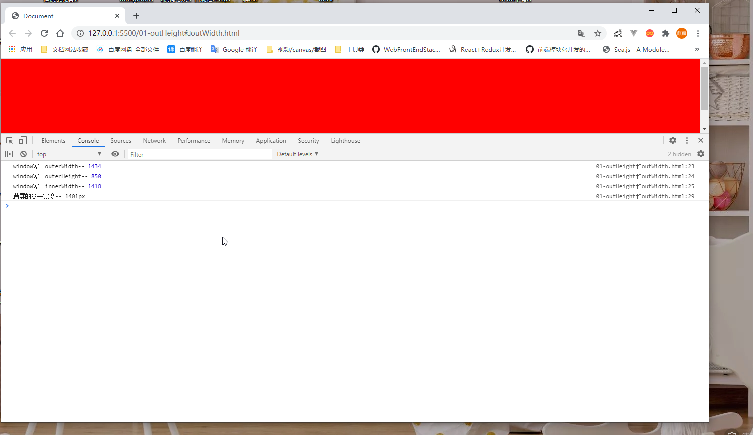
我的笔记本是 1920*1080 的分辨率
<style>
body {
margin: 0;
}
.box {
width: 100%;
height: 200px;
background-color: red;
}
</style>
<body>
<div class="box"></div>
<script>
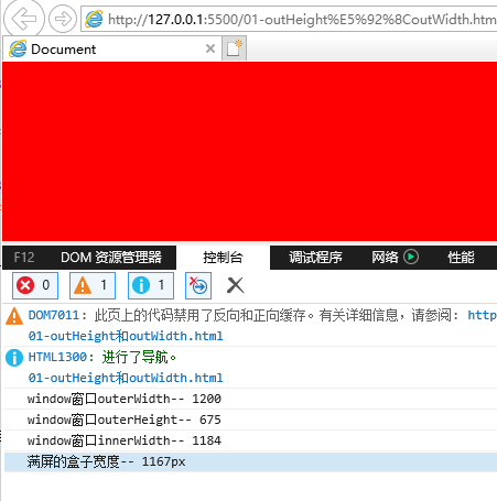
console.log("window窗口outerWidth--",window.outerWidth)
console.log("window窗口outerHeight--",window.outerHeight)
console.log("window窗口innerWidth--",window.innerWidth)
let box = document.querySelector(".box")
console.log("满屏的盒子宽度--",getComputedStyle(box).width)
</script>
</body>
我这里插入一个元素,宽度刚好 100% 来对比,发现问题
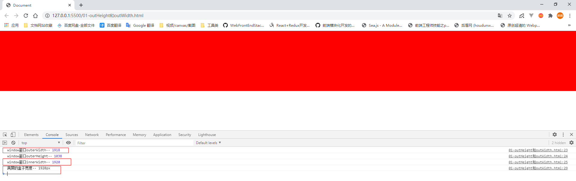
什么情况,outerWidth 的值不是应该等于 满屏的 1920吗? 怎么会比它略小 2px
这是因为:
outerWidth = 浏览器内部的宽度 + 侧边栏(如果有,就算宽度,没有就不算) + 窗口镶边+ 调整浏览器大小的边框(鼠标可以拖拽的那个地方)
可变因素就是后面的那2项,每个浏览器的表现不一样
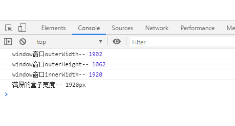
将窗口缩小,Chrome和IE中的表现
Chrome中:
这个数据又不一样,100% 盒子不等于outerWidth
IE中:
结论
缩小的时候:outerWidth > 满屏盒子的宽度
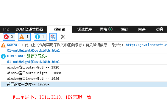
F11全屏下,chrome和IE下的表现
F11 窗口全屏的数据, chrome下的表现
F11 窗口全屏,IE11,IE10,IE9中的表现一致
innertWidth / innerHeight
innerWidth表示获取window窗体的内部宽度,不包括用户界面元素,比如窗框 如果有垂直滚动条,则innerWidth 是包含滚动条的宽度的,如果有横向滚动条,innertHeight也是包含滚动条高度的
- innerWidth
- innerHeight
元素的视图属性
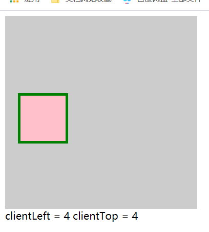
clientLeft / clientTop
clientLeft 元素左边框的宽度, 不包含 padding, 不包含margin
clientTop 上边框的宽度
 <style>
    .box {
      width: 300px;
      height: 300px;
      background-color: #ccc;
      overflow: hidden;
    }

    .son {
      width: 50px;
      height: 50px;
      margin-left: 20px;
      margin-top: 120px;
      border: 4px solid green;
      padding: 10px;
      background: pink;
    }
</style>
<div class="box">
    <div onClick="showMe(this)" class="son"></div>
</div>

<div class="content"></div>

<script>
function showMe(self) {
  let c = document.querySelector('.content')

  c.innerHTML = `
    clientLeft = ${self.clientLeft}

    clientTop = ${self.clientTop}
  `
}
</script>
clientWidth / clientHeight
一句话: 元素内容区的 宽度和高度, 包含padding,不包含border和margin , 不包含滚动条的宽度
注意
行内元素,没有宽高的概念,所以 clientWidth = 0, clientHeight = 0
<style>
.box {
  width: 200px;
  height: 200px;
  padding: 10px;
  background: red;
  border: 2px solid blue;
  overflow-y: scroll;
}
.son {
  height: 300px;
  background: #ccc;
}

</style>
<span onClick="showMe(this)">我是行内元素</span>

<div class="box">
    <div class="son"></div>
</div>

<script>
document.querySelector(".box").addEventListener("click", function () {
  console.log("clientWidth=",this.clientWidth)
  console.log("clientWidth=",this.clientHeight)
})

function showMe(self) {
  console.log(self.clientWidth) // 0
}
</script>
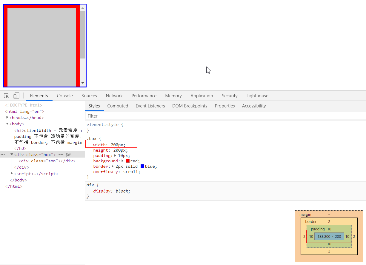
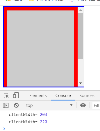
203 = 内容实际宽度183 + 10 + 10
clientHeight也是一样的计算方式
offsetLeft / offsetTop
这2个属性,会返回距离元素最近的,包含当前元素A的,具有定位属性的父级元素B的 left 距离和top距离
或者 最近的 table,td,th,body元素的left和 top距离
1、父子元素都无定位,普通文档流的情况下
示例:
.box {
  width: 100%;
  height: 200px;
  background-color: red;
}
.parent {
  width: 200px;
  height: 100px;
  margin-left: 100px;
  background-color: blueviolet;
}

.son {
  width: 50px;
  height: 50px;
  background-color: pink;
}
<body>
<div class="box">100% * 200px</div>

<div class="parent">
    <div class="son">子元素50*50</div>
    父元素:200*200
    margin-left:100
</div>
</body>
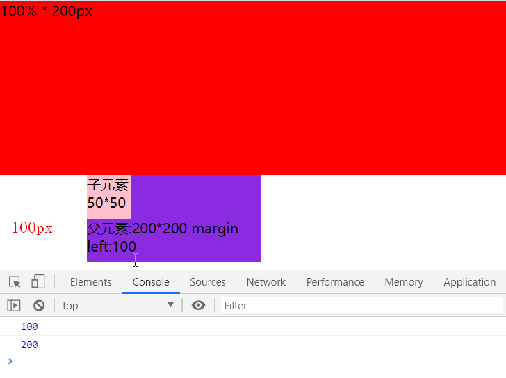
在都无定位情况下, 子元素.son 始终是一 body为参照物,子元素的左上角坐标,等同于父元素左上角坐标 (100, 200), 子元素无视父元素
2、子元素的外层,父元素存在定位属性的情况下 当父元素position是 relative、 absolute、fixed 的情况下, 子元素.son参照物将变成 父元素,不再以body为参照物品,那么 offsetLeft和offsetTop 就是(0,0)
我想知道,我是相对于谁偏移, 使用 offsetParent获取
 document.querySelector(".son").addEventListener("click", function() {
    console.log(this.offsetLeft)
    console.log(this.offsetTop)

    // 获取我是相对于谁偏移
    console.log(this.offsetParent)
})
offsetParent 返回一个DOM元素
注意:
如果当前元素A定位是 fixed或者元素的display:none; 则 offsetParent返回null
offsetWidth / offsetHeight
这个也是描述了 ,元素相对于 offsetParent的一个宽和高, offsetParent是谁,怎么定? 上一行描述比较详细
offsetWidth = 盒子的width + padding(left+right)+盒子的垂直滚动条(scrollbar,如果有的话)
.son {
  width: 50px;
  height: 50px;
  padding: 10px;
  margin: 2px;
  border: 4px solid blue;
  background-color: pink;
}
<div class="parent">
    <div class="son">子元素50*50</div>
    父元素:200*200
    margin-left:100
</div>

document.querySelector(".son").addEventListener("click", function() {
  console.log("offsetWidth", this.offsetWidth) // 78
  console.log("offsetHeight", this.offsetHeight) //78
})
78 = 50 + 10 + 10+ 4 + 4
offsetHeight也是一样的计算方式
scrollLeft / scrollTop
就字面意思,元素发生溢出,出现滚动条,滚动条距离左边的scrollLeft, 或者滚动条距离上边的scollTop 距离
- 首先 需要发生内容溢出,才会出现滚动条和 scollLeft或者 scollTop
- scollLeft或者scollTop 的范围是 0- 元素的宽度/高度 不会是负数或者无限大的一个数字
 <style>
.box {
  width: 300px;
  height: 300px;
  background: red;
  overflow: scroll;
}
.son {
  width: 301px;
  height: 400px;
  background: #ccc;
}
</style>
<body>
  <div class="box">
    <div class="son">一段文字描述一下</div>
  </div>

  <div>
    <h3>当前滚动</h3>
    <div>
      <span>scrollLeft:</span> <span class="scrollLeft"></span>
    </div>
    <div>
      <span>scrollTop:</span> <span class="scrollTop"></span>
    </div>
  </div>

  <script >
    document.querySelector(".box").addEventListener("scroll", function() {
      console.log("scrollLeft=",this.scrollLeft)
      console.log("scrollTop=",this.scrollTop)

      document.querySelector(".scrollLeft").innerText = this.scrollLeft
      document.querySelector(".scrollTop").innerText = this.scrollTop
    })
  </script>
</body>
scrollWidth / scrollHeight
两句话:
- 外层父元素A没有出现滚动条,则元素A的 scollWidth = A元素的clientWidth
- 外层父元素A出现滚动条, A元素的 scollWidth = A元素的clientWidth + A元素最大的scrollLeft
scrollHeight也是一样的道理
干巴巴的话有啥意思,上代码
<style>
// 父元素比子元素小
.box {
  width: 500px;
  height: 500px;
  background: red;
  overflow: auto;
}

.son {
  width: 600px;
  height: 600px;
  background-color: #ccc;
}
</style>
<button onClick="getbox(this)">获取父元素的clientWidth和clienHeight</button>
<div class="content"></div>

<div>
    <h3>父元素</h3>
    <label for="">son-scrollWidth / scrollHeight </label><span class="sw-sh"></span>
    </div>
    <div class="box" onScroll="showMe(this)">
    <div class="son"></div>
</div>

<script>
function showMe(self) {
  let scrollWidth = self.scrollWidth
  let scrollHeight = self.scrollHeight

  let scrollTop = self.scrollTop

  let c = document.querySelector(".sw-sh")

  c.innerText = `

  scrollWidth=  ${scrollWidth}

  scrollHeight= ${scrollHeight}

  clientWidth = ${self.clientWidth}

  clientHeight = ${self.clientHeight}

  滚动条滚动scrollTop=${scrollTop}`
}

function getbox(self) {
  let c = document.querySelector(".content")
  let box = document.querySelector(".box")

  c.innerText = `
  可视区的宽度 clientWidth = ${box.clientWidth}

  scrollWidth = ${box.scrollWidth}
  `
}
</script>
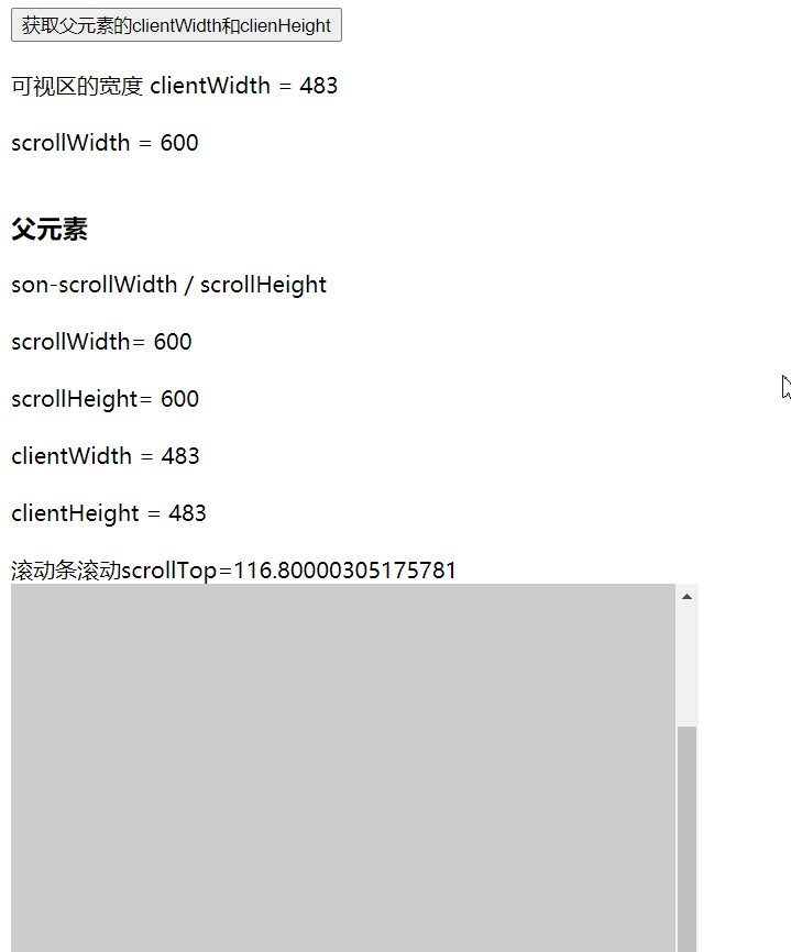
scrollHeight 600 = clientHeight 483 + scollTop 117
