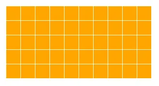
1、网格
<div class="linearBox"></div>
<style>
    .linearBox{
        width: 200px;
        height: 100px;
        background: orange;
        background-image: linear-gradient(white 1px,transparent 0),linear-gradient(to right,white 1px,transparent 0);
        background-size: 20px 20px;
    }
</style>
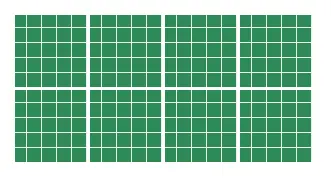
2、网格嵌套
<div class="linearBox"></div>
<style>
.linearBox{
width: 200px;
height: 100px;
background: seagreen;
background-image: linear-gradient(white 2px,transparent 0),linear-gradient(to right,white 2px,transparent 0),
linear-gradient(
background-size: 50px 50px,50px 50px,10px 10px,10px 10px;
}
</style>
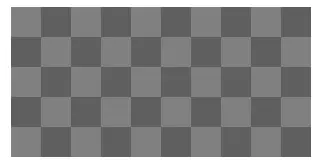
3、棋盘网格
<div class="linearBox"></div>
<style>
    .linearBox{
        width: 200px;
        height: 100px;
        background: seagreen;
        background-image: linear-gradient(45deg,rgba(0,0,0,.25) 25%,transparent 0,transparent 75%,rgba(0,0,0,.25) 0),
                          linear-gradient(45deg,rgba(0,0,0,.25) 25%,transparent 0,transparent 75%,rgba(0,0,0,.25) 0);
        background-size: 40px 40px;
        background-position: 0 0,20px 20px;
    }
</style>
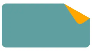
4、折角
<div class="linearBox"></div>
<style>
    .linearBox{
        width: 200px;
        height: 100px;
        position: relative;
        background: linear-gradient(-150deg,transparent 30px,cadetblue 0);
        border-radius: 10px;
    }
    .linearBox::after{
        position: absolute;
        content: "";
        width: 30px;
        height: 60px;
        right: 0;
        border-bottom-left-radius: inherit;
        background: linear-gradient(to left bottom,transparent 50%,orange 0);
        transform: translateY(-44%) rotate(-34deg);
        transform-origin: right bottom;
    }
</style>