

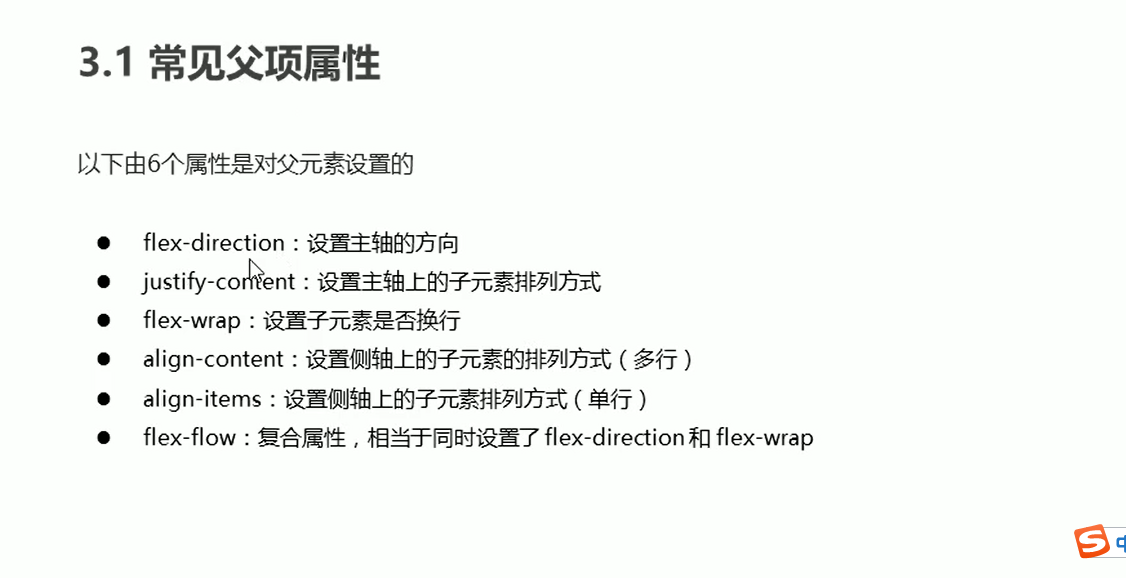
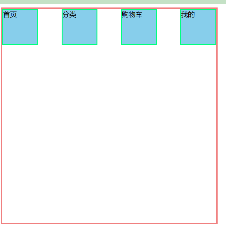
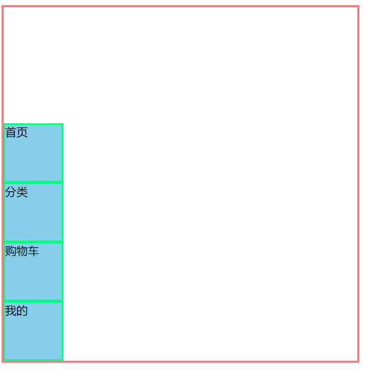
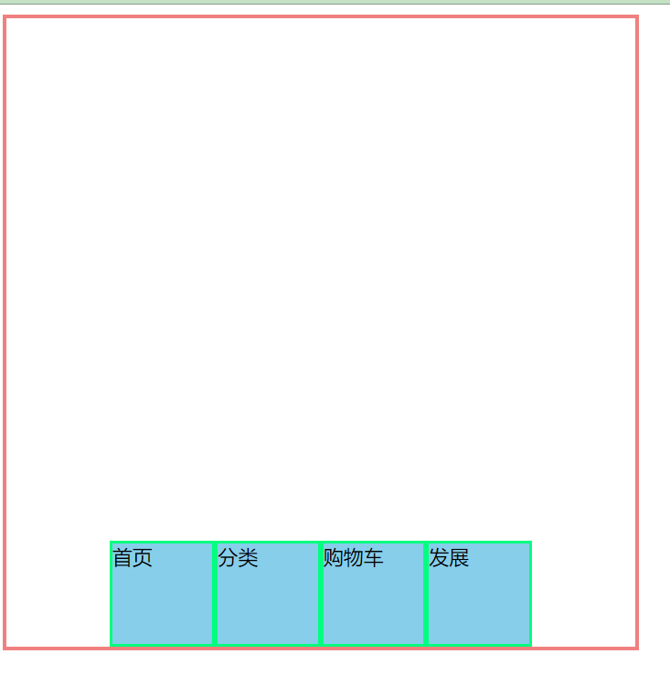
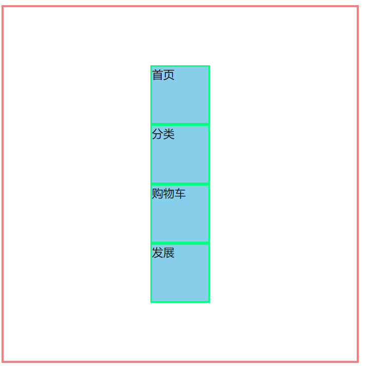
放在父级元素上的属性
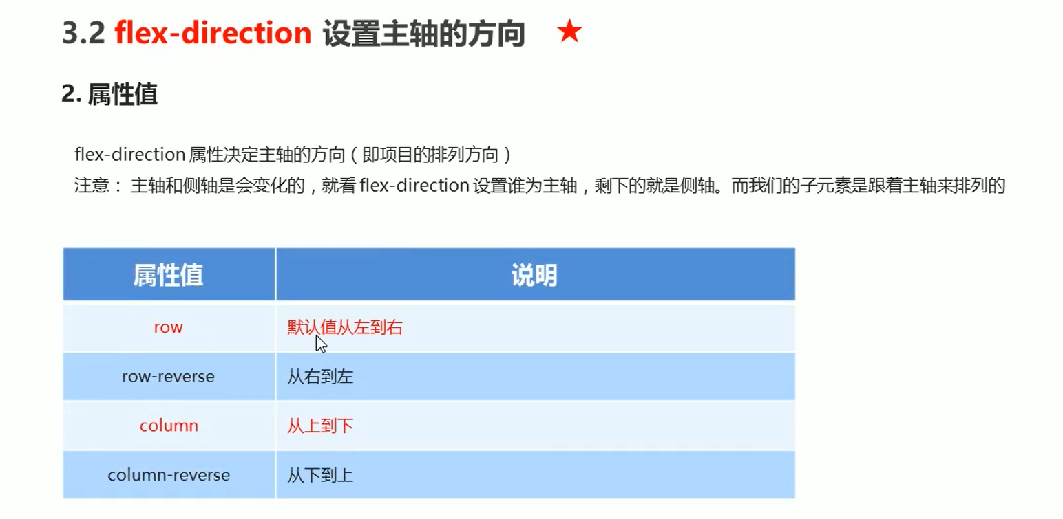
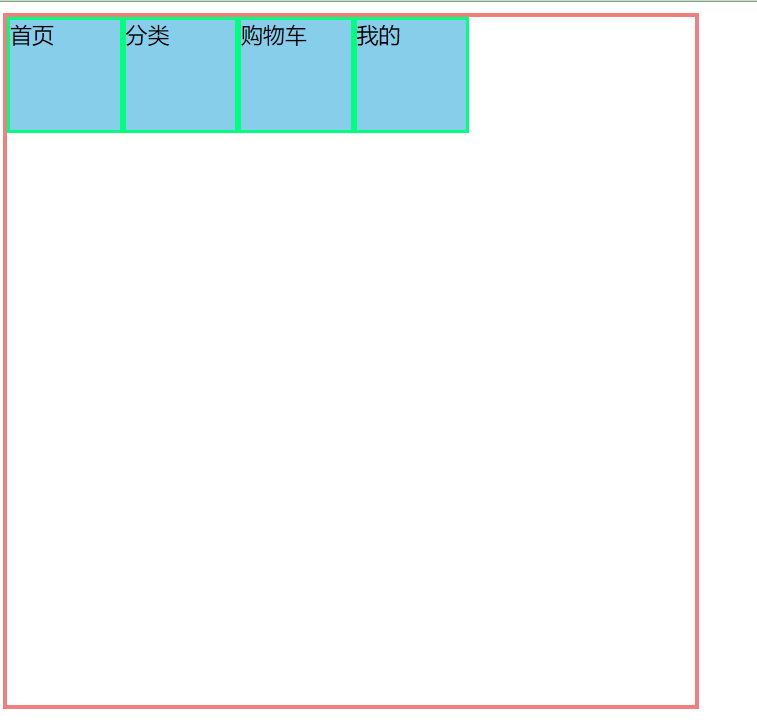
flex-direction
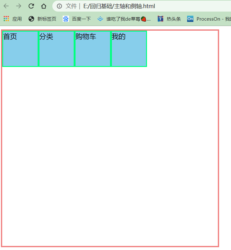
<!DOCTYPE html>
<html lang="en">
<head>
<meta charset="UTF-8">
<meta name="viewport" content="width=device-width, initial-scale=1.0">
<title>Document</title>
<style>
.father{
display: flex;
width: 500px;
height: 500px;
border: 3px solid lightcoral;
/* 默认向右 */
flex-direction: row;
/* flex-direction: row-reverse; */
}
.father div{
width: 80px;
height: 80px;
background-color: skyblue;
border: 2px solid springgreen;
}
</style>
</head>
<body>
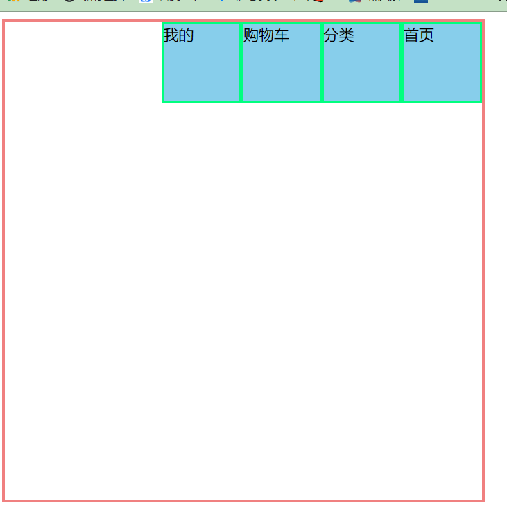
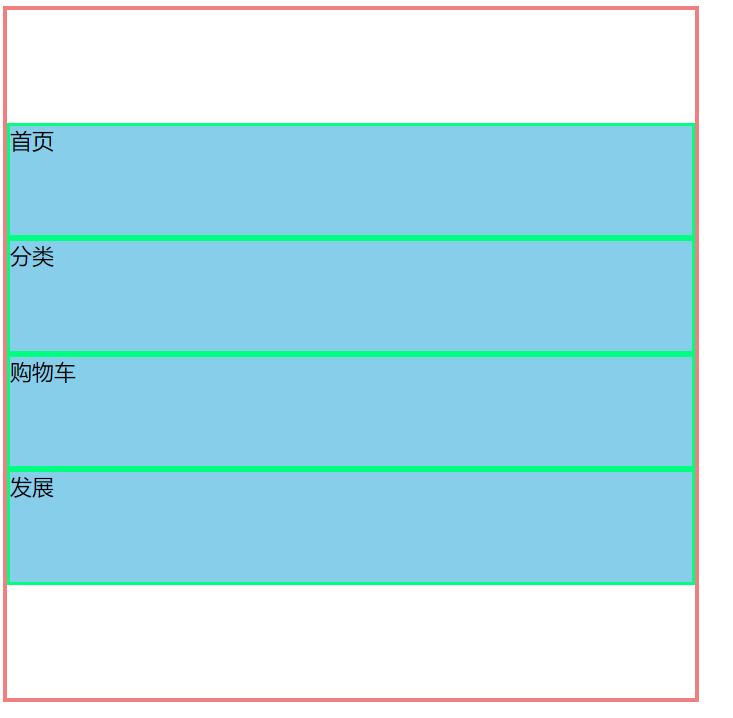
<div class="father">
<div>首页</div>
<div>分类</div>
<div>购物车</div>
<div>我的</div>
</div>
</body>
</html>
右往左排 默认向右 flex-direction: row;
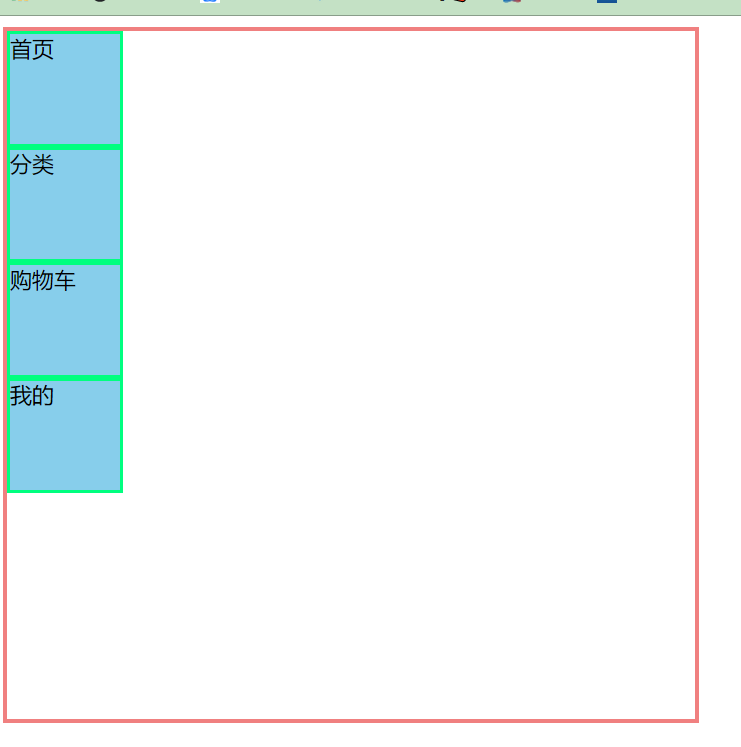
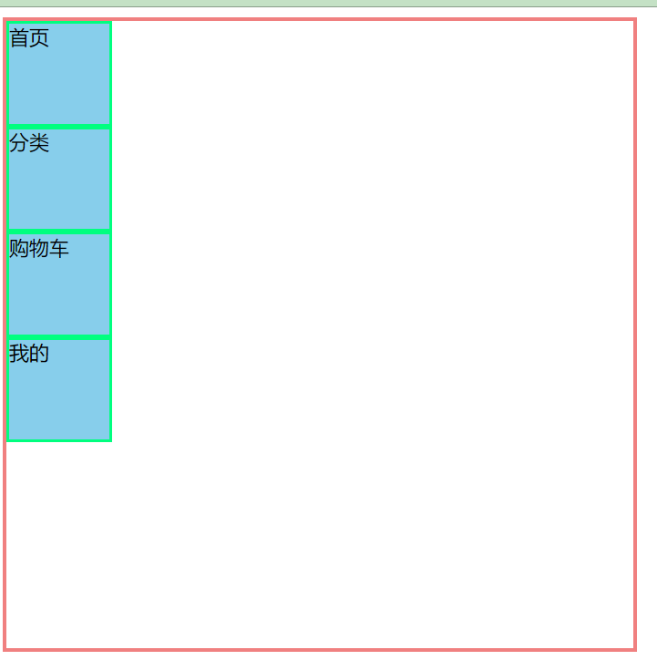
上往下排 flex-direction: column;
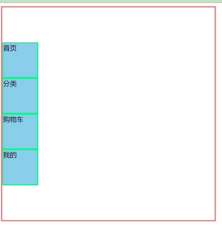
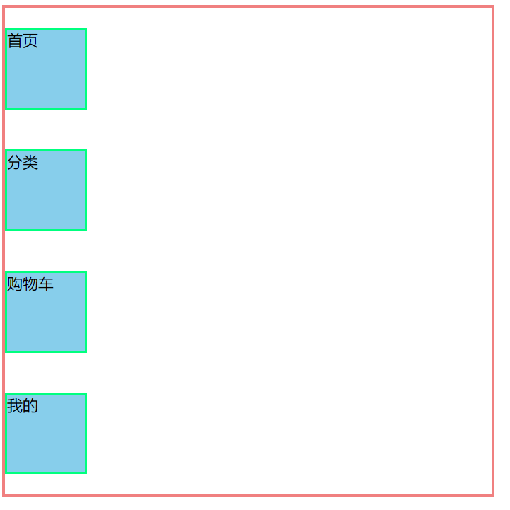
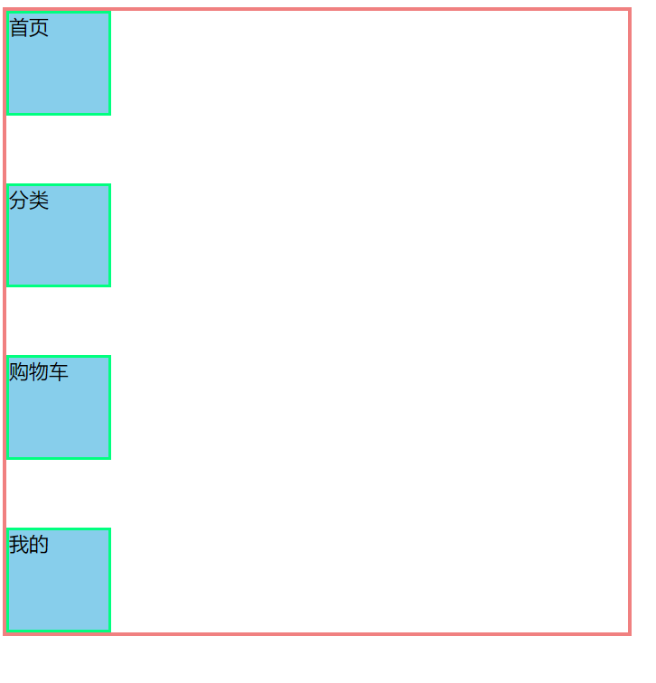
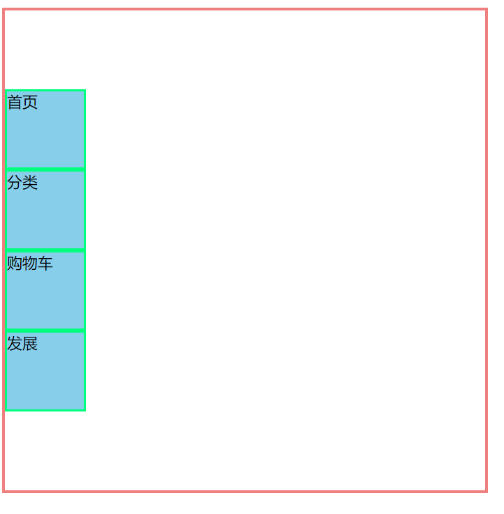
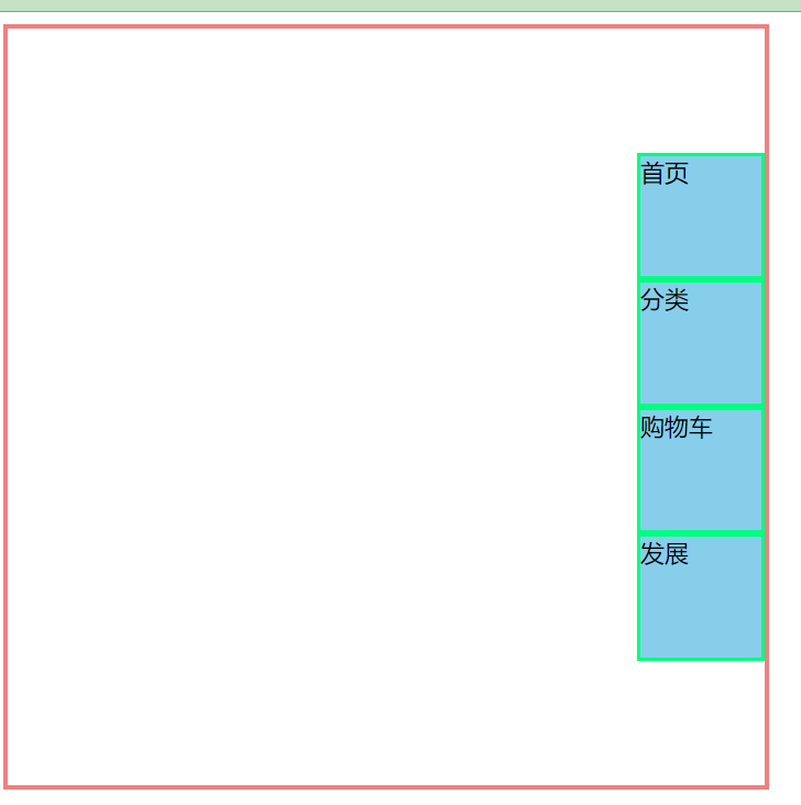
justify-content
<!DOCTYPE html>
<html lang="en">
<head>
    <meta charset="UTF-8">
    <meta name="viewport" content="width=device-width, initial-scale=1.0">
    <title>Document</title>
    <style>
        .father{
            display: flex;
            width: 500px;
            height: 500px;
            border: 3px solid lightcoral;
            flex-direction: row;
            justify-content: flex-start;
            /* justify-content: flex-end; */
        }
        .father div{
            width: 80px;
            height: 80px;
            background-color: skyblue;
            border: 2px solid springgreen;

        }
    </style>
</head>
<body>
    <div class="father">
        <div>首页</div>
        <div>分类</div>
        <div>购物车</div>
        <div>我的</div>
    </div>
</body>
</html>
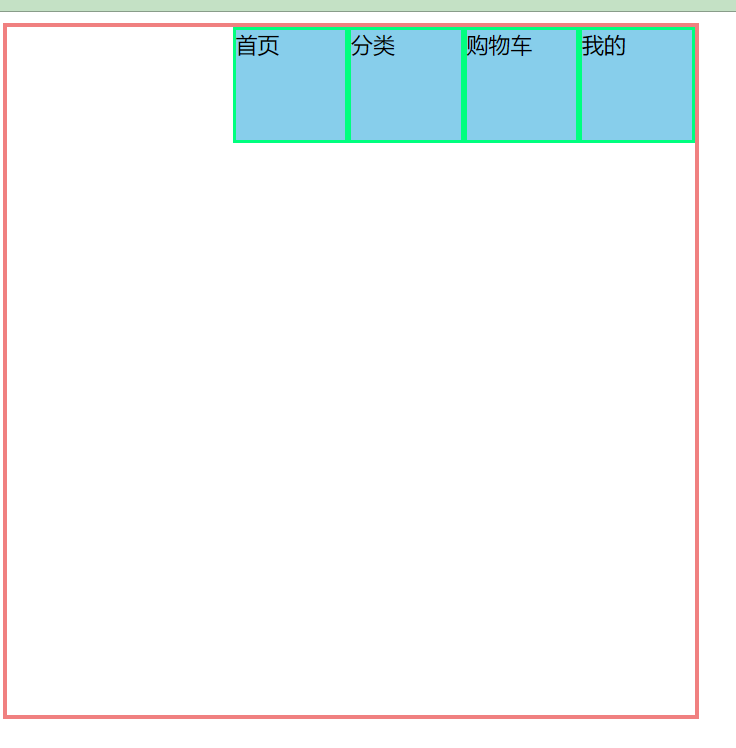
justify-content: flex-start;
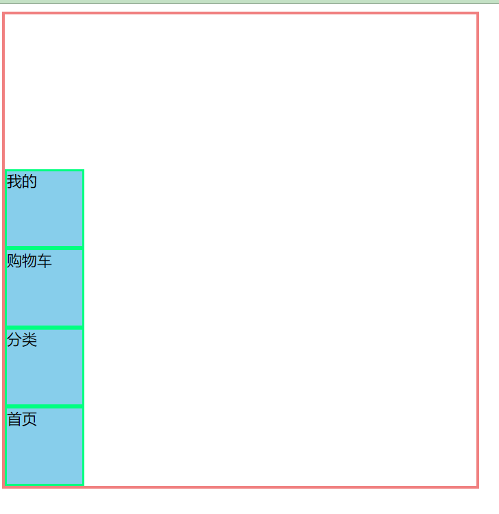
justify-content: flex-end; 注意是子盒子是没有从右向左边排列的
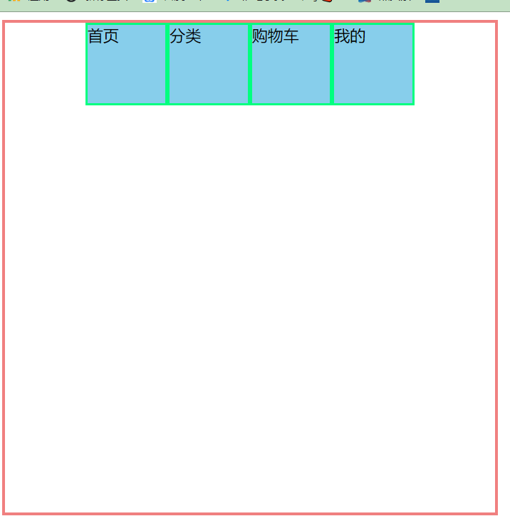
- 水平居中(经常用到的)
justify-content: center;
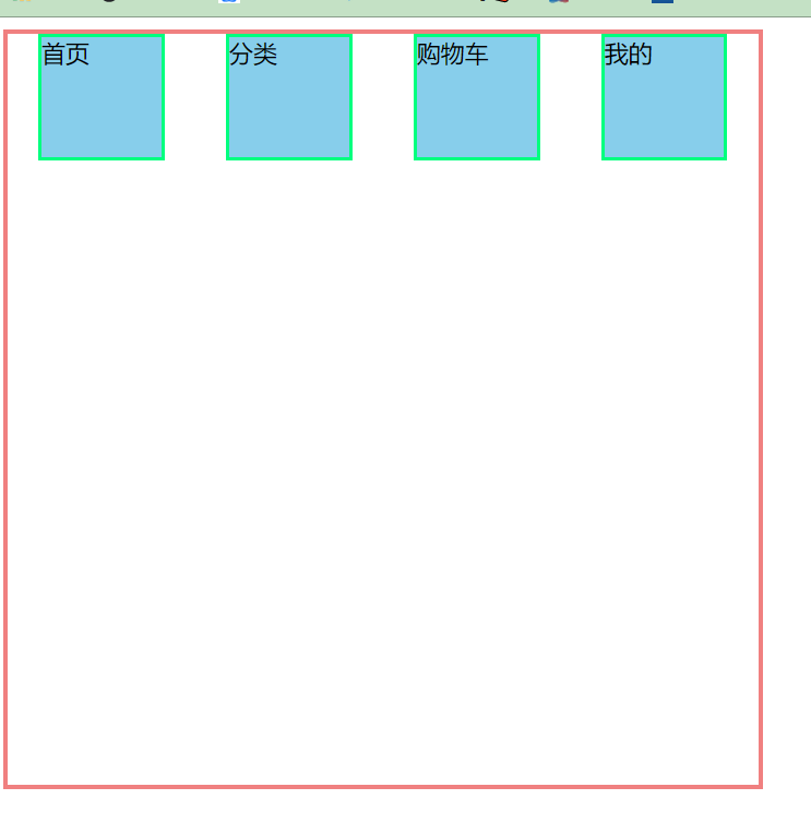
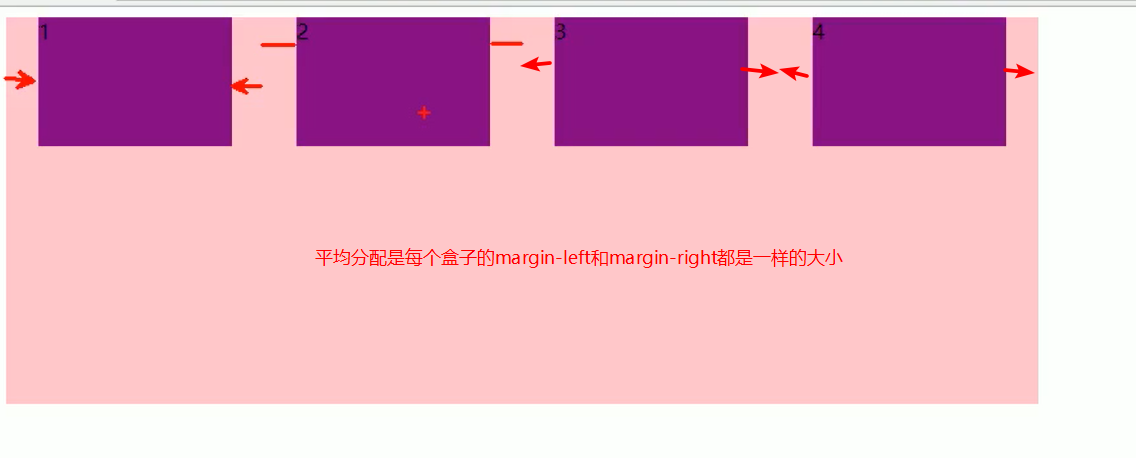
justify-content: space-between; 完成这种布局用到
justify-content 以y轴为主轴
flex-direction: column;
justify-content: flex-start;
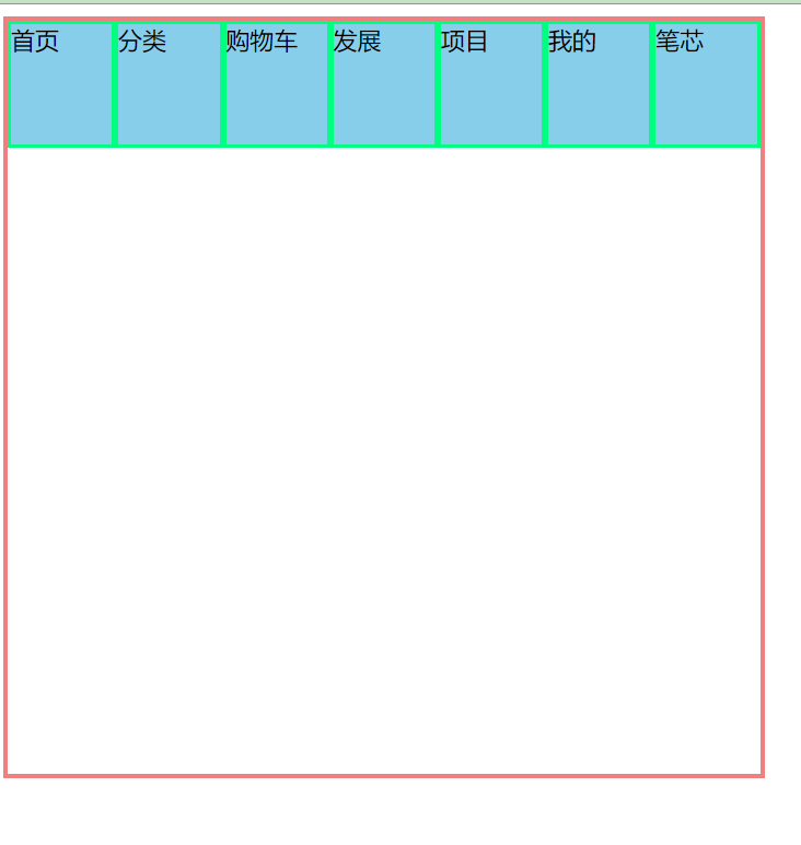
<!DOCTYPE html>
<html lang="en">
<head>
    <meta charset="UTF-8">
    <meta name="viewport" content="width=device-width, initial-scale=1.0">
    <title>Document</title>
    <style>
        .father{
            display: flex;
            width: 500px;
            height: 500px;
            border: 3px solid lightcoral;
            flex-direction: row;

        }
        .father div{
            width: 80px;
            height: 80px;
            background-color: skyblue;
            border: 2px solid springgreen;

        }
    </style>
</head>
<body>
    <div class="father">
        <div>首页</div>
        <div>分类</div>
        <div>购物车</div>
        <div>发展</div>
        <div>项目</div>
        <div>我的</div>
        <div>笔芯</div>
    </div>
</body>
</html>
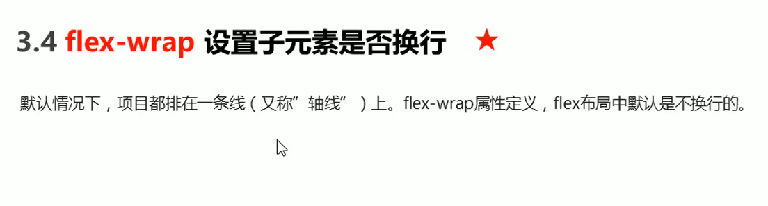
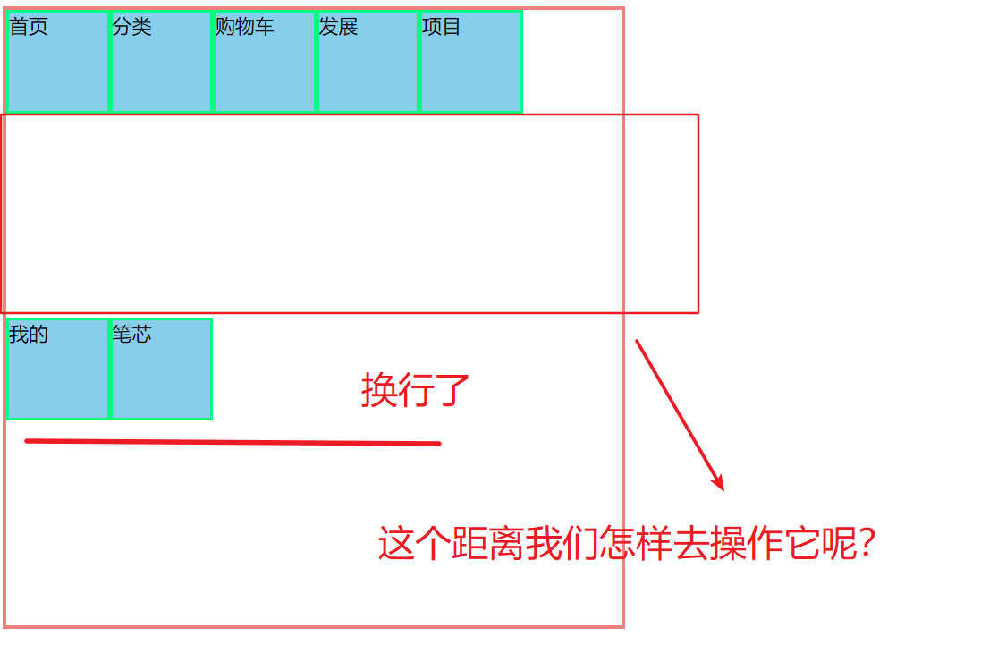
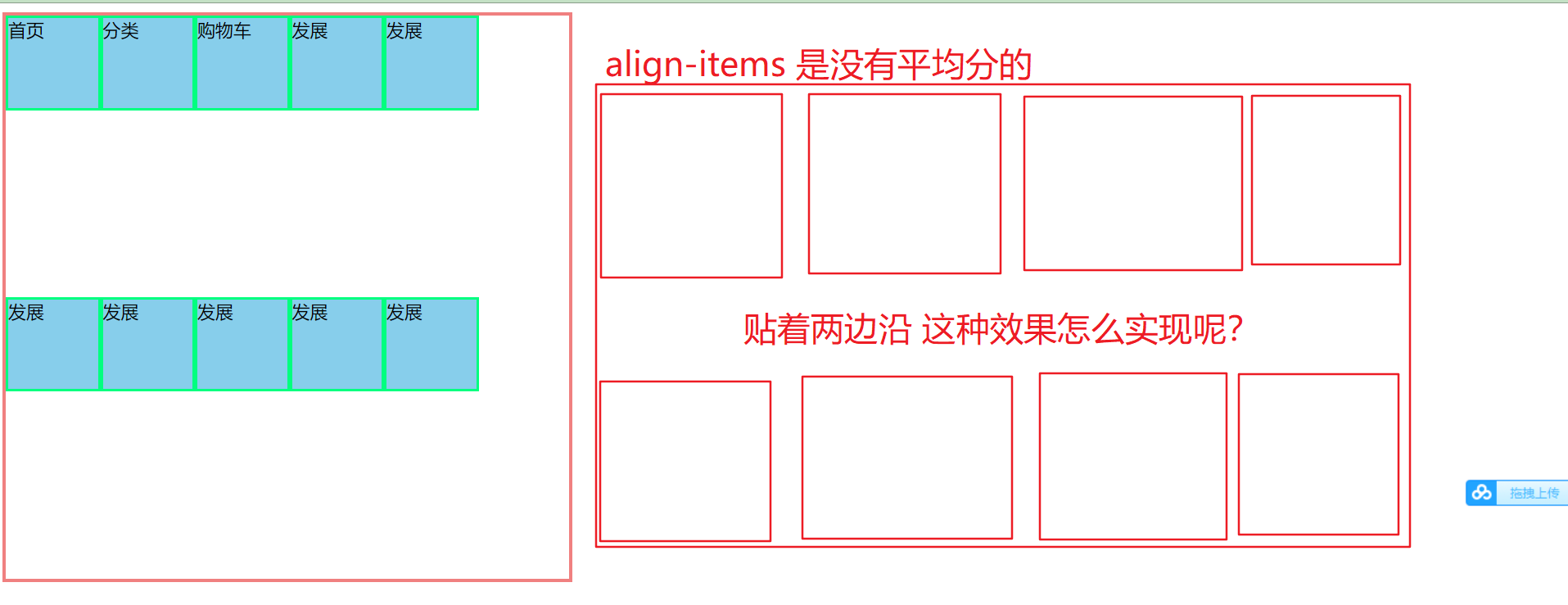
flex布局中,默认的子元素是不换行的,如果装不下,会缩小子元素的宽度,放到父元素里面
换行:flex-wrap:wrap
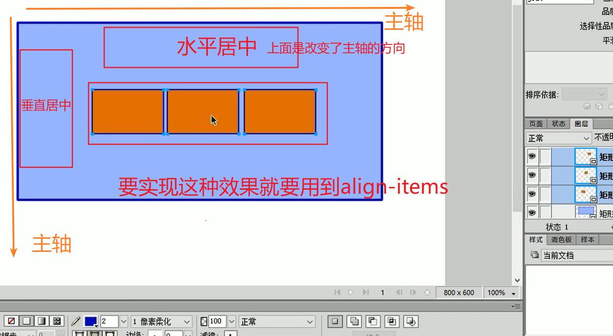
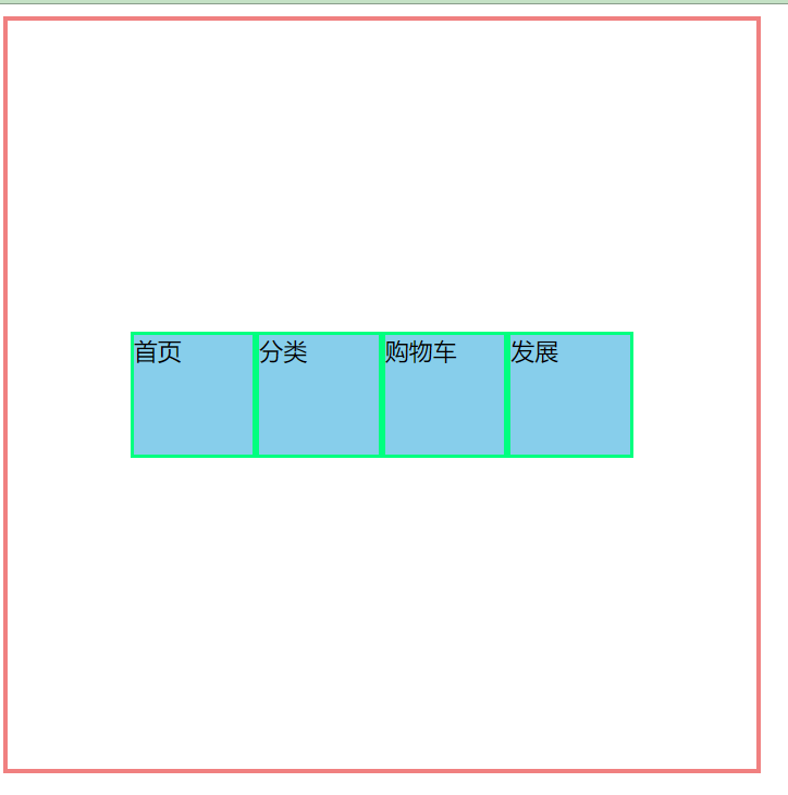
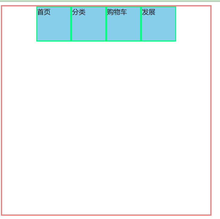
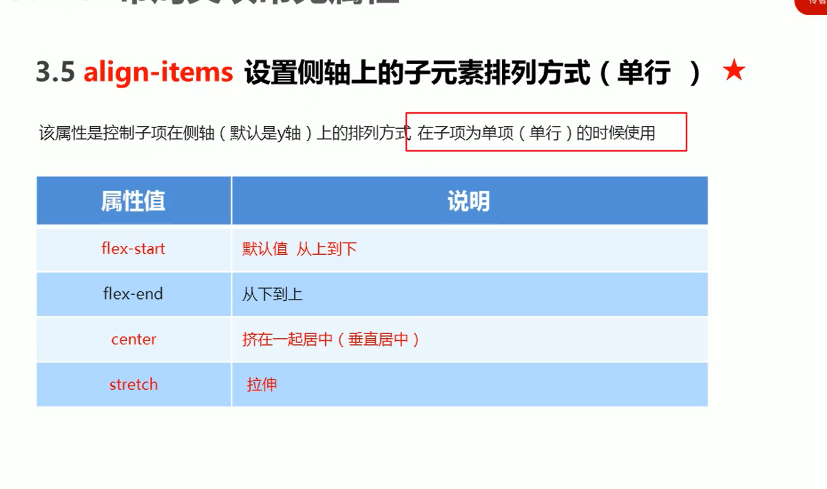
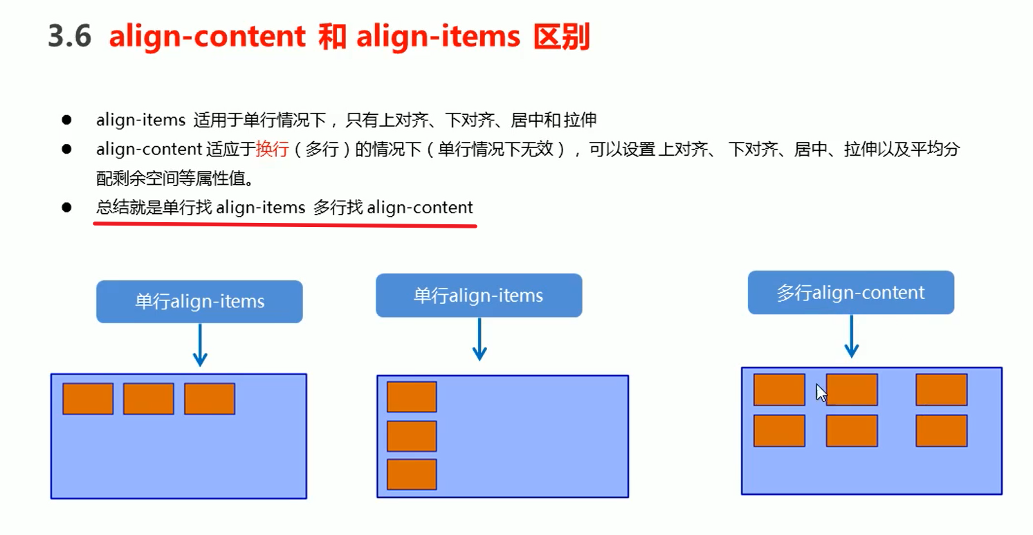
align-items 设置侧轴的(适用于单行)
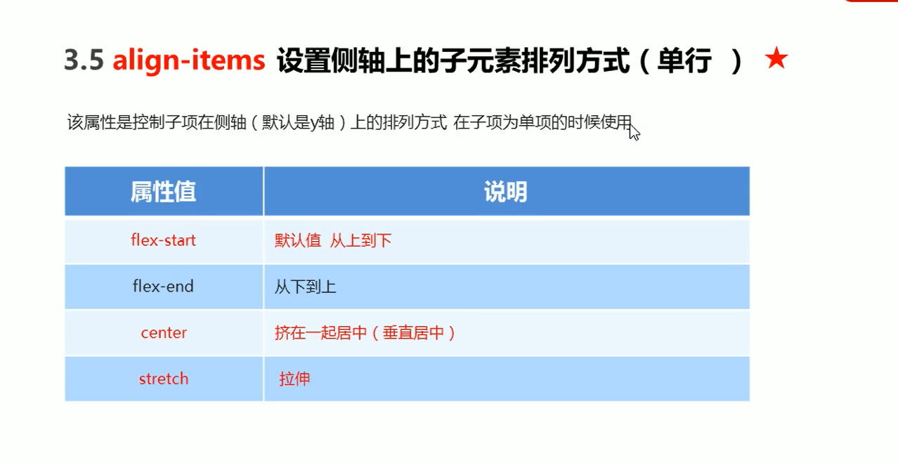
 flex-direction: row;
 justify-content: center;
 align-items: center;
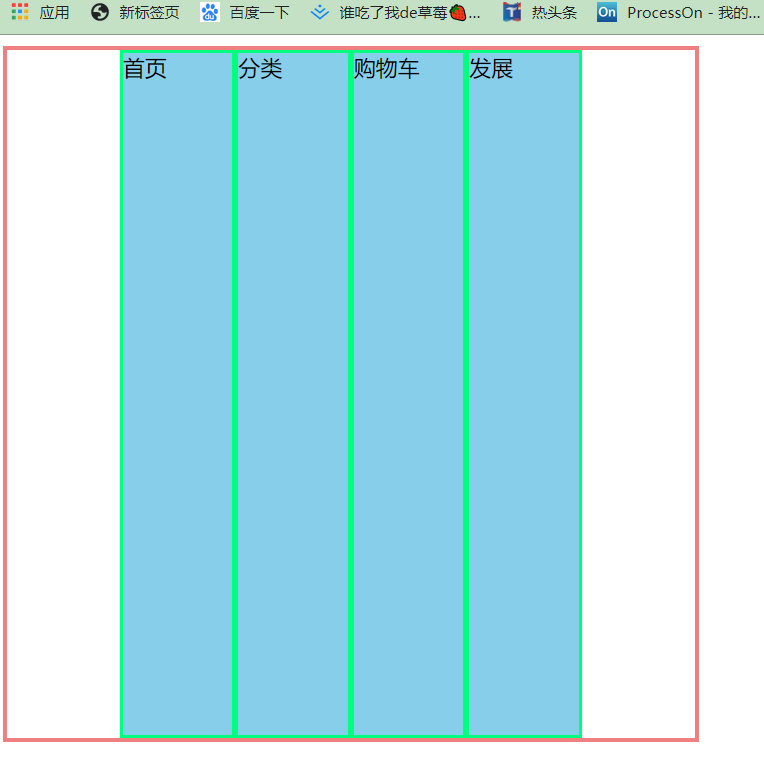
 .father{
            display: flex;
            width: 500px;
            height: 500px;
            border: 3px solid lightcoral;
            /* flex-direction: row; */
            flex-direction: row;
           justify-content: center;
           /* align-items: center; */
           /* align-items:flex-start; */
           /* align-items:flex-end; */
           /* 伸缩 不要给子盒子设置高度 */
           align-items:stretch;

        }
        .father div{
            width: 80px;
            /* height: 80px; */
            background-color: skyblue;
            border: 2px solid springgreen;

        }
align-items:flex-start;
主轴是侧轴:
flex-direction: column;
justify-content: center;
align-items: center;
<!DOCTYPE html>
<html lang="en">
<head>
<meta charset="UTF-8">
<meta name="viewport" content="width=device-width, initial-scale=1.0">
<title>Document</title>
<style>
.father{
height: 500px;
width: 500px;
background-color: bisque;
border: 1px solid saddlebrown;
}
.father p{
color: lightgreen;
font-size: 20px;
line-height: 500px;
}
</style>
</head>
<body>
<div class="father">
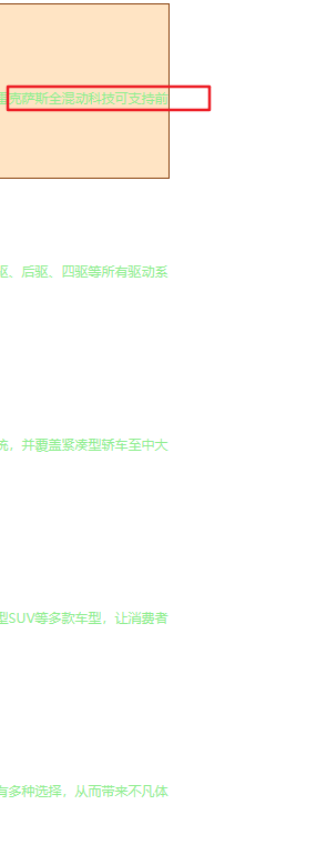
<p>雷克萨斯全混动科技可支持前驱、后驱、四驱等所有驱动系统,并覆盖紧凑型轿车至中大型SUV等多款车型,让消费者有多种选择,从而带来不凡体验。</p>
</div>
</body>
</html>
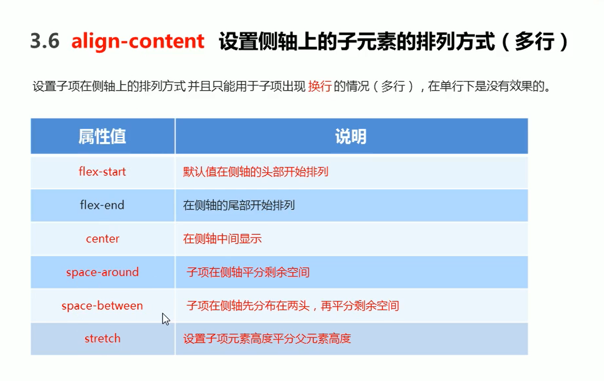
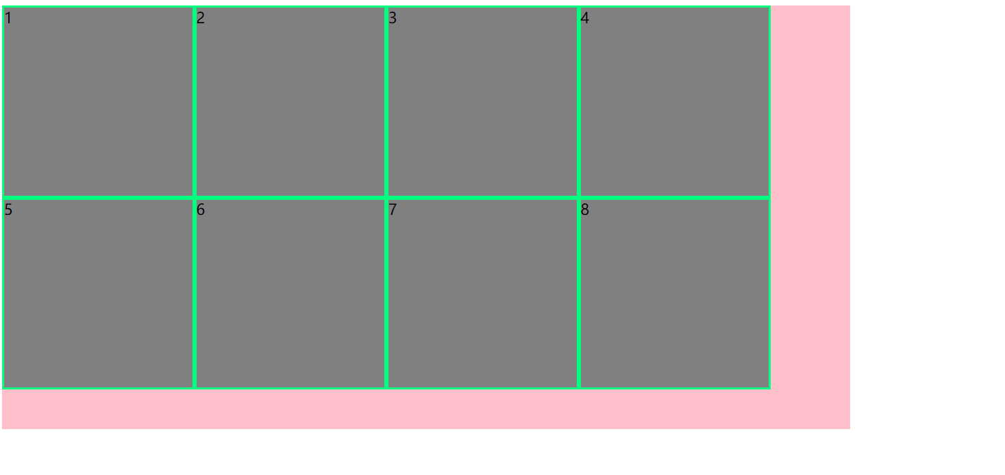
align-content (适用于多行)
ps:在单行里面设置align-content是无效的
常用布局 案例:
<!DOCTYPE html>
<html lang="en">
<head>
<meta charset="UTF-8">
<meta name="viewport" content="width=device-width, initial-scale=1.0">
<title>Document</title>
<style>
ul{
list-style: none;
margin: 0;
padding: 0;
}
.father{
height: 450px;
width: 900px;
background-color: pink;
display: flex;
flex-direction: row;
flex-wrap: wrap;
justify-content: space-between;
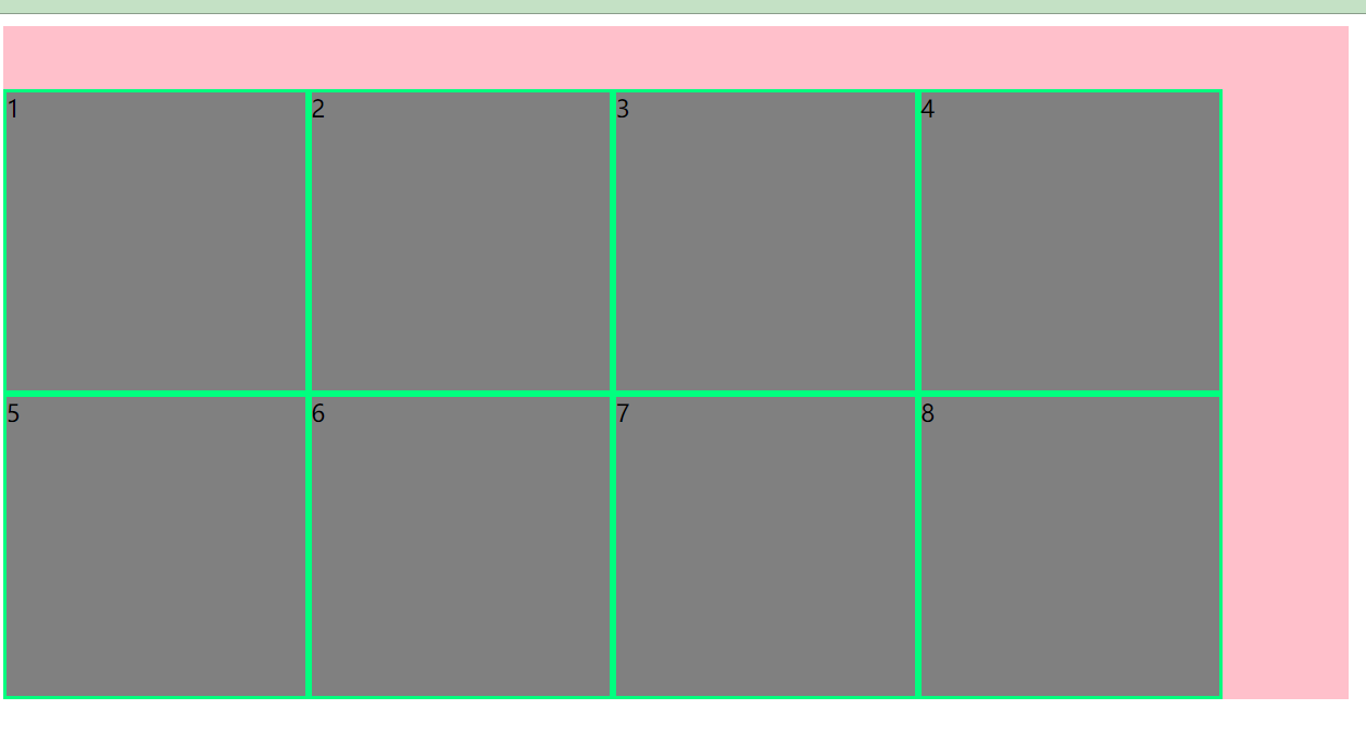
align-content: space-between;
}
li{
width: 200px;
height: 200px;
background-color: gray;
}
</style>
</head>
<body>
<ul class="father">
<li>1</li>
<li>2</li>
<li>3</li>
<li>4</li>
<li>5</li>
<li>6</li>
<li>7</li>
<li>8</li>
</ul>
</body>
</html>
<!DOCTYPE html>
<html lang="en">
<head>
<meta charset="UTF-8">
<meta name="viewport" content="width=device-width, initial-scale=1.0">
<title>Document</title>
<style>
ul{
list-style: none;
margin: 0;
padding: 0;
}
.father{
height: 500px;
width: 900px;
background-color: pink;
display: flex;
flex-direction: row;
flex-wrap: wrap;
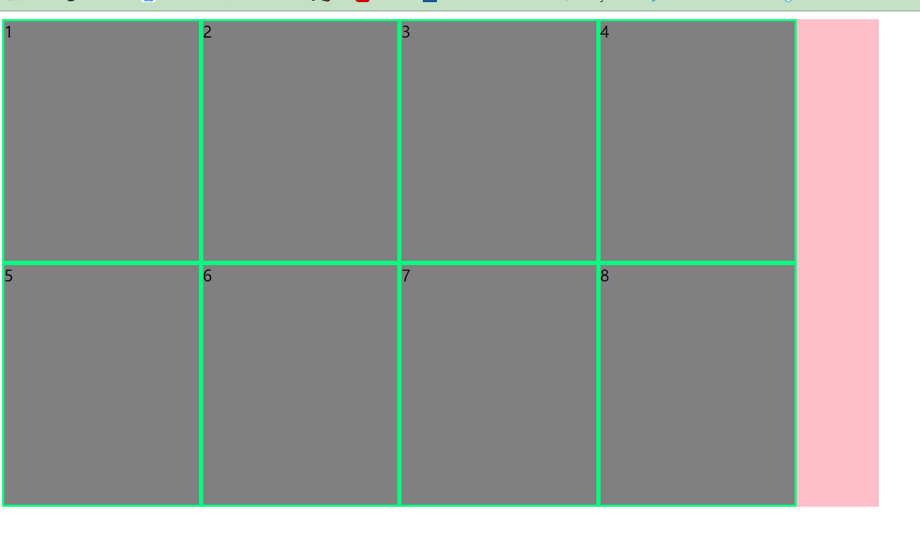
align-content: flex-start;
/* align-content: flex-end; */
/* align-content: stretch; */
/* align-content: space-around; */
/* justify-content: space-between; */
}
li{
width: 200px;
height: 200px;
background-color: gray;
border: 2px solid springgreen;
}
</style>
</head>
<body>
<ul class="father">
<li>1</li>
<li>2</li>
<li>3</li>
<li>4</li>
<li>5</li>
<li>6</li>
<li>7</li>
<li>8</li>
</ul>
</body>
</html>
align-content: flex-start;
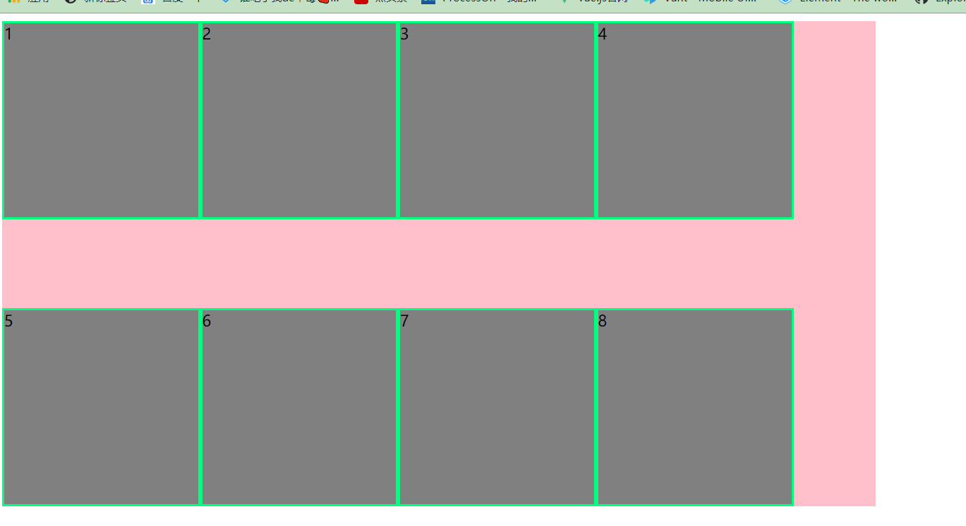
把li的高度去掉/* height: 200px; */ align-content: stretch;
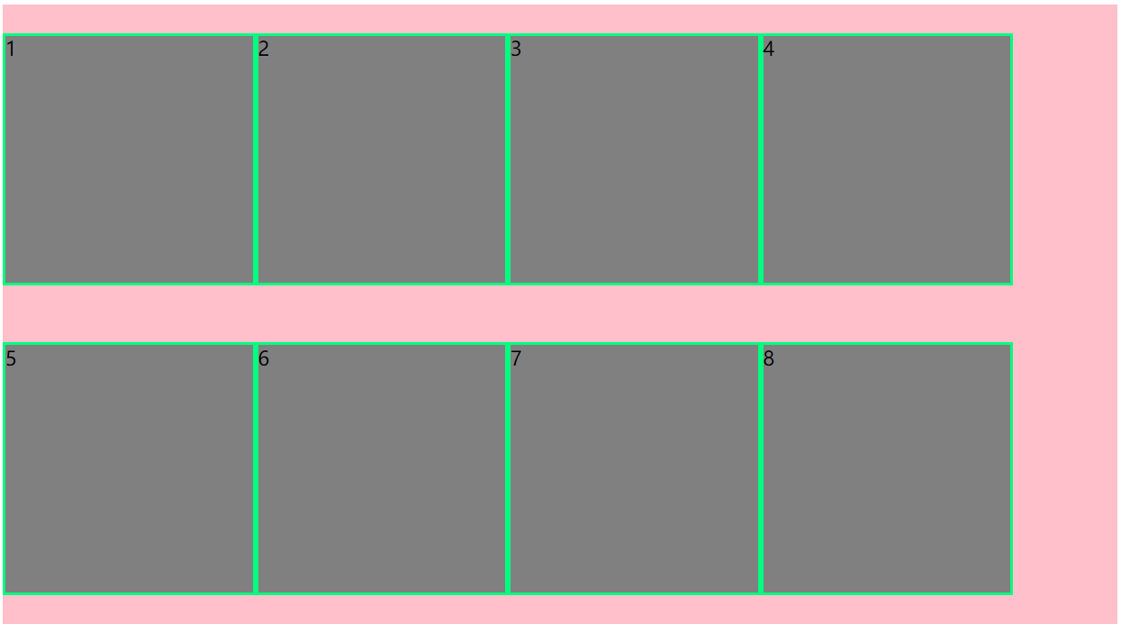
align-content: space-around;
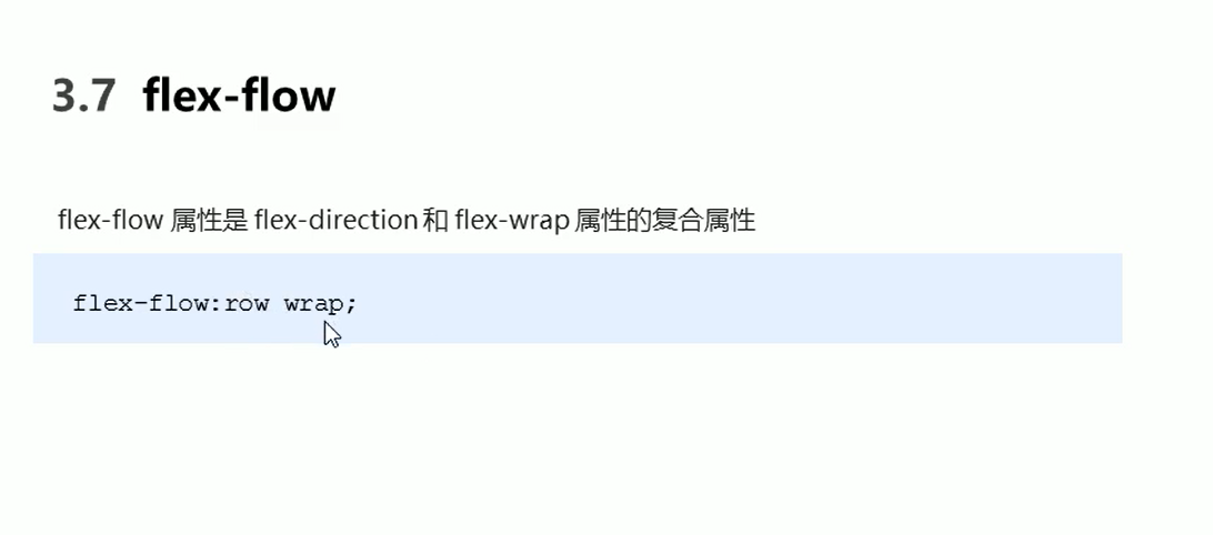
flex-flow
<!DOCTYPE html>
<html lang="en">
<head>
    <meta charset="UTF-8">
    <meta name="viewport" content="width=device-width, initial-scale=1.0">
    <title>Document</title>
    <style>
        ul{
            list-style: none;
            margin: 0;
            padding: 0;
        }
        .father{

            height: 900px;
            width: 900px;
            background-color: pink;
            display: flex;
            flex-direction:column;
            flex-wrap: wrap;
        }
        li{
            width: 200px;
            height: 200px;
            background-color: gray;
            border: 2px solid green;
        }
    </style>
</head>
<body>
    <ul class="father">
        <li>1</li>
        <li>2</li>
        <li>3</li>
        <li>4</li>
        <li>5</li>
        <li>6</li>
        <li>7</li>
        <li>8</li>
    </ul>
</body>
</html>
/* flex-direction:column; flex-wrap: wrap; */
- flex-flow: column wrap; 是上面的合并
flex布局子项常见属性
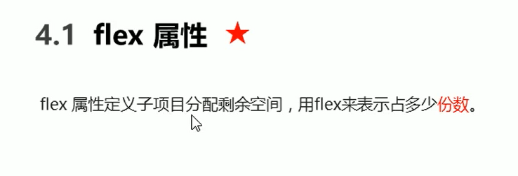
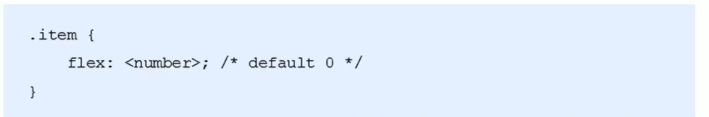
注意:flex是分配剩余空间的哦
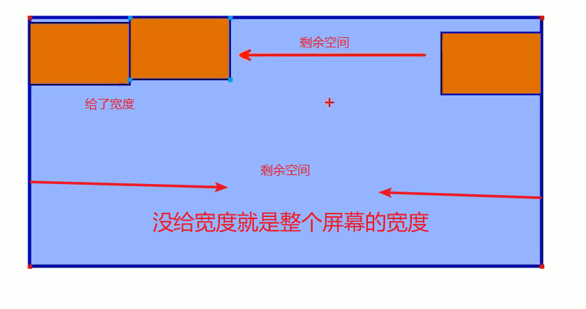
案例:左右固定中间自适应
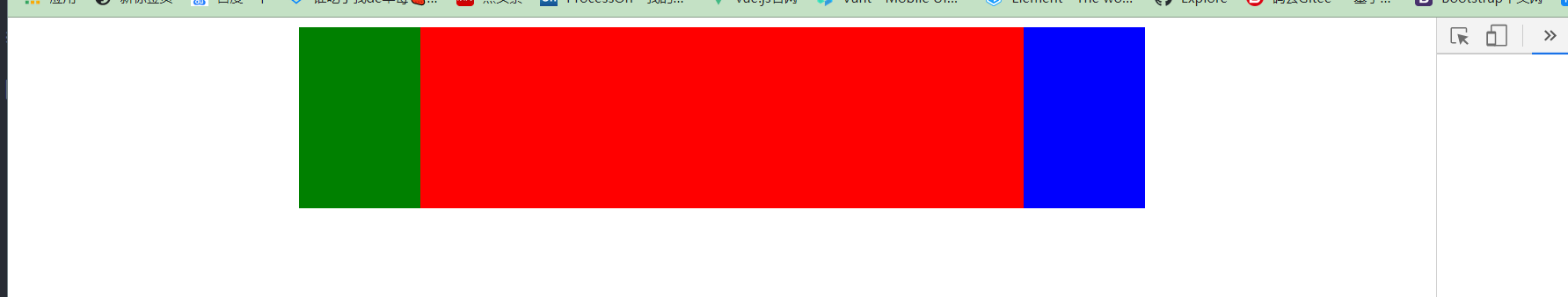
<!DOCTYPE html>
<html lang="en">
<head>
    <meta charset="UTF-8">
    <meta name="viewport" content="width=device-width, initial-scale=1.0">
    <title>Document</title>
    <style>
        section{
            width:60%;
            height: 150px;
            background-color: pink;
            display: flex;
            margin: 0 auto;
        }

        section div:nth-child(1){
            width: 100px;
            height: 150px;
            background-color: green;
        }
        section div:nth-child(2){
            flex: 1;
            background-color: red;
        }
        section div:nth-child(3){
            width: 100px;
            height: 150px;
            background-color:blue ;
        }
    </style>
</head>
<body>

    <section>
        <div></div>
        <div></div>
        <div></div>
    </section>
</body>
</html>
父元素设置flex 子元素为两个块级元素 宽加起来为100% 实现同一行显示

  .father{
            width: 500px;
            height: 200px;
            background-color: purple;

            display: flex;
        }
        .left{
            width: 30%;
            height: 80%;
            background-color: gray;
        }
        .right{
            width: 70%;
            height: 80%;
            background-color:yellow;
        }


    <div class="father">
        <div class="left"></div>
        <div class="right"></div>
    </div>
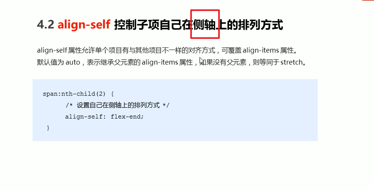
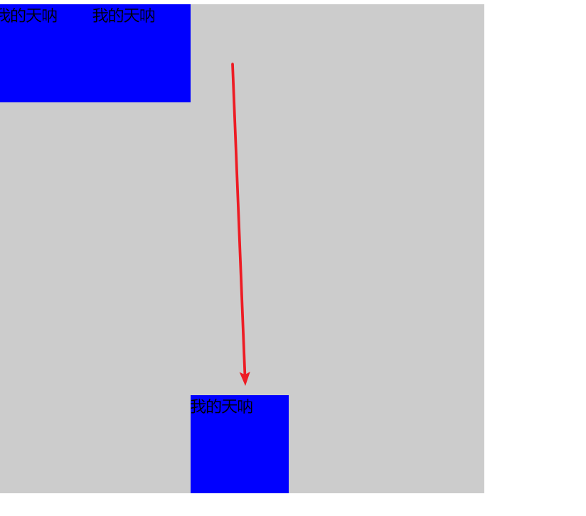
align-self
<!DOCTYPE html>
<html lang="en">
<head>
    <meta charset="UTF-8">
    <meta name="viewport" content="width=device-width, initial-scale=1.0">
    <title>Document</title>
    <style>
        .father{
            width: 500px;
            height: 500px;
            background-color: #ccc;
            display: flex;
        }
        .father div{

            width: 100px;
            height: 100px;
            background-color: blue;
        }
        .father div:nth-child(3){

            width: 100px;
            height: 100px;
            background-color: blue;
            align-self: flex-end;
        }
    </style>
</head>
<body>
    <div class="father">
        <div>
            我的天呐
        </div>
        <div>
            我的天呐
        </div>
        <div>
            我的天呐
        </div>
    </div>
</body>
</html>
order 默认是0 越小越靠前
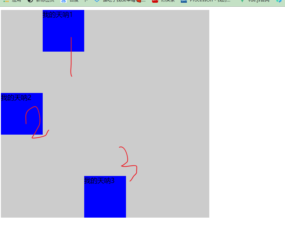
.father div:nth-child(2){
            order: -2;
            width: 100px;
            height: 100px;
            background-color: blue;
            align-self: center;
}
